9 The Selectors of CSS
The selectors are an essential and indispensable part of CSS. You’ll find a comprehensive overview of the many types of selectors in this chapter and also learn how to use them in practice.
In Chapter 8, Section 8.2.1, you’ve already briefly and fundamentally learned about the structure of a CSS rule and the use of a simple selector, more precisely, a type selector.
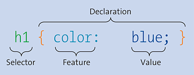
Figure 9.1 The Structure of a Simple CSS Rule with a Selector and a Declaration
But let’s briefly summarize again the purpose of a selector. For the format properties to be applied to a specific HTML element, you must define a CSS rule with a selector and a declaration (or multiple declarations). A selector is the part of a CSS rule that comes before the curly brackets ({}) section, as shown in Figure 9.1. You can use the selector to choose the element or elements to which the various format properties declared between the subsequent curly brackets should be applied. You can group several independent selectors for the same declarations if you separate them with commas. A theoretical example follows:
Selector {
  CSSProperty1: Value1;
  CSSProperty2: Value2;
  ...
}

Selector_01,
Selector_02,
Selector_03 {
  CSSProperty1: Value1;
  CSSProperty2: Value2;
  ...
}
Without such a selector, you wouldn’t be able to specify a pattern match with which to address elements in the document tree. The pattern determined by the selector ranges from a simple element name to much more complex patterns. If the pattern matches a particular element, the rule gets applied to the element with the declaration. It’s absolutely possible to use no selector or only *, but, in this case, the declarations will be applied to all elements in an HTML document.
CSS Selector Test
If you want to know which selectors are implemented in the web browser you’re currently using and which you can use accordingly, you can find a corresponding test at http://css4-selectors.com/browser-selector-test/. The level 1 to level 4 selectors are tested.
The goal of this chapter is to introduce you to the different types of selectors so that you can form more complex pattern comparisons using selectors. For this purpose, CSS provides many different selectors, which should be categorized as follows:
-
Simple selectors
Simple selectors include the type selector, universal selector (*),class selector (.class), ID selector (#id), attribute selector, and several pseudo-classes. -
Combinators
Combinators are two selectors concatenated by a greater-than sign (E > F; child combinator), the plus sign (E + F; adjacent sibling combinator), a tilde sign (E ~ F; general sibling combinator), or a space (E F; descendant combinator).
A Note on Working through This Chapter
This chapter describes many types of selectors. However, the subject is less spectacular and, in some places, more theoretical. It isn’t absolutely necessary to work through this chapter selector by selector. You can also use it just as a reference if a certain selector is used in the book that you aren’t yet familiar with, or if you ever get stuck on how to select a certain element or why a different element was selected than expected.
9.1 The Simple Selectors of CSS
This section describes the simple selectors of CSS. These include the universal selector, simple type selector, class selector, ID selector, attribute selector, and pseudo-classes.
9.1.1 Addressing HTML Elements Using the Type Selector
The type selector—sometimes also referred to as an HTML element selector—is the simplest selector, which you’ve already used several times in this book. Such a type selector addresses the HTML elements directly with the element name. This rule gets applied to all elements of the same type in the HTML document. It’s irrelevant where in the HTML document these elements are written, to which class they belong, or which identifier they have.
The following lines show the type selector in use in a separate CSS file:
/* Black frame, centered text, 5 pixel distance from top
 */
header,
nav,
footer {
  text-align: center;
  border: 1px solid black;
  margin-top: 5px;
}

/* Gray text
 */
h1,
abbr { color: gray; }

/* Gray dotted frame
 */
p { border: 1px dotted gray; }
Listing 9.1 /examples/chapter009/9_1_1/css/style.css
First, for the HTML elements <header>, <nav>, and <footer>, you cause the text to be center-aligned and a black border with a thickness of 1 pixel is to be drawn around it. The distance to the upper next element is 5 pixels for these elements. Then you set the rule that all HTML elements <h1> and <abbr> are to be displayed in gray color. At the end, each HTML element <p> in the HTML document gets a gray dotted frame.
In the following example, you’ll add this CSS file, style.css, via the link element to the HTML document head:
...
  <head>
  ...
   <link rel="stylesheet" href="css/style.css">
  </head>
  <body>
    <header>Header</header>
    <nav>Navigation</nav>
    <main>
      <h1>Type selectors</h1>
      <p>Such a type selector addresses the <abbr>HTML</abbr>
         elements directly via the element names. </p>
      <p> This rule will be applied to all elements of the same
          type in the HTML document. With ... .</p>
    </main>
    <footer>Footer</footer>
  </body>
...
Listing 9.2 /examples/chapter009/9_1_1/index.html
As you can see in Figure 9.2, according to the CSS rules, the individual HTML elements are selected using the corresponding type selector and formatted according to the declarations of the rule.
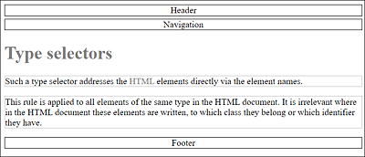
Figure 9.2 The Individual HTML Elements Were Selected with the Appropriate Type Selector and Formatted with CSS
|
Selector |
Name |
Selection |
HTML Example |
|---|---|---|---|
|
element {...} |
Type selector |
HTML element named element |
<element> |
Table 9.1 The Type Selector Has Been Around Since CSS Level 1
At this point, I have a quick note on how you can save yourself some typing. Consider the following theoretical example:
h1 {
  font-family: Arial, Helvetica, sans-serif;
  font-size: 160%;
  color: blue;
}

h2 {
  font-family: Arial, Helvetica, sans-serif;
  font-size: 140%;
  color: blue;
}

h3 {
  font-family: Arial, Helvetica, sans-serif;
  font-size: 120%;
  color: blue;
}
If you take a closer look at these lines, you’ll see that for all three HTML elements for the headings <h1>, <h2>, and <h3>, only the font-size property is different. Accordingly, you can shorten these CSS rules by grouping them as follows:
h1,
h2,
h3 {
  font-family: Arial, Helvetica, sans-serif
  color: blue;
}

h1 { font-size: 160%; }
h2 { font-size: 140%; }
h3 { font-size: 120%; }
First, you group the HTML elements <h1>, <h2>, and <h3> and set the font family and color. Second, you set the font size for each of these HTML elements.
9.1.2 Addressing HTML Elements Using a Specific Class or ID
The type selector is ideal for styling specific HTML elements in an HTML document. For example, if you want to display all HTML elements <p> in blue font, you can address these elements quite easily via the type selector p {color: blue;}. If you don’t want to assign all HTML elements (here again, <p> as an example) in the document the same style, you need to be more specific. For this purpose, the class selector or the ID selector are suitable.
Class Selector: Addressing Elements with a Specific “class” value
You can use the class selector to select the HTML elements that belong to a particular class. In HTML, you can assign such a class name using the global HTML attribute class for almost all elements, for example:
<p class="note">A paragraph text ...</p>
Now you can address the HTML element with the class name note in CSS via the class selector by placing a dot in front of the class name, as follows:
.note { color: red; }
Using “class=""” or “id=""”?
This isn’t a crucial question, but nevertheless, especially as a beginner, one stumbles over these two HTML attributes. You can use the class attribute if you want to style multiple elements in multiple places in the HTML document with it. The id attribute, on the other hand, can be used only once in the HTML document for an element.
You can also use multiple classes at once in HTML elements by separating the individual classes with a space, for example:
<p class="bigfont note">...</p>
Here, the two classes note and bigfont are assigned to the p element.
Here’s an example that demonstrates the class selectors in use. First the CSS file:
...
/* Font family for all p elements, irrespective of the class.
 */
p { font-family: Verdana, Arial; }

/* Style for a note
 */
.note {
  margin-left: 50px;
  border-left: 10px solid green;
  padding-left: 5px;
}

/* Style for a warning
 */
.warning {
  border-left: 10px solid red;
  border-top: 2px solid red;
  border-right: 10px solid red;
  border-bottom: 2px solid red;
  text-align: center;
}

/* Font size to 140%; background color to gray
 */
.headfoot {
  font-size: 140%;
  background: #f5f5f5;
}

/* Font size to 130%
 */
.bigfont { font-size: 130%; }
Listing 9.3 /examples/chapter009/9_1_2/css/style.css
Here’s another simple HTML document that uses these class selectors and demonstrates how to use them in practice:
...
  <head>
   ...
   <link rel="stylesheet" type="text/css" href="css/style.css">
  </head>
  <body>
    <header class="headfoot">Header</header>
    <nav class="bigfont">Navigation</nav>
    <main>
      <h1>class selector</h1>
        <p>The p element without a class.</p>
        <p class="note">The p element with the class
           <code>note</code></p>
        <p class="note warning">The p element with the
           classes <code>note warning</code></p>
        <p class="warning">The p element with the class
           <code>warning</code></p>
        <p class="note bigfont">The p element with the
           classes <code>note bigfont</code></p>
    </main>
    <footer class="headfoot">Footer</footer>
  </body>
...
Listing 9.4 /examples/chapter009/9_1_2/index.html
The first paragraph which contains the p element doesn’t use a class, so only the type selector p with the font family customization is applied to it here. The same font family is used for the other four paragraphs. The second paragraph is formatted with the .note class selector, indented by 50 pixels from the left and also adding a 10-pixel green border to the left. The distance to the border is 5 pixels. The third paragraph uses the class selectors .note and .warning, where everything is formatted quite similarly to the second paragraph. It should be added here that the .warning class inherits the properties of .note, which thus also affects the indentation. The fourth paragraph, which contains the .warning class, on the other hand, contains no indentation because the properties of .note aren’t known here. In the fifth paragraph, the class selectors .note and .bigfont were also combined, so that in the example, in addition to .note, the font was slightly enlarged.
Similarly, in the example, the HTML elements <header> and <footer> were selected with the class selector .header and given a larger font and a gray background. You can see the result of this example in Figure 9.3.
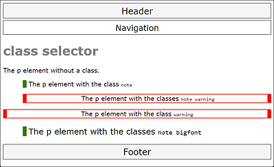
Figure 9.3 This Is What the Example /examples/chapter009/9_1_2/index.html Looks Like with the Class Selectors Written in CSS File style.css
You can also associate class selectors with other selectors to specify more precisely which elements should be selected and customized. For example, with regard to the example just shown, /examples/chapter009/9_1_2/css/style.css, let’s suppose you had written the style for the .warning class as follows:
...
.note.warning {
  border-left: 10px solid red;
  border-top: 2px solid red;
  border-right: 10px solid red;
  border-bottom: 2px solid red;
  text-align: center;
}
...
In that case, the fourth paragraph of the example would no longer be formatted because no selector is defined for <p class="warning"> and .note.warning only addresses <p class="note warning">.
Likewise, you can connect the class selector to the type selector. For example, you could use a definition such as p.note to make sure that only p elements containing the class attribute note (<p class="note">) will be styled. You wouldn’t be able to use the note class in any other HTML element.
ID Selector: Addressing an Element with a Specific “id” Value
With the ID selector, similar to the class selector, you select the HTML elements to which you’ve assigned a specific ID. You can assign an ID to an HTML element using the general HTML attribute, id. Unlike classes (with the class attribute), IDs are always unique elements in an HTML document, so only one element in the entire HTML document can be assigned this ID. The fact that an ID may only occur once is also a reason why the id attribute has been preferred over the class attribute, especially for div elements, to create document-wide unique IDs such as content, header, and navigation.
For this purpose, /examples/chapter009/9_1_2/index.html has been slightly rewritten: the HTML elements have been removed; instead, the individual sections have been written with the classic div element and corresponding id attributes. Here’s an HTML approach to this:
...
  <body>
    <div id="header">Header</div>
    <div id="nav">Navigation</div>
    <div id="main">
      <h1>class selector</h1>
      <p>The p element without a class</p>
      ...
      ...
    </div>
    <div id="footer">Footer</div>
  </body>
...
Listing 9.5 /examples/chapter009/9_1_2/index2.html
To create a CSS rule for this, you can use the ID selector with the name of the corresponding id attribute value in the HTML document. Such an ID selector must be written with the hash character (#) followed by the ID. The ID selector for <div id="header"> can thus be written as follows:
#header { ... }
An ID may occur only once in the document, but this error doesn’t prevent the web browser from styling other id attributes of the same name with the ID selector as well. A validation immediately reveals such erroneous circumstances.
To illustrate this, here’s the complete CSS file where you divide the individual div elements into document-wide unique sections based on their id attributes:
/* Black frame, centered text, 5 pixel distance from top
 */
#header,
#nav,
#footer {
  text-align: center;
  border: 1px solid black;
  margin-top: 5px;
  padding: 5px;
  font-family: Verdana, Arial;
}

/* Font size to 140%; background color to gray
 */
#header,
#footer {
  font-size: 140%;
  background: #f5f5f5;
}

/* 20 pixels distance from all other elements
 */
#main { margin: 20px; }
...
Listing 9.6 /examples/chapter009/9_1_2/css/style2.css
The result is exactly the same as the one with the class selector before, shown previously in Figure 9.3.
Like class selectors, you can associate ID selectors with other selectors. For example, you can use div#header to connect the type selector to the ID selector. In the example, this would address the div element where the id equals header (<div id="header">). However, because an ID may only be used once anyway, you can omit the type selector in this example and use #header as usual.
Mixing the ID Selector with a Class Selector
ID selectors can also be associated with class selectors. It’s therefore possible to use a selector in the following form: .classname#id and #id.classname. However, you should keep in mind that an ID still remains unique across the entire document.
When to Use the Class Selector versus the ID Selector?
The class selector is the selector with the dot, while the ID selector is the selector with the hash. Likewise, you should keep in mind that while you can assign one or more classes to each HTML element, you can generally assign only one ID. Unlike classes, IDs must be unique in an HTML document. In addition, you can’t assign more than one ID to an HTML element.
Permitted Characters for Selectors
For the name of the selector, you can only use uppercase and lowercase letters (a-z; A‐Z), digits (0-9), and the hyphen (-) as well as the underscore character (_). In addition, the name mustn’t begin with a digit.
In your daily work, you should prefer to use class selectors for specific properties or groups such as notes, warnings, or error messages. You can use the ID selectors, on the other hand, to write single or unique main areas of a web page such as #headarea, #mainarea, or #footarea, although the range of HTML elements available for those purposes is absolutely sufficient.
Using Meaningful Class Names and ID Names
The class names and ID names you use should be meaningful and you shouldn’t choose any names that reflect the formatting. For example, you should rather avoid a class name such as redframe and use warning or error instead, if this should be the corresponding function. A meaningful name will help you understand the meaning more quickly during a later revision, and it will be easier for you to assign this class or ID name to an HTML element when designing the web pages. In general, styling details should be kept out of the name.
|
Selector |
Name |
Selection |
HTML Example |
|---|---|---|---|
|
.clname |
Class selector |
Element with the clname class |
<p class="clname"> |
|
#elemid |
ID selector |
Element with ID elemid |
<p id="elemid"> |
Table 9.2 Class and ID Selectors
9.1.3 Universal Selector: Addressing All Elements in a Document
You can use the universal selector to select all HTML elements in a document at once. The universal selector must be written with an asterisk (*).
Let’s take a look at the following example:
/* Black dotted frame;
   Distance to the next element: 5 pixels;
   Fill with 3 pixels and center text
 */

* {
  margin: 5px;
  padding: 3px;
  border: 1px dotted black;
  text-align: center;
}
Listing 9.7 /examples/chapter009/9_1_3/css/style.css
In this example, the universal selector * draws a black dotted frame around all HTML elements. In addition, the spacing of each HTML element was styled to 5 pixels in all directions, and the interior spacing was styled to 3 pixels. The text is also center aligned. Figure 9.4 shows the universal selector written in style.css applied to /examples/chapter009/9_1_3/index.html.
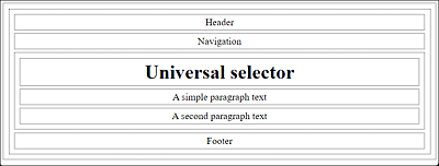
Figure 9.4 The Universal Selector Applied to All Elements Used in the HTML Document
The universal selector can be used not only to select all elements but also to select all elements within an element. Let’s again use the HTML document and the CSS file from which Figure 9.4 was created. Consider the following excerpt of the HTML document:
...
  <body>
  <header>Header</header>
  <nav>Navigation</nav>
  <main>
    <h1>Universal selector</h1>
    <p>A simple paragraph text</p>
    <p>A second paragraph text</p>
  </main>
  <footer>Footer</footer>
  </body>
...
Listing 9.8 /examples/chapter009/9_1_3/index.html
Your main focus should be on the main element. If you want to define a CSS rule to put a special border around the main element, you can do that using a type selector like the following, as you already know:
main { border: 2px solid black; }
You can see the result of this type selector in Figure 9.5.
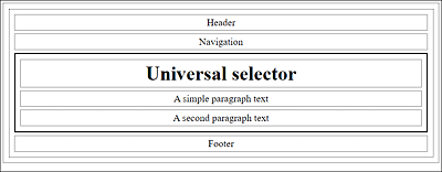
Figure 9.5 A Solid Frame with a Thickness of 2 Pixels Was Drawn around HTML Element <main>
If instead you want to draw the same frame around all HTML elements written inside <main>, you can define that using the universal selector as follows:
main * { border: 2px solid black; }
As you can see in Figure 9.6, thanks to the combination of a type selector and the universal selector, all elements inside the main element have now been selected and provided with the frame. Here, I’ve preempted the descendant selector to demonstrate another example to the universal selector.
|
Name |
Selection |
Example |
|
|---|---|---|---|
|
* |
Universal selector |
All elements |
<p> |
Table 9.3 Universal Selector
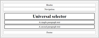
Figure 9.6 A Combination of a Type Selector and the Universal Selector
9.1.4 Addressing Elements Based on Attributes Using the Attribute Selector
The attribute selector can be used to select HTML elements by their HTML attributes. This allows you to check the presence of an attribute or the value it contains. In addition, you also have the possibility of a partial matching of attribute values. Using the HTML element <a> in Figure 9.7 as an example, these three attribute selector options are explained in more detail.
If you want to address all HTML elements that have a specific HTML attribute, you merely need to put the attribute name between square brackets:
[attributname] { ... }
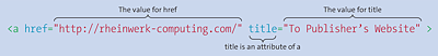
Figure 9.7 HTML Element <a> with Two HTML Attributes
For example, if you want to address all title attributes of an HTML document, you can write the attribute selector for it as follows:
[title] { border: 1px solid black; }
This attribute selector will draw a frame within an HTML document around any HTML element that has a title attribute.
The following HTML document is intended to serve as an example and demonstrate the attribute selector in use:
...
<h1>Attribute selector</h1>
<p>Here’s the publisher's website for the book:
   <a href="https://www.sap-press.com/"
      title="Publisher’s website">Rheinwerk Publishing</a>
</p>
<p title="A paragraph with title">This paragraph also has
   a title attribute.
</p>
...
Listing 9.9 /examples/chapter009/9_1_4/index.html
While the example won’t be awarded any esthetics prizes when executed, as you can see in Figure 9.8, it nicely illustrates how the attribute selector has drawn a frame around the a and p elements because they both contain the title attribute.
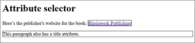
Figure 9.8 The Attribute Selector Draws a Frame around the <a> and <p> Elements Because Both Contain the “title” Attribute
Based on this example, you can see that specifying [attributname] is the same as specifying the universal selector *[attributname]. If you want to address special HTML elements with a specific attribute, you need to connect the attribute selector with the type selector. For example, if you want to style only the a elements with the title attribute, you can use the following notation:
a[title] {
  text-decoration: none;
  color: gray;
  font-weight: bold;
}
In Figure 9.9, you can see that, thanks to the union of the type selector and the attribute selector in the HTML document, only the title attribute contained in HTML element <a> has been selected and styled.
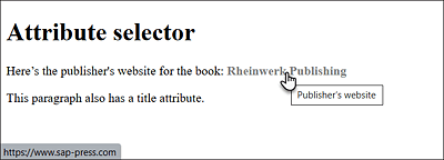
Figure 9.9 A Combination of a Type Selector and an Attribute Selector
You can also create such a combination of attribute selectors with class selectors and ID selectors.
|
Selector |
Name |
Selection |
Example |
|---|---|---|---|
|
[attr] |
Attribute selector (presence) |
Any element that contains the attr attribute |
<element attr="..."> |
Table 9.4 Attribute Selector (Presence of an Attribute)
9.1.5 An Attribute Selector for Attributes with a Specific Value
In addition to selecting attributes, it’s possible to address attributes with a specific value using the attribute selector. Strictly speaking, there are three ways to use an attribute selector to select a particular value:
-
The simplest way is to address elements whose attributes contain a certain value. You must write such an attribute selector between square brackets as usual; there you put an equal sign after the attribute name, followed by the attribute value to be selected:
[attributename=attributevalue]
-
The second option allows you to address elements whose attributes contain a single word separated by at least one space. To do so, you must write a tilde (~) between the attribute name and the equal sign:
[attributename~=attributevalue]
-
The third option can be used to address elements whose attribute value is at the beginning of a string that’s separated by a hyphen (e.g., with a language definition of the hreflang or lang attribute). Here, you must use the concatenation sign (|) between the attribute name and the equal sign, as follows:
[attributename|=attributevalue]
For demonstration purposes, an HTML document with the attribute selectors presented here gets selected and visually designed. First, the CSS file:
/* Styling for all HTML elements where title
   has the attribute value deprecated
 */
[title=deprecated] {
  color: red;
  text-decoration: line-through;
}

/* Styling of HTML elements where title contains the
   the word "Rheinwerk" in the attribute value
 */
[title~=Rheinwerk] { font-weight: bold; }

/* Styling of HTML elements where hreflang
   begins with the attribute value en followed by
   a hyphen
 */
[hreflang|=en] { font-weight: bold; }
Listing 9.10 /examples/chapter009/9_1_5/style.css
You can test these attribute selectors using the following HTML document:
...
<h1>[title=deprecated]</h1>
<p>The HTML element <code title="deprecated">center</code> has been
   declared deprecated and should be implemented by a CSS solution like
   <code>text-align: center</code>,
   for example.</p>
<h1>[title~=Rheinwerk]</h1>
<ul>
  <li><a href=" https://www.sap-press.com/
         title=" To Rheinwerk-Publishing website">
            Rheinwerk Verlag</a></li>
  <li><a href="http://de.wikipedia.org/wiki/Rheinwerk_Verlag"
         title="To the Wikipedia page of Rheinwerk">
            Rheinwerk at Wikipedia (German language)</a></li>
</ul>
<h1>[hreflang|=en]</h1>
<ul>
  <li><a href="http://en.anywhere.com/" hreflang="en-us">
         US English version</a></li>
  <li><a href="http://en.anywhere.com/" hreflang="de-de">
         UK English version</a></li>
</ul>
...
Listing 9.11 /examples/chapter009/9_1_5/index.html
The results are displayed in Figure 9.10. The attribute selector [title=deprecated] can be used to select any HTML element in the HTML document where the title attribute contains the value deprecated. In the example, the selected text is marked with red color and crossed out, as it is once included and demonstrated in the HTML document with the HTML element <code title="deprecated">.
The second attribute selector [title~=Rheinwerk] selects all elements in the document where the title attribute contains the word Rheinwerk. Here, the word Rheinwerk can either be the sole attribute value, which would thus correspond to [title=Rheinwerk], or the word Rheinwerk stands alone, separated by spaces. In the example, the first list item was therefore not selected and formatted in bold because there’s no space at the end of Rheinwerk with title="To Rheinwerk-Publishing website". The attribute value in the second list item, on the other hand, fits the pattern perfectly with title="To the Wikipedia page of Rheinwerk".
In the last example with [hreflang|=en], the first link in the list item is selected because here the pattern matches and the beginning of hreflang contains the text string en followed by the hyphen, which isn’t the case in the second list item. In addition, an element would still be selected if there was only hreflang="en".
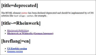
Figure 9.10 The Attribute Selectors in Use
Attribute Values with a Digit and Attribute Values without a Value
If the attribute value starts with a digit (e.g., [title=4u]), then you must note such special characters between double quotes (e.g., [title="4u"]).
Furthermore, there are attributes that don’t need to be assigned a value in HTML, such as the HTML form element for checking off or selecting an option:
<input type="checkbox" checked>
If you use the checked attribute in this form, it will still get an empty string, so you should write the attribute selectors in the following way: [checked=""], [checked~=""], or [checked|=""].
Needless to say, you can also combine these attribute selectors with the type selector to achieve an even more specific selection of attribute values. For example, you can use a[title=Rheinwerk] to select only a elements where the title attribute contains the value Rheinwerk.
|
Selector |
Name |
Selection |
Example |
|---|---|---|---|
|
[attr=value] |
Attribute selector (attribute value) |
Any element where the attribute attr contains the value value |
<elem attr="value"> |
|
[attr~=value] |
Attribute selector (attribute value) |
Any element with the value value in the attribute attr as a standalone word |
<elem attr="abc value xyz"> |
|
[attr|=valx] |
Attribute selector (attribute value) |
Any element that has the value valx in the attr attribute at the beginning as a string separated by a hyphen |
<elem attr="valx-valy"> |
Table 9.5 Overview of Attribute Selectors (Attribute Value)
9.1.6 Attribute Selector for Attributes with a Specific Partial Value
The attribute selector also provides an extended option to select partial values. The following three attribute selectors are available for this purpose:
-
To select an element where the value of the attribute starts with a certain string, you only need to note the ^ character between the attribute name and the equal sign:
[attributename^=partialvalue]
-
To achieve the counterpart of the attribute selector just mentioned, you can write the dollar sign ($) instead of the circumflex character (^) between the attribute name and the equal sign. Then all values of the attribute ending with a certain string will be selected:
[attributename$=partialvalue]
-
To select an element where the value of the attribute is contained as a character string, you need to write the asterisk (*) between the attribute name and the equal sign:
[attributename*=partialvalue]
Again, the presented attribute selectors for selecting partial values in attributes will be briefly demonstrated in use. First, the CSS file:
/*
   all a elements where the attribute href starts with http://
 */
a[href^="http://"] {
 text-decoration: none;
 border-bottom: 1px dotted blue; /* dotted blue. Underscore */
}

/*
   all a elements where the href attribute ends with .pdf
 */
a[href$=".pdf"] {
  text-decoration: none;
  color: black;
  padding: 1px;
  border: 2px dotted gray; /* gray frame around it */
}
/*
   a elements where the href attribute contains the text string,
   mydomain
 */
a[href*=mydomain] { font-weight: bold; }  /* Boldface */
Listing 9.12 /examples/chapter009/9_1_6/style.css
You can test the CSS file style.css on the following HTML document:
...
<h1>Attribute selector (partial values)</h1>
For more information, go to
   the following <a href="http://domain.com/">website</a>.</p>
<p>In addition, I have created a
   <a href="/documents/document.pdf">
   PDF document</a> with interesting content
   for you.</p>
<p>And, of course, there are a few very interesting links: </p>
  <ul>
    <li><a href="http://abcdomain.com/report01">
      Report No. 1</a></li>
    <li><a href="http://domainxyz.com/report02">
      Short report</a></li>
    <li><a href="http://mydomain.com/report03">
      Best report</a></li>
    <li><a href="http://vwxdomain.com/report04">
      Another report</a></li>
  </ul>
...
Listing 9.13 /examples/chapter009/9_1_6/index.html
You can see the result of this example in Figure 9.11. The attribute selector a[href^="http://"] is applied several times to a elements in this HTML document where the attribute value of href starts with the partial value http://, which means it’s an external link.
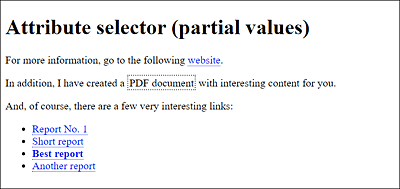
Figure 9.11 The Extended Attribute Selectors in Use
The second attribute selector a[href$=".pdf"] is used only once in the document where, in the a element, the attribute value of the href attribute ends with .pdf (and is thus a PDF document). And the last attribute selector, which contains a[href*=mydomain], is also applied to an a element where the attribute value of href contains the text string mydomain; this is styled with boldface.
|
Selector |
Name |
Selection |
Example |
|---|---|---|---|
|
[attr^=value] |
Attribute selector (partial value) |
Any element where the attribute attr starts with the text string value |
<elem attr="valueless"> |
|
Attribute selector (partial value) |
Any element where the attribute attr ends with the text string value |
<elem attr="outvalue"> |
|
|
[attr*=value] |
Attribute selector (partial value) |
Any element where the attribute attr contains the text string value |
<elem attr="misvalued"> |
Table 9.6 Attribute Selectors (Partial Value)
9.1.7 CSS Pseudo-Classes: The Selectors for Specific Features
In HTML, there are elements you can’t access using ordinary selectors. These include, for example, elements over which the mouse pointer is currently located, or a hyperlink that has already been visited or not. Many of those properties can be addressed via pseudo-classes, which will be briefly described in the following sections.
Pseudo-Classes for Visited and Nonvisited Hyperlinks
The pseudo-classes:link and :visited allow you to select and specially mark unvisited and visited links, respectively. A simple example might look as follows:
a:link { color: red; }
a:visited { color: green; }
...
Listing 9.14 /examples/chapter009/9_1_7/css/style.css
In this example, all a elements whose reference hasn’t been visited yet are displayed in red, while the references that have already been visited are displayed in green. You can find an example here: /examples/chapter009/9_1_7/index.html.
|
Selector |
Name |
Selection |
Example |
|---|---|---|---|
|
:link |
Link pseudo-class |
An unvisited hyperlink |
a:link{ color: blue; } |
|
:visited |
Link pseudo-class |
A visited hyperlink |
a:visited{ color: gray; } |
Table 9.7 Link Pseudo-Classes for Visited and Nonvisited Links
There’s also a newer pseudo-class, :any-link, which selects all links, whether visited or not. This way, you can select all elements that contain an href attribute, for example:
Listing 9.15 /examples/chapter009/9_1_7/css/style.css
This will display all a elements contained in the articlestyle class in gray.
Pseudo-Classes for User Interactions with Mouse and Keyboard
You can use the CSS pseudo-classes :hover, :active, and :focus to respond to different user interactions. Using :hover, you can select elements over which the mouse pointer is located. The pseudo-class :focus selects the elements that receive focus (e.g., via the (Tab) key), while :active selects elements that are currently clicked. What’s also interesting in connection with the input element is the pseudo-class :placeholder-shown, which enables you to address the placeholder text of an input element.
Here’s a simple example that demonstrates all four pseudo-classes in use:
input { background-color: lightgray; }
input:focus { background-color: white; }
input:hover { box-shadow: 0 0 3px blue;  }
input:placeholder-shown { color: white; }
li { background-color: lightgray; }
li:hover { background-color: snow; }
li:active{ background-color: gray; }
a:link { text-decoration: none; color: blue; }
a:hover { font-weight: bold; }
a:active { color: red; }
Listing 9.16 /examples/chapter009/9_1_7/css/style2.css
...
    <h1>:hover and :focus</h1>
    <ul>
      <li><a href="http://www.washingtonpost.com/">Washington Post</a></li>
      <li><a href="http://www.nytimes.com/">New York Times</a></li>
      <li><a href="http://www.cnn.com/">CNN</a></li>
    </ul>
    <h2>:focus</h2>
    <form>
    Your name:
      <input type="text" name="name" id="name" placeholder="Your name" />
    </form>
...
Listing 9.17 /examples/chapter009/9_1_7/index2.html
Figure 9.12 shows the result of the HTML document with the pseudo-classes in use. Here, for example, input:focus was used to cause the input field containing the HTML element <input> to be displayed with a white background when the text input field receives focus. With input:hover, on the other hand, a blue frame is displayed around the input field when you pause over it with the mouse cursor. input:placeholder-shown, in turn, was used to display the placeholder text in white color.
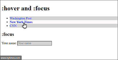
Figure 9.12 The Pseudo-Classes for an Interactive User Input in Use: Pseudo-Class “:hover”
Pseudo-Classes for Form Elements
The styling of HTML forms will be described in Chapter 14, Section 14.7, but it should be mentioned here that there are also three dynamic pseudo-classes available for the form elements: :enabled (selectable; enabled), :disabled (not selectable; disabled), and :checked (checked). Strictly speaking, these are user interface pseudo-classes.
You can use li:hover or a:hover to respond when a user hovers over the HTML element <li> or <a> by changing the background color or font style to bold. With li:active and a:active, you respond when a user activates or left-clicks the HTML elements <li> and <a>, respectively.
It’s important to maintain the order of the pseudo-class selectors, that is :link, :visited, :hover, :focus, and :active (LVHFA); otherwise, :visited will overwrite the :hover pseudo-class. If you ever have problems with a dynamic pseudo-class not working as intended, it’s probably because one pseudo-class has overridden another. In that case, you should check the order of the pseudo-classes. To help you remember the LVHFA order, you can use a mnemonic such as Lord Vader Hates Furry Animals.
“:hover” and Tablets or Smartphones
While the pseudo-classes can now be used for any HTML element, you should still keep in mind that there’s no :hover available on smartphones or tablets—that is, that a mouse is placed over an element.
|
Name |
Selection |
Example |
|
|---|---|---|---|
|
:hover |
Dynamic pseudo-class |
The element is being hovered over by the user moving the mouse cursor over a hyperlink or element. |
a:hover { color: red; } |
|
:focus |
Dynamic pseudo-class |
The element has the focus (e.g., input field with active cursor). |
input:focus{ background-color: yellow; } |
|
:active |
Dynamic pseudo-class |
The element is being activated (e.g., clicked on with the mouse). |
a:active { color: green; } |
|
:placeholder-shown |
Dynamic pseudo-class |
The element is used to address the placeholder text of an input element. |
input:placeholder-shown { color: white; } |
Table 9.8 Dynamic Pseudo-Classes for Mouse and Keyboard Interaction
The “:target” Pseudo-Class for Reference Targets
Another pseudo-class is :target, which can be applied to elements that are the target of a reference. The CSS rule that’s written with it doesn’t become active until the reference target has been jumped to. To activate the reference target, you can use an ID in addition to an ordinary anchor (see Chapter 5, Section 5.2.7).
A simple example shows the :target pseudo-class in use:
:target { background: lightgray; }
div#show { display: none; }
div#show:target { display: block; }
Listing 9.18 /examples/chapter009/9_1_7/css/style3.css
...
<h1>:target-reference-targets</h1>
  <ul>
    <li><a href="#target01">Target No. 1</a></li>
    <li><a href="#target02">Target No. 2</a></li>
    <li><a href="#target03">Target No. 3</a></li>
    <li><a href="#show">Show note</a></li>
  </ul>
<div id="show">Important note!!!</div>
<h2 id="target01">Target No. 1</h2>
<p>Lorem ipsum dolor sit amet, consectetuer adipiscing ... </p>
<h2><a name="target02">Target No. 2</a></h2>
<p>Lorem ipsum dolor sit amet, consectetuer adipiscing ... </p>
<p id="target03">Target No. 3: Lorem ipsum dolor sit amet ... </p>
...
Listing 9.19 /examples/chapter009/9_1_7/index3.html
Here, the pseudo element :target was used to display the reference target that’s currently being jumped to in gray background color. In the example, you’ve defined three reference targets: target01, target02 and target03. The reference targets target01 and target02 are the h2 elements, while target03 is a p element that’s also grayed out when you select the reference target. Another possible use of :target can be found with div#show:target, where you first used div#show and display: none; to hide the div element with the show ID when loading the page. If the visitor selects the reference target Show note, the text between <div> and </div> will show with the Show ID and use display: block;. You can use the CSS feature display to specify how an element should be displayed or change the behavior of an element. The use of display: block; and display: none; to show and hide HTML elements is a commonly cited example.
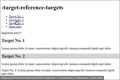
Figure 9.13 The Pseudo-Class “:target” for “Target No. 2”, Resulting in the Heading Now Being Displayed with a Gray Background
9.1.8 The Convenient Structural Pseudo-Classes in CSS
The structural pseudo-classes allow you to select elements based on their position in the document structure.
Addressing the Root of a Document via “:root” and Empty Elements via “:empty”
The two structural pseudo-classes :root and :empty can be used to select either the root of the document (:root) or empty elements (:empty). Here’s a simple example that demonstrates these two pseudo-classes in use:
:root { color: lightgray; }
:empty { background-color: yellow; padding: 10px; }
td:empty { background-color: green; }
Listing 9.20 /examples/chapter009/9_1_8/css/style.css
<!doctype html>
<html>
  <head>
...
  <link rel="stylesheet" href="css/style.css">
  </head>
  <body>
    <h1>:root and :empty</h1>
    <p>Lorem ipsum dolor sit amet, consectetuer ...</p>
    <p></p>
    <h2>:empty on table</h2>
    <table>
      <tbody>
        <tr><td>Value</td><td></td></tr>
        <tr><td></td><td>Value</td></tr>
       <tr><td></td><td></td></tr>
      </tbody>
    </table>
  </body>
</html>
Listing 9.21 /examples/chapter009/9_1_8/index.html
Compared to Figure 9.14, you can see that :root, for which a gray text color was used, affects the entire document. Thus, the use of the structural pseudo-class :root{} corresponds to that of the type selector html{}, the only difference being that it has a higher weighting. If your web browser doesn’t know :root, the text won’t be formatted in gray.
The structural pseudo-class :empty, on the other hand, has an effect on empty elements such as the empty paragraph <p></p>, which has been formatted in yellow. More specifically, in conjunction with a type selector, td:empty, the empty table cells have been styled with green color.
However, :empty is limited to elements that contain nothing at all or only one comment. If a whitespace such as a space, tab feed, or line break gets included in the element, :empty will no longer access it. For this purpose, you can use the structural pseudo-class :blank. :blank works like :empty, except that it also selects empty elements with whitespace characters. However, this structural pseudo-class isn’t yet natively supported by any web browser. Only Firefox allows you to test this pseudo-class by using the vendor prefix :-moz-only-whitespace.
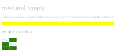
Figure 9.14 Effects of the Pseudo-Classes “:root” and “:empty” on the HTML Document
Structural Pseudo-Classes for Child Elements
The structural pseudo-classes :first-child, :last-child, :nth-child(), :nth-last-child(), and :only-child allow you to select specific child elements in the HTML document structure. A child element (or descendant element) is an element below a given element when you look at the Document Object Model (DOM) tree.
You can use the structural pseudo-class :first-child to select the first child element of an HTML element. The counterpart to this, :last-child, can be used to select the last child of a parent element in the document structure.
Figure 9.15 shows an example with the pseudo-class selectors :first-child and :last-child in use. The CSS code for this can be found in the ZIP file located in /examples/chapter009/9_1_8/css/style2.css and the corresponding HTML document in /examples/chapter009/9_1_8/index2.html. The selected :first-child elements were framed with a solid black line for clarity, while :last-child elements were framed with a dotted gray line. The example shows that body is also a :last-child element of the html element. The first element of html is head.
The structural pseudo-class :nth-child(), on the other hand, allows you to select the nth child element of a parent element. As an argument, this selector expects an integer value or an arithmetic calculation that returns an integer value. Possible arguments you can use are the values odd (odd numbers) and even (even numbers). The structural pseudo-class :nth-last-child() works in a similar way, except that here the counting starts at the end. These pseudo-classes can be used, for example, to alternately color table rows, which greatly simplifies the readability of long tables:
Listing 9.22 /examples/chapter009/9_1_8/css/style3.css
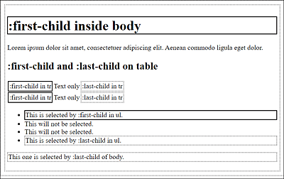
Figure 9.15 The Pseudo-Class Selectors “:first-child” and “:last-child” in Use
As you can see in Figure 9.16, each odd table row (tr element) is styled with lightgray, and each even table row is styled with gray color.
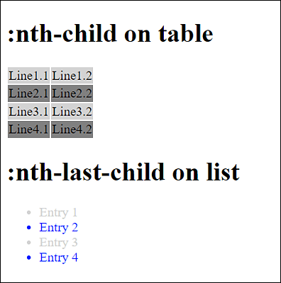
Figure 9.16 The Pseudo-Classes “:nth-child()” and “:nth-last-child()” in Use (HTML Document Available in /examples/chapter009/9_1_8/index3.html)
Another structural pseudo-class is :only-child, which is used to select only those elements in the HTML document which are the only child element of a parent element. For example, for a list with HTML element <ul>, this would be the case if there was only one li element in the list.
Structural Pseudo-Classes for Specific Child Elements
The structural selectors :first-of-type, :last-of-type, :nth-of-type(), :nth-last-of-type(), and :only-of-type apply only to specific child elements. This is in contrast to the :...child selectors, which can apply to all child elements.
Accordingly, you can use :first-of-type or :last-of-type to select the first or last child element of a particular HTML element. Here’s a simple example you couldn’t have implemented with :first-child or :last-child:
article:first-of-type { border: 2px solid black; }
article:last-of-type { border: 2px dotted gray; }
Listing 9.23 /examples/chapter009/9_1_8/css/style4.css
    ...
    <link rel="stylesheet" href="css/style4.css">
  </head>
  <body>
      <header>Header</header>
      <article>
        <h1>Article 1</h1>
        <p>Text for article</p>
      </article>
      <article>
        <h1>Article 2</h1>
        <p>Text for article</p>
      </article>
      <article>
        <h1>Article 3</h1>
        <p>Text for article</p>
      </article>
      <footer>Footer</footer>
  </body>
</html>
Listing 9.24 /examples/chapter009/9_1_8/index4.html
In this example, article:first-of-type and article:last-of-type select the first and last article elements respectively. Because of the header and footer elements, in this case you can’t select the first and last article elements with :first-child and :last-child, respectively, and must use :first-of-type and :last-of-type instead.
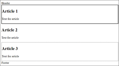
Figure 9.17 The Pseudo-Class Selectors “:first-of-type” and “:last-of-type” in Use
If you had wanted to select the second article in the example in Figure 9.17, you would have done this with the following:
article:nth-of-type(2) {...}
Again, you would have to use the :nth-of-type() version instead of the :nth-child() version because you would have used article:nth-child(2) to select the first article element; the header element would have been the first child in this example, and the first article element would have been the second child. The counterpart to :nth-of-type() is :nth-last-of-type(), except that the counting of elements starts at the end.
Finally, the of-type counterpart to :only-child, that is, :only-of-type, allows you to address an element if it’s the only element of the type in the parent element. Let’s look at a simple example:
em:only-of-type { font-weight: bold; }
Listing 9.25 /examples/chapter009/9_1_8/css/style5.css
...
  <link rel="stylesheet" href="css/style5.css">
...
<body>
  <h1>:only-of-type</h1>
  <p><em>Bear</em>! Who is this <em>Bear</em>?</p>
  <p>Caution! <em>Bear</em> could be standing <strong>behind</strong>.
     you!</p>
</body>
...
Listing 9.26 /examples/chapter009/9_1_8/index5.html
In this example, only the em element in the second paragraph is selected with em:only-of-type because it’s the only em element in the p element. The strong element isn’t important in such a case. With the em:only-child version, no em element would have been selected at all because there’s no only element in the two p elements.
Finally, here’s a table with an overview of the various structural pseudo-classes that are available.
|
Selector |
Selects |
|---|---|
|
:root |
Root element. |
|
:empty |
Empty elements. |
|
:first-child |
An element that is the first of its parent element. |
|
:last-child |
An element that is the last of its parent element. |
|
:nth-child(n) |
An element that is the nth child element. For n, the values odd (odd numbers) and even (even numbers) are also possible. |
|
:nth-last-child(n) |
Like :nth-child(n), except that here the count starts at the end. |
|
:only-child |
An element that is the only child element in the parent element. |
|
:first-of-type |
An element that is the first child element of a given type. |
|
:last-of-type |
An element that is the last child element of a given type. |
|
:nth-of-type(n) |
An element that is the nth identical child element of a parent element. For n, the values odd (odd numbers) and even (even numbers) are also possible. |
|
:nth-last-of-type(n) |
Like :nth-of-type(n), except that the counting starts at the end. |
|
:only-of-type |
An element if it’s the only child of this type in the parent element. |
Table 9.9 Overview of the Structural Pseudo-Classes
9.1.9 Other Useful Pseudo-Classes
CSS provides some more pseudo-classes, which I’ll briefly describe here. First, there’s the language pseudo-class :lang(), which you can use to select elements you’ve provided with the lang attribute. The corresponding element gets selected together with its descendants. For example, if you want to style all elements written with lang="en" in blue text color, you can do it as follows:
:lang(en) { color: blue; }
Another very useful pseudo-class is the negation pseudo-class :not(), which allows you to select elements with which a selector does not match. This pseudo-class expects a simple selector as an argument. With the following simple example, you can make sure that all elements which aren’t text paragraphs (i.e., not p elements) get a gray text color:
:not(p) { color: gray; }
All this can be specified in more detail as follows:
#content:not(p) { color: gray; }
Now all child elements of the element with ID content that aren’t p elements get a gray color. Such combinations can be expanded even further, for example:
article:not(.news) { ... }
This selects all article elements whose elements don’t contain the news class.
In the future, it will also be possible to use more than one selector as an argument, for example:
p:not(.advertisment, .news) { color: gray; }
This way, you can style all p elements in gray font color. Elements that are provided with the advertisement or news class are excluded from this. At the time of printing this book, however, only the Safari web browser was able to handle multiple selectors.
The counterpart of the pseudo-class :not() is :matches(). This allows you to select multiple elements that match the selector, for example:
p:matches(.advertisement, .news) { color: gray; }
This will gray out all p elements that contain the advertisement or news class. When this book was printed, Safari could already use this natively. In Chrome and Edge, you still need to use :-webkit-any() for it.
|
Name |
Description |
|
|---|---|---|
|
:lang(xx) |
Language pseudo-class |
Selects elements where the language has been provided with the lang="xx" attribute |
|
:not(s) |
Negation pseudo-class |
Selects elements to which selector s doesn’t apply |
|
:matches(s1,s2, ...) |
Matches pseudo-class |
Selects all elements to which selectors s1 and s2 ... apply |
Table 9.10 Language Pseudo-Class and Negation Pseudo-Class
9.1.10 Pseudo-Elements: The Selectors for Nonexistent Elements
CSS pseudo-elements provide you with another group of selectors. This allows you to address elements that aren’t directly present as elements in the structure of the HTML document, but are still resulting from the structure with HTML or are generated using the CSS feature content.
Like pseudo-classes, pseudo-elements in CSS start with a colon (:pseudo-element). However, they should be used with two colons (::pseudo-element) to better distinguish them from CSS pseudo-classes.
The Pseudo Elements “::first-letter” and “::first-line”
You can use ::first-letter to select and style the first character in an HTML element. And as you might guess from the name, the CSS pseudo-element ::first-line selects the first line in an HTML element.
The Pseudo-Elements “::before” and “::after”
The CSS pseudo-elements ::before and ::after allow you to add content to an existing content. These pseudo-elements are often used in conjunction with the CSS feature content to add content before (::before) or after (::after) the existing content.
The Pseudo-Element “::selection”
The CSS pseudo-element ::selection selects the text marked by the user. This can be useful if the color scheme of the layout doesn’t match the one used when selecting text, which is usually white on blue. However, only some CSS features can be used with this pseudo-element. These include color, background (background-color, background-image), and text-shadow.
Here’s a simple example you can use to test some of the pseudo-elements presented here:
p::first-line { font-weight: bold; }
p::first-letter{ font-size: xx-large; float: left; }
td.time::before { content: "ca. "; }
td.time::after  { content: " minutes"; }
Listing 9.27 /examples/chapter009/9_1_10/css/style.css
...
    <link rel="stylesheet" href="css/style.css">
  </head>
  <body>
     <h1>:first-letter and :first-line</h1>
     <p>Lorem ipsum dolor sit amet, consectetuer adipiscing.
        Aenean commodo ligula eget dolor. Aenean massa. ...</p>
     <h1>:before and :after</h1>
     <table>
      <tbody>
        <tr><td>from A to B</td><td class="time">55</td></tr>
        <tr><td>from A to C</td><td class="time">35</td></tr>
        <tr><td>from B to C</td><td class="time">20</td></tr>
      </tbody>
    </table>
  </body>
...
Listing 9.28 /examples/chapter009/9_1_10/index.html
You can use p::first-line to select the first line of the p element that can be displayed in the web browser and output it in bold. p::first-letter, on the other hand, allows you to select the first letter in the p element and highlight it clearly with a larger font. Used in this way, this applies to all p elements in the HTML document. On the other hand, if you have a p element such as <p class="abc">, you can also access it via p.abc::first-line, which is a composite of type selector, class selector, and pseudo-element.
td.time::before enables you to insert the text "approx. " before the content of a table cell that contains the time class by means of the CSS feature content. In a similar way, you can use td.time::after, except that here the content " minutes" is inserted at the end of the content of the table cells. Figure 9.18 shows the example in use.
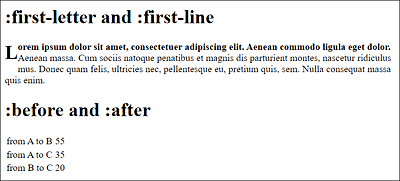
Figure 9.18 The Pseudo-Elements in Use
|
Selector |
Description |
|---|---|
|
::first-letter |
Selects the first character in a line |
|
::first-line |
Selects the first line in a paragraph |
|
::before |
Inserts content before an element and formats it |
|
::after |
Inserts content after an element and formats it |
Table 9.11 Overview of the Pseudo-Elements