14 Styling with CSS
Welcome to the pleasure dome! Now that you’ve familiarized yourself with the important basics of CSS, such as selectors, the box model, positioning, and layout, you can turn your attention in this chapter to things such as website design—or, more simply—the CSS elements you can use to make websites more beautiful.
This chapter covers other ways to make websites more beautiful or readable that haven’t been described up to now. The main focus is clearly on working with text at first, as text is usually the most important thing on most websites. In addition, you may want to design elements such as lists or tables with CSS. Likewise, I’ll briefly describe the design of images and graphics with CSS. You’ll also learn newer options such as moving and rotating or animating elements using CSS. At the end of the chapter, I’ll briefly describe how you can design HTML forms.
The following topics are covered in this chapter:
-
Designing texts with CSS
-
Styling ordered and unordered lists with CSS
-
Making tables more beautiful with CSS
-
Designing graphics and images with CSS
-
Transforming HTML elements with CSS
-
Creating smooth transitions with CSS
-
Styling HTML forms with CSS
14.1 Designing Texts with CSS
The purpose of most websites on the internet is to convey information. Usually, the flow of information on websites consists of text, images, and videos. The most important type of information flow on the web is text. CSS provides an impressive amount of CSS features for this purpose, which you can use to design or customize texts for websites. I’ll describe these CSS features in more detail in the following sections.
14.1.1 Selecting Fonts via “font-family”
You can use the CSS feature font-family to select the font for the text within an element. As the value for this CSS feature, you can pass the name of the font you want to use to format the text within the HTML element, for example:
body { font-family: Arial; }
This sets the font between <body> and </body> to Arial.
A prerequisite for the corresponding font to be used for display is that it must be installed on the local system of a visitor to the website. In the case of the Arial font, this is probably pretty much the case. Nevertheless, you can specify several alternatives separated by commas—called a font stack. Here’s an example:
body { font-family: Arial, Verdana, sans-serif; }
In this case, the Arial font is used between the HTML elements <body> and </body>. If the visitor doesn’t have this font installed on his system, the web browser can use Verdana as an alternate font. If that font also isn’t available on their system, you instruct the web browser to select any sans-serif font on the system and use it to display the text.
The list can be as long as you want, and the web browser will use the first font installed on the system. Fonts that contain a space in their name must be specified between quotation marks (e.g., "Courier New").
If No Suitable Font Is Available
If no specified font from font-family is available on the system, the default font of the web browser will be used.
Overview of Generic Fonts
To be on the safe side, it’s recommended to specify a generic font (or font class) in a list of different fonts at the end. There are five different generic fonts listed in Table 14.1. In Figure 14.1, you can see the different font classes printed for better distinction.
|
Font Class |
Meaning |
Known Examples |
|---|---|---|
|
serif |
In serif fonts, you’ll find small fine lines or tick marks at the end of the letter stroke across the base direction. |
Times |
|
These are sans-serif fonts where the end of the stroke is straight. |
Arial |
|
|
monospace |
These are fonts with a fixed width, where all letters have the same width. |
Courier |
|
cursive |
The name is somewhat confusing because these are fonts that are meant to give the impression of a cursive script. |
Comic Sans MS |
|
fantasy |
These are often decorative ornamental fonts that can be used for creative purposes and are less suitable for entire passages of text. |
Impact |
Table 14.1 Various Generic Font Classes
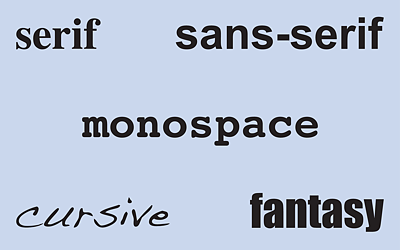
Figure 14.1 The Five Different Generic Fonts: “serif”, “sans-serif”, “monospace”, “cursive”, and “fantasy”
Of course, you could simply specify just a generic font such as a sans-serif:
body { font-family: sans-serif; }
However, it can’t be predicted with certainty which sans-serif font will then be used to display text.
Inheritance of Fonts
Fonts are inherited by the subordinate elements as long as no custom font has been written in the subordinate elements. Often, therefore, a font is defined for <body> that applies to the entire document, for example:
body { font-family: Arial, Verdana, Helvetica, sans-serif; }
In Figure 14.2, you can see an HTML document /examples/chapter014/14_1_1/index. html without font-family for the body element, while in Figure 14.3, there’s one with the CSS feature font-family for the body element.
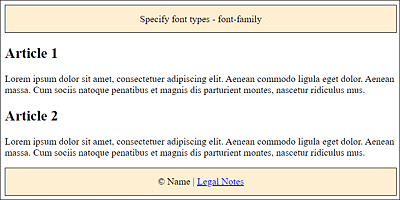
Figure 14.2 An HTML Document with the Default Font of the Web Browser
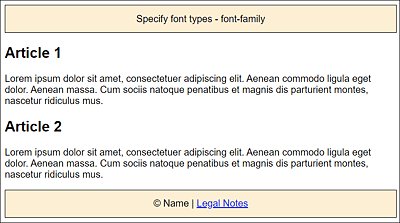
Figure 14.3 The Same Document Again, but Now with the CSS Feature “font-family”: Sans-Serif Font (Here, Arial) Was Used
I’ve slightly extended this example for demonstration purposes:
...
body { font-family: Arial, Verdana, Helvetica, sans-serif; }
.footer, .header {
    background-color: papayawhip;
    border: 1px solid black;
    padding: 2% 2%;
    text-align: center;
    font-family: cursive;
}

.article { font-family: Georgia, Times, serif; }
...
Listing 14.1 /examples/chapter014/14_1/css/style.css
We first use the body type selector to specify a sans-serif font such as Arial, Verdana, Helvetica, or even a generic font for the entire document. This font is used as the default font if no other font is specified for an element. Then, for the footer and header elements, we let the system select a cursive type with the generic font class cursive, so the result here will probably look different on different computers. For the text in the article elements themselves, we use a serif font such as Georgia, Times, or any other serif font available on the system. The results are displayed in Figure 14.4.
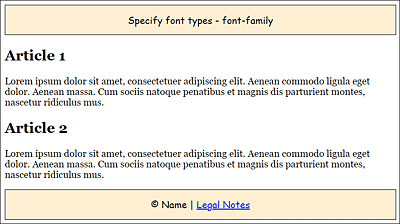
Figure 14.4 Multiple Different Fonts in Use
Number of Different Fonts
In practice, you should keep the number of different fonts on a web page rather low. Too many fonts won’t necessarily make a website look better. A good guideline should be to use no more than three or four fonts. However, this also depends on the type of website.
Benefits and Drawbacks of “font-family”
The drawback of using font-family to select the font is that a font must be installed on the visitor’s computer. So you’re quite limited in the choice of fonts. Mostly common fonts such as Times, Times New Roman, Georgia, Helvetica, Arial, or Verdana are used.
The use of font-family does have one advantage: you don’t have to worry about font licenses because you don’t share the font.
Analyzing Fonts in Firefox
At this point, I’d like to discuss the Fonts tab, which you can find in the Developer Tools in the Firefox web browser. In addition to the default settings of the web browser, you can also use it to determine the fonts of other websites if you particularly like one of them. You can also make adjustments to the font size, line height, character spacing, or stroke width here to see in the browser what it would look like with different settings. The matching values will then be displayed inline in the HTML element.
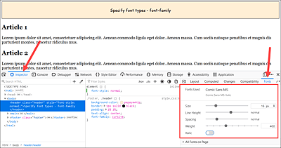
Figure 14.5 You Can Analyze and Change the Font Used on a Web Page in Firefox, Which Makes the Effects Visible in the Browser Window
14.1.2 Providing Fonts via Web Fonts: “@font-face”
@font-face allows you to use fonts that aren’t installed on visitors’ computers. To do this, you just need to specify a path from where the font can be downloaded.
To add fonts to a website using the @font-face rule, you need the following:
-
font-family
Specify the name of the font. You can then pass this name as a value for the font-family feature. -
src
Set the path or link to the font file. You can also provide different versions of the font. -
format
Specify the file format in which the font is available.
Here’s a theoretical example of how you can include such a downloadable font for a website:
@font-face {
   font-family: 'A font name';
   src: url('path/to/my/font.ttf') format('truetype');
}
Again, you can use these web fonts in CSS via the CSS feature font-family:
body { font-family: 'A font name', Times, Georgia, serif; }
As a fallback solution, you can specify a list of alternate fonts if the font (here, 'A font name') couldn’t be downloaded and used.
Longer Loading Time
Logically, adding additional resources to your website, as you did here with the web fonts, also means that the loading time will increase. In addition, you often have no control over fonts that are hosted and made available on another server.
Different File Formats for Web Fonts
The different file formats for the fonts seem a bit exotic at first. Not everyone is familiar with font file abbreviations such as EOT (Embedded Open Type; format('eot')), WOFF (Web Open Font Format; format('woff')), TTF (TrueType; format('truetype')), OTF (Open Type; format('opentype')), and SVG (SVG Fonts; format('svg')).
Meanwhile, the WOFF format standardized by the W3C seems to be gaining more and more acceptance. WOFF is a compressed TIFF format with additional information such as the origin or license of the font and is supported by the latest web browsers. The oldest of the formats, EOT, on the other hand, was used by the older Internet Explorer up to version 8. Other older web browsers, on the other hand, used the TTF or OTF formats. The SVG format is popular for displaying on the iPhone or iPad, but it’s also used by Safari. However, you can do without SVG now because iPhone and iPad also support the WOFF format. To provide the widest possible support for the downloadable font, you can provide the fonts in multiple formats.
In practice, this is how you reach almost all web browsers to provide a font in a particular file format:
@font-face {
   font-family: 'A font name';
   src: url('path/to/font.eot'); /*IE9*/
   src: url('path/to/font.eot#iefix') format('eot'), /*IE5-8*/
        url('path/to/font.woff') format('woff'),
        url('path/to/font.ttf') format('truetype'),
        url('path/to/font.svg#svgFN') format('svg');
}
This way, you can include different formats for different web browsers. If a web browser doesn’t support a certain format, it chooses the next possible font format. You could do without TrueType and SVG altogether in this example nowadays. The first EOT file is used for the old Internet Explorer 9. The hash (#), in turn, is a browser switch for even older Internet Explorer versions prior to version 9. At this point, the web browser in question stops reading. All other web browsers, however, read their preferred font format.
Having Fonts Converted to Different Formats
When you’ve found a font that you want to use, you often don’t have all the necessary formats such as EOT, WOFF, TTF, or SVG ready. For this purpose, the Font Squirrel website (www.fontsquirrel.com/tools/webfont-generator) offers a free service: you can upload a font file and have it converted to all other formats. Then you download the different formats, and the CSS rule with @font-face is included in an extra CSS file. However, after embedding web fonts, you should always test the rendering quality in different web browsers because the quality can differ significantly between web browsers when rendering.
In addition, you can use the font-style, font-weight, and font-stretch features in the @font-face rule, which is very useful when the font exists in different files, for example:
@font-face {
 font-family: 'A font name';
 src: url('path/to/my/font.eot');
 src: url('path/to/my/font.eot#iefix') format('eot'),
      url('path/to/my/font.woff') format('woff'),
      url('path/to/my/font.ttf') format('truetype'),
      url('path/to/my/font.svg#svgFN') format('svg');
}

@font-face {
 font-family: 'A font name';
 src: url('path/to/my/font-it.eot');
 src: url('path/to/my/font-it.eot#iefix') format('eot'),
      url('path/to/my/font-it.woff') format('woff'),
      url('path/to/my/font-it.ttf') format('truetype'),
      url('path/to/my/font-it.svg#svgFN') format('svg');
   font-style: italic;
}
This allows you to use the italic font for styling purposes in addition to the regular version of the font, for example:
...
p { font-family: 'A font name', Times, Georgia, serif; }
.it { font-style: italic; }
...
<p>Regular version of the embedded font</p>
<p class="it">Cursive version of the embedded font</p>.
...
Embedding Royalty-Free Fonts by Google into the Website
The easiest way might be to use a font from Google Fonts and embed it into the website. However, “easy” doesn’t mean it’s “not complicated” but rather refers to ease of getting the necessary licenses. If you use fonts from the web for a custom project, you really need to be sure that you have the permission to do so from the font’s developer. Even a “free” font doesn’t always mean that it’s free for all purposes. You can find the fonts from Google Fonts listed at https://fonts.google.com.
On the upper-left side of the Google Fonts website, you’ll see a magnifying glass icon to search with some filters to find the font you need. For the category (Categories), you select the type of font (Serif, Sans Serif, Display, Handwriting, or Monospace). You can filter out other properties using Font properties with the thickness or font width. Then, you can select the desired fonts via the preview.
Once you’ve clicked on a font, you can specify the styles. Useful styles are regular, italic, and bold. Click + Select this style to add a font style. The selected styles will be displayed in the Review tab on the right.
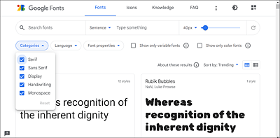
Figure 14.6 Fonts on https://fonts.google.com
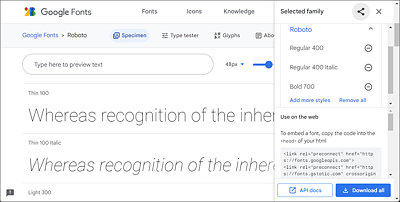
Figure 14.7 I’ve Chosen the Roboto Font with a Regular, Italic, and Bold Font Style
Once you’re done with the selection, take a look at the Review tab on the right side where you’ll find the code to embed the font on your website under the text Use on the web. You can choose between a link element, an @import rule, or a JavaScript. Copy and paste the code to your website.
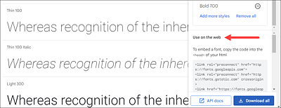
Figure 14.8 A <link> Element or an “@import” Statement Enables You to Add the Code to the Website via Copy and Paste
In the following example, the Roboto font from Google Fonts was embedded and used via @import:
@import url('https://fonts.googleapis.com/css2?family=Roboto:ital,wght@0,400;0,700;1,400&display=swap');
body {
    font-family: 'Roboto', sans-serif;
}
...
Listing 14.2 /examples/chapter014/14_1_2/css/style.css
You can see the result with the HTML document /examples/chapter014/14_1_2/index. html in Figure 14.9.
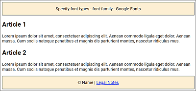
Figure 14.9 Here, the Roboto Font from Google Fonts Was Downloaded and Embedded
Google Fonts and the GDPR
If you offer fonts from a Google server on your website, you may feel insecure about the General Data Protection Regulation (GDPR) because data gets transferred between your website visitors and Google. If you want to be on the safe side, you can also offer Google Fonts “locally” in your own web space. For this purpose, you’ll find the google-webfonts-helper tool at https://gwfh.mranftl.com/fonts to pack up and download the appropriate font formats.
Other Royalty-Free and Commercial Web Font Providers
Not everyone likes Google’s fonts, and if you’re looking for a special font, there are other font hosting services as well. Many of these services offer free fonts for private use or even entirely royalty-free fonts. Others offer a mix of free and commercial fonts, and then there are fee-only services. Here’s a short list of different hosting services for fonts:
Note that in the services where you can download the corresponding fonts, you usually receive a text file with the license in addition to the font file. Be sure to read them so you know under what conditions you may use the fonts. If you buy a font, you should make sure you have the license to use it as a web font (not just for the desktop).
Pros and Cons of “@font-face”
The advantage of @font-face is certainly that it allows you to finally use fonts that aren’t installed on the computers of your website visitors. However, this font needs to be downloaded beforehand, which might slow down the loading of the website a bit. In addition, here you need to know the license of the font used and whether the distribution of the font is allowed or not. If you want to be absolutely sure in this regard, you need to either create your own fonts or use @font-face via a free or commercial service. In that case, the service takes care of the licensing arrangements with the font manufacturer.
14.1.3 Using Icons via Icon Fonts
Adding graphics to the website is basically no big deal anymore. However, it gets somewhat more complicated if you want to insert an icon in the middle of a text. And that’s particularly difficult when you want the icon to look equally good on any device, from a small screen such as a smartphone to a screen with an extremely high resolution. Sure, you could make the icon responsive as a graphic and scale it accordingly, but it won’t necessarily make the result more attractive (blurry or pixelated). On the other hand, you could also provide multiple versions of the graphic, and SVG as a graphic format still comes to mind as a possible workaround.
However, you can save this effort right away and just use icon fonts instead. The icon fonts name already suggests what it’s about, and those who have a lot to do with word processing might know fonts such as Wingdings from Microsoft, which use icons. You only need to include the corresponding icon fonts via @font-face. This makes it possible to treat these icons like an ordinary font. For example, you can adjust the appropriate size with the CSS feature font-size.
There are several providers of attractive icon fonts. Here we’ll introduce and use one of the arguably more popular icon fonts, Font Awesome (https://fontawesome.com). A list of other popular icon fonts can be found at the end of the section. To download icon fonts, you need to create an account at fontawesome.com. However, it is also possible to use the icon fonts via a CDN server. For more details, please refer to the fontawesome.com website.
If you’ve downloaded and unpacked Font Awesome, you’ll also find other embedding options in the package, such as for the CSS preprocessor Less, for example. For our purposes, the contents of the css and webfonts folders, which are located below the webfonts-with-css folder, are sufficient for now. The css folder contains all the necessary CSS statements, while you can find the font icons in webfonts. Both folders were copied to the directory of the sample website.

Figure 14.10 Font Awesome Has Become a Favorite of Web Designers
In the first step, you don’t need to do anything but include the CSS file all.css in the HTML document, which you can do using the link element in the document header as follows:
...
<link href="css/all.css" rel="stylesheet">
...
That’s all it takes. The included CSS file from Font Awesome handles the integration of the icon fonts with @font-face as an additional font. The second step is to use Font Awesome’s font icons anywhere in the HTML document using the <i> tag, but basically this works with any other tag as well. For example, you can insert and display a house icon in the HTML document as follows:
<i class="fas fa-home"></i>
You can adjust the size with font-size as you would with an ordinary font because basically they are embedded font icons, for example:
<i class="fas fa-home" style="font-size:3em;"></i>
The font icons of Font Awesome have special classes included that allow you to increase the icon size with fa-2x, fa-3x, fa-4x, and fa-5x relative to their container, for example:
<i class="fas fa-home fa-2x"></i>
You can also customize colors as you would with an ordinary font using the CSS feature color. For example, the following line uses the Twitter logo in Twitter’s usual color:
<i class="fab fa-twitter fa-2x" style="color:#0084b4;"></i>
For symbols with a trade name or trademark, you must use the fab prefix instead of fas. The b of fab stands for brand, and the s of fas for solid. Font Awesome also offers a commercial version with even more icons and different styles, where you can use far (for regular) and fal (for light) as prefixes.
For an overview of Font Awesome’s icons, you can visit https://fontawesome.com/icons?d=gallery. To find out what else you can do with Font Awesome, go to https://fontawesome.com/start.
Here is a snippet of an HTML document with various font symbols from Font Awesome in use:
...
<head>
...
<link href="css/all.css" rel="stylesheet">
<style>
...
<style>
</head>
<body>
<header class="header">Use icon font</header>
<nav>
<a href="#">Home page <i class="fas fa-home"></i></a>|
<a href="#">Blog <i class="fas fa-book"></i></a> |
<a href="#">Links <i class="fas fa-anchor"></i></a> |
<a href="#">About <i class="fas fa-user"></i> </a> |
<a href="#">Contact <i class="fas fa-envelope"></i>
</a>
</nav>
<main>
<article>
<h1><i class="fab fa-css3 fa-2x"></i> Article 1</h1>
<p>Lorem ipsum dolor sit ... </p>
</article>
<article>
<h1><i class="fas fa-html5 fa-2x"></i> Article 2</h1>
<p>Lorem ipsum dolor sit ... </p>
<ul class="fa-ul">
<li><i class="fa-li fas fa-check-circle"></i>
Done</li>
<li><i class="fa-li fas fa-circle"></i>
Not done</li>
<li><i class="fa-li fas fa-ban"></i>
Not possible</li>
<li><i class="fa-li fas fa-spinner fa-spin"></i>
In process</li>
</ul>
</article>
</main>
<footer class="footer">© Name | <a href="#">Legal Notes</a><br><br>
<i class="fab fa-twitter fa-2x" style="color:#0084b4;"></i>
<i class="fab fa-google-plus fa-2x" style="color:red;"></i>
<i class="fab fa-facebook fa-2x" style="color:#3b5998;"></i>
<i class="fab fa-skype fa-2x" style="color:#12A5F4;"></i>
</footer>
</body>
...
Listing 14.3 /examples/chapter014/14_1_3/index.html
You can see the example with the different icon fonts, including social media icons, from Font Awesome in Figure 14.11.
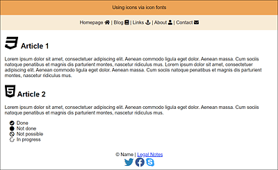
Figure 14.11 Various Icons without Graphics in Use Thanks to Font Awesome Icon Fonts
Besides Font Awesome, there are many other providers of such font icons, which can often be integrated and used in a similar way. Other interesting icon fonts can be found on the following websites, among others:
Observing Licenses
The same applies here as with the downloadable fonts. Many of these icon fonts are free, but still have some sort of license (GPL, Creative Commons, etc.) that you should be sure to read through before using and embedding icon fonts on your website. Others are commercial and can be purchased.
14.1.4 Setting the Font Size Using “font-size”
The font size can be set using the CSS feature font-size. As a matter of fact, you might think it should be trivial to set the font size. But it already starts with the fact that the font size can be specified with pixels, points, percentages, em, or rem. The ideal font size will probably not exist anyway because there are too many different settings in the operating system and different large and small screens with different resolutions. In addition, the web browser allows you to scale the websites in different zoom levels.
Different screen sizes and resolutions, settings in the operating system or web browser, and different units of measure (UoM) make it truly complicated for the web designer to use the right font size and UoM. Nevertheless, in this chapter, you’ll learn what you can use when and what you should not use.
No Specifications with “font-size”: The Browser Standard
If you don’t specify anything via font-size, the default value of the web browser will be used, which is often 16 pixels (= 100%, 1em, 1rem, or 16pt) as the base font size. Because default fonts are often displayed at different sizes, and users can change the size in the web browser, you should take control of the font size and not leave the display of text to chance.
Preset Keywords for the Font Size
CSS provides the predefined keywords small, x-small, xx-small, medium, large, x-large, and xx-large, where medium is the base font size. The other keywords decrease (small) or increase (large) the value of medium by a factor of 1.2 each. These values are absolute values. smaller and larger are two more keywords with relative values. Relative here means relative to the parent element. I personally have rarely made use of these keywords, as they allow only limited control over the actual font size. For this reason, I won’t go into detail about those values.
Relative Font Sizes with “em”
An easy way to adjust the font size for the entire document is to set font-size for the body element. For example, if you set font-size for the body element to 1em or 100%, you’d have effectively used the default value of the web browser, which is the case in Figure 14.12.
If you want to increase the font size by 15% for the complete document, you only need to set font-size in the body element to 1.15em or 115%. This will automatically increase the font size of the other elements such as <h1> and <p> by 15%, and you don’t have to worry about that. In Figure 14.13, compared to Figure 14.12, this is exactly what was done: the font was increased by 15% via the body element.
Due to the fact that a relative font size of the body element regulates the font size for all elements of the web page through inheritance, this option is widely used in practice to adjust the font size.
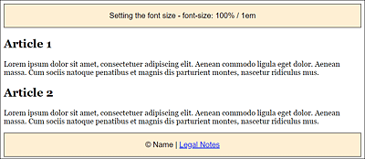
Figure 14.12 The Default Font Size Gets Preserved If You Set “font-size” to 100% or “1em” for the <body> Element
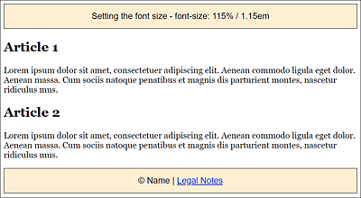
Figure 14.13 Here, the Font Size Has Been Increased by 15% via the <body> Element
But it’s precisely this inheritance or, more accurately, cascading, that can make adjusting font sizes a little more complex if you don’t act with caution here. Consider the following theoretical example:
...
  body    { font-size: 0.95em;  /* or 95% */ }
  article { font-size: 0.8em;   /* or 80% */ }
  p       { font-size: 0.8em;   /* or 80% */ }

...
Listing 14.4 /examples/chapter014/14_1_4/css/style.css
...
<body> <!-- 0.95em -->
...
  <article> <!-- 0.76em -->
    <h1> ... </h1>
    <p> <!-- 0.608em --> ... </p>
  </article>
...
</body>
...
Listing 14.5 /examples/chapter014/14_1_4/index.html
For <body>, we set a smaller font size of 0.95em (or 95%). As mentioned earlier, this specification applies to the entire document, which has the side effect of reducing the article element by another 0.8em (or 80%) of this 0.95em (or 95%), thus setting it to 0.76em, since 0.96 × 0.8 = 0.76em.
In the example, the p element is still used inside an article element, which again reduces the set font size of 0.76em by 0.8em, so that a text inside the p element in an article element is set only in the font size 0.608em (0.76 × 0.8 = 0.608). The text in the p element would thus be displayed extremely small.
Setting the Font Size Using “rem”
The problem with inheriting relative values that occur if you use em or % for setting the font size can be avoided by using rem (rem = root em). Basically, rem is also just an em, the only difference being that when it inherits, it adheres to the highest root element, <html>, instead of the font size of the corresponding parent element. Let’s take a look at the same section as before, but this time we use rem:
...
  html    { font-size: 100%; } /* Browser default */
  body    { font-size: 0.9375rem; }
  article { font-size: 0.8125rem; }
  p       { font-size: 0.8125rem; }
...
Listing 14.6 /examples/chapter014/14_1_4/css/style2.css
...
<body> <!-- 0.9375em -->
...
  <article> <!-- 0.8125em -->
    <h1> ... </h1>
    <p> <!-- 0.8125em --> ... </p>
  </article>
...
</body>
...
Listing 14.7 /examples/chapter014/14_1_4/index2.html
Here, you don’t need any more math like in the example before with em because we’ve set the value of <html> to 100%, and on the basis of <html>, the root em, you can be sure that the subsequent font sizes with rem correspond to what has been written. Of course, the relationship of body text such as <p> to headings such as <h1>, <h2>, and so on will be preserved.
Fixed Defaults for the Font Size via Pixel and Point
For a long time, font sizes were specified in pixels. People were familiar with this UoM from the screen, and they could avoid the problem with the inheritance of relative values, as it was the case with percentages or with em. In addition, pixels can be used to implement a pixel-precise layout.
However, 12 pixels looks different on a 1,024 × 768 pixel 13-inch screen than on a 27-inch screen with a resolution of 2,560 × 1,440 pixels. In addition, it’s no longer possible to say that a pixel is just a pixel. The days of uniform pixel densities of 72 ppi or 96 ppi are over. Newer devices such as smartphones often have 326 ppi, or various screens like the Retina of the iMac have a pixel density of 104 ppi. Without going too much into the complex details, this specifically means that with a higher pixel density on an inch, the pixels inevitably become smaller (and therefore the resolution becomes sharper). We hardly notice the individual pixels on a smartphone due to the high pixel density.
What about Points (“pt”) as a Unit for Font Size?
The point value (pt) is better suited for printers or typesetters in the print sector. However, the different conversion factors of the pixel densities from 72 ppi up to 326 ppi result in different displays. The pt unit is more suitable for printing if you create a print version with CSS. It should be mentioned here that a specification of cm (for centimeters) is also possible. As with pt, it’s also true for cm that it isn’t possible to say whether the conversion to pixels has been performed correctly, and therefore the results of these specifications are relatively unpredictable.
For this reason, if a smartphone actually used 12 pixels for a font size at this high pixel density, you would have to use a magnifying glass to find the text. As a result, such mobile web browsers convert the device’s pixels into a kind of pixel for CSS. Consequently, 12 pixels aren’t always really 12 pixels. Thus, specifying pixels is rather unreliable with the extremely different sizes and resolutions of screens that exist today.
Responsive Units “vw” and “vh”
The font sizes with %, em, and especially rem are probably the most common units at the moment. These specifications are relative to the base font size or relative to the parent element. What’s still missing here is a font size specification, which is relative to the screen dimensions. For this purpose, the W3C has introduced the viewport units, vw (for view width) and vh (for view height), which allow you to assign a size to an element that’s calculated in relation to the width and height of the viewport. For the width, you can use vw, and 1vw corresponds to 1% of the width of the viewport. Similarly, the same applies to the height where you can use vh, and 1vh corresponds to 1% of the height of the viewport. In addition, the units vmin and vmax are available, which refer to the height or width, using the smaller or larger value, respectively. Again, 1vmax corresponds to 1% of the width or height of the viewport.
Here’s a simple example of how you can adjust the font size without media queries based on the screen width with just a single specification:
html { font-size: 3vw; }
...
Listing 14.8 /examples/chapter014/14_1_4/css/style3.css
If you now run the example /examples/chapter014/14_1_4/index3.html on different devices or scale the browser window, the font size will always be scaled by 3vw according to the screen width. This can be converted as follows if, for example, the screen width is 1,024 pixels:
1024px / 100 * 3vw = 30.72 pixels
This would have set the general font size of the web browser to 30.72 pixels for a screen width of 1,024 pixels. On a smaller screen width with a 480-pixel viewport this would be as follows:
480px / 100 * 3vw = 14.4 pixels
The example shows very nicely how you can achieve extremely responsive font specifications with the viewport unit, but in the example with 3vw, the font size in the html element is now much too large on large screens and barely legible on smaller screens.
Mike Riethmuller has found a solution to the problem (see www.madebymike.com.au/writing/precise-control-responsive-typography/), where he limits the scaling of the font size using calc():
html { font-size: calc(100% + 0.5vw); }
...
Listing 14.9 /examples/chapter014/14_1_4/css/style4.css
When you run the example with /examples/chapter014/14_1_4/index4.html, you’ll notice that everything is far from perfect, and the question remains how to specifically adjust individual elements with the viewport units. Just giving the vw or vh information seems to be too inaccurate. Further calculations with calc() might make everything a little too complicated. Probably the best solution is to set the viewport units only in the html element and use em or rem for everything else relative to it, as is also currently recommended by Zell Liew at https://zellwk.com/blog/viewport-based-typography/.
This was just intended as a brief introduction to the newer viewport units related to font sizes. We’ll probably encounter the new unit more often in the future.
General Relative Length Measure
The units vw and vh aren’t limited to fonts, but were introduced as a general length measure, which you can already conclude from the names viewport width and viewport height. As mentioned previously, 1vw corresponds to 1% width of the web browser window. Thus, 100vw is the full browser width. This makes it easy, for example, to make sure that an element is always a certain size, no matter how big the screen is. Here’s an example:
.quarter {
  width: 50vw;
  height: 50vh;
}
The element with the .quarter class will now always cover a quarter of the browser window, no matter how large the device’s screen is or whether you scale the browser window afterward.
Overview of the Common Methods for “font-size”
Table 14.2 provides a brief overview of the common methods or units you can apply to the CSS feature font-size.
|
Unit |
Example |
Description |
|---|---|---|
|
em |
font-size: 1em; |
Relative to the font size of the parent element |
|
% |
font-size: 100%; |
Relative to the font size of the parent element |
|
px |
font-size: 16px; |
Absolute font size |
|
rem |
font-size: 1rem; |
Relative to the font size of <html> |
|
smaller, larger |
font-size: larger; |
Slightly larger than the parent element |
|
font-size: small-x; |
Uses exactly small-x (absolute font size) |
|
|
vw |
font-size: 3vw; |
Adjusts the font size according to the width of the viewport (see next section) |
Table 14.2 Common Ways to Set the Font Size
Converting Pixels to “em” or “rem” with the 62.5% Trick
Richard Rutter’s 62.5% trick is frequently encountered in responsive web design. Because most web browsers set the default font size to 16 pixels, and, based on that, 1 rem (or 1 em) always corresponds to the base font size, it makes sense to set the base font size to 10 pixels so that you can more easily set the relative values via em or rem. For example, if you want to set the text for an element to 18 pixels, you’d have to write a cumbersome specification such as 1.125em. You can find a table on this at http://pxtoem.com. Of course, you can also calculate this with 18 px ÷ 16 px = 1.125 em, but this is cumbersome in the long run. One option would be to use 1.8em right away for an 18-pixel font size. To do that, you just need to write the following definition:
body { font-size: 62.5%; /* base font size to 10 pixels */ }
h1 { font-size: 2.4em; /* = 24 pixels */ }
h2 { font-size: 1.9em; /* = 19 pixels */ }
…
14.1.5 Italic and Bold Fonts via “font-style” and “font-weight”
You can assign an italic font style by assigning the value italic to the CSS feature font-style. This will display the font in italic style. If a font doesn’t have an italic style, the web browser will try to slant it using oblique, which is another value you can assign to font-style. The difference between italic and oblique isn’t apparent at first glance, but italic uses real italics supplied by the font’s manufacturer. With oblique, on the other hand, you can subsequently slant the fonts so that they look like real italic fonts. The default value of the CSS feature font-style is normal, with which the font gets displayed normally upright.
The CSS feature font-weight enables you to define the weight of the font. The term weight describes how thick or bold the letters will be displayed. The bold value allows you to define a bold font style. The default value of the normal font style is normal. In addition to bold, there are other weights such as bolder (bolder than bold), lighter (thinner than normal), and the numeric values 100, 200, and up to 900 (in increments of 100), where 400 is normal and 700 is bold. The question as to how strongly the font will be displayed with the values 100 to 900 depends on the computer platform and the web browser.
For Me, Only “bold” and “normal” with “font-weight” Works!
Most of the time, the web browser only recognizes the bold and normal font styles. Values such as lighter, bolder, or 100 to 900 can only be used if the font has these gradations.
In Figure 14.14, you can see a trivial example that demonstrates the CSS features font-style and font-weight for adjusting the font style with CSS.
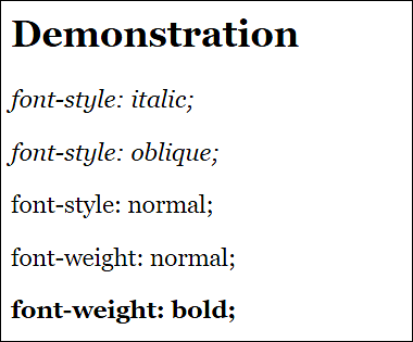
Figure 14.14 Changing the Font Style with “font-style” and “font-weight” (Example in /examples/chapter014/14_1_5/index.html)
14.1.6 Creating Small Caps Using “font-variant”
With font-variant and the single value small-caps, you can turn a letter into small caps. By means of a small cap, the text is converted to all uppercase, while maintaining the size of the lowercase letters. As a rule, true small caps, in which all letters have the same stroke width, aren’t used unless the font used contains small caps. With the help of @font-face and an appropriate font, it’s possible to use real small caps.
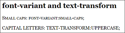
Figure 14.15 The Difference between (Fake) Small Caps and Capital Letters (Example in /examples/chapter014/14_1_6/index.html)
Capital Letters
If you want to convert a text to uppercase, you can do this by using the CSS feature text-transform and the uppercase value (Section 14.1.14).
14.1.7 Defining Line Spacing via “line-height”
The line spacing defines the distance from baseline to baseline and can be set using the CSS feature line-height. Line spacing is important for better readability of longer text passages. In practice, the default value on the monitor is almost always too small because this distance comes from the print area. For this reason, you’re well advised to use a higher value. Most of the time, the following applies: the longer the lines of a text are, the larger you should choose the line spacing. A good value is often 120% (or 1.2em) up to 150% (or 1.5em). An increased line spacing helps your visitor “keep” the line while reading.
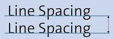
Figure 14.16 Line Spacing Is the Distance from Baseline to Baseline
Line spacing is often confused with the optical bleed-through shown in Figure 14.17.
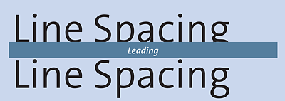
Figure 14.17 Don’t Confuse the Optical Bleed-Through with Line Spacing
In Figure 14.18, you can see how different values for the CSS feature line-height have a significant impact on the readability of the body text. You can also clearly see that a value below 100% reduces the line spacing and drastically worsens the readability of the continuous text because you can no longer keep the line as easily when reading.
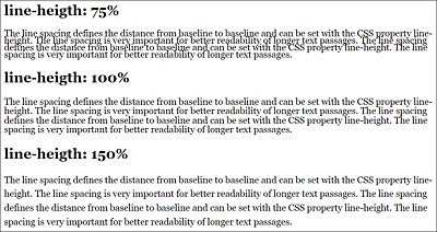
Figure 14.18 Different Line Spacing Has a Drastic Effect on the Readability of the Text (Example in /examples/chapter014/14_1_7/index.html)
14.1.8 A Short Notation for Font Formatting Using “font”
The CSS feature font is a short notation for all the features presented here in the order font-style, font-variant, font-weight, font-size/line-height, and font-family. In practice, this short CSS notation is preferably placed in the <body> tag, and for individual elements such as headings or paragraph text, only the individual adjustments are made for it. For example:
body { font: 1.125em/150% Arial, sans-serif; }
footer, header {
  ...
  font-size: 1.2em;
}
h1 { font-style: italic; }
article {
  font-family: Georgia, Times, serif;
  font-size: 1em;
}
...
Listing 14.10 /examples/chapter014/14_1_8/css/style.css
Here, the font size was set to 1.125em for the <body> tag, the line height to 150%, and the font to Arial or any existing serif font using the CSS feature font. By using this line, you’ve virtually defined the font for the website. For all other variations, as you can see in the example for the footer, header, h1, and article tags, you only need to adjust the individual characteristics for that font.
As you can see with the CSS feature font, you don’t have to specify all properties. At least the font-size and font-family features must be present. In addition, if you use font-size and line-height, you must separate the two with a slash, where the first value is for font-size, and the second is for line-height. If only one value is used, it will apply to font-size. Here’s a summary of the sequence that must be followed when using all features:
font: font-style               /* font style */
      font-variant             /* font variant */
      font-weight              /* font weight */
      font-size/line-height    /* font size/line spacing */
      font-family;             /* font family */
A complete example in which all font features have been combined can look like the following:
p { italic normal bold 1.2em/120% Georgia, Times, serif; } 14.1.9 Specifying Letter and Word Spacing via “letter-spacing” and “word-spacing”
If you want to control the spacing between the letters, you can do this by using the CSS feature letter-spacing. In your daily work, you shouldn’t use letter spacing in regular body text because it tends to make the text less readable. This feature might be more useful for headlines or for texts that are written entirely in capital letters.
What letter-spacing does with individual letters, the CSS feature word-spacing can do with the spacing between individual words. By default, this kind of spacing is usually 0.25em, but as always, it depends on the default setting of the web browser. Here, too, a wider specification tends to worsen the reading flow and should therefore only be used sporadically.
In Figure 14.19, you can see the effects of word-spacing and letter-spacing used after the heading for the corresponding paragraph text. The headlines here were also styled using letter-spacing. The example can be found in /examples/chapter014/14_1_9/index.html.
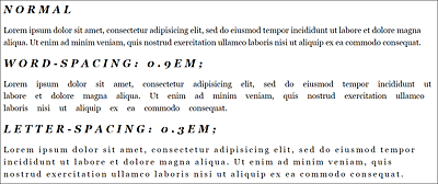
Figure 14.19 CSS Features “word-spacing” and “letter-spacing” in Use
Controlling the Width of the Individual Characters via “font-stretch”
The font-stretch feature can be used to change the width of the font by compressing or stretching the individual characters. However, this feature can’t be applied to any font, but works only for fonts that contain appropriate subsets for it. Possible values in ascending order of font compression are semi-condensed, condensed, extra-condensed, and ultra-condensed. Values that stretch the text, on the other hand, are semi-expanded, expanded, extra-expanded, and ultra-expanded. The default setting, which doesn’t change the font width, is normal. There are fonts that can handle all nine values. Some fonts, on the other hand, can only be compressed via condensed and stretched via expanded. When this book went into print, all modern browsers were able to handle this feature, except for Safari for iOS. For an example, see /examples/chapter014/14_1_9/index2.html.
14.1.10 Setting the Text Alignment Using “text-align”
Another important aspect for a good reading flow of texts (and also other inline elements) is the alignment—also referred to as font type—which can be set to one of the following four values using the CSS feature text-align:
-
left
This left-aligns the text, and is usually the default setting of the web browser. In a left-justified text with ragged margins, the line beginnings of all lines are in a perpendicular alignment to each other. This left-justified alignment is most often used on websites because texts can be read best that way. -
right
This aligns the text to the right. -
center
This value is used to align the text centered (also called axial alignment). This is a uniform type setting in which the lines of a text are aligned exactly along a central axis. For ordinary and longer paragraph text, the center alignment is less suitable for reading. Centered text, on the other hand, can be useful for headlines, poems, or short texts. -
justify
This aligns the text in justified type, with each line the same width and flush left and right. Justification is mainly used in book and newspaper typography. While justified text can look prettier than left-justified text with ragged margins, it can result in unsightly larger gaps between words because the web browser tries to keep the text flush on the right and left, which disrupts the flow of reading. CSS has introduced a hyphenation option via the CSS feature hyphens, but currently not all web browsers (see http://caniuse.com/css-hyphens) can handle it without any problem.
In Figure 14.20, you can see the different effects of text-align on a paragraph text; the best reading flow is achieved with a left-aligned or justified alignment. Because justified text can result in unsightly gaps, left justification is probably still the first choice for websites. For short texts or headlines, a centered alignment can be interesting. The example for this figure can be found in /examples/chapter014/14_1_10/index.html.
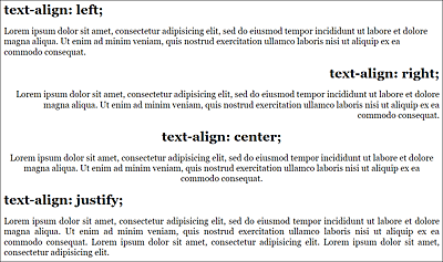
Figure 14.20 Effects of “text-align” on Paragraph Text
14.1.11 Setting the Vertical Alignment via “vertical-align”
The CSS feature vertical-align can be used for the vertical alignment of inline elements and isn’t intended for block elements such as <p> or <div>.
This makes it easy to align text or images in a table cell using a baseline, for example. For table cells, you can use the values top, middle, or bottom. In Figure 14.21, you can see these three values when executed in table cells that have been vertically aligned with the following rows:
...
  .vtop { vertical-align: top; }
  .vmiddle { vertical-align: middle; }
  .vbottom { vertical-align: bottom; }
  .vsuper { vertical-align: super; }
  .vsub { vertical-align: sub; }
  .vsub-05em { vertical-align: -0.5em; }
...
Listing 14.11 /examples/chapter014/14_1_11/css/style.css
Similarly, you can align inline elements in texts based on a baseline relative to the text by using vertical-align. Here you align the text with the value baseline on the baseline, with sub below it and with super above the baseline. If aligning above or below the baseline doesn’t suffice for you, you can use positive or negative values of percent, (r)em, or pixels to set the elements even higher or even lower. Here’s an example where the inline elements <em> or <strong> have been set higher or lower, respectively, via vertical-align, which you can see in Figure 14.21:
...
<p>Lorem <em class="vsuper">ipsum</em>
   dolor sit amet, consectetur adipisicing elit,
   <strong class="vsub">sed do</strong> eiusmod
   tempor incididunt ut labore et
   <strong class="vsub-05em ">dolore</strong>
   magna aliqua.
</p>
...
Listing 14.12 /examples/chapter014/14_1_11/index.html
You can also use the CSS feature vertical-align for images with <img>. Note that a vertical alignment of the image at the top edge isn’t the same as a float. In contrast to float, the image with vertical-align still occupies one line, as you can see clearly in Figure 14.22.
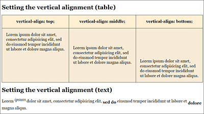
Figure 14.21 Vertical Alignment of Text in Table Cells and of Inline Elements in Text on the Baseline
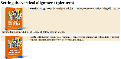
Figure 14.22 If You Align an Image with “vertical-align: top;” to the Top Edge of the Text, This Has Different Effects Than in the Lower Example with “float: left;”
14.1.12 Indenting Text Using “text-indent”
The CSS feature text-indent allows you to indent the first line of text with a positive value or drag it outward with a negative value. Such indentations are known mainly from books and the column typesetting of magazines, where the first line of a paragraph is indented to keep the reading flow smooth. On web pages, however, this kind of indentation occurs rarely. Here, the spacing from one paragraph to the next is more important, where the p element defaults to sufficient space from one paragraph to the next, and you can further adjust this using margin. In Figure 14.23, you can see such indentation of two paragraphs implemented with the following CSS statement:
...
.p-indent {  text-indent: 1.2em;  }
...
Listing 14.13 /examples/chapter014/14_1_12/css/style.css
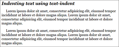
Figure 14.23 You Can Implement Text Indentation via the CSS Feature “text-indent”
14.1.13 Underlining Text and Striking Text Through Using “text-decoration”
To add an underscore to a text using CSS, you can use the CSS feature text-decoration. This allows you to draw a line under, above, or through the text. The values are underline, overline, and line-through. By using none (default setting), you can remove this decoration. Removing an underscore with text-decoration: none; can also be used to remove the underscore of a link (<a> tag).
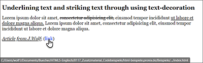
Figure 14.24 Underlining (or Undoing the Underlining) or Striking Text Through Using the CSS Feature “text-decoration”
In Figure 14.24, you can see the use of text-decoration, where body text was underlined using the span element and the author information by means of text-decoration: underline;. In addition, next to the author’s name, the underline for the link was removed via text-decoration: none;, and text was struck through using the span element in the body text via text-decoration: line-through.
...
.underline { text-decoration: underline; }
.a-no-underline { text-decoration: none; }
.line-through { text-decoration: line-through; }
...
Listing 14.14 /examples/chapter014/14_1_13/css/style.css
Underlining Using “border-bottom”
Because an underscore with text-decoration often crosses the letters g and y, you can use border-bottom for an underscore of texts that aren’t links. This means that the letters y and g won’t be crossed.
14.1.14 Uppercase and Lowercase Text via “text-transform”
You can use the CSS feature text-transform to control the case of the text. For this purpose, you can use the values uppercase (for uppercase letters), lowercase (for lowercase letters), and capitalize (first letter as uppercase). Again, the default setting is none.
The capitalize value, which is used to represent each first letter of a word as a capital letter, is usually used only in English for titles. In languages such as German, for example, this value is less interesting.
In Figure 14.25, you can see how the h1 heading is displayed entirely in uppercase letters by means of text-transform: uppercase;. The paragraph, on the other hand, was set completely in lowercase via text-transform: lowercase;.
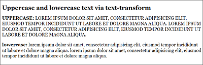
Figure 14.25 Uppercase and Lowercase Text via “text-transform”
Listing 14.15 /examples/chapter014/14_1_14/css/style.css
Small Caps
If you’re not looking for continuous uppercase letters, but small caps, you should take a look at the CSS feature font-variant from Section 14.1.6.
14.1.15 Adding Shadow to Text via “text-shadow”
A popular effect is to add a shadow to the text using the CSS feature text-shadow. The use of text-shadow is also quite convenient:
    text-shadow: 5px     /* Horizontal offset   */
                 5px     /* Vertical offset     */
                 4px     /* Gradient radius shadow */
                 gray;   /* Shadow color          */
In Figure 14.26, you can see some variants of shadows used via the following CSS statements for headings:
...
  .shadow-one { text-shadow: 3px 3px 5px gray; }
  .shadow-two {
    color: lightgray;
    text-shadow: 0px -2px 1px black;
  }
  .shadow-three {
    color: rgba(255, 0, 0, 0.7);
    text-shadow:
      15px -15px 5px green,
      -5px 15px 8px blue;
  }
...
Listing 14.16 /examples/chapter014/14_1_15/css/style.css
In the example, you can see that it’s possible to use several shadows at once for one text (up to six). To do that, you simply need to list the shadows separated by commas.
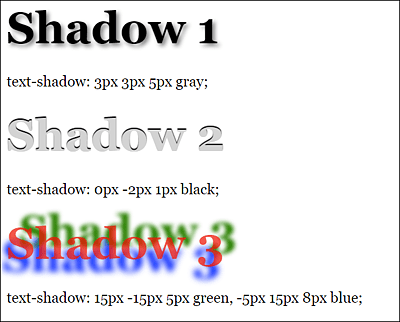
Figure 14.26 Different Variants of Shadows
14.1.16 Splitting Text into Multiple Columns Using “column-count”
One very useful feature for typography is the ability to automatically split a text into a multicolumn set using the CSS feature column-count and without any manual work with JavaScript. This function is especially useful for wide screens, so that lines which are too long can be split up into columns, increasing the readability of the text.
Here’s how you can set up a two-column layout for the element used with .column:
.column {
  column-count: 2;
  column-gap: 1.5rem;
}
You can use column-gap to control the gap between the columns. In Figure 14.27, you can see the effect of these lines on an article element as a container with multiple p elements.
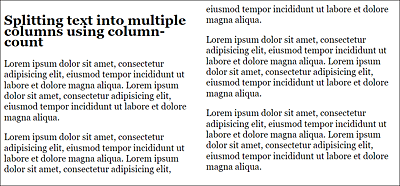
Figure 14.27 The Multicolumn Set Has Been Applied to an <article> Element as a Container
Instead of column-count, you can also use column-width and specify a width for a column. Depending on the value you specify for the width, this will automatically create as many columns as there is space in the viewport of the web browser. When the web browser can no longer split the columns in width, it will make one single column out of it, for example:
.column {
  column-width: 250px;
  column-gap: 1.5rem;
}
In Figure 14.28, the web browser has split the text into three columns of 250 pixels. In Figure 14.29, on the other hand, the browser window was reduced in size, and it was no longer possible to split the text into at least two columns of 250 pixels, so the text is now displayed in one column.
There’s also a short notation available for the two properties column-width and column-count of the CSS feature columns:
.column {
  columns: 20em 2;
  column-gap: 1.5rem;
}
This way, you specify that two columns with a width of at least 20 em (320 pixels) should be used. If two columns of 20 em will no longer fit in the browser window, only one column will be used. This would be the case in the example if the viewport is less than 40 em or less than 640 pixels.
Other properties related to the multicolumn set are column-rule, which enables you to draw a line in the gap between columns, and column-span, which lets individual elements span multiple columns.
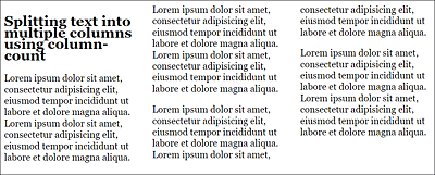
Figure 14.28 Three Columns with 250 pixels
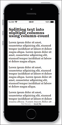
Figure 14.29 If Two Columns No Longer Fit into the Width Specified with the CSS Property “column-width”, Only One Column Will Be Displayed