14.7 Styling HTML Forms with CSS
While you’ve seen HTML forms in action, I haven’t yet described how to design forms with CSS. The following isn’t meant to be the ultimate way, but rather a creative suggestion on how you can go about it. There are certainly countless ways to design a form with CSS. Here, I’ll show you one of them.
Less Is More!
CSS now provides an extremely wide range of options for designing forms, which are only briefly touched on here. After these sections on forms, you should take a look at the many examples of HTML forms on the internet.
Please keep in mind that, despite the wide range of design options, forms are real functional elements of a website, and when designing them, you want to make sure that these elements remain recognizable as what they are intended for. A form is usually used to submit entered data to the web server via a web browser.
14.7.1 Neatly Structuring an HTML Form
The first step should be to create a structure with all necessary form elements in HTML. I decided to use the example of a simple HTML form that submits feedback or a simple message. Here’s the HTML framework for it:
...
<form id="myForm" method="post">
  <fieldset>

    <div>
      <label for="name">Name:</label>
      <input type="text" name="name" id="name"
             placeholder="Your name">
    </div>
    <div>
      <label for="fname">First name:</label>
      <input type="text" name="fname" id="fname"
             placeholder="Your first name">
    </div>
    <div>
      <label for="mail">Email:</label>
      <input type="email" name="mail" id="mail"
             placeholder="Email address" required>
      <label for="mail"></label>
    </div>
    <div>
      <label for="born">Year of birth:</label>
      <input type="number" name="born" id="born"
             min="1920" max="2015" value="1990">
    </div>
    <div class="form_radio">
      <label>Gender:</label>
      <input type="radio" name="gender" id="male"
             value="male" class="nobreak">
      <label for="male" class="nobreak">Male</label>
      <input type="radio" name="gender" id="female"
             value="female" class="nobreak">
      <label for="female" class="nobreak">Female</label>
    </div>
    <div>
      <label for="nachricht">Your message:</label>
      <textarea name="message" id="message"
                placeholder="Enter message here..." rows="8"
                required>
      </textarea>
      <label for="message"></label>
    </div>
    <div>
      <input type="checkbox" name="reply" id="reply"
             value="reply" class="nobreak">
      <label for="reply" class="nobreak">
         GDPR consent (<a href="#">Privacy policy</a>)
      </label>
    </div>
    <div>
      <input name="submit" type="submit" value="Submit" class="nobreak">
      <input name="Reset" type="reset" value="Reset" class="nobreak">
    </div>
    <p>(×) = Input required</p>
  </fieldset>
</form>
...
Listing 14.38 /examples/chapter014/14_7/index.html
There isn’t much more that needs to be said about this HTML form; you learned about all the individual elements and attributes in detail in Chapter 7.
If you want to make CSS life easier with HTML forms, you can place all input fields with their associated labels between <div> and </div> right away, as shown in the example. This will display the related elements directly in one line; you can see the difference in Figure 14.57 (without <div>) and in Figure 14.58 (with <div>).
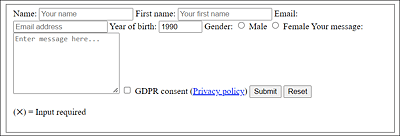
Figure 14.57 The Form without the <div> Elements
Likewise, it can only be recommended to use <fieldset> and <label> because these elements can be very useful for design tasks.
Between <fieldset> and </fieldset>, you can group logically matching areas of form elements and at the same time have another approach to use CSS to design this area.
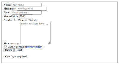
Figure 14.58 Here’s the Form with the <div> Elements
The same applies to <label> because not only do you use it to create a connection to the form element with the HTML attribute for, which means that when you click on the label, you immediately activate the form element, but you also get a kind of grid in which elements are displayed next to each other as in a table by specifying <label> and another form element such as <input>. Furthermore, you could design a <label> with an ID or class separately, which is more difficult with an empty text. Finally, screen readers help you show the relationship between text and form elements.
14.7.2 Aligning Form Elements with CSS
Once you’ve created the basic HTML framework with the relevant form elements, the first thing you should take care of is the alignment of the individual form elements. At the moment, everything is still a bit unordered (see Figure 14.58).
Just take a closer look at the figure: what you need first is a uniform alignment and a width for the labels on the left of the HTML form. You need to decide whether you want to display the labels next to the form elements or above them. In this example, I decided to place the labels next to the form elements, which I write in the following CSS snippet:
...
  label {
    min-width: 8em;
    display: inline-block;
    text-align: left;
  }
...
Listing 14.39 /examples/chapter014/14_7/css/style.css
Here, I’ve used inline-block for display, which allows you to treat an element like a block element and use the width and height properties as well as margin without creating a paragraph (as would be the case with block). If, on the other hand, you want to place the labels above the form elements for input, you should use display: block; instead.
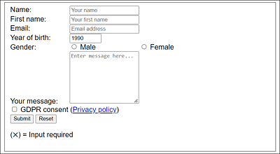
Figure 14.59 After the First Alignment of the HTML Element <label> with CSS
The first alignment of the label element looks good (see Figure 14.59). Next, you’ll probably want to write a uniform width for the input input fields and the textarea field. Again, not much is needed to do that, as the following CSS lines show:
...
input {
  width: 20em;
  padding : 0.7em;
  font-family: Arial;
  color: gray;
}
textarea {
  width: 24em;
  padding: 0.1em;
  font-family: Arial;
  color: gray;
}
...
Listing 14.40 /examples/chapter014/14_7/css/style.css
Because the radio buttons and the checkbox are input input fields as well, and they would look strange with a width of 20em, we use an extra selector for them. In the example, I’ve therefore written the following:
Listing 14.41 /examples/chapter014/14_7/css/style.css
This only cancels the length assignment of the input fields of type radio and checkbox. Let’s take a quick look at Figure 14.60—the interim result looks impressive, doesn’t it?
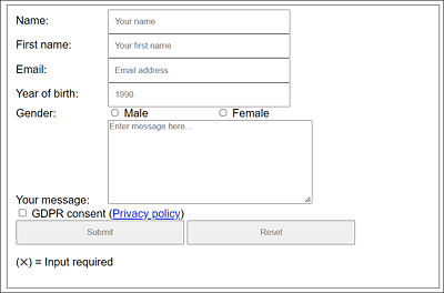
Figure 14.60 It’s Starting to Look Neatly Arranged
What still doesn’t look really appealing is the arrangement of the label in front of the multiline text field, the position of the checkbox below the text field, and the two buttons.
We should move the label in front of the multiline text field up as follows:
...
  label:first-child { vertical-align: top; }
...
You can move the checkbox to the right by using a simple margin-left, and you can do the same with the submit button:
...
  input[type="checkbox"], input[type="submit"] {
    margin-left: 12em;
  }
...
Finally, a width specification for the two buttons is missing, which you can write as follows:
...
  input[type="submit"], input[type="reset"] {
    width: 12em;
  }
...
All in all, this completes the simple arrangement of the form elements with CSS. The result in Figure 14.61 looks very nice.
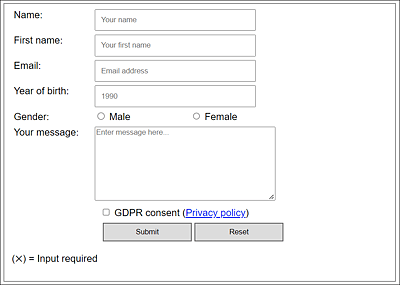
Figure 14.61 Neatly Arranged Thanks to CSS
14.7.3 Designing Form Elements with CSS
After you’ve put everything in place, you can get down to styling the form visually with CSS. From the outside to the inside, the first thing to do is to design the fieldset and legend. In this example, I’ve used the following styles:
...
fieldset {
  width: 90%;
  padding-top: 1.5em;
  padding-left: 1.5em;
  background: rgb(240, 240, 240);
}

...
This way, we’ve styled the area between <fieldset> and </fieldset> by setting the width, a background color, and a border.
In addition to the visual design of form elements, you can also include interactions for visitors, which will make the website not only more beautiful, but easier to use. You can implement such interactions using the CSS pseudo-class :hover or :active. Here are some practical examples:
...
  input:hover, textarea:hover {
    background: #fffff0;
    border: 2px solid #efe816;
    box-shadow: 0 0 10px rgba(0,0,0,0.2);
  }
  input[type="submit"]:hover, input[type="reset"]:hover {
    background: #c9c9c9;
    border: 2px solid #6c6c6c;
  }
  input[type="submit"]:active, input[type="reset"]:active {
    background: #8f8f8f;
  }
...
If you now hover the mouse pointer over one of the input input fields or the multiline textarea input field (:hover), this input field will be displayed with a different color and a different border. The box-shadow feature also gives the impression that this input field is glowing.
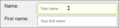
Figure 14.62 Interaction Help When the Mouse Pointer Is over an Input Field
The buttons in this example were also designed separately with CSS pseudo-classes, so that the background color changes when the mouse hovers over the button (:hover) or if you click on it (:active).
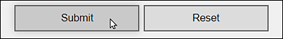
Figure 14.63 Hover Effect for Buttons with CSS
At the end of the example, I’ve created a version for smaller viewports. If the viewport width is less than 640 pixels, all label and input elements that aren’t marked with the .nobreak class will be converted to block elements via display:block; and thus displayed one below the other. Here is the CSS for that:
...
/* Single column break at 640 pixels */
@media screen and (max-width: 40em) {
  label:not(.nobreak) { display: block; }
  label{ padding-bottom: 0.4em; }
  input:not(.nobreak) { display:block; }
  input[type="checkbox"], input[type="submit"], input[type="radio"]  {
    margin-left: 0;
  }
}
At this point, I could demonstrate and explain countless more options with CSS for HTML forms, but this would go beyond the scope of the book. The complete example for this section can be found in /examples/chapter014/14_7/index.html.
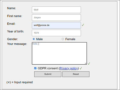
Figure 14.64 A Simple HTML Form Styled with CSS