13.3 Even More Flexible Elements
With the fluid responsive layout you created on the previous pages, the development of a responsive website is far from being complete. The important topics that haven’t been considered yet are typography, flexible image elements, and mobile navigation. This will be briefly described here, so that you at least know what’s important and what else you should consider.
13.3.1 Use Relative Font Sizes instead of Pixels
Text design is a very important topic in web design and is therefore also covered separately in Chapter 14, Section 14.1. Nevertheless, I want to make a few remarks about it at this point. As with the media queries layout breaks, you should always use relative specifications instead of pixels for the font sizes. When zooming an entire page (page zoom), most web browsers have no problems if the specifications are made in pixels or relative units.
Even on screens with a higher pixel density, fonts that are specified with pixels are displayed relatively small. Although users could again zoom in afterwards, a website should be rendered legibly right after loading. For this reason, you should avoid font specifications in pixels and use relative specifications such as em, rem, or percent.
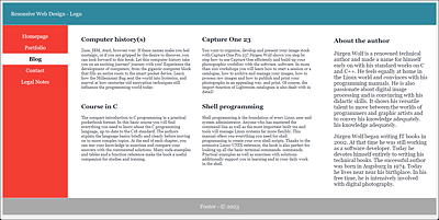
Figure 13.21 If the Font Size Is Wrong, the Best Responsive Layout Is Useless
13.3.2 Making Images Responsive
If you’re going to add images to the responsive layout, you’ll also want to make them responsive and not leave them rigid in width. In Figure 13.22, you can see what happens with rigid images when the screen becomes narrower.
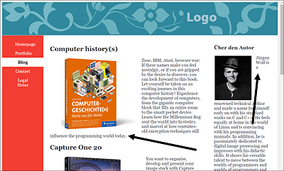
Figure 13.22 Flowing around the Text When the Image Size Is Rigid Can Cause the Text to Slip Away at the Bottom, and/or Individual Words Can Be Left at the Top If There Isn’t Enough Space
Here, a few words may get stuck next to the image or slip away to the bottom, which is a normal behavior of float, but not very attractive. You can avoid this text wrapping by setting the maximum width of the image accordingly as a percentage using the CSS feature max-width, which allows you to define the maximum width of an element. In the example, the image should be allowed to absorb 40% in the article element. The same should apply to the author image in the aside element. For this purpose, I’ve extended the basic version with the class selectors .img-art and .img-side:
...
.img-art {
  float: left;
  margin: 0 1em 0.2em 0;
  max-width: 40%;
  height: auto;
}
.img-side {
  float: left;
  margin: 0.1em 1em 0.2em 0.2em;
  max-width: 40%;
  height: auto;
}
...
Listing 13.13 /examples/chapter013/13_3_2/css/layout.css
In Figure 13.23, the images in the article and sidebar now adjust by 40% to the article width and the sidebar, respectively. Because these selectors were written in the base version, these features apply to all layout widths. In Figure 13.24, you can see the layout for extra-wide desktops, and, in Figure 13.25, you can see the smartphone version. Of course, there’s nothing that speaks against setting a separate width for the images for each layout break by using max-width.
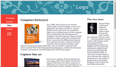
Figure 13.23 The Image Size Now Also Adapts to the Screen Width and Is Displayed Relative to the <article> or <aside> Element in the Corresponding Size (here, 40%)

Figure 13.24 The 40% Image Width with an Extra-Wide Desktop
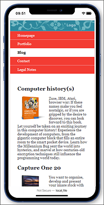
Figure 13.25 Responsive Images Also Pay Off on a Smartphone
In addition to using max-width for the width, you can use height to specify the height. Here, I’ve set height to auto so that the web browser automatically adjusts the height in proportion to the width.
You can simply add the classes in the HTML document as usual to the <img> tags of those images that should be responsive:
...
<div class="container">
  <main class="content">
    <article class="article">
      <h2>LR Classic and PS</h2>
      <p><img src="graphics/cover-3.png" alt="Cover" class="img-art">... </p>
    </article>
     ...
  </main>
  <aside class="aside">
    <h3>About the author</h3>
    <p><img src="graphics/me.jpg" alt="Cover" class="img-side"> ... </p>
  </aside>
</div>
...
Listing 13.14 /examples/chapter013/13_3_2/index.html
13.3.3 Flexible Images in Maximum Possible Width
If you want images to always stretch across the full width regardless of the device and still leave them responsive, you can set max-width to 100%. In that case, it depends on where you place these images to make them responsive. As a matter of fact, setting max-width to 100% also means that an image won’t respond until the column in which it has been defined is smaller than the image. This means that an image with a width of 300 pixels doesn’t become responsive until the width where it’s used is less than 300 pixels. So, setting an image with max-width to 100% depends on the context in which the image is used. Here’s an example where you insert a graphic with a size of 1,280 × 150 pixels with <img> into the header element of the HTML document:
...
<header class="header">
  <img src="images/logo.jpg" alt="Logo">
</header>
...
Without any further preparations, the image would be displayed in full size; on screens smaller than 1,280 pixels, the logo would be cut off on the right, and a horizontal scroll bar would be displayed in the browser, as in Figure 13.26.
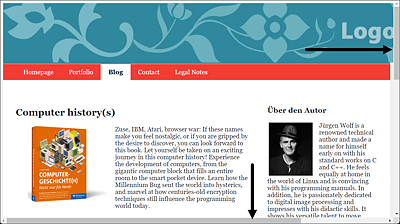
Figure 13.26 If the Browser Width Is Too Small, the Image Gets Cut Off and a Horizontal Scroll Bar Appears
Figure 13.27 Things Don’t Look Much Better in the Mobile Version
In this example, you can use CSS and max-width: 100% to respond as follows:
...
.img-logo {
  max-width: 100%;
  height: auto;
}
...
Listing 13.15 /examples/chapter013/13_3/css/layout.css
You merely need to add the class to the img element:
<header class="header">
  <img src="graphics/logo.jpg" alt="Logo" class="img-logo">
</header>
Listing 13.16 /examples/chapter013/13_3/index.html
In Figure 13.28, you can see how the image in the <header> responds to the appropriate screen width and is made flexible.
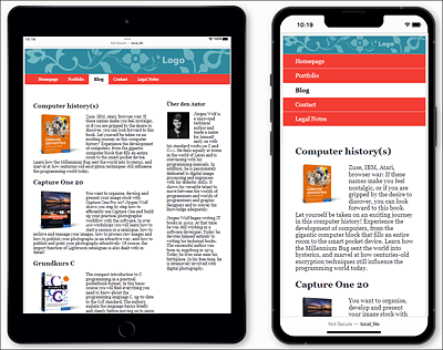
Figure 13.28 The Width for the Image in the <header> Adjusts for Tablets (Left) and the Width for the Image in the <header> Also Adjusts for Smartphones (Right)
Responsive Videos: <video>
Everything you can do with images, you can also do with videos that you’ve integrated via <video> using the same CSS instructions.
13.3.4 Hiding Images Entirely
If you look at Figure 13.28 with the logo in the header, it already looks relatively small and lost in the header. I would completely omit the logo in the header in this example for the smartphone version. To remove it from the smartphone version, that is, the basic version, you need to set display to none:
Listing 13.17 /examples/chapter013/13_3_4/css/layout.css
Accordingly, for the other layout breaks, you should make the header visible again via display:block and set max-width to 100%:
...
.img-logo {
  display: block;
  max-width: 100%;
  height: auto;
}
...
Listing 13.18 /examples/chapter013/13_3_4/css/layout.css
13.3.5 Loading the Right Image for the Screen Width: <picture>
You now know how to make images responsive with max-width. The disadvantage of this method is that small displays often load files that are too large, which unnecessarily slows down performance and increases the amount of data transfer. Furthermore, on small displays, the images have to be scaled down again, which impacts the image quality. High-resolution displays aren’t taken into consideration at all. If you’ve read the book from the beginning, you already know an alternative solution. In Chapter 6, Section 6.3, you already learned how to specify alternate image sources for different viewports using the HTML elements <picture> and <source> and media queries with the media attribute.
The picture element is an HTML element that serves as a container element for multiple image sources. You can specify the individual image sources using the source element. In the following example, we want to load an image source in the first article for the book cover that matches the display. To distinguish when which image gets loaded, I’ve added appropriate text to the graphics. High-resolution displays are taken into account right away.
...
<header class="header">
<picture class="img-logo">
   <source media="(min-width: 1023px)"
           srcset="graphics/logo-desktop.jpg 1x,graphics/logo-desktop-HD.jpg 2x">
   <source media="(min-width: 639px)"
           srcset="graphics/logo-tablet.jpg 1x,graphics/logo-tablet-HD.jpg 2x">
   <source srcset="graphics/logo-smartphone.jpg 1x,graphics/logo-smartphone-HD.jpg 2x">
   <!-- Fallback for browsers that can't do <picture> -->
   <img src="graphics/logo.jpg" alt="Logo" class="img-logo">
</picture>
</header>
...
Listing 13.19 /examples/chapter013/13_3_5/index.html
Between the HTML containers <picture> and </picture>, you can use the source element to specify the individual image sources. Depending on the media attribute, corresponding images will be loaded. In the example, for displays with a width of 1,023 pixels and above (min-width: 1023px), the logo-desktop.jpg image gets loaded on ordinary displays with a single pixel density (1x). On the other hand, logo-desktop-HD.jpg will be loaded for high-resolution displays with double pixel density (2x).
For a screen width of less than 1,023 pixels, that is, from 1,022 pixels to 639 pixels (min-width:639px), either logo-tablet.jpg with normal pixel density or logo-tablet-HD.jpg with double pixel density is loaded as the image source. These image sources are intended for tablets or smaller screens. If the display width is smaller than 638 pixels, the image source logo-smartphone.jpg or logo-smartphone-HD.jpg (depending on the pixel density) for smartphones will be loaded. For web browsers that aren’t able to process the picture element, an alternative image source is specified in the img element (here, logo.jpg), which is used instead.
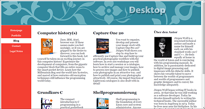
Figure 13.29 The Logo for the Desktop Version from 1,023 Pixels Onwards Was Loaded
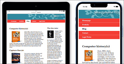
Figure 13.30 From a Display Width of 1,022 to 639 Pixels, a Smaller Image (Tablet) Is Used for the Logo, and Below 639 Pixels, the Smallest Version (Smartphone) Is Used
13.3.6 Using Area-Covering Images
If you insert background images with background-image, you can adjust the height and width using the CSS feature background-size. For example, you can use the following:
...
.img-background {
  background-size: 100% 100%;
  background-image: url("../graphics/background.jpg");
  background-repeat: no-repeat;
}
...
This way, the background image always fills the corresponding HTML element in which you use the class. You can also define an image as a background image in the body element for the entire HTML document. The first value represents the width, and the second value represents the height. Depending on the HTML element in which the image is used as a background, it will often be distorted, as you can see in the comparison between the desktop version in Figure 13.31 and the tablet version in Figure 13.32 with a square 500 × 500 pixel background image in an article element.
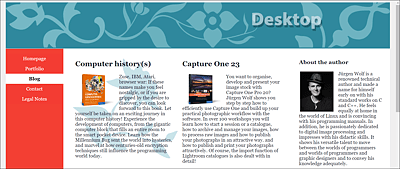
Figure 13.31 The Distortion on a Desktop Screen with “background-size: 100% 100%;” Is Still Acceptable Here
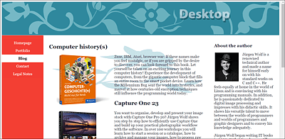
Figure 13.32 The Same Is Not True with a Smaller Screen Width: The Background Image of the First Article Is Already Distorted Significantly and Doesn’t Look Nice Anymore
If you want the image to always be stretched by 100% in width and proportionally adjusted in height, you can set the second value of background-size to auto so that the height will be adjusted to the aspect ratio, and the image no longer gets stretched out of proportion:
...
background-size: 100% auto;
...
Now the image is only stretched in width, and the height is automatically adjusted proportionally to it. When the HTML element narrows, the height value is greater than the width, and you have background-repeat set to no-repeat, a border without transitions will become visible at the bottom.
In Figure 13.33, you can see this unsightly effect with the first article: the background image is adjusted proportionally to the width, but in portrait mode, either the image is repeated or, if the repetition has been deactivated as in the example, the color of the background appears (here, a white border). In this example, it’s not that dramatic because part of the background image was white anyway, but still, it doesn’t look quite right. Although this makes the tablet version look better again, you’ll get a similar result as in Figure 13.33 on smaller smartphones.
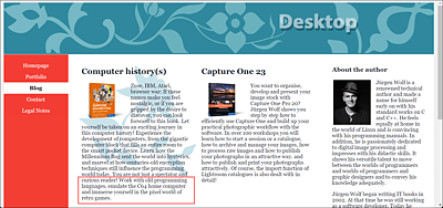
Figure 13.33 A White Border Remains at the Bottom of the First <article> Element
Calculating and adjusting with relative and absolute values with background-size rarely leads to an ideal responsive solution. What can help in this context are the two keywords contain and cover, which you can assign to the CSS feature background-size.
When you use background-size: contain;, the background image will always be displayed in its entirety. This “growing along” and “shrinking” occurs proportionally. Because the image is always visible, depending on the ratio of width and height, the background image will never fill the entire area of the screen.
The value of cover, on the other hand, is different. This value makes sure that the image is always displayed on the complete screen as far as possible. If the aspect ratio is different, the image will be cropped and not displayed completely. Let's look at the following solution for our example:
This seems to provide the best result, as you can see in Figure 13.34: The cover value was supposed to show the complete background image if possible. If it doesn’t fit, it’s not distorted, repeated, or truncated, but “clipped.”

Figure 13.34 You Can Always Use “background-size: cover” to Try and Show the Entire Background Image If Possible