6.3 Loading the Appropriate Image Using <picture>
In the past, it wasn’t always easy to provide a suitable image for all display sizes. Frequently, quality or performance losses had to be accepted in this regard. The picture element enables you to find an HTML element that serves as a container element for multiple image sources. The individual image sources must be specified using the source element.
The following example demonstrates the use of these HTML elements:
...
  <h1>The picture element in use</h1>
  <p>
  <picture>
     <source media="(min-width: 1024px)" srcset="images/HK-1024.jpg">
     <source media="(min-width: 640px)" srcset="images/HK-640.jpg">
     <source media="(min-width: 480px)" srcset="images/HK-480.jpg">
     <!-- Fallback for old browsers -->
     <img src="images/HK-480.jpg" alt="Hong Kong Island">
  </picture>
  </p>
...
Listing 6.5 /examples/chapter006/6_3/index.html
Using the picture element is relatively simple. Between <picture> and </picture>, you can position several source elements. Each source element contains a query (i.e., media query) with the HTML attribute media, which you can use to query information such as viewport width, viewport height, and orientation. In addition, the source element contains the HTML attribute srcset, which you use to specify the image file to be loaded. At the end, you should use an <img> as a fallback, in case web browsers can’t process the picture element.
The sources of <source> within <picture> and </picture> will be read from top to bottom, which means that the first match of the HTML attribute media will be loaded. If the viewport is at least 1,024 pixels (min-width: 1024px), the image HK-1024.jpg will get loaded. With a viewport of at least 640 pixels (min-width: 640px), HK-640.jpg (see Figure 6.12) will get loaded, and with at least 480 pixels (min-width: 480px), HK-480.jpg will get loaded. Web browsers that can’t handle this will load the fallback, that is, <img> (here, also HK-480.jpg).
These specifications in the HTML attribute media are the same as those you use when creating queries in CSS. In addition to min-width, you can also use max-width, max-height, min-height, or orientation (for alignment). I’ll describe such CSS queries, also referred to as media queries, separately in Chapter 13, Section 13.4. This section covers only the basic principles of the HTML elements, <picture> and <source>.
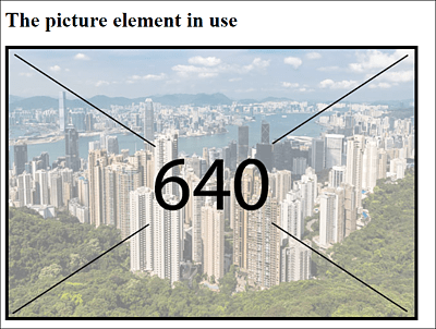
Figure 6.12 Here, the Screen Width Was at Least 640 Pixels, Which Is Why the Matching Image HK-640.jpg Was Loaded
6.3.1 HTML Attributes of <source>
Here’s a listing of the HTML attributes for the source element before you’ll see more examples about it.
|
Attribute |
Description |
|---|---|
|
You can specify the media source to be loaded. This attribute can also contain multiple media sources. You must separate the individual sources with a comma. In addition to the URL that leads the visitor to the media source itself, you can optionally specify the width with a positive value followed by w, and also optionally specify the pixel density followed by an x (e.g., 1x, 2x, 3x, etc.). |
|
|
You can specify the query (media query) for the media sources to be loaded. The attribute can be used only in the picture element. If the query specified in media is correct, the corresponding source will be loaded into srcset. You can learn more about such CSS media queries separately in Chapter 13, Section 13.4. |
|
|
You can inform the web browser about the MIME type (file format) to which the linked file belongs. In the example of the picture element, for instance, this can be useful if you want to use different file formats for display. |
|
|
You can specify how wide or with which pixel density the image should be displayed. It’s possible to specify additional and more complex framework conditions. |
Table 6.5 The HTML Attributes of the <source> Element
6.3.2 Multiple Image Sources with the HTML Attribute “srcset”
You can also specify and reference multiple image sources with the HTML attribute srcset. This can be useful if you want to provide an alternative for high-resolution displays besides the ordinary image. With regard to the /examples/chapter006/6_3/index.html example, you could provide higher resolution images for retina displays with 2x pixel density as follows:
...
  <picture>
     <source srcset="images/HK-1024.jpg, images/HK-1024-hd.jpg 2x"
             media="(min-width: 1024px)">
     <source srcset="images/HK-640.jpg, images/HK-640-hd.jpg 2x"
             media="(min-width: 640px)">
     <source srcset="images/HK-480.jpg, images/HK-480-hd.jpg 2x"
             media="(min-width: 480px)">
     <!-- Fallback for old browsers -->
     <img src="images/HK-480.jpg" alt="Hong Kong Island">
  </picture>
...
Listing 6.6 /examples/chapter006/6_3_2/index.html
Using Different File Formats
It’s quite possible to use different file formats using <picture>. For this purpose, you should use the type attribute in <source> to define the MIME type of the image. For example, web browsers such as Chrome or Opera can handle the WebP graphics format (see https://en.wikipedia.org/wiki/WebP), which is supported as a direct competitor of the JPEG format and requires considerably less memory with comparable quality. Consider this example:
...
  <picture>
     <source srcset="images/HK-640-WebP.webp" type="image/webp">
     <source srcset="images/HK-640-jpg.jpg">
     <!-- Fallback for old browsers -->
     <img src="images/HK-640.jpg" alt="Hong Kong Island">
  </picture>
...
You can find this example in /examples/chapter006/6_3_2/index2.html. In Google Chrome and Opera, the WebP graphic will be displayed. All other web browsers will display the JPEG graphic. I haven’t specified the HTML attribute media here, although you could use this attribute as well.
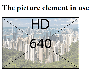
Figure 6.13 On High-Resolution Displays, the Image Is Loaded with a Higher Pixel Density (Here, “2x”)