13.4 CSS Grid Layout
In the example you created in Section 13.2, it takes considerable effort to implement a more complex layout or redesign it. Of course, it’s also possible to do it this way, but you often can’t just move an element up, down, right, or left without a lot of effort.
For this purpose, grid layouts are the ideal solution. Whereas previously, you often created your own grid layout manually, CSS provides real design grids via CSS grid layouts, which you’ll get to know a bit better on the following pages. To avoid having to create a completely new project, we’re going to rewrite the known example from the previous sections for the grid layout. The complete example can be found in /examples/chapter013/13_4/css/layout.css; the HTML document for it is located in /examples/chapter013/13_4/index.html.
13.4.1 Creating a Grid for the Content
The principle of a CSS grid is based on the fact that you create a grid in a parent element, as you already know from responsive layout, and position the child elements in it. To do that, you must assign the grid value to the CSS feature display in the parent element and then use the features grid-template-columns and grid-template-rows to define the individual grid lines. Let’s take a look at the following simple example:
.grid {
  display: grid;
  grid-template-rows: 150px auto auto 100px;
  grid-template-columns: 20% 20% 20% 20% 20%;
}
This would create a CSS grid with four rows and five columns. The first row is 150 pixels high, while the last one is 100 pixels high. The two middle rows are still adjusted according to the content using auto. All five columns are also 20% wide. Besides the units in percent or pixels, you can also use em or fr (e.g., 1fr or 2fr). The fr unit stands for a flexible fragment (fraction), which you can think of as the percentage of space left. Figure 13.35 shows the created CSS grid layout.
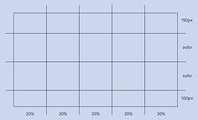
Figure 13.35 A Grid Layout with “display:grid;” Can Be Created Quickly
Because the responsive layout from Section 13.2 has been revised here and will be used for the grid layout, the grid created in Figure 13.35 is a bit too narrow. Because five columns have been defined with 20%, you can thus divide the content of the HTML elements into areas of 20%, 40%, 60%, 80%, and 100%. For the example, we want to divide the grid a bit finer in 10% steps and therefore use the following grid layout:
...
.grid {
  display: grid;
  grid-template-rows: 150px auto auto auto 100px;
  grid-template-columns: repeat(10, 10%);
}
...
Listing 13.20 /examples/chapter013/13_4/css/layout.css
The grid gets defined here even before the first layout breaks occur in the basic version. This way, you can define a grid layout with 5 rows and 10 columns. For the header and footer, we define a height of 150 and 100 pixels, respectively. The three lines in between get adjusted according to the content via auto. To avoid having to write 10% 10 times, the repeat() function was used here. The first value of the function represents the number of repetitions of the second value—here: 10 times 10%. Instead of the repeat() function, you could have written the following:
...
.grid {
  display: grid;
  grid-template-rows: 150px auto auto auto 100px;
  grid-template-columns: 10% 10% 10% 10% 10% 10% 10% 10% 10% 10%;
}
...
This sets a grid layout like the one shown in Figure 13.36.
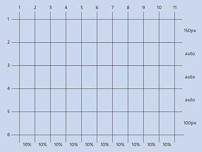
Figure 13.36 The Grid Layout for the Example
To use the grid layout with the .grid class selector, you must use it in the HTML document in the parent element whose child elements are positioned in this grid. In the example, we do this right after the body element and use a div element for it:
...
  <body>
    <div class="grid">
      <header class="header">...</header>
      <nav class="nav">...</nav>
      <main class="content">...</main>
      <aside class="aside">...</aside>
      <footer class="footer">... </footer>
    </div>
  </body>
...
Listing 13.21 /examples/chapter013/13_4/index.html
Inside the parent element div with the grid class, you can now position the child elements <header>, <nav>, <main>, <aside>, and <footer> in the grid cells shown in Figure 13.36.
13.4.2 Placing Elements in the Grid
Once you’ve specified the grid layout, you can easily specify where you want to place the HTML elements in the grid using the CSS features grid-row-start and grid-row-end or grid-column-start and grid-column-end. When you take a look at the grid layout in Figure 13.36, the values for grid-column-start and grid-column-end range from 1 (0%) to 11 (100%), and the values for grid-row-start and grid-row-end can be defined as 1 to 6. Thus, to make the header in the first line extend to the full width, you need to write the following:
...
.header {
   grid-column-start:1;
   grid-column-end:11;
   grid-row-start:1;
   grid-row-end:2;
   text-align: right;
   background-color: #07889b; /* Teal */
   color: #efefef;            /* Neutral */
   border-bottom: 1px solid #efefef;
}
...
Figure 13.37 shows the result of these lines.
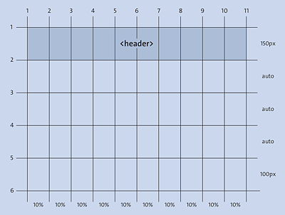
Figure 13.37 The <header> Element Was Added to the Grid Layout
This way, you can now define the start and end points of the other HTML elements in the grid layout for the basic version:
...
.nav {
   grid-column-start:1;
   grid-column-end:11;
   grid-row-start:2;
   grid-row-end:3;
}
.content {
   grid-column-start:1;
   grid-column-end:11;
   grid-row-start:3;
   grid-row-end:4;
}
.aside {
   grid-column-start:1;
   grid-column-end:11;
   grid-row-start:4;
   grid-row-end:5;
}
.footer {
   grid-column-start:1;
   grid-column-end:11;
   grid-row-start:5;
   grid-row-end:6;
}
...
The result of our basic version in Figure 13.38 is now exactly the same as the mobile version you’ve already created in the responsive layout in Section 13.2.3.
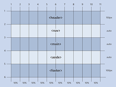
Figure 13.38 The Basic Mobile Version for Our Layout with CSS Grid
Using Shorter Notations for Placing Elements in the Grid
For the grid-column-start and grid-column-end functions, you can use the short notation grid-column, or instead of grid-row-start and grid-row-end, you can use the version grid-row. Applied to the example shown earlier with the nav element, you could therefore also write the following:
This version corresponds to the following notation:
...
.nav {
   grid-column-start:1;
   grid-column-end:11;
   grid-row-start:2;
   grid-row-end:3;
}
...
It even gets shorter if you use the grid-area feature. The order of the start and end points is as follows:
grid-area: row-start / column-start / row-end / column-end;
Thus, you could also use the following third notation for positioning the nav element, for example:
...
.nav {
  grid-area: 2 / 1 / 3 / 11;
}
...
Placing Elements in the Next Layout Break
Starting from the basic mobile layout version, little work is now needed to respond with appropriate properties at the next layout break for the tablet version:
...
@media screen and (min-width: 40em) {
  .content {
    grid-column: 1 / 8;
    grid-row: 3 / 4;
  }
  .aside {
    grid-column: 8 / 11;
    grid-row: 3 / 4;
  }
...
}
...
With regard to our grid, you’ve created the layout that had been created in Figure 13.39 for the tablet version. You can see the example in use in Figure 13.40.
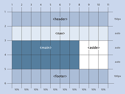
Figure 13.39 The Layout for the Tablet Version with CSS Grid
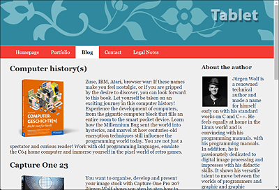
Figure 13.40 The Tablet Version Was Created Using a CSS Grid
Finally, another version is to be created for the desktop version:
...
@media screen and (min-width: 64em) {
  .content {
    grid-column: 3 / 8;
    grid-row: 2 / 4;
  }
  .aside {
    grid-column: 8 / 11;
    grid-row: 2 / 4;
  }
  .nav {
    grid-column: 1 / 3;
    grid-row: 2 / 4;
  }
...
}
This way, you’ve allocated 20% space in width for the navigation, 50% for the main content, and 30% for the sidebar. This results in the layout of the HTML elements in the grid shown in Figure 13.41.
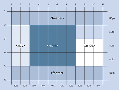
Figure 13.41 The Desktop Version with the CSS Grid
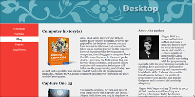
Figure 13.42 The Desktop Version with the CSS Grid in Use
13.4.3 Layout Changes Made Easy
Thanks to the simplicity of positioning the elements completely freely in the grid, it now becomes a breeze to redesign the layout. To do that, you only need to adjust the positions of the rows and columns in the grid for the HTML elements. For example, if you want to change the desktop version so that the sidebar is on the left and the navigation is on the right, you can simply change the values for grid-column in our example as follows:
@media screen and (min-width: 64em) {
  .content {
    grid-column: 3 / 8;
    grid-row: 2 / 4;
  }
  .aside {
    grid-column: 8 / 11;
    grid-row: 2 / 4;
  }
  .nav {
    grid-column: 1 / 3;
    grid-row: 2 / 4;
  }
...
}
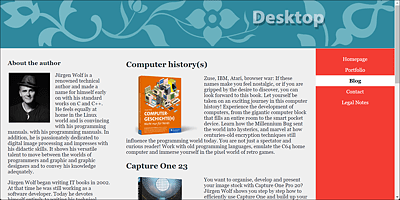
Figure 13.43 A Layout Change with a CSS Grid Can Be Done in a Few Seconds
13.4.4 Spacing between Grid Lines
If you want to add spaces between the columns or rows of a grid, you can do this in the parent element via the grid-column-gap or grid-row-gap commands or the short notation, grid-gap. The distances are only created between the columns. No space is added at the beginning and end of the column or row. Here’s an example:
.grid {
  display: grid;
  grid-template-rows: 150px auto auto auto 100px;
  grid-template-columns: repeat(10, 10%);
  grid-row-gap: 15px;
  grid-column-gap: 10px;
  /* or as short notation: grid-gap: 15px 10px; */
}
Aligning Elements in the CSS Grid
You can also specify the horizontal and vertical alignment of the elements in the parent element using the CSS features align-items for vertical behavior and justify-items for horizontal behavior. The values start, end, stretch, and center are available for that. For an individual alignment of a single grid cell, on the other hand, you can use align-self and justify-self. The values start, end, stretch, and center are also available here.
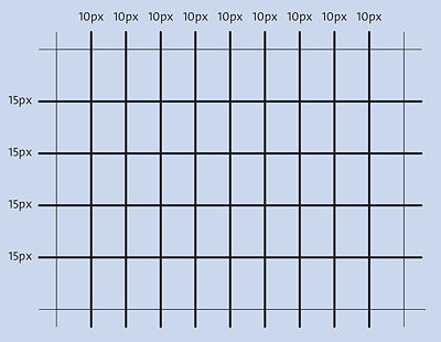
Figure 13.44 Adding Spacing between the Columns of a CSS Grid
13.4.5 Checking the Grid in the Web Browser
CSS grids are also worth taking a look in the developer tools (e.g., with (Ctrl)+(Shift)+(I)) of the web browser, which usually makes them visible when you select the corresponding HTML element used as a container for the grid. This visual view is very helpful when you look for errors or check the grid layout.
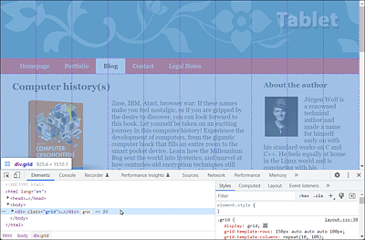
Figure 13.45 The Grid Is Also Displayed in the Developer Tools of the Web Browser