13.2 Let’s Create a Simple Responsive Layout
Now that you know the necessary basics about media queries and how to use them to query media features, it’s time to create a small responsive layout. I won’t go into all the details here, which are also important in responsive web design. This is purely about arranging the content of a website for specific screen sizes. For demonstration purposes, I’ll first use the classic method with float. In Section 13.4, I’ll show you the modern way using the CSS grid.
13.2.1 Let’s Create the Basic Framework Using HTML
Before you can even begin to create the responsive layout with CSS, you must first write the basic framework with HTML. For this purpose, you can find a simple example in /examples/chapter013/13_2_1/index.html, which contains basic HTML elements such as <header>, <nav>, <main>, <aside>, and <footer>. These five basic elements are then placed accordingly in the responsive layout. First, the basic HTML framework is as follows:
...
<body>
<header> Responsive Web Design—Logo </header>
<nav>
<ul>
<li><a href="#">Homepage</a></li>
<li><a href="#">Portfolio</a></li>
<li>Blog</li>
<li><a href="#">Contact</a></li>
<li><a href="#">Legal Notes</a></li>
</ul>
</nav>
<main>
<article>
<h2>LR Classic and PS</h2>
<p>Get the most out of ... </p>
</article>
<article>
<h2>Capture One 11</h2>
<p>You want to increase your image stock ... </p>
</article>
<article>
<h2>macOS High Sierra</h2>
<p>In this comprehensive guidebook ... </p>
</article>
<article>
<h2>PSE 2018</h2>
<p>Whether photo optimization, image retouching ... </p>
</article>
</main>
<aside>
<h3>About the author</h3>
<p>Jurgen Wolf is ... </p>
<p> ... </p>
</aside>
<footer> Footer—© 2023 </footer>
</body>
...
Listing 13.2 /examples/chapter013/13_2_1/index.html
We’ll now add a responsive layout to the bare HTML framework in the following sections. You can see the basic framework without CSS in Figure 13.10 during execution.
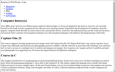
Figure 13.10 HTML Framework for Our Responsive Layout
13.2.2 Setting General CSS Features
Before you start worrying about layouts for specific screen widths, you should first write the general CSS features such as the box model, font size, color, and so on. These should be CSS features that don’t change when a layout breakpoint exists. You can either write such general features in a separate CSS file that you add to the HTML document header, or write everything in a single CSS file, as I did in this example. As mentioned earlier, I’ll keep this example very simple. Initially, I only activated the new box model via box-sizing and set the font in body.
Resetting/Normalizing CSS
It often happens that the CSS is reset/normalized at the beginning of the layout creation to bring the different basic browser settings of the various manufacturers to a common basis. This ensures that no differences exist between the different browsers. If you did a complete reset of the CSS features at the beginning of the web development, then usually the file normalize.css (from https://necolas.github.io/normalize.css) will be used to have a reasonable basis for the further use of CSS. Although I’ve omitted this in our example, it needed to be mentioned here.
13.2.3 What Should I Use as a Basic Version without Media Queries: Mobile First?
When you start creating the layout, you first need to think about what you want to start with. Do you want to start with the desktop version and then work your way down to the smaller versions for tablets and then smartphones via layout breaks and media queries? Or do you want to start with the mobile version for smartphones and then work your way up to the desktop version? This is entirely up to you and probably depends on the nature and content of your project.
Personally, I’ve come to prefer creating the mobile version first because (1) these devices are the most common medium that users use to get around the web, and (2) it forces you as a developer to stick to the basics first. And the essential thing on the web is the content. You could also say “Mobile first means content first.” Furthermore, the desktop version also benefits from this because you can extend the uncomplicated display to this layout width as well, and the focus remains on the content.
Figure 13.11 shows the first draft of the mobile design planning. If you look at the basic HTML framework in /examples/chapter013/13_2_1/index.html and Figure 13.10, you’ll see that with this basic framework, you practically already have the mobile design. The only thing missing here is the styling with CSS.
Figure 13.11 Design for the Mobile Version
The following CSS file (/examples/chapter013/13_2_3/css/layout.css) should therefore no longer hold any special surprises. Once you’ve set box-sizing with border-box to the new box model, you’ll find the styling of each area for the mobile version.
@charset "UTF-8";
/* General basic settings */
html {
  box-sizing: border-box;
}
*, *::before, *::after {
  box-sizing: inherit;
}
body {
   color: #1d2731;            /* Ivory Black*/
   background-color: #efefef; /* Neutral */
   font-family: Georgia;
}
ul {
  padding: 0;
}
.wrapper {
   background-color: #ff3b3f; /* Watermelon */
}
.header {
   text-align: center;
   padding: 1em;
   background-color: #07889b; /* Teal */
   color: #efefef;            /* Neutral */
   border-bottom: 1px solid #efefef;
}
.aside {
  border-top: 1px solid #a9a9a9;
  padding-top: 0.5em;
}
.footer {
   background-color: #a9a9a9; /* Carbon */
   color: #efefef;            /* Neutral */
   padding: 1em;
   text-align: center;
   border-top: 1px solid #efefef;
}
.nav-ul {
   background-color: #ff383f; /* Watermelon */
   margin:0;
}
.nav-li {
   list-style: none;
   margin-left: 0;
   border-bottom: 1px solid #efefef;
}
.nav-li-a {
    padding: 0.6em 2rem;
    display: block;
}
.nav-ul a:link {
    text-decoration: none;
}
.nav-ul a:link, .nav-ul a:visited {
   color: #fff; /* white*/
}
.nav-ul a:hover, .nav-ul a:focus, .nav-ul a:active {
   background-color: #000; /* Black */
   color: #efefef; /* Neutral */
}
.nav-active {
   color: #000; /* Black */
   background-color: #fff; /* White */
}
.container {
   background-color: #fff; /* white */
   padding: 2em 2rem;
}
Listing 13.3 /examples/chapter013/13_2_3/css/layout.css
Next, you can enter the individual classes in the basic HTML framework. But before you do that, you should set the viewport metatag and add the CSS file for the layout. The basic HTML framework is thus already finished and won’t get changed in the further course of this book. From now on, we’ll work exclusively on the layout using the CSS file. Here’s the finished basic HTML structure:
...
<head>
...
<meta name="viewport" content="width=device-width, initial-scale=1">
<link rel="stylesheet" href="css/layout.css">
</head>
<body>
<div class="wrapper">
<header class="header">Responsive Web Design—Logo</header>
<nav>
<ul class="nav-ul">
<li class="nav-li"><a href="#" class="nav-li-a">Homepage</a></li>
<li class="nav-li"><a href="#" class="nav-li-a">Portfolio</a></li>
<li class="nav-li nav-active"><strong class="nav-li-a">Blog</strong></li>
<li class="nav-li"><a href="#" class="nav-li-a">Contact</a></li>
<li class="nav-li"><a href="#" class="nav-li-a">Legal Notes</a></li>
</ul>
</nav>
<div class="container">
<main class="content">
<article class="article">
<h2> Computer History </h2>
<p>Zuse, IBM, Atari, browser war: ... </p>
</article>
<article class="article">
<h2>Capture One 20</h2>
<p>You want your ...</p>
</article>
<article class="article clear">
<h2>Shell programming</h2>
<p>Shell programming is ... </p>
</article>
<article class="article">
<h2>Basic Course C</h2>
<p>The compact introduction ... </p>
</article>
</main>
<aside class="aside">
<h3>About the author</h3>
<p>Jurgen Wolf is ... </p>
<p> ... </p>
</aside>
</div>
<footer class="footer"> Footer - © 2023</footer>
</div>
</body>
</html>
Listing 13.4 /examples/chapter013/13_2_3/index.html
Without much effort, you’ve already created the layout for the mobile version. The layout now extends to 100% of the layout viewport on all devices. This mobile layout would also be used for (old) web browsers that can’t do anything with media query layout breaks. At this point, you’ll get the same layout on a tablet or desktop PC (see Figure 13.12) as on smartphone (see Figure 13.13). On the desktop computer, this single-column layout may not look spectacular, but it’s clear, the content is rendered properly, and the website works.
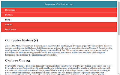
Figure 13.12 The Basic Version without Media Queries on a Desktop Screen
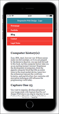
Figure 13.13 The Basic Version on a Smartphone, Which Is What It Was Created For
13.2.4 Setting the Layout Break (Breakpoint)
Even though the basic version provides visitors with all the basic functions of a website and the content gets displayed neatly, it’s rather unusual to use this single-column layout for the tablet and desktop version as well. For this reason, we now want to provide another view of the layout, namely for tablets. With reference to our example, this means the layout should have two columns. The header, navigation, and footer can remain where they are. The main content and the sidebar, on the other hand, will now be positioned next to each other. Figure 13.14 shows the layout intended for a tablet.
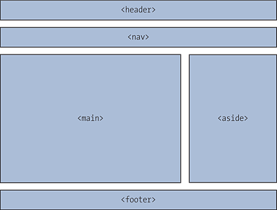
Figure 13.14 This Layout Is Intended for Tablets
First, you need to decide from which screen width onward you want to set the first layout break (breakpoint). In the following example, the breakpoint occurs at 640 pixels (= 40 em):
...
/* Tablet version from 640 pixels—640px / 16px/em = 40em */
@media screen and (min-width: 40em) {
  .header {
    padding: 1.5em;
    text-align: left;
  }
  .container {
    padding: 3rem 0;
    display: block;
    overflow: auto;
  }
  .content {
    display: block;
    float: left;
    width: 65%;
    padding: 0 1rem 0 2rem;
  }
  .aside {
    display: block;
    margin: 0 0 0 65%;
    width: 35%;
    padding: 0 2rem 0 2rem;
    border-top: none;
  }
  .nav-ul {
    padding: 0 2rem;
    overflow: hidden;
  }
  .nav-li {
      float: left;
      display: inline-block;
      border: none;
      width: auto;
  }
  .nav-li-a {
     padding: 0.7em 1.2rem;
     display: inline-block;
    }
}
Listing 13.5 /examples/chapter013/13_2_4/css/layout.css
To get the main content and sidebar next to each other here, we provide the main content .content with a width of 65% and let the sidebar .aside flow next to it for the remaining 35% thanks to float:left; in .content. To prevent the other subsequent elements from “flowing along,” we surround these two elements with a container (.container) and resolve the flowing around of the elements outside with overflow:auto; again. Here’s the corresponding HTML part:
...
<div class="container">
  <main class="content">
    <article class="article">
      ...
    </article>
    ...
  </main>
  <aside class="aside">
    ...
  </aside>
</div>
...
Listing 13.6 /examples/chapter013/13_2_4/index.html
The layout break occurs from a viewport of 640 pixels onward. In Figure 13.15 you can still see the layout on a viewport with less than 640 pixels on the left, whereas on the right, the layout break has taken place because the screen width was more than 640 pixels. This layout break will also be executed on smartphones if you switch to landscape format and the width is more than 640 pixels in the process.
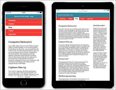
Figure 13.15 Now the Basic Version Is Switched to the Next Layout Version from a Screen Width of 640 Pixels
13.2.5 Adding More Layout Breaks
In our example, we could already be pretty happy with these two versions—a mobile version for screens smaller than 640 pixels and a second version for screens with a width of 640 pixels or more. However, we still need to add two more breakpoints for a desktop and an extra-wide desktop because on wider screens, the text lines of the main content would otherwise become much too long. To fill the space for a larger viewport, the navigation should now be added as a third column, so that it gets positioned to the left of the main content, while the sidebar is to the right of it. We’ll leave the header and footer as they are. The design for desktop screen layout can be found in Figure 13.16.
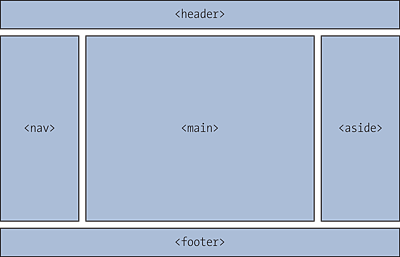
Figure 13.16 To Be Used for the Layout of Desktop Screens
We define the next layout break for screens with a wider viewport than 1,024 pixels (64 em). Here is the corresponding CSS code:
...
/* Screens from 1024 pixels—1024px / 16px/em = 64em */
@media screen and (min-width: 64em) {
  .container {
    width: 85%;
    padding: 0;
    margin-left: 15%;
  }
  .content {
    width: 70%;
    padding: 1em 1.5em;
  }
  .aside {
    width: 30%;
    padding: 1em 1.5em;
    margin: 0 0 0 70%;
  }
  .nav-ul {
    width: 15%;
    float: left;
    margin: 1em 0;
    padding:0;
  }
  .nav-li {
    width: 100%;
    float: none;
    text-align: center;
  }
  .nav-li-a {
    padding: 0.5em 3rem;
    display: block;
  }
}
Listing 13.7 /examples/chapter013/13_2_5/css/layout.css
For the .container with the main content .content and the sidebar .aside, 85% of the window width has been reserved now. Of this 85% within .container, the main content (.content) shares this space with 70% and the sidebar .aside with 30%. The remaining 15% space is reserved for the navigation (.nav). For this purpose, space was left free for the container .container with margin-left. Due to float:left; at .nav, the container .container with its main content and sidebar is placed to the right of it. The HTML document with the corresponding passages is also shown in Listing 13.8 to illustrate what has just been described:
...
<nav>
  <ul class="nav-ul">
    <li class="nav-li"><a href="#" class="nav-li-a">Homepage</a></li>
    ...
  </ul>
</nav>
<div class="container">
  <main class="content">
    <article class="article">
      ...
    </article>
    ...
  </main>
  <aside class="aside">
    ...
  </aside>
</div>
...
Listing 13.8 /examples/chapter013/13_2_5/index.html
In Figure 13.17, you can see the layout for the desktop starting at a viewport width of 1,024 pixels during execution.
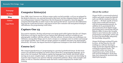
Figure 13.17 The Layout for the Desktop Version from a Viewport of 1,024 Pixels Wide
You should now define another breakpoint here for extra-large screens because, otherwise, the lines there will again become too long. Here, you can either decide that the complete layout must not extend further beyond a certain screen width, or you can split the articles of the main content. In the example, I’ve created a final breakpoint for a screen width of 1,280 pixels (80 em) or wider, which offers both solutions just mentioned. The .wrapper sets the max-width feature to 1,280 pixels when the width exceeds 1,280 pixels so that the website can’t expand any further. Furthermore, I reduced the .article articles to 50% and arranged them next to each other via float:left;. However, you can also use the .wrapper or .article class alone for this example. Here’s the corresponding CSS code for the last breakpoint:
...
/* Large screens (>1280 pixels)—1280px / 16px/em = 80em */
@media screen and (min-width: 80em) {
  .wrapper {
    margin: 0 auto;
    max-width: 80em;
  }
  .article {
    display: block;
    width: 50%;
    float:left;
    padding: 0 1rem 0 1rem;
  }
  .clear { clear: both; }
}
Listing 13.9 /examples/chapter013/13_2_5/css/layout.css
You can see the result with an extra-wide viewport from 1,280 pixels in Figure 13.18.
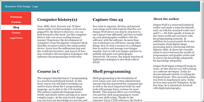
Figure 13.18 This Layout Is for extra-Large Screens of 1,280 Pixels or Wider
The example created in this way now flexibly adapts to visitors’ devices thanks to the layout breaks with the media queries. You now have used an easy method to create a simple version for smartphones, a version for tablets, and another version for desktop PCs.
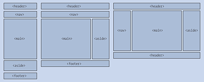
Figure 13.19 Multiple Layout Breaks for Different Screen Resolutions Thanks to Media Queries
13.2.6 Customizing the Main Content
Once you’ve created the responsive design, you can get to working on the details. In the example, we still want to keep an eye on the main content with the articles when the desktop width is extra large. If, for example, an article on the left-hand side is longer than usual, and you haven’t taken any precautions, the article after the next one can’t slide to the left and remains attached to the overlong article. Figure 13.20 shows such a case.
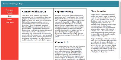
Figure 13.20 For Clarity, I’ve Highlighted the Articles with a Frame
In the /examples/chapter013/13_2_5/css/layout.css example, I wrote a .clear class with clear:both; at the end for this. You only need to add this class to the corresponding article as follows:
...
<article class="article clear">
   ...
</article>
...
Listing 13.10 /examples/chapter013/13_2_5/index.html
This solves the problem shown in Figure 13.20, and the “sticking” article can “slide” back down, but this procedure is still quite tedious when you change the website and add new articles. Instead, it makes more sense to write a class for a row with articles that you can use with <div class="row"> and that automatically includes a clear:both; at the end of the line. In practice, you could implement this as follows:
...
<main class="content">
  <div class="row">
    <article class="article">
       ...
    </article>
    <article class="article">
       ...
    </article>
  </div>
  <div class="row">
    <article class="article">
     ...
    </article>
    <article class="article">
     ...
    </article>
  </div>
</main>
...
Listing 13.11 /examples/chapter013/13_2_6/index.html
You’ve practically already defined the .row class for this at the layout break of 1,280 pixels with the designation .clear. It makes sense that it should be called .row here now. Here’s the CSS code for it:
...
@media screen and (min-width: 80em) {
  .wrapper {
    margin: 0 auto;
    max-width: 80em;
  }
  .article {
    display: block;
    width: 50%;
    float:left;
    padding: 0 1rem 0 1rem;
  }
  .row { clear: both; }
}
Listing 13.12 /examples/chapter013/13_2_6/css/layout.css