14.2 Designing Lists with CSS
You already know how to create lists in HTML from Chapter 4, Section 4.2. Now you’ll learn how to manipulate those lists using CSS. Strictly speaking, you can apply the CSS features list-style-type, list-style-image, and list-style-position to <ul> or <ol> for this purpose. A short notation for all three CSS features with list-style also exists. In the following sections, I’ll go into a little more detail about these CSS features for styling lists.
14.2.1 Customizing Bullet Points Using “list-style-type”
The CSS feature list-style-type allows you to specify the bullet selection of unordered lists with <ul> and the type of numbering ordered lists with <ol>.
For unordered lists with <ul>, the following values are available:
-
none
No bullet. -
disc
Filled circle, also called bullet character, default setting. -
circle
Empty circle as bullet character. -
square
Square bullet sign.
For ordered lists with <ol> the following values are available, among others:
-
decimal
Numbering in the form 1., 2., 3., 4., 5., 6., and so on. -
decimal-leading-zero
Numbering in the form 01., 02., 03., 04., and so on. -
lower-alpha and lower-latin
Numbering in the form a., b., c., and so on. -
upper-alpha and upper-latin
Numbering in the form A., B., C., and so on. -
lower-roman
Numbering in the form i., ii., iii., iv., v., and so on. -
upper-roman
Numbering like I., II., III., IV., V., and so on. -
none
No numbering.
Numbering in Other Languages
There are other numberings in other languages such as Armenian (armenian), Hebrew (hebrew), Georgian (georgian), or Japanese (hiragana).
In Figure 14.30, you can see how a square bullet (square) was used instead of the filled circle (with disc) for an unordered list, and alphabetical numbering in capital letters was used instead of decimal numbering (decimal) for the ordered list. Only the following two lines were used as CSS statements:
...
  ul { list-style-type: square; }
  ol { list-style-type: upper-alpha; }
...
Listing 14.17 /examples/chapter014/14_2_1/css/style.css
Feel free to experiment with the values for <ul> and <ol> listed previously.
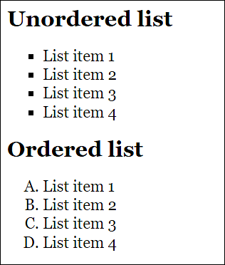
Figure 14.30 Designing Bullets with “list-style-type”
14.2.2 Using Images as Bullets via “list-style-image”
You can use the CSS feature list-style-image to add a custom graphic as an enumeration icon. The value you need to specify is url(path) with the path to a graphic.
In Figure 14.31, you can see such an example, where a simple graphic was used for the ul elements. The graphic was added with the following CSS line:
...
  ul { list-style-image: url("../graphic/stern.png"); }
...
Listing 14.18 /examples/chapter014/14_2/css/style.css
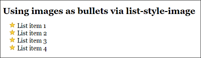
Figure 14.31 You Can Use a Graphic as a Bullet Point with the CSS Feature “list-style-image”
Using a Special Character Instead of a Graphic
As an alternative, you can also use a special character instead of a graphic. To do that, you simply need to set list-style-type to none and define a special character as a list icon via li:before using content:
...
.myul { list-style-type: none; }
.myul li:before { content: '\2713'; color: green; }
...
If you want to know what is represented by the character '\2713', you should test this code (or look in /examples/chapter014/14_2/index2.html). The advantage of using special characters instead of graphics is that you can adjust the size and color more easily.
14.2.3 Positioning Bulleted Lists via “list-style-position”
You can use the CSS feature list-style-position to set whether the bullet should be inside or outside the box that contains the entries. The default behavior can be set using the outside value, which places the bullet point to the left of the text block. The counterpart to this value is inside, which places the bullet point inside the text block.
It’s best to look at Figure 14.32, where you can see the difference between outside and inside. In the example, the box with the <li> tag was assigned a gray background color. The CSS statements for that were written as follows:
...
.outside { list-style-position: outside; }
.inside { list-style-position: inside; }
...
Listing 14.19 /examples/chapter014/14_2_3/css/style.css
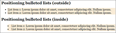
Figure 14.32 You Can Use “list-style-position” to Define Whether the Bullet Points Should Be outside (Default Setting) or inside the Box with the Entries
14.2.4 Short Notation “list-style” for Designing Lists
As is the case with several other CSS features, list-style is a short notation for the list-style-type, list-style-image, and list-style-position features, so you may be able to specify the shape, the graphic, and/or the bullet position in one go.
You can use any order and also enter only one or two entries. If you specify a graphic (list-style-image) with url(), the shape (list-style-type) will always be overwritten. list-style-type will only be used as an alternative if the graphic couldn’t be loaded. Even if the order is arbitrary, it’s recommended to maintain the order, as follows:
list-type: list-style-type list-style-position list-style-image;
This can simplify any troubleshooting work. Here’s another example to clarify this:
ul { list-style: disc url(mybullet.png) inside; }
This short notation corresponds to the following entries:
ul {
  list-style-type: disc;
  list-style-image: url(mybullet.png);
  list-style-position: inside;
}
14.2.5 Creating Navigation and Menus via Lists
To create a navigation with CSS, lists are commonly used. In this section, I’ll describe a simple way to implement a navigation using lists and CSS. The following HTML code with a list is used for this purpose:
...
<nav>
   <ul class="menu">
       <li class="logo"><img src="graphics/logo.png" height="30"></li>
       <li class="menu-item"><a href="#">Home page</a></li>
       <li class="menu-item"><a href="#">News</a></li>
       <li class="menu-item"><a href="#">About me</a></li>
       <li class="menu-item"><a href="#">Contact</a></li>
       <li class="menu-item"><a href="#">Privacy</a></li>
       <li class="menu-item button"><a href="#">Sign in</a></li>
   </ul>
</nav>
...
Listing 14.20 /examples/chapter014/14_2_5/index.html
The result of the list completely without styling is shown in Figure 14.33.
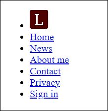
Figure 14.33 The Pure HTML Representation of the Navigation as a List
In Figure 14.34, on the other hand, I’ve already added basic styling to the individual elements in /examples/chapter014/14_2_5/css/style.css. With regard to the lists, I’ve set list-style-type to none so that no bullet gets displayed.
...
ul {
    list-style-type: none;
}
...
Listing 14.21 /examples/chapter014/14_2_5/css/style.css
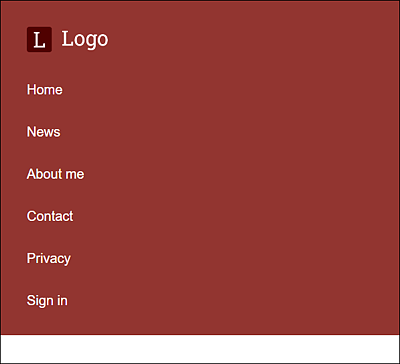
Figure 14.34 The List after a First Basic Styling
Creating the Mobile Navigation for the Smartphone
First of all, it’s recommended to create the mobile navigation for smartphones. I chose a flexbox for this purpose because it allows me to lay out the menu and menu items without much effort. The important CSS lines for the mobile layout are as follows:
...
.menu {
    display: flex;
    flex-wrap: wrap;
    justify-content: space-between;
    align-items: center;
}

.menu-item.button {
    order: 1;
}

.menu-item {
    width: 100%;
    text-align: center;
    order: 2;
}
...
Listing 14.22 /examples/chapter014/14_2_5/css/style.css
By using display: flex, you make the ul element a flex container, while align-items: center allows you to center the li elements (here, .menu-item) vertically on the cross axis. order enables you to sort the order of the flexbox elements. In the mobile version, I can thus position the button (order:1) in front of the navigation elements of the menu (order: 2). You can extend the individual li menu items across the entire width using width: 100%. You can see the mobile version of the vertical navigation menu with lists in Figure 14.35.
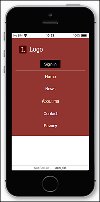
Figure 14.35 The Mobile Smartphone Version of the Vertical Navigation Menu with Lists
Creating the Vertical Navigation Menu for Tablets
I didn’t change much for the vertical navigation menu for tablets. The logo can be extended using flex: 1. The button next to it, on the other hand, only gets as much space as it needs (width: auto). The other menu items remain at width: 100%, as in the smartphone version and thus still extend across the entire width, placing each element in its own line.
...
@media all and (min-width: 37.5em) {
    .logo {
        flex: 1;
    }
    .menu-item.button {
        width: auto;
        border-bottom: 0;
    }
}
...
Listing 14.23 /examples/chapter014/14_2_5/css/style.css
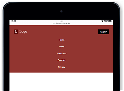
Figure 14.36 The Tablet Version of the Vertical Navigation with List Items
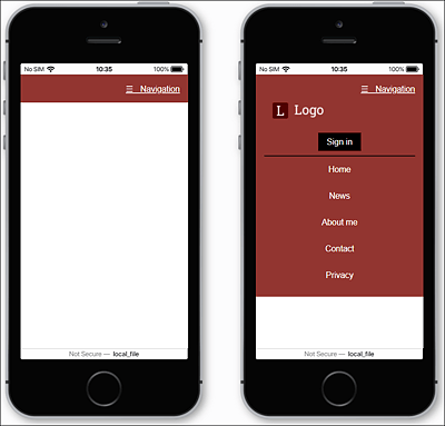
Expandable Menu with JavaScript for Mobile Versions
I didn’t include an expandable menu for the mobile versions here because I would have had to anticipate JavaScript at this point. Instead, I created the example using a very simple expandable menu with jQuery, which you can find in /examples/chapter014/14_2_5/index2.html.
Creating the Vertical Navigation Menu for Desktops
For the desktop version, I keep it very simple and set all menu items to width: auto, making them share the space behind the logo, which still uses flex: 1. If you want to provide all elements with equal space in the horizontal navigation, you could do this by setting the CSS feature flex to 1 in the menu-item class as well.
...
@media all and (min-width: 60em) {
    .menu-item {
        width: auto;
    }
    .logo {
        order: 0;
    }
    .menu-item {
        order: 1;
    }
    .button {
        order: 2;
    }
    .menu li.button {
        padding-right: 0;
    }
}
Listing 14.24 /examples/chapter014/14_2_5/css/style.css
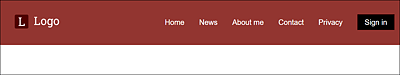
Figure 14.38 The Desktop Version of the Vertical Navigation with List Elements