11.5 Designing Boxes
The topic of the box model also includes the styling of boxes. This isn’t yet about the layout, but mainly about the visual design such as the background or the frame of boxes. Specifically, you’ll learn the following in this section:
-
How to design the frame
-
How to set the background color
-
How to use background images
-
How to use transparency
-
How to add a gradient
-
How to create a shadow
-
How to make the square boxes round
11.5.1 Adding and Designing a Border Using the “border” Property
For each element, you can display a border and customize the border color, line width, and type. Even though a border can be used for all elements, the use of a border seems to make sense only for HTML elements that create their own paragraph. To understand the use of borders, you should be familiar with the box model, which I covered in detail in Section 11.1 and Section 11.2.
Designing All Four Sides at Once with the Short Notation
Because there are many border properties, creating borders is relatively flexible and versatile. In real life, you’ll often use the short notation with border:
/* border: Border color Line width Line style */
border: black 1px solid;
This draws a solid black border with a line width of one pixel (1px) around all four sides. You can define this short notation with three CSS features:
border-color: black;    /* Border color */
border-width: 1px;      /* Line width */
border-style: solid;    /* Line style   */
This specifies the same properties as the short notation of border in the previous example.
Four Styles for “border-style” and “border-color”
It’s possible to specify two, three, or four values for the two CSS features border-style or border-color. Specify a value such as the following:
border-color: black;
This will cause everything to apply as before to all four sides. On the other hand, if you specify two values, such as the following:
border-color: red green;
This will cause the top and bottom borders to be colored red and the left and right borders to be colored green. If you use three values, the top border is styled with the first value, the right and left borders with the second, and the bottom border with the third. In addition, of course, you can still write all four sides individually:
border-color: red green blue yellow;
Here, the border colors are assigned clockwise starting with top. Similarly, all this also applies to the border style with border-style.
Designing Each Side of the Border Individually
Similar to how the CSS feature border can be used as a bundle for border-color, border-width, and border-style for all four sides, border-top, border-right, border-bottom, and border-left each have a CSS feature that you can use to access each side of the border separately. For example, if you want to define only the upper side of a border, you can do it as follows:
border-top: red 5px dotted;
This adds a dotted red border with a line width of 5 pixels to the top of the box only. Again, this is ultimately a summarizing short notation of the following:
border-top-color: red;
border-top-width: 5px;
border-top-style: dotted;
Similarly, there are summarizing properties with border-right, border-bottom, and border-left for each individual side of the border. Needless to say, these summarizing properties are also available in a short notation in the form of border-...color, border-...-width, and border-...-style for the respective sides right, bottom, and left.
Using Different Border Styles
As you’ve already noticed, there are different styles of borders. You can use solid to display a solid border. Table 11.2 contains an overview of the different border styles you can use.
|
Value |
Description |
|---|---|
|
none |
Default value, no border |
|
hidden |
Like none, no border |
|
dotted |
Displays a dotted border |
|
dashed |
Displays a dashed border |
|
solid |
Displays a solid border |
|
double |
Displays a double solid border |
|
groove |
Displays a 3D border, the effect also depends on the border color |
Table 11.2 Different Border Styles at a Glance
Experiment with the Different Features
Printing a comprehensive example here probably doesn’t make much sense as the design of border with the many different border properties is extremely diverse. So, I recommend you experiment a bit with the example in /examples/chapter011/11_5_1/css/style.css to get a feel for it. The corresponding HTML document can be found in /examples/chapter011/11_5_1/index.html.
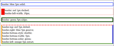
Figure 11.17 Some Different Border Styles in Use (Example in /examples/chapter011/11_5_1/index.html)
Creating a Decorative Border Using “border-image”
border-image allows you to easily insert an image for the border. For this purpose, a pixel graphic or Scalable Vector Graphic (SVG) is sufficient, in which the areas for the decorative border are located. Let’s take a look at the following 150 × 150 pixel graphic in Figure 11.18 with colored circles of 50 × 50 pixels in each. Because a vector graphic can be scaled without quality restrictions and is also much smaller than a pixel graphic, I used an SVG for this example.
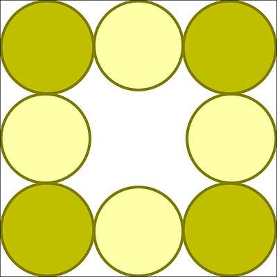
Figure 11.18 The 150 × 150 Pixels Source Image myborder.svg for the Decorative Border with “border-image”
The image with the decorative border can be added using CSS with the following line:
...
border: 25px solid transparent;
border-image: url('../images/myborder.svg') 50 50 50 50 round;
...
Listing 11.9 /examples/chapter011/11_5_1/css/style2.css
Strictly speaking, border-image is again a summarizing property of border-image-source (image source), border-image-slice (divides the border image into nine parts), border-image-width (width of the border), and border-image-repeat (determines how the image parts are repeated in the side margins). Figure 11.19 shows the decorative border with border-image and the myborder.svg graphic from Figure 11.18 in use.
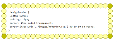
Figure 11.19 A Decorative Border with “border-image” (HTML Document Is in /examples/chapter011/11_5_1/index2.html)
11.5.2 Setting a Background Color Using “background-color”
In the previous examples, you defined the colors for the background as follows:
background: lightblue;
You can also apply this to boxes. However, I haven’t mentioned yet that background is again just a bundling of CSS features for the background, where the first one is equal to background-color. Thus, the definition just used leads to the same result as the specification with background-color:
background-color: lightblue;
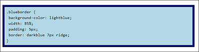
Figure 11.20 The Use of a Background Color within Boxes Can Be Noted Relatively Simply with “background” or “background-color”
The example in Figure 11.20 can be found in /examples/chapter011/11_5_2/index.html (HTML) and /examples/chapter011/11_5_2/css/style.css (CSS).
11.5.3 Using Background Images
As you just learned in Section 11.5.2, when you set the background color, background is just a bundling or short notation of several CSS features for the background. The following properties are bundled via the short notation, background:
-
background-repeat
Repeats the background image along the vertical or horizontal axis. -
background-attachment
Here you can define whether the background can be scrolled or is fixed.
The main focus in this section is on adding a background image inside boxes. It’s important to distinguish whether you want to use an image or a background graphic only for decoration. Images or logos should still be added via the HTML element <img>. Graphics for design or decoration, on the other hand, can be added as background images using CSS.
Even though it’s possible to use an image as the background graphic of an element (here, e.g., as the background image of a p element), as you can see in Figure 11.21, it can be confusing because you would expect the HTML element <img> rather than a CSS statement. The example can be found in /examples/chapter011/11_5_3/css/style-bg.css. The HTML document for this is /examples/chapter011/11_5_3/index-bg.html.
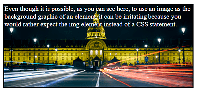
Figure 11.21 It’s Possible, But Rather Untypical, to Use an Image as the Background Graphic of an Element, as Shown Here
You can add a background graphic via background in the short notation version or via background-image.
Where Do the Background Graphics Come From?
You can either create background graphics yourself or search for ready-made background graphics on the internet. The choice of ready-made background patterns is enormous. For our example, I used a graphic from the website https://dinpattern.com.
This is how you insert a background graphic as a class selector for an article element:
...
.article01 {
   width: 70%;
   background-image: url('../images/pattern.png');
   border-left: gray 1px dotted;
   border-right: gray 1px dotted;
   padding: 10px;
   background-color: #c4c4c4;
}
...
Listing 11.10 /examples/chapter011/11_5_3/css/style.css
In the example, the background graphic pattern.png is located in the images directory of the HTML document. As you can see in Figure 11.22 with /examples/chapter011/11_5_3/index.html and in the corresponding CSS in /examples/chapter011/11_5_3/css/style.css, the background graphic also overlays the background color. Nevertheless, you should use a background color that matches the font, as I have done here with background-color: #c4c4c4; in case the graphic won’t get displayed to a visitor because the user has disabled the graphic display.
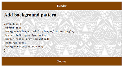
Figure 11.22 A Background Graphic That Overlays the Background Color Has Been Added to the <article> Element (Background Pattern: https://dinpattern.com)
Tiling and Repeating Background Graphics
If you don’t specify anything, the background graphic will be repeated (or tiled) vertically and horizontally as many times as there is space available. This is very convenient if you have a suitable background graphic. In Figure 11.23, the pattern was replaced with a 350 × 50 pixel gradient. Toward the bottom, tiling the graphic with a gradient works great, but at the right-hand edge, the gradient doesn’t look nice when the background graphic gets repeated.
However, you can restrict tiling to the vertical direction and set the background color to be the color at the end of the gradient. For tiling in the vertical direction, you just need to assign the repeat-y value to the CSS feature background-repeat. You already know how to set the background color. Figure 11.24 shows the result of this modification. The example can be found in /examples/chapter011/11_5_3/index2.html, while the corresponding CSS file is located in /examples/chapter011/11_5_3/css/style2.css.
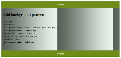
Figure 11.23 Tiling a Background Graphic Doesn’t Always Produce the Desired Result
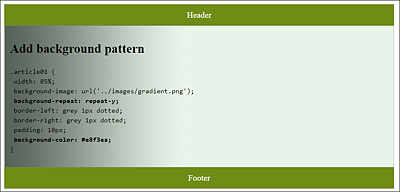
Figure 11.24 Tiling in the Vertical Direction with “background-repeat: repeat-y”, and the Matching Background Color Also Works with the Gradient
In total, you have three ways to tile a background graphic via the CSS feature background-repeat:
-
background-repeat: repeat-y
Vertical tiling (y-axis). -
background-repeat: repeat-x
Horizontal tiling (x-axis). -
background-repeat: no-repeat
No tiles at all.
Positioning and Fixing a Background Graphic
You can use the CSS feature background-position to position the background graphic in the HTML element. The positions available to you are top, right, bottom, left, and center. If you use two values, the first value is taken for the horizontal position and the second for the vertical position.
In Figure 11.25, the pattern was positioned with background-position right top and tiled with background-repeat along the y-axis (repeat-y). If you were to use no-repeat here, the pattern would only be displayed once in the top-right corner. The example can be found in /examples/chapter011/11_5_3/index3.html, and the CSS for it is located in /examples/chapter011/11_5_3/css/style3.css.
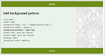
Figure 11.25 The Pattern Was Positioned via “background-position” at the Top Right (“right top”) and Tiled with “background-repeat” along the Y-Axis (“repeat-y”)
The CSS feature background-attachment is used pretty rarely; you can use it to fix a background graphic with the value fixed to the display area of the page. When scrolling, the graphic remains in place within the HTML element. You can find an example demonstrating this interesting effect when scrolling down in /examples/chapter011/11_5_3/index4.html with the corresponding CSS in /examples/chapter011/11_5_3/css/style4.css. The default value is scroll, which scrolls the background graphic along with the element as usual.
The Short Notation for a Background Graphic with “background”
Let’s now return to the short notation of background: you should have no more trouble bundling the example from /examples/chapter011/11_5_3/css/style4.css in the short notation, as follows:
background: #e8f3ea url('../images/pattern.png') repeat-y right top;
This short version thus corresponds to the following:
background-image: url('../images/pattern.png');
background-repeat: repeat-y;
background-position: right top;
background-color: #e8f3ea;
You’ve already seen the corresponding result in Figure 11.25.
Stacking Multiple Background Graphics
The stacking of multiple background images can be implemented in CSS as follows:
background: url(img01.jpg), url(img02.jpg), url(img03.jpg)
            #e8f3ea;
Here, three images are stacked on top of each other. img01.jpg is at the top, followed by img02.jpg and img03.jpg. The background color is set as the last value. The individual background images to be stacked must be separated with commas.
Additionally, you can write the background-position and background-repeat options. By default, the position is top left, and the tiles are evenly distributed along the y-axis and x-axis. If the images are on top of each other, the upper graphic will cover the one below. For this reason, without a concrete specification of background-position and background-repeat, only the top background images would be displayed because it would get tiled by default and cover the images below it.
You can implement two background images with different values, for example, as follows:
background: url(img01.jpg) left top no-repeat,
            url(img02.jpg) right top repeat-y,
            #e8f3ea;
Here, the first background image img01.jpg is positioned on the top left and not tiled. The second background image img02.jpg is positioned at the top right and tiled down along the y-axis.
In Figure 11.26, with the new ability to stack multiple backgrounds, an ornament was added to all four corners of the article element for decoration. The HTML document for this can be found in /examples/chapter011/11_5_3/index5.html. The CSS statement is as follows:
...
background: url('../images/left-top.jpg') top left no-repeat,
            url('../images/right-top.jpg') top right no-repeat,
            url('../images/bottom-right.jpg') bottom right no-repeat,
            url('../images/bottom-left.jpg') bottom left no-repeat,
            white;
...
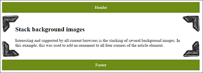
Figure 11.26 The Example after Stacking Multiple Background Images and Positioning Them Accordingly without Tiles
Setting the Size of the Background Image
The CSS feature background-size allows you to specify the size of the background image. This enables you to scale the background image up or down, as it were. The information can be given either in pixels or as a percentage. A percentage specification is relative to the height and width of the parent element in which the background image is to be displayed. Let’s take a look at the following example:
...
.article01 {
    width: 500px;
    padding: 20px 50px;
    background: white url('../images/pattern.png') left no-repeat;
    background-size: 100% 100%;
}
...
Listing 11.11 /examples/chapter011/11_5_3/css/style6.css
This makes sure that the background image pattern.png completely fills the HTML element that uses the article01 class. Figure 11.27 shows the /examples/chapter011/11_5_3/index6.html example with the CSS /examples/chapter011/11_5_3/css/style6.css; you can see how the background image is stretched across the entire article element.
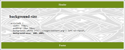
Figure 11.27 A 189 × 229 pixel Background Image Has Been Stretched Entirely across the <article> Element via “background-size”
It should be clear that upscaling or stretching pixel graphics doesn’t necessarily look nice. There are also two options—contain and cover—that you can assign to background-size:
-
background-size: contain
This will always display the background image completely inside the box, even if it doesn’t fill the entire surface. -
background-size: cover
This will always cover the entire area of the box with the image, even if the image isn’t completely visible.
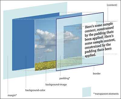
The Box Model in the Third Dimension
Because the background color and background image have now been added to the box model in addition to the content, padding, border and margin, it’s useful for your understanding to view this box in a third dimension. John Hicks has designed such a 3D box model at https://hicks.design/journal/3d-css-box-model.
11.5.4 Making Boxes Transparent
To create transparent boxes, there are three options available to you. You can use the CSS feature opacity, RGBA colors, or HSLA colors, which you already got to know in Chapter 10, Section 10.3.3, with the CSS functions rgba() and hsla().
As with RGBA or HSLA colors, the CSS feature opacity specifies opacity as 0 for full transparency and 1 for full opacity. The specification opacity: 0.5; means that 50% opacity is used.
The difference between opacity and the RGBA or HSLA colors is that with opacity, the transparency applies to all elements within the box. As you can see in Figure 11.29, where a transparent box with opacity has been used in the top article element, the font has also become transparent. For the lower article element, however, rgba() was used, and here only the background becomes transparent. Here’s the corresponding code snippet:
...
.article_01 {
  width: 90%;
  padding: 10px;
  background-color: white;
  border: black 1px dotted;
  opacity: 0.5;
}
.article_02 {
  width: 90%;
  padding: 10px;
  background-color: white;
  border: black 1px dotted;
  background-color: rgba(255, 255, 255, 0.5);
}
...
Listing 11.12 /examples/chapter011/11_5_4/css/style.css
The CSS feature opacity is therefore pretty useful for graphics and images because transparency doesn’t work with RGBA or HSLA colors. For boxes with text, you should use RGBA or HSLA colors if you want to have a transparent background.
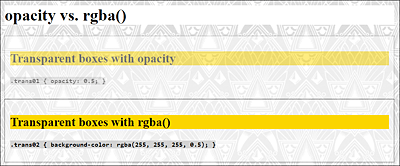
Figure 11.29 The /examples/chapter011/11_5_4/index.html Example with Transparent Boxes: One with “opacity” and One with “rgba()”
11.5.5 Adding a Gradient
CSS also allows you to create and use a gradient without having to insert a background image. You must create a linear gradient using the CSS function linear-gradient() and assign it to the background (or background-image) property. The easiest way to do this is as follows:
background: linear-gradient(white, orange);
This displays a linear gradient from white to orange from top to bottom (default setting).
To direct the gradient in a different direction, you just need to specify the keyword to, followed by the direction bottom (top to bottom), top (bottom to top), right (left to right), or left (right to left), for example:
background: linear-gradient(to right, white, orange);
This displays a linear gradient from white to orange, but this time, a gradient from left to right has been defined via to right. You can define diagonal directions via to right bottom (top left to bottom right) and to left top (bottom right to top left). It’s also possible to specify the position of the color break. A line without specifying a color break appears as follows:
background: linear-gradient(to right, white, orange);
The specification for the color break with values for the gradient looks as follows:
background: linear-gradient(to right, white 0%, orange 100%);
A line with the specification of a color break appears as follows:
background: linear-gradient(to right, white 30%, orange 70%);
You would therefore display a color gradient from left to right. The first color break of white is performed after 30%. The second color break of orange is performed after 70%. At each of these color breaks, the corresponding color starts and continues until the next color break (or until the end, if there’s no further color break). You would therefore create a hard transition if both color breaks were in the same place, as shown in the following example:
background: linear-gradient(to right, white 50%, orange 50%);
Here, the color transition is shown exactly after 50% with a hard edge because both color breaks were specified there. If you combine this information with background-size, you can create a pattern:
background: linear-gradient(to left, white 50%, orange 50%);
background-size: 50px 100px;
Figure 11.30 shows all the examples described here in use. Instead of specifying color names, you can also use hex values, RGB/HSL colors, or RGBA/HSLA colors.
In Figure 11.30, we also demonstrated the CSS function repeating-linear-gradient(), which allows you to repeat a gradient. The example snippet follows:
background: repeating-linear-gradient(40deg,
            white, white 25px, orange 25px, orange 50px);
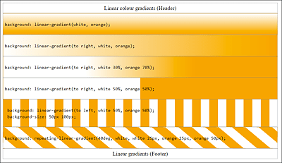
Figure 11.30 Linear Gradients with “linear-gradient()” (Example in /examples/chapter011/11_5_5/index.html, and CSS File in /examples/chapter011/11_5_5/css/style.css)
In this example, you use a gradient at a 40-degree angle (40deg), starting with white color and having a width of 25 pixels, while the color orange also starts exactly at the position (25px), ending after 50 pixels. Then the gradient gets repeated.
Radial Gradients
In addition to the linear CSS gradients linear-gradient() and repeating-linear-gradient() mentioned here, there are two counterparts that enable you to create radial gradients from the center point. The radial gradients can be created via the CSS functions, radial-gradient() or repeating-radial-gradient(). You can see examples of this in Figure 11.31. The corresponding example files can be found in /examples/chapter011/11_5_5/index2.html and /examples/chapter011/11_5_5/css/style2.css.
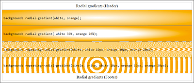
Figure 11.31 The Example with Radial Color Gradients in Use
You can use several colors for the gradient. A linear or radial gradient in a rainbow color can be created as follows:
...
background: linear-gradient(to left,
   purple, blue, green, yellow, red, purple);
background: radial-gradient(
   purple, blue, green, yellow, red, purple);
...
Listing 11.13 /examples/chapter011/11_5_5/css/style3.css
Creating Gradients with Online Tools
Those who find the manual creation of gradients with CSS a bit too cumbersome should take a look at the online tool Ultimate CSS Gradient Generator at www.colorzilla.com/gradient-editor/. This online tool enables you to generate a color gradient like you would with Photoshop. The tool generates the CSS code from this, which you copy and paste into your project.
11.5.6 Adding a Shadow Using the “box-shadow” Feature
In the past, if you wanted to add shadows to the elements, you had to do it by means of graphics. For websites with a flexible width, that was hardly useful. The CSS feature box-shadow makes adding shadows a breeze. The simplest specification to create a shadow with the CSS feature box-shadow is as follows:
box-shadow: 4px 4px gray;
This allows you to place a gray shadow around an element with a horizontal and vertical offset of 4 pixels each. The first value is used for the horizontal shift (offset-x) and the second value for the vertical one (offset-y). A positive value shifts the shadow of the horizontal shift to the right and the vertical shift down. The opposite happens with negative values. Instead of a color name, you can also use a hexadecimal color specification or the RGB(A) or HSL(A) color specifications.
If you want to have a soft shadow, you only need to specify a third value that defines the blur of the shadow. The higher the value, the softer the shadow will be (default value is 0):
box-shadow: 4px 4px 4px gray;
If you still want to determine the radius or the spread of the shadow, you can specify that with a fourth value:
box-shadow: 4px 4px 4px 4px gray;
The last value defines the color of the shadow, but it can also be in front of the other values.
In Figure 11.32, you’ll see the shadows described here in actual use. In addition, you can also see an example with an inner shadow that you can define and use via inset as the first value of box-shadow. The CSS code for this can be found in /examples/chapter011/11_5_6/css/style.css.
Shadow Generator
If you don’t feel like creating the shadow manually, you can find various generators on the web that do this work for you, such as html-css-js.com/css/generator/box-shadow/.
It’s also possible to specify multiple shadows at once, separated by commas, for one element, for example:
box-shadow: 4px 4px 4px red, -4px 4px 4px yellow,
            4px -4px 4px green, -4px -4px 4px blue;
In this example, four shadows are defined at once.
As you may recognize in Figure 11.32, a shadow doesn’t extend the area around the elements in the way margin does. If the shadow is extremely large, it can extend into the next element.
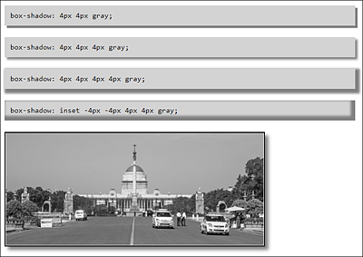
Figure 11.32 Adding Shadows for HTML Elements Becomes a Breeze Thanks to “box-shadow” (Example in /examples/chapter011/11_5_6/index.html)
11.5.7 Adding Round Corners Using the CSS Feature “border-radius”
For round corners of elements, you can use border-radius. This CSS feature can be used independently of border. You don’t have to draw an extra frame to round off corners. In turn, the use of border-radius is a short notation of border-top-left-radius, border-top-right-radius, border-bottom-right-radius, and border-bottom-left-radius. For example, you can write a border-radius as follows:
border-radius: 20px;
This is a shortened notation of the following:
border-top-left-radius: 20px;
border-top-right-radius: 20px;
border-bottom-right-radius: 20px;
border-bottom-left-radius: 20px;
You can also specify two, three, or four values for border-radius. Here’s an example with two values:
border-radius: 20px 10px;
The upper-left and lower-right corners get a radius of 20 pixels, and the upper-right and lower-left corners get a radius of 10 pixels. The order for using all four values is top left, top right, bottom right, and bottom left, which is similar to the short notation of padding or margin, that is, clockwise, starting at the top left.
In Figure 11.33, I’ve rounded off the top corners of the header with the following information:
border-top-left-radius: 10px;
border-top-right-radius: 10px;
The article element in the middle, on the other hand, has been rounded off with a simple border-radius of 20 pixels for all sides. In the last example with the footer, I rounded off the bottom corners with the following short notation:
border-radius: 0px 0px 10px 10px;
Instead of pixels (px), you can also use other units such as percent (%), em, or rem.
border-radius can be applied nicely to images, as you can see in Figure 11.34. The image on the left has a border-radius of 25 pixels. The image on the right was shaped into an ellipse by setting the border-radius to 50%. The example can be found in /examples/chapter011/11_5_7/index2.html; the CSS code is contained in /examples/chapter011/11_5_7/css/style2.css.
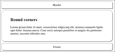
Figure 11.33 Round Corners Are Relatively Easy to Create (Example in /examples/chapter011/11_5_7/index.html; CSS Is in /examples/chapter011/11_5_7/css/style.css)
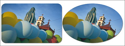
Figure 11.34 “border-radius” Applied to Images
You also have the option to specify different values for the horizontal and vertical radius. To do that, you need to separate these two values with a slash. As a result, you get corners with elliptical curves, for example:
border-radius: 5px / 20px;
This sets an ellipse of 5 pixels × 20 pixels for all corners. Of course, you can use the same as a percentage:
border-radius: 80% / 20%
If you want to set each corner individually, you can use border-top-left-radius, border-top-right-radius, border-bottom-right-radius, and border-bottom-left-radius as before. The short notation can also be used here as follows:
border-radius: 5px 10px / 20px;
This notation corresponds to the following:
border-top-left-radius: 5px / 20px;
border-top-right-radius: 10px / 20px;
border-bottom-right-radius: 5px / 20px;
border-bottom-left-radius: 10px / 20px;
You can also use the short notation for all corners differently as follows:
border-radius: 10px 20px 30px 40px / 5px 10px 5px 10px;
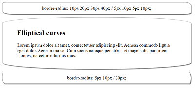
Figure 11.35 With “border-radius”, You Can Also Provide Elements with Elliptical Curves
Thus, you’ve achieved the same result as with the following notation:
border-top-left-radius: 10px / 5px;
border-top-right-radius: 20px / 10px;
border-bottom-right-radius: 30px / 5px;
border-bottom-left-radius: 40px / 10px;
You can see the example for this in Figure 11.35 and find it in /examples/chapter011/11_5_7/index3.html; the CSS code is located in /examples/chapter011/11_5_7/css/style3.css.