10.3 Related Topic: Passing Values to CSS Features
To conclude the chapter, you’ll learn a few things about passing values to CSS features. I’ll limit the individual descriptions to what is most necessary. More details about where you can use which value and how will be described in the remaining CSS chapters when the respective CSS feature is covered.
Further Online Reading
For more information on CSS value specifications and some other allowed value types, visit the W3C website at www.w3.org/TR/css-values-3/. At this point, I’ll only describe the most common types, which you’ll encounter more frequently in the following chapters.
10.3.1 Different Units of Measurement in CSS
The specification of numerical values, for example, for font sizes, heights, and widths or for distances, is often written in connection with a unit of measurement (UoM) directly after the numerical value. In CSS, there are many UoMs that can be used as either relative or absolute specifications. For the number 0, the UoM doesn’t have to be specified. Here are some examples of length specifications with different UoMs:
font-size: 12pt;
margin-left: 1em;
line-height: 125%;
border-width: 0.2in;
Specifying Numerical Values or Numbers
The numeric values in CSS can be integers and floating-point numbers. The comma in the floating-point number is represented by a dot in CSS (e.g., font-size: 1.2em). There are also numbers in CSS that are used without a UoM (e.g., z-index: 1 or opacity: 0.75). Negative values with a minus sign can also be used if this seems reasonable (e.g., z-index: -2). Negative values can’t be used for length specifications such as height and width, or for padding.
See Table 10.3 for a list of common UoMs for CSS. In the further course of the book, you’ll learn in more detail where you can or should use which UoM.
|
CSS Name |
Specification |
Description |
|
|---|---|---|---|
|
px |
Absolute |
The display of pixels depends on the pixel density of the output device. With a high screen resolution, the pixels become smaller, which is why the display appears smaller. It’s the same with a low screen resolution, where the pixels and hence the display appear larger. A pixel is thus a relative UoM on display devices and an absolute UoM in relation to the display or content. |
|
|
pt |
Absolute |
This is a typographic UoM, and 1 point is equal to 1/72 inch, for example: |
|
|
pc |
Absolute |
Pica is also a UoM widely used in typography. A pica is 1/6 of an inch and is therefore equivalent to 12 points, for example: |
|
|
cm |
Absolute |
A centimeter is the hundredth part of a meter and corresponds to 10 mm, for example: |
|
|
mm |
Absolute |
A millimeter is one-thousandth of a meter or the tenth part of a centimeter, for example: |
|
|
in |
Absolute |
1 inch is equal to 2.54 cm, for example: |
|
|
em |
Relative |
An em represents the font size of the element. If em is used for the font size itself (font-size), then this value refers to the font size of the parent element, for example: |
|
|
ex |
Relative |
An ex represents the height of the lowercase x of the font used in this element. Again, if ex is used for the font-size, then this height refers to the value of the lowercase x in the parent element. |
|
|
% |
Relative |
Percentages can be used in a variety of ways. It depends on the CSS feature whether this value refers to the element’s own size, to that of the parent element, or to a general context. |
|
|
rem |
Relative |
The rem (rem = root em) behaves in the same way as em, except that the rem value is based on the root element and not on the font size of the respective parent element. In HTML, the root element is the body or html element, for example: |
|
|
vw |
Relative |
1vw corresponds to 1% or the hundredth part of the width of the display area (i.e.,viewport). Thus, 100vw corresponds to the complete width of the display area. This UoM allows you to adjust the font size to the display area of the device or the size of the browser window. |
|
|
vh |
Relative |
1vh corresponds to 1% or the hundredth part of the height of the display area (i.e., viewport). Thus, 100vh corresponds to the total height of the display area. This UoM allows you to adjust the font size to the display area of the device or the size of the browser window. |
Table 10.3 Common Absolute and Relative Length Specifications in CSS
10.3.2 Character Strings and Keywords as Values for CSS Features
CSS makes a strict distinction between keywords and strings. Strings are enclosed between single or double quotes in CSS. Here’s an example with strings in CSS:
content: " meter";  /* string */
content: '$ ';      /* string */
The keywords in CSS, on the other hand, aren’t marked separately, for example:
color: black;
width: auto;
display: inline-block;
You can’t just put keywords between single and double quotes. A statement the following would have no effect:
color: "black"; /* !!! string !!! CSS error */
Here the color wouldn’t be set to black because you made it an ordinary string by using double quotes. Strictly speaking, this is an invalid value assignment, which a CSS validator would find fault with if you had this line checked.
10.3.3 Many Ways of Using a Color in CSS
Colors generally represent an important design element. In CSS, you have several options for writing color values. It should be noted right away that none of the different color specifications has any advantages or disadvantages in the display or execution of web pages. The only advantages or disadvantages are probably more for the individual who may not be familiar with hexadecimal notation and thus can use named colors. Graphic designers who are familiar with RGB or HSL colors will find these color specifications easier to use. Consequently, there’s something for everyone.
Named Colors Using a Name as a Color Value
Even at the time CSS was introduced, it was possible to write color values directly with a name. For this purpose, 16 VGA color names were initially added to the CSS specification (later, orange was added). The advantage of such color names is, of course, that you can easily remember and use them (at least those of the basic colors), for example:
.p_article {
  background-color: blue;
  color: white;
}
Here, a CSS rule has been defined for a paragraph text with the <p> element with blue background and white font. In Table 10.4, you’ll find classic color names that have been part of CSS since its beginnings.
|
CSS Name |
Hexadecimal |
RGB |
Color |
|---|---|---|---|
|
black |
#000000 |
rgb(0,0,0) |
Black |
|
gray |
#808080 |
rgb(128,128,128) |
Gray |
|
silver |
#C0C0C0 |
rgb(192,192,192) |
Silver |
|
white |
#FFFFFF |
rgb(255,255,255) |
White |
|
purple |
#800080 |
rgb(128,0,128) |
Purple |
|
#FF00FF |
rgb(255,0,255) |
Fuchsia |
|
|
maroon |
#800000 |
rgb(128,0,0) |
Maroon |
|
red |
#FF0000 |
rgb(255,0,0) |
Red |
|
olive |
#808000 |
rgb(128,128,0) |
Olive |
|
yellow |
#FFFF00 |
rgb(255,255,0) |
Yellow |
|
green |
#008000 |
rgb(0,128,0) |
Green |
|
lime |
#00FF00 |
rgb(0,255,0) |
Lime |
|
navy |
#000080 |
rgb(0,0,128) |
Navy |
|
blue |
#0000FF |
rgb(0,0,255) |
Blue |
|
teal |
#008080 |
rgb(0,128,128) |
Teal |
|
aqua |
#00FFFF |
rgb(0,255,255) |
Aqua |
|
orange |
#FFA500 |
rgb(255,165,0) |
Orange |
Table 10.4 Classic Named Colors
In the current CSS, additional color values have been added to these named ones, which are now understood by all popular web browsers. There should be 147 color names by now, although it’s also permitted to write all color names containing the word gray with e (grey). You can also find a list of color names, neatly sorted, at www.colors. commutercreative.com.
Classic Hexadecimal Notation for the Color Specification
If you look at the HTML code of web pages, the use of hexadecimal notation still seems to be the most commonly used notation for color values. The specification starts with the # character, followed by the color components for red, green, and blue in a range from 00 (for 0) to FF (for 255). The general notation of the hexadecimal notation is
#RRGGBB
Here R stands for the red portion, G for the green, and B for the blue one. Let’s take a look at a simple example:
.p_article {
  background-color: #0000FF;
  color: #FFFFFF;
}
Here again, a CSS rule was defined for a paragraph text containing the <p> element with a blue background and white font. Table 10.4 contains an overview of different color specifications with the corresponding hexadecimal values. In contrast to named color names, where you’re limited to a certain number and fixed defaults of color names, with such RGB mixing, you can theoretically reproduce 256 × 256 × 256 colors (over 16.7 million) colors.
Short Hexadecimal Notation
In CSS, you can abbreviate the hexadecimal notation if the first and second digits of red, green, or blue are identical. The specification #0F0 thus corresponds to #00FF00, or the short notation #123 corresponds to #112233. The web browser converts the #RGB value to the six-digit #RRGGBB value, for example:
.p_article {
  background-color: #00F;
  color: #FFF;
}
This is identical to the following:
.p_article {
  background-color: #0000FF;
  color: #FFFFFF;
}
The FF value is the hexadecimal notation for the value 255. In contrast to the decimal system with base 10, the hexadecimal system uses base 16. Here, the characters A to F are used from the value 10 onward (see Table 10.5).
|
0 |
1 |
2 |
3 |
4 |
5 |
6 |
7 |
8 |
9 |
10 |
11 |
12 |
13 |
14 |
15 |
16 |
17 |
100 |
255 |
|
0 |
1 |
2 |
3 |
4 |
5 |
6 |
7 |
8 |
9 |
A |
B |
C |
D |
E |
F |
10 |
11 |
64 |
FF |
Table 10.5 Comparison between the Counting of the Decimal System with Base 10 (Upper Row) and the Hexadecimal System with Base 16
Mixing the Colors with Red, Green, and Blue (RGB Mixture)
You can also define an RGB color mixture using the CSS function, rgb(Red, Green, Blue). You make the specifications for red, green, and blue either with percentage values (0–100%) or with decimal numbers in the range of 0–255. An example of using the rgb() function might look as follows:
.p_article {
  background-color: rgb(0,0,255);
  color: rgb(255,255,255);
}
The following is an example as a percentage value:
.p_article {
  background-color: rgb(0%,0%,100%);
  color: rgb(100%,100%,100%);
}
Again, in both examples, you’ve used the class selector to define a CSS rule for an HTML element of the p_article class with a blue background and white font. In Table 10.4, you’ll find various color specifications with the corresponding RGB mixtures for the rgb() function.
RGB Mixture with Transparency
Another CSS function is rgba(), which adds a fourth value—the alpha value for transparency—to the ordinary rgb() function. This value allows you to specify the transparency for the color. The value 0.0 represents full transparency, while the value 1.0 stands for full opacity and corresponds to the function, rgb().
With the following specifications, you specify that the paragraph text in white color with 0.3 is exactly 30% visible and 70% transparent:
.p_article {
  background-image: url('background.jpg');
  background-repeat: no-repeat;

  color: rgba(255, 255, 255, 0.3);
}
Here, an image has also been inserted with background-image to demonstrate how the image remains visible through the text thanks to the rgba() function. You can fine-tune the transparency value even more and use a second decimal place (hundredths) after the decimal point, for example, 0.35.
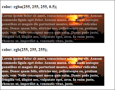
Figure 10.11 Using “rgba()”
An example of this is shown in Figure 10.11. The paragraph text was created over the top background image using the rgba() function in white font with a transparency of 50%. In the paragraph text below, the familiar rgb() function was used. The example can be found in /examples/chapter010/10_3_3/index.html.
HSL Mixture: Mixing Colors with Hue, Saturation, and Lightness
Not everyone likes the RGB color mix with red, green, and blue, and not everyone is familiar with it. For this purpose, as of Level 3 CSS, it provides a mixture of Hue, Saturation, and Lightness (HSL), which is referred to as hsl.
Many web designers find it more intuitive or easier to remember to specify the hue with an integer value from 0 to 360. To illustrate this, you can imagine a color circle from 0 to 359 degrees, where the value 0 or 360 stands for red, 120 for green, and 240 for blue.
The values of saturation and lightness are provided in percentages. The more the saturation value is reduced from 100% to 0%, the more the hue turns to gray. The normal lightness, on the other hand, is displayed via the value 50%. A lightness of 100% is white, and a lightness of 0% is black.
Here’s a simple example of hsl():
.p_article {
  background-color: hsl(240, 100%, 50%);
  color: hsl(0,100%,100%);
}
As with the other examples, you use the class selector to define a CSS rule for a paragraph text with the <p> element with a blue background and white font.
HSL Mixture with Transparency
As with the RGB mixtures with the rgba() function, there’s an HSL mixture with hsla (hue, saturation, lightness, opacity), where the opacity can be specified as a fourth parameter with a floating-point number from 0 (completely transparent) to 1 (no transparency). The a in hsla stands for the alpha channel (opacity).
Color Selection Tools
If you want to know a specific color value on a website, Firefox provides a color picker in the developer tools. If you select it and move the cursor to the respective color, you’ll know the color value. If you click on it, the hex value will be copied to the clipboard.
For Google Chrome, you can use the ColorZill a extension, and for Microsoft Edge I recommend ColorFish Color Picker. The two extensions provide more functions than just selecting the color. ColorZilla is also available for Firefox.
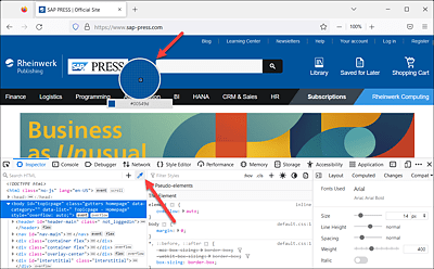
Figure 10.12 Firefox Color Picker
In the Chrome, Edge, and Firefox web browsers, there’s also another useful helper related to the color and CSS.
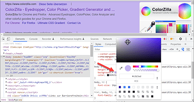
Figure 10.13 Developer Tools: Color Picker Where You Can Change the Colors of Individual HTML Elements
Open the developer tools via (Ctrl)+(Shift)+(I), for example. Then select the HTML element for which you want to see the stylesheet with the color. In the color details of the stylesheet, you’ll find a color plate next to the color value. When you move over it with the mouse pointer, you can switch the different notations by holding the (Shift) key (hex value, color name if available, hsl() value or rgb() value). If, on the other hand, you click on the color plate, a color selection opens in which you can directly change the color value and also determine it. This allows you to experiment with the colors of a web page. The changes are only temporary.
10.3.4 Angular Dimensions in CSS
CSS also defines some angular dimensions that you can use to write rotations. If you use a negative value for these units, which are listed in Table 10.6, the rotation is counterclockwise, converting the negative value to its positive counterpart (-40deg would become 320deg). Positive values are rotated clockwise.
|
UoM |
CSS Name |
Description |
|---|---|---|
|
deg |
Angle in degrees; a complete circle corresponds to 360 degrees, for example: |
|
|
grad |
Angle in gradian (grad), a complete circle corresponds to 400 grad. 100 grad corresponds to a 90° turn, for example: |
|
|
rad |
Angle in radian; a complete circle here corresponds to 2 pi = 6.2831853, for example: |
|
|
turn |
A round angle is a circle rotation (0.25turn corresponds to a 90° rotation; 1 turn = 360°). At the time this book went to press, only Firefox was capable of working with this unit. Example: |
Table 10.6 Different Angular Dimensions in CSS
Time Data
You can also find two time specifications in the CSS specification. The identifiers s for second and ms for millisecond are available for this purpose. For example:
transition-delay: 2s;10.3.5 Passing Values via Short Notation to a CSS Feature
You can use short notations in CSS to bundle some CSS features and write them down in one go. Thus, take a specification such as the following:
.my_article { margin: 25px; }
It is merely a short version of the following:
.my_article {
  margin-top: 25px;     /* Top margin  */
  margin-right: 25px;   /* Right margin */
  margin-bottom: 25px;  /* Bottom margin */
  margin-left: 25px;    /* Left margin  */
}
The CSS feature margin is used for an outer margin or distance between the current element and its parent or adjacent element. We’ll return to that later.
You can use this short notation not only for more than just four of the same properties but also for specifying four different values in a shorter way:
.my_article { margin: 25px 10px 20px 5px; }
This shorter specification is identical to the following:
.my_article {
  margin-top: 25px;     /* Top margin  */
  margin-right: 10px;   /* Right margin */
  margin-bottom: 20px;  /* Bottom margin */
  margin-left: 5px;     /* Left margin  */
}
The only important thing about the short notation is that you know about the clockwise order. Starting from 12 o’clock with top, the order in the clock hand is top, right, bottom, and left.
If the values of left and right are the same, you can use the following:
article { margin: 25px 10px 20px; }
Because the fourth value (left) has been omitted, the value of right gets used instead, making the value of the left and right margins 10 pixels. You can do the same with top and bottom:
.my_article { margin: 20px 10px; }
Here, I’ve specified only two values, so that 20 pixels apply to top and bottom and 10 pixels to right and left. You can also subsequently use the top, bottom, left, or right versions to override the value of the general CSS feature for all four sides, for example:
.my_article {
  margin: 25px;       /* All four side 25 pixels margin */
  margin-left: 0px;   /* Set left margin to 0 pixels */
}
Besides margin, there are other CSS features that are short notations of several CSS features. I’ll describe the individual CSS features in the following chapters, but want to present a few examples already at this point. Without going into detail about the individual functions, the following lines all contain short notations of multiple CSS features:
padding: 20px 30px 10px 20px;
border: 1px solid yellow;
background: orange url('background.jpg') no-repeat left top;
font: bold 16px Arial, Helvetica;
list-style: square inside url(bullet.png);
outline: blue dotted thick;