12.3 Floating Boxes for Positioning via “float”
Another important CSS feature for creating a layout with CSS is float. This feature enables you to take an element out of the usual document flow and place it on the right or left edge of the embracing element. The subsequent elements (without float) flow around this floated element. The CSS feature float was used for years to create layouts for websites. You can certainly still use this technique today, but there are now better techniques available for this, such as flexboxes or the grid layout. The classic example, which is still often used today to demonstrate the CSS feature float in use, is the flowing of text around an image. Let’s first take a look at the following HTML lines:
...
  <body>
    <h1>A report</h1>
    <figure>
        <img src="images/image01.jpg" alt="Placeholder">
        <figcaption>An image</figcaption>
    </figure>    <p>Lorem ipsum dolor ... </p>
    <p>Lorem ipsum dolor ... </p>
    <p>Lorem ipsum dolor ... </p>
  </body>
...
Listing 12.16 examples/chapter012/12_3/index.html
As befits a standard static positioning, the individual elements are arranged one below the other, as you can see in Figure 12.18.
If you apply the CSS feature float with the value left or right to the image, in this case inside the figure element, the text will flow around the image. You can do this via a simple type selector:
...
figure {
  float: left;
  margin: 0 1rem 0 0;
}
...
Listing 12.17 /examples/chapter012/12_3/css/style.css
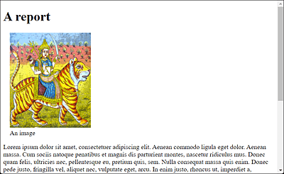
Figure 12.18 The Typical Document Flow with Standard Positioning
This will cause the figure element to float to the left along with the image and caption, while the subsequent elements, here the paragraphs with the p element, flow around the image (see Figure 12.19). The margin feature was only used here so that the text won’t be “glued” too tightly to the image and there’s a small buffer in between.
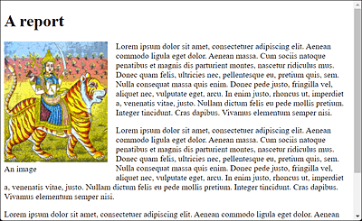
Figure 12.19 The Image Was Floated with “float: left” on the Left, While the Following Paragraphs with the Text Flow around the Image
Besides left and right, you can use the values none (default) and inherit for float. none allows you to specify that the element shouldn’t be floated. With the inherit value, on the other hand, the element inherits the float value of the parent element in which it resides.
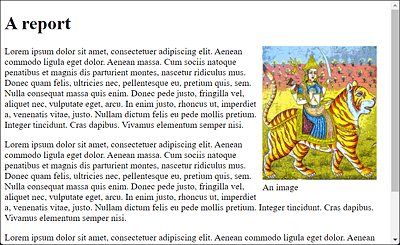
Figure 12.20 Here, the <figure> Element Has Been Set to the Value “right” Using “float”, and Consequently the Image It Contains Is Right-Aligned
Floating elements work only horizontally. The elements can only flow around to the left or to the right, whereas upward or downward movements aren’t possible. In addition, only the elements after a floated element flow around it. Elements that were written before the floated element in the document flow won’t be affected.
Testing a Narrow Viewport
If you use floated boxes, you shouldn’t forget to test the result on a narrower viewport such as a smartphone, especially to make sure that the text is still present next to the image and not displayed as one word per line. That doesn’t look nice, as you can see in Figure 12.21. Here, it would be a good idea to use a smaller image, or you could make the image responsive (which I’ll describe in Chapter 13, Section 13.3.2).
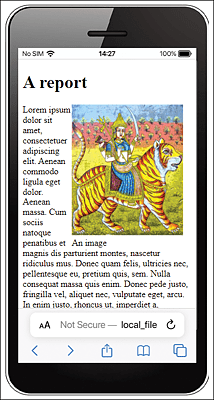
Figure 12.21 Layout No Longer Looks Nice on a 320-Pixel-Wide Smartphone: In Some Places, There’s Only One Word Left in the Line
At this point, it’s still important to know that only the text flows around the image, but not the padding, border, margin, and background features. They remain behind the floated image. You should know this if, for example, you want to use margin on the text to adjust the distance to the image and wonder why this won’t work.
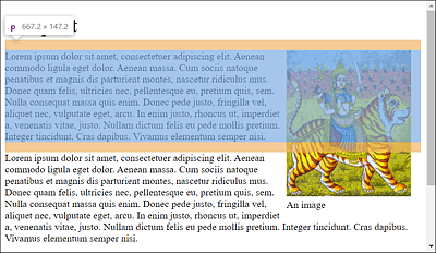
Figure 12.22 The Proof: Only the Text from the “p” Paragraph Element Flows around the “figure” Element with the Image; “padding”, “border”, “margin”, and “background” Remain
12.3.1 Terminating the Float
You’ve certainly noticed in the example with the floated element that the next p element also flows around the image. This is convenient because then you don’t have to worry about it, but that’s not always desired. For example, if you want to start a new paragraph with a new heading in the next paragraph, this will look messy.
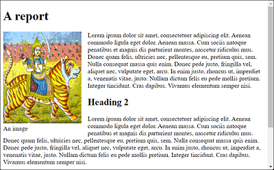
Figure 12.23 The Next Paragraph with the “h2” Heading Also Flows around the Image
You can stop this floating around using the CSS feature clear. The clear feature allows you to disable the floating behavior for the subsequent elements. You can pass the values left, right, both, or none to the CSS feature clear. A clear: left ends a float: left, a clear: right ends a float: right, and a clear: both ends both. For this reason, it isn’t wrong to always use clear: both. The value none is the default value, which you can use if you want the elements to flow around each other again
In the following example, I’ll terminate the float using clear: both;. Because the image is floated around on the left, I could also have used clear: left;.
...
.float-left {
    float: left;
    margin: 0 1rem 1rem 0;
}
.endfloat {
    clear: both;
}
...
Listing 12.18 /examples/chapter012/12_3/css/style2.css
In the sample document, I include the class to stop reflowing in the h2 heading, which stops reflowing exactly at that point and for all subsequent elements, as you can see in Figure 12.24.
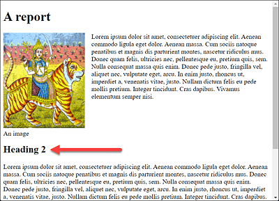
Figure 12.24 From the h2 Heading Onward, the Flow around the Image Will End
Depending on the screen width, however, a gap opens up here.
...
    <h1>A report</h1>
    <figure class="float-left">
        <img src="images/image01.jpg" alt="Placeholder">
        <figcaption>An image</figcaption>
    </figure>
    <p>Lorem ipsum dolor ... </p>
    <h2 class="endfloat">Heading 2</h2>
    <p>Lorem ipsum dolor sit amet ... </p>
...
Listing 12.19 /examples/chapter012/12_3/index2.html
12.3.2 Combining Floats into One Entity
As already shown in Figure 12.22, only the text flows around the image, and the padding, border, margin, and background features remain behind the floated image in the document flow. In the example, the image also protrudes from the parent element. Because further text follows behind it in the example, that didn’t bother me any further. It also isn’t recommended at first if you put everything into a parent element, such as the following:
...
    <header class="head-foot">Header</header>.
    <article class="article-bg">
        <h1>An article</h1>
        <figure class="float-left">
            <img src="images/image01.jpg" alt="Placeholder">
            <figcaption>An image</figcaption>
        </figure>
        <p>Lorem ipsum dolor sit ... </p>
    </article>
    <footer class="head-foot">Footer</footer>
...
Listing 12.20 /examples/chapter012/12_3/index3.html
A clear: left; with the footer would fix the problem for now, but the problem remains when styling the padding, border, margin, and background features, as shown in Figure 12.26. There, a gray background is used for the article element for the purpose of clarity.
There’s a solution to this with display: flow-root;, as this creates a new block for the surrounding element via CSS. If you use display: flow-root; for the article element, the elements it contains are enclosed in a block, resulting in Figure 12.27. Now the thing is that display: float-root; is available to all newer web browsers but not to older browsers. For this purpose, the ancient trick with overflow: hidden; is useful, which also encloses the content in a new block as a side effect.
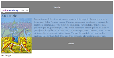
Figure 12.25 The Image Extends from the “article” Element beyond the “footer” Element
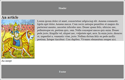
Figure 12.26 Stopping the Float Solves Only Part of the Problem: With the CSS Features “padding”, “border”, “margin”, and “background”, the Image Remains Protruding
An elegant solution to this is the CSS feature query @supports(). It allows you to check whether a browser can handle certain CSS property-value combinations. With regard to our example, this could be implemented as follows:
...
    .article-bg {
        background-color: lightgray;
        overflow: hidden;
    }

    @supports(display: flow-root) {
        .article-bg {
            display: flow-root;
            overflow: initial;
            background-color: lightgray;
        }
    }
...
Listing 12.21 /examples/chapter012/12_3/css/style3.css
First, you set the overflow: hidden; feature in the article-bg class. If the browser doesn’t know the @supports() query, then it simply continues. A browser that knows the @supports() query checks whether it can handle display: flow-root, and, if so, it will use the features inside the statement block where display: flow-root; is set and overflow is provided with initial.
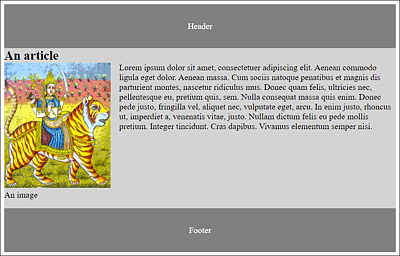
Figure 12.27 Now the Floated “figure” Element inside the “article” Element Has Been Combined into a New Block with the “p” Element