16.10 Adjusting Colors and Brightness
Colors can be specified in Sass as usual in CSS with rgb(), rgba(), hsl(), hsla(), #fff, #ffffff, and of course the CSS keywords for color such as green, gray, red, and so on. In addition, Sass contains functions to adjust the brightness and saturation of colors. I’ve listed some of these functions for you in Table 16.12.
|
Syntax |
Example |
Description |
|---|---|---|
|
lighten(color, [n]%) |
background:lighten($color, 10%); |
Lightens the color by n% |
|
darken(color, [n]%) |
background:darken($color, 10%); |
Darkens the color by n% |
|
desaturate(color, [n]%) |
background:desaturate($color, 30%); |
Reduces the color saturation by n% |
|
saturate(color, [n]%) |
background:saturate($color, 30%); |
Increases the color saturation by n% |
|
background:adjust-hue($color, -90%); |
Changes the hue of the color by n% |
|
|
invert(color) |
background:invert($color); |
Inverts the color |
|
complement(color) |
background:complement($color); |
Creates the complementary color to the specified color |
|
grayscale(color) |
background:grayscale($color); |
Converts the specified color to grayscale |
Table 16.12 Some Useful Sass Functions for Manipulating Colors
The functions are relatively easy to use. To give you an impression, I want to create an example with buttons. In it, I’ll just define a color for the button and adjust the rest using the Sass color-manipulation functions. This way, you only need to change that one color, while you’ve created an entire theme system for a simple button.
The effort of the SCSS example seems at first more extensive than necessary when looking at the CSS code. However, now you’ve also created a great template here that you can use to generate many more buttons in different colors. You just need to create more classes in the style of .my-btn. Especially helpful in this example are the functions for color manipulation when the hover effect is applied and when the button is deactivated. When hovering, the color is merely darkened (darken()) and desaturated (saturate()). If the button gets disabled, it will be lightened (lighten()).
Table 16.13 The SCSS File and the CSS File after the Preprocessor Run
In addition to the color manipulations, the ampersand character & was also placed in front of :hover, .disabled, and .disabled.hover in this example within the selector. The & is very useful when you use a nesting selector. For example, let's look at the following:
.my-btn {
  &.:hover {}
}
The CSS preprocessor turns this into the following:
.my-btn:hover {}
Without the ampersand character &, the CSS preprocessor would do the following:
.my-btn :hover {}
With this, the hover effect would not work. So, if you use the ampersand character inside a nested Sass selector, that selector will be appended to the parent selector instead of getting nested under it. This is especially popular in conjunction with the pseudo-class selectors such as :hover or ::after because they need to be linked to a selector. With the & you can easily reference the parent selectors.
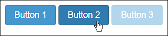
Figure 16.7 The HTML File /examples/chapter016/16_10/index.html during Execution