14.5 Transforming Elements with CSS
With CSS, it’s also possible to change the position of HTML elements using the CSS feature transform. The possible actions are movements via translate(), an enlargement or reduction using scale(), a rotation by means of rotate(), the skewing of elements via skew(), and a distortion with matrix(). These transformations are supported by all currently available web browsers.
Although these transformations can be applied to other HTML elements as well, for demonstration purposes, we’ll use images that have been placed side by side using a flexbox. You can see the starting point for the planned transformations in Figure 14.50.
...
<h1>Transforming images with CSS</h1>
<ul>
    <li>
        <img src="images/image01.jpg" alt="China photography tour 2019">
    </li>
    <li>
        <img src="images/image02.jpg" alt="China photography tour 2019">
    </li>
    <li>
        <img src="images/image03.jpg" alt="China photography tour 2019">
    </li>
    <li>
        <img src="images/image04.jpg" alt="China photography tour 2019">
    </li>
    <li>
        <img src="images/image05.jpg" alt="China photography tour 2019">
    </li>
...
</ul>
...
Listing 14.31 /examples/chapter014/14_5/index.html

Figure 14.50 These Images Are Supposed to Be Transformed When Users Hover over Them (“:hover”)
14.5.1 Scaling HTML Elements via “transform: scale()”
You can enlarge (or reduce) elements using the CSS feature transform and the CSS function scale(). A value of scale(1.0) has no effect. If you use scale(1.25), the element will be enlarged by a factor of 1.25. Similarly, if you specify scale(0.75), an image will be scaled down by a factor of 0.75. The surrounding elements aren’t affected by an enlargement or reduction and remain firmly in position.
Here’s an example in which an image is to be enlarged by a factor of 1.25 when hovering. The results of the following CSS lines are shown in Figure 14.51:
...
img:hover {
  transform: scale(1.25);
}
Listing 14.32 /examples/chapter014/14_5_1/css/style.css

Figure 14.51 The Images Are Enlarged by a Factor of 1.25 When You Move the Cursor over Them (“:hover”)
14.5.2 Rotating HTML Elements Using “transform: rotate()”
When you use rotate(), the respective element gets rotated by a specified number of degrees. The specification is in the form of rotate(15deg), which rotates the element clockwise by 15 degrees. A negative value rotates the element counterclockwise. You can see the result of the following CSS lines in Figure 14.52.
...
.trans a img:hover {
  transform: rotate(15deg);
}
Listing 14.33 /examples/chapter014/14_5_2/css/style.css

Figure 14.52 A Rotation on Mouseover Using “transform: rotate()”
14.5.3 Skewing HTML Elements Using “transform: skew()”
The skew() function can be used to skew an HTML element around the x-axis and y-axis. Here, too, two values are expected as degrees. The first value indicates the skew around the x-axis and the second one around the y-axis. For example, you can use skew(5deg, 10deg) to rotate the element 5 degrees around the x-axis and 10 degrees around the y-axis. You can view the results of the following CSS lines in Figure 14.53.
...
.trans a img:hover {
  transform: skew(5deg, 10deg);
}
Listing 14.34 /examples/chapter014/14_5_3/css/style.css

Figure 14.53 Skewing HTML Elements via “transform: skew()”
Additional Functions via “skewX()” and “skewY()”
If you want to skew an HTML element only around the x-axis or y-axis, the corresponding functions for these actions are skewX() and skewY(), respectively.
14.5.4 Moving HTML Elements Using “transform: translate()”
The translate() function enables you to move elements. For this purpose, you also need to specify two values to indicate by how much you want to move the element along the x-axis and y-axis. A specification such as translate(10px, 20px) moves the element 10 pixels to the right along the x-axis and 20 pixels down along the y-axis. Negative values move the element in the other direction. The following CSS snippet causes the movement shown in Figure 14.54 when you halt the mouse cursor on the image:
Listing 14.35 /examples/chapter014/14_5_4/css/style.css

Figure 14.54 Moving HTML Elements via “transform: translate()”
14.5.5 Combining Different Transformations
It’s possible to combine several functions for the purpose of transforming. To do that, you only need to specify the respective functions separated by a space. Here’s a simple example of this, in which an element gets enlarged by a factor of 1.25 and rotated clockwise by 10 degrees (see Listing 14.36).

Figure 14.55 The Element Was Enlarged and Rotated
Listing 14.36 /examples/chapter014/14_5_5/css/style.css
14.5.6 Other HTML Elements
By the way, the transform functions presented here aren’t limited to images or graphics and can be used for other HTML elements as well. Likewise, you can transform the HTML elements at any time and don’t need to use hovering with the mouse to do so, although this is what people tend to prefer.
In Figure 14.56, for example, the articles were rotated or skewed via the rotate() and skew() functions. Of course, this isn’t always useful, but my point is to show that these functions can be applied to other HTML elements too.
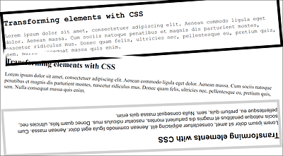
Figure 14.56 Other HTML Elements Can Also Be Transformed. Here, <article> Elements Were Rotated or Skewed (Example in /examples/chapter014/14_5_6/index.html)
Other Functions for Transforming
I haven’t mentioned transform-origin(x, y) yet, which allows you to move the origin point from the element to be transformed.