14.4 Adjusting Images and Graphics Using “width” and “height”
Basically, you already know the CSS features you can use to customize images and graphics with CSS if you’ve read the book from the beginning. You can also set the size of the images using the CSS features, width and height. For example:
...
.large {
    width: 325px;
    height: 267px;
}

.medium {
    width: 225px;
    height: 184px;
}

.small {
    width: 125px;
    height: 103px;
} }
Listing 14.27 /examples/chapter014/14_4_1/css/style.css
For example, with these three classes, you can conveniently output the same image in three different sizes. Instead of width and height, you just need to specify the corresponding class name for the img elements. You can see the result of the following HTML lines in Figure 14.48:
...
    <img src="cover.png" alt="Computer History" class="small" />
    <img src="cover.png" alt="Computer History" class="medium" />
    <img src="cover.png" alt="Computer History" class="large" />

...
Listing 14.28 /examples/chapter014/14_4_1/index.html
You already know how to align images, namely by giving the CSS feature float the value left or right. If you also want to center an image, you merely need to make a block element out of the img element via display: block;, then you can use margin: 0px auto; or text-align: center; to center-align the image. Here are three more classes you can use to align or center images with CSS:
...
  img.align-left {
    float: left;
    margin: 0 0.6em 0.3em 0;
  }
  img.align-right {
    float: right;
    margin: 0 0 0.3em 0.6em;
  }
  img.align-center {
    display: block;
    margin: 0px auto;
  }
Listing 14.29 /examples/chapter014/14_4_1/css/style2.css
Figure 14.48 One and the Same Image Was Put into a Class with the CSS Features “width” and “height” and Used in Different Sizes
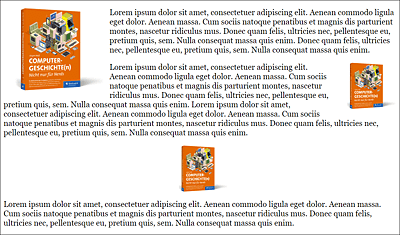
You can combine the classes created in this way with the classes for the appropriate size and have the images output in the appropriate size and orientation for your website in no time at all. You can view the result of the following HTML code in Figure 14.49:
...
  <p>
    <img src="cover.png" alt="Computer History"
         class="align-left medium">
    Lorem ipsum ...
  </p>
  <p>
    <img src="cover.png" alt="Computer History"
         class="align-right small">
    Lorem ipsum ...
  </p>
  <p>
    <img src="cover.png" alt="Computer History"
         class="small align-center">
    Lorem ipsum ...
  </p>
...
Listing 14.30 /examples/chapter014/14_4_1/index2.html