13.5 Changing the Behavior of HTML Elements Using “display”
You’ve used the CSS feature display many times in the examples, so we’ll dedicate a few more paragraphs to it for a brief description. As you’ve seen several times by now, you can use the CSS feature display to change the behavior of an HTML element when it displays in the web browser. For each HTML element, a box is specified that describes the behavior of the element. Even simple HTML elements inside a text line such as <em> or <a> are boxes, and you can change their default behavior via display. This has already been described in greater detail.
You can change the behavior of an HTML element such as <p> by using display: inline; which will no longer executes a line break or paragraph break. Conversely, you can change the behavior of an element such as <a> by using display: block; so that it performs a line break or paragraph break. In addition to the common use of display: block; and display: inline;, display: none; can also be used; this way, you can hide an element so that it no longer takes up any space in the HTML document.
13.5.1 “display: block”, “display: inline”, and “display: inline-block”
display: block; allows you to display an element as a block that contains a line break. This feature is often used in combination with display: inline;, for example, elements for navigation are displayed either with display: block; with a line break between them, or with display: inline; in the same line without a line break from left to right.
For demonstration purposes, the following CSS features will be applied to several p elements in the HTML document:
p {
  display: block; /* Not necessary here, since <p> is display:block anyway */
  width: 150px;
  border: 1px solid black;
  background-color: white;
  padding: 1em;
}
Listing 13.22 /examples/chapter013/13_5_1/index.html
You could do without display: block; in this case because the p element is a block element anyway. These lines of CSS are now to be applied to four paragraph texts with the p element. An example of this is shown in Figure 13.47.
The next example is to use display: inline; instead of display: block;:
Listing 13.23 /examples/chapter013/13_5_1/index2.html
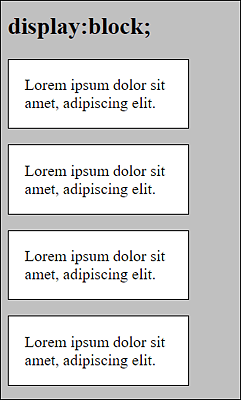
Figure 13.46 The Behavior You Know from the <p> Element
In Figure 13.47, you can already see that due to display: inline;, the specification of width was ignored and has no effect here. Although you can specify inner and outer spacing and borders as usual, these specifications also have no effect on the line height. Thus, an inline box absorbs only the width the content requires. In Figure 13.48, you can see that an inline box can also extend across multiple lines, which isn’t very nice to look at in this case.

Figure 13.47 The Behavior of the <p> Elements Was Set to “display: inline;”
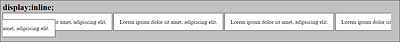
Figure 13.48 “inline” Boxes Can Also Extend across Multiple Lines
Let’s now use the same example with inline block:
p {
  display: inline-block;
  width: 150px;
  border: 1px solid black;
  background-color: white;
  padding: 1em;
}
Listing 13.24 /examples/chapter013/13_5_1/index3.html
An inline-block box initially behaves like an inline box and runs across one line (see Figure 13.49). Unlike the inline box, however, an inline-block box doesn’t continue in the next line but is moved to the next line, similar to float, when the box no longer fits in the screen width, as you can see in Figure 13.50. Unlike inline boxes, what’s also taken into account for inline-block boxes is the width that you specify via width.
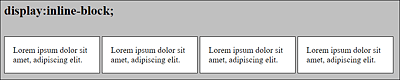
Figure 13.49 Here, I’ve Set the Behavior of the <p> Elements to “display:inline-block;”
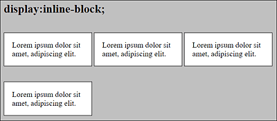
Figure 13.50 An “inline-block” Box Can’t Be Split across Multiple Lines
13.5.2 Hiding Elements Using “display:none”
display: none; allows you to easily hide elements so that they are no longer visible in the document. The web browser doesn’t create a box for such elements, and all positioning statements are ignored. Besides display: none;, you can also hide elements using visibility: hidden;. Unlike display: none;, however, the box gets preserved, and the element retains its effects on subsequent elements. visibility: hidden; allows you to make the element completely transparent.
13.5.3 Further Values for “display”
There are a few more values you can use to change the behavior of elements with display. With display: flex;, you have an alternative model for positioning elements in rows and columns. display: grid;, on the other hand, is even more flexible and allows you to create a more complex layout grid in which you can place any element you want. I’ve already described flex and grid.
Another way to change the behavior of elements with display is table and other table-* features. This allows you to arrange elements as you would in a table and, in practice, theoretically create a layout for a website. But there’s a much better alternative for that: CSS-Grid (display:grid), which enables you to create a responsive layout with only a few CSS rules.
Another value to mention here is list-item, which you can use to represent the item as a list. It creates two boxes for one element. One box is used for the list item and the other box for the list element.
There are yet other values available for display, but those are used rather rarely or were either not implemented properly or never. An overview of the available display values can be found at https://developer.mozilla.org/de/docs/Web/CSS/display.