12.4 Flexible Boxes of CSS
As the topic of responsive web design is becoming increasingly important, the desire for a simpler and better alternative to positioning according to the float principle is getting stronger as well. One of these alternatives is the extremely promising flexbox model. The CSS flexbox is perfect for arranging elements next to or below each other. This is very useful for galleries or links of a navigation, for example, because the CSS flexboxes provide even more options, such as neatly arranging the elements next to each other with a certain spacing, in a certain order, or in a certain size.
The principle of flexboxes is simple and can be quickly explained: You need a parent element in which you set the CSS feature display to flex. This feature affects all child elements contained in it. The parent element that has been given the CSS feature display: flex is also referred to as a flex container. The child items contained in it are the flex items.
12.4.1 Aligning the Flexbox
The CSS feature flex-direction allows you to specify how to align the elements within the flexbox. For a horizontal alignment, you can use the row value, and for a vertical alignment, you can use the column value. If you don’t use the CSS feature flex-direction, then row is the default setting. Thus, the default orientation for the elements of a flexbox is horizontal.
Here’s an example that demonstrates these basic features of flexboxes in use:
      .myarticle {
        width: 300px;
        padding: 10px;
        margin: 0px 5px 5px 0px;
        border: 1px solid black;
        background-color: bisque;
      }
      .mymain {
        width: 90%;
        padding: 10px;
        background-color: sienna;

        display: flex;
        flex-direction: row;
      }
Listing 12.22 /examples/chapter012/12_4_1/css/style.css
...
    <main class="mymain">
      <article class="myarticle">
        <h1>Article 1</h1>
        <p>Lorem ipsum dolor sit amet ...</p>
      </article>
      <article class="myarticle">
        <h1>Article 2</h1>
        <p>Lorem ipsum dolor sit amet ...</p>
      </article>
      <article class="myarticle">
        <h1>Article 3</h1>
        <p>Lorem ipsum dolor sit amet ... </p>
      </article>
    </main>
...
Listing 12.23 /examples/chapter012/12_4_1/index.html
Here, only the mymain class selector was used to set the display type of the parent element <main> to flex and the alignment of flex-direction to row. You can also omit the specification with flex-direction because display: flex is set up for this setting by default. These two specifications cause all child elements contained in the main element (here again, article elements) to be aligned horizontally in the flexbox, which have been colored in gray here for clarity, as you can see in Figure 12.28.
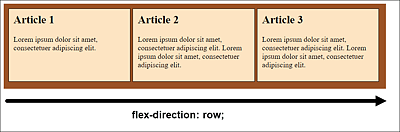
Figure 12.28 Flexbox in Horizontal Direction
If you use the column value for the CSS feature flex-direction instead, the individual elements within the main element will be vertically aligned, which is shown in Figure 12.29.
Sorting in Reverse Order
For the CSS feature flex-direction, you can use the values row-reverse and column-reverse, which will sort and display the contained elements in reverse order. With regard to our example, Article 3 would be displayed first, then Article 2, and finally Article 1. Just try these values out for yourself.
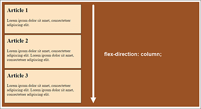
Figure 12.29 Flexbox in Vertical Orientation (/example/chapter012/12_4_1/index2.html)
Wrapping Elements in a Flexbox: “flex-wrap”
The unattractive aspect about the example in /examples/chapter012/12_4_1/index.html is that it doesn’t look nice beyond a certain window width, and the elements end up flowing beyond the surrounding flexbox, as you can see in Figure 12.30.
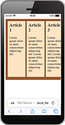
Figure 12.30 At Some Point, the Flexibility of a Flexbox Also Comes to an End
If you want a behavior where the elements wrap to the next row, the flexbox model provides the CSS feature flex-wrap for this purpose. The default value nowrap prevents the elements in the flexbox from wrapping. If you use the wrap value for this, the elements wrap into a new row. Besides nowrap and wrap for the CSS feature flex-wrap, there’s the wrap-reverse value, which you can use to wrap flexible elements to the top.
Following is an example of flex-wrap:
...
.mymain {
  width: 95%;
  padding: 10px;
  background-color: sienna;
  display: flex;
  flex-direction: row;
  flex-wrap: wrap;
}
Listing 12.24 /examples/chapter012/12_4_1/css/style3.css
Figure 12.31 Thanks to “flex-wrap: wrap;” the Elements in a Flexbox Wrap into a New Row (/examples/chapter012/12_4_1/index3.html)
“flex-flow”, the Short Notation for “flex-direction” and “flex-wrap”
With flex-flow there’s a short notation available for flex-direction and flex-wrap. It doesn’t matter in which order you write the values. Let's look at an example specification:
flex-flow: row wrap;
This corresponds to the following notation:
flex-direction: row;
flex-wrap: wrap;
Arranging Elements along the Main Axis: “justify-content”
With reference to Figure 12.28 and the example in /examples/chapter012/12_4_1/index. html, you can arrange the individual elements with the CSS feature justify-content. Possible values for this are flex-start, center, space-between, and space-around, for example:
...
.mymain {
  ...
  display: flex;
  justify-content: center;
}
Listing 12.25 /examples/chapter012/12_4_1/css/style4.css
As you can see in Figure 12.32 for the example in /examples/chapter012/12_4_1/index4. html, justify-content: center; centers all child elements within class selector mymain.

Figure 12.32 You Can Use “justify-content: center;” to Center the Elements
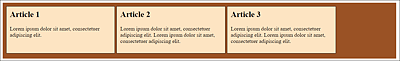
Figure 12.33 “justify-content: flex-start;” Allows You to Arrange the Elements Left-Justified
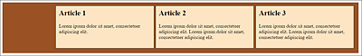
Figure 12.34 “justify-content: flex-end;” Enables You to Arrange the Elements Right-Justified
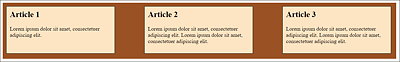
Figure 12.35 “justify-content: space-between;” Makes Sure That the Elements Are Arranged with Equal Spaces In Between: The First and Last Elements Are Located at the Beginning and End of the Line, Respectively
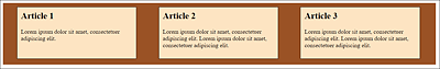
Figure 12.36 “justify-content: space-around;” Ensures That All Elements Are Distributed Evenly
Arranging Elements along the Cross Axis: “align-content”
If you want to arrange elements along the cross axis, you can use the CSS feature align-content. The default value here is stretch. As you can see in Figure 12.29, this distributes all elements evenly. The other possible values for align-content are flex-start, flex-end, center, space-between, and space-around. The meaning of these values is the same as for justify-content, only for the cross-axis. For example, flex-start places the elements at the top, flex-end at the bottom, and center in the middle. space-between ensures an even distribution, with the first element at the top and the last at the bottom. space-around, on the other hand, distributes all elements evenly without treating the first or last element separately. Consider this example.
.myarticle {
  width: 500px;
  padding: 10px;
  margin: 0px 5px 5px 0px;
  border: 1px solid black;
  background-color: bisque;
}
.mymain {
  width: 95%;
  height: 500px;
  padding: 10px;
  background-color: sienna;
  display: flex;
  flex-wrap: wrap;
  align-content: space-between;
}
Listing 12.26 /examples/chapter012/12_4_1/css/style5.css
You can see the example from /examples/chapter012/12_4_1/index5.html in Figure 12.37 during execution. If you want to see the other values flex-start, flex-end, or space-around in use, you just need to change the align-content value in the /examples/chapter012/12_4_1/css/style5.css example accordingly.
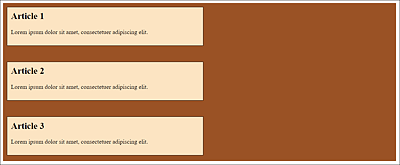
Figure 12.37 With “align-content: space-between;”, the Elements Are Evenly Distributed: The First and Last Elements Are at the Top and Bottom, Respectively
Arranging Individual Elements Differently: “align-self”
If you want to assign a different property to individual elements in the arrangement of flexible elements than the one specified in the parent element, you can use the CSS feature align-self for this purpose. As a default value (auto), the value is taken from the parent element. Otherwise, you’ll also find the values stretch (evenly distribute), center (center), flex-start (top), and flex-end (bottom) with the same result in the arrangement as I described it for align-content. In addition, you’ll find baseline as a possible value, which you can use to align an element to the baseline.
Let’s look at a simple example: You are invited again to experiment with the values of align-self:
.myarticle {
  ...
}
.mymain {
  ...
  display: flex;
  flex-wrap: wrap;
  justify-content: flex-start;
}
.bottom {
  align-self: flex-end;
}
Listing 12.27 /examples/chapter012/12_4_1/css/style6.css
...
    <main class="mymain">
      <article class="myarticle">
        <h1>Article 1</h1>
        <p>Lorem ipsum ... </p>
      </article>
      <article class="myarticle  bottom">
        <h1>Article 2</h1>
        <p>Lorem ipsum ... </p>
      </article>
      <article class="myarticle">
        <h1>Article 3</h1>
        <p>Lorem ipsum ... </p>
      </article>
    </main>
...
Listing 12.28 /examples/chapter012/12_4_1/index6.html
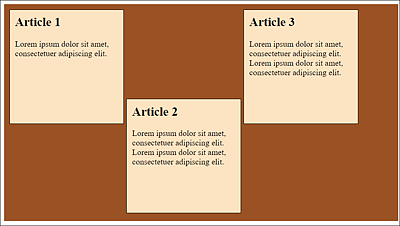
Figure 12.38 Here I’ve Arranged the Middle Article with “align-self: flex-end;” at the Bottom of the Flexbox
12.4.2 Setting the Flexibility of the Flexbox
To set the flexibility of the corresponding elements within the flexbox, you can use the CSS feature flex. The property expects a numerical value. The numbers behave relatively, which means that an element with the specification flex: 4 is four times as flexible as an element with the flex property: 1.
Short Notation for “flex-grow”, “flex-shrink”, and “flex-basis”
The CSS feature flex is a short notation for the other existing CSS features of flexboxes—flex-grow, flex-shrink, and flex-base. Strictly speaking, the specification corresponds to flex: 2 of the specification flex-grow: 2. You can also use the other two values for flex-shrink and flex-base. For example, take the following:
flex: 2 1 30%; /* flex-grow=2 flex-shrink=1 flex-basis=30% */
This specification is a short notation for the following:
flex-grow: 2;
flex-shrink: 1;
flex-basis: 30%;
Using flex-grow, you can control how flexibly the element grows relative to the rest of the elements (when zoomed in). You can specify how far the element shrinks relative to the other elements (when shrinking) using flex-shrink, and you can specify the basic width for the element via flex-basis. Besides percentages, you can use pixels (px), em, or other units. The default value for flex-basis is auto.
The default value of flex in general is 0 1 auto(flex: 0 1 auto).
Here’s an example that demonstrates the CSS feature flex in use:
...
.mymain {
  width: 90%;
  padding: 10px;
  background-color: sienna;

  display: flex;
}
.article01 { flex: 0 0 200px; }
.article02 { flex: 4 1 auto; }
.article03 { flex: 1 3 150px; }
...
Listing 12.29 /examples/chapter012/12_4_2/css/style.css
For the first article element with class selector article01, flex: 0 0 200px; causes the box to have zero flexibility relative to the other elements in the main element when zoomed in and out, respectively. The width of the box is initialized with 200 pixels and, because the two preceding values are 0, can’t change when the window is enlarged or reduced (see Figure 12.39 and Figure 12.40). The HTML document for this can be found in /examples/chapter012/12_4_2/index.html.
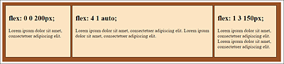
Figure 12.39 Different Values for Flexboxes
In the second article element with class selector article02, the box is four times more flexible than the other boxes when enlarged. When shrinking, the value was set to 1 and the basic width to auto. You could have omitted the auto value because it’s the default value. In Figure 12.39, you can see that this item is always relatively larger than the other items when displayed wider. With a narrower viewport, as in Figure 12.40, this ratio applies only to the third article because the first article allows no flexibility and remains rigid at its 200 pixels.
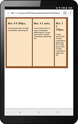
Figure 12.40 Unlike Figure 12.39, a Small Device Was Used
In the last article element with class selector article03, the relative flexibility on zooming was set to 1. When shrinking, on the other hand, this box is three times more flexible than the other boxes. The base value for the width was specified as 150 pixels. If you had used auto here, you would immediately have noticed this threefold flexibility when shrinking, which wouldn’t look nice. In Figure 12.39, the base value of 150 pixels for the width still applies. Nevertheless, the article is already relatively smaller than the second article. For the smaller viewport in Figure 12.40, the effect of having three times the flexibility of the other two items is relatively clear.
The Special Feature of “flex-grow” with Line Breaks
You’ll also find a very interesting and useful feature if you allow a line break with flex-flow: wrap and set the flex-grow feature to 1, for example:
...
.myarticle {
    width: 300px;
    ...
    flex-grow: 1;
}
.mymain {
    width: 95%;
    ...
    display: flex;
    flex-direction: row;
    flex-wrap: wrap;
}
...
Listing 12.30 /examples/chapter012/12_4_2/css/style2.css
If you run /examples/chapter012/12_4_2/index2.html here and use a sufficiently large viewport, all article elements will be aligned side by side in the flexbox. If the viewport is now made smaller and the last article element slides down, the article element will take over the full width of the next line thanks to flex-grow: 1.
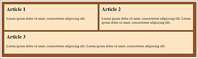
Figure 12.41 If You Allow the Line Break and Use “flex-grow: 1”, the Flex Item Wrapped to the Next Line Will Take the Complete Width of the Line
12.4.3 Determining the Order of the Boxes
Another very nice feature of flexboxes is that you can set the order yourself using the CSS feature order. Here, too, you must use a numerical value. Let’s look at an example:
...
.article01 {  order: 2;  }
.article02 {  order: 3;  }
.article03 {  order: 1;  }
...
Listing 12.31 /examples/chapter012/12_4_3/css/style.css
Here, by order: 1, the third article element becomes the first; due to order: 2, the first article element becomes the second; and order: 3 declares the second article element to be the third. In Figure 12.42, you can see how the order has changed. The HTML document for this can be found in /examples/chapter012/12_4_3/index.html.
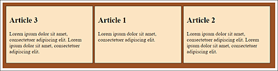
Figure 12.42 You Can Change the Order of the Elements in the Container Element via the CSS Feature “order”
Additional Examples
When you’ve read this chapter, you’ll know the basics of using flexboxes in practice. The main area of use for flexboxes is to arrange elements as neatly as possible next to or below each other. In practice, flexboxes are used for photo galleries, maps, or aligning form elements such as navigation or a contact form, among other things. Simple examples to study and test CSS flexboxes can be found at http://quackit.com/css/flexbox/examples/.