12 CSS Positioning
You’re now familiar with the box model of CSS. However, before you can start creating layouts with CSS, you’re still missing one small important building block. The question is how you can position HTML elements or the boxes with CSS.
Until now, you’ve been used to HTML elements being positioned and displayed in the flow of the HTML document. The elements are displayed one after the other in the order in which they were noted in the HTML code. However, you aren’t limited to such static positioning and can manipulate this using CSS.
There are several ways to perform positioning tasks with CSS. Here’s what you’ll learn in this chapter:
-
Positioning model
Positioning HTML elements using the CSS feature position. -
Stacking model
Stacking HTML elements using z-index. -
Float model
Floating HTML elements with the CSS feature float. -
Flexbox model
Positioning HTML elements with flexible boxes.
12.1 Positioning via CSS Feature “position”
The CSS feature position allows you to determine how and where you position an element and what should happen to the elements following it. In this context, a distinction is made between four possible methods for positioning elements:
-
Static positioning (position: static;)
This is the default setting for all elements, and it gets used if you haven’t written the CSS feature position at all. In the process, all elements are arranged one after the other as usual, as they were written in the HTML document. -
Relative positioning (position: relative;)
This method places or moves an element relative to its current position with the CSS features top, bottom, left, and right and the corresponding value specifications. The other elements won’t get affected by this; that is, the other elements remain in the same position as if the moved element would remain in its original place. -
Absolute positioning (position: absolute;)
You can use this method to drag the element out of the document flow. Here, you can use the CSS features top, bottom, left, and right to place the element absolutely in the nearest parent element or web browser window, regardless of where the HTML element was written in the HTML document. All other elements then act as if the absolutely moved element no longer belongs to the document flow, and any gap thus created is “filled” with the element that follows next, or it moves up. -
Fixed positioning (position: fixed;)
Initially, the fixed positioning behaves like the absolute positioning, but with the clear difference that this fixed position is measured absolutely to the upper-left edge of the web browser window. In practice, unlike the absolute position, this means that a fixed element no longer moves when the web browser window gets scrolled. -
Sticky positioning (position: sticky;)
This function is a hybrid of relative and fixed positioning. The element will initially behave similar to relative positioning, until a certain boundary such as the top or bottom of the screen is reached, where the element will then “stick” and behave similar to fixed positioning.
12.1.1 Normal Positioning (“position: static”)
Unless you’ve specified otherwise, the elements are arranged according to the corresponding box type (block or inline) in the document flow. Basically, you’ve always used the positioning with position: static; in the book so far because this is the default setting. When you use this method, the elements get displayed one after the other in the document flow, that is, as they were written in the HTML document.
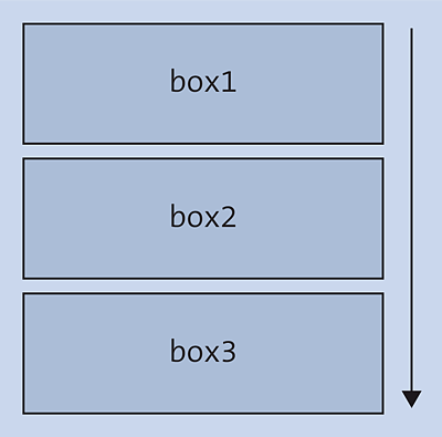
Figure 12.1 Static Positioning with “position: static” as the Default Setting. Each New Element Follows the Other as It Was Written in the HTML Document.
The document flow (often referred to as flow) for block elements (or block boxes) usually starts as far to the top left as possible and is as wide as the surrounding box. The next box starts in the next line. The principle behind this scenario is shown in Figure 12.1. Inline elements (or inline boxes), on the other hand, also start at the top left, but become only as wide as the content. The next inline element gets positioned to the right of it. If there isn’t enough space left on the right-hand side, the element slides to the next line. The question as to why the rather inappropriate keyword static was used here instead of a more appropriate one like flow remains a mystery.
Here’s a simple code snippet for this:
...
.article01 {
  position: static;
  width: 300px;
  padding: 10px;
  border: 1px solid black;
  background-color: sandybrown;
}
.article02 {
  position: static;
  width: 300px;
  padding: 10px;
  border: 1px solid black;
  background-color: bisque;
}
...
Listing 12.1 /examples/chapter012/12_1/css/style.css
...
  <body>
    <header class="foothead">Header</header>
      <article class="article01">
        <h1>Article 1</h1>
        <p>Lorem ipsum dolor sit amet ...</p>
      </article>
      <article class="article02">
        <h1>Article 2</h1>
        <p>Lorem ipsum dolor sit amet ... </p>
      </article>
       ...
    <footer class="foothead">footer</footer>
  </body>
...
Listing 12.2 /examples/chapter012/12_1_1/index.html
In this example, you could have omitted the lines position: static; because this is the default setting anyway. For this reason, there’s nothing surprising in Figure 12.2: The individual elements are displayed one after the other, as written in the document flow.
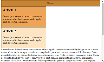
Figure 12.2 Default Static Arrangement according to the Document Flow with the Default Setting “position: static;”
12.1.2 Positioning Elements Using “top”, “right”, “bottom”, and “left”
Before we go into the details of relative, absolute, and fixed positioning, I want to briefly describe the CSS features, top, right, bottom, and left (also referred to as offset properties). As a matter of fact, these four CSS features are also used for the CSS feature position. This way, you can specify whether an absolutely or relatively positioned element starts at the top, right, bottom, and/or left. For a normal positioning with position: static;, specifications with the CSS features top, right, bottom, and left have no effect. In that case, the default orientation is always as far up on the left as possible. Common units for the top, right, bottom, or left values are pixel (px), percent (%), and em.
It makes sense to use one property each of the values top and bottom or left and right. Specifications of top and bottom or left and right are rarely useful in practice, and a second specification is ignored if it doesn’t correspond to the (also allowed) negative value of the first value.
The default value of all four CSS features is auto, which means that the position of the corresponding edges depends on the surrounding elements, or more simply, contains no special starting position.
12.1.3 Relative Positioning (“position: relative”)
Relative positioning moves an element from its current position. No other elements are affected by this move and they remain in the same place, as if the moved element were also still in the same place. Because the other elements aren’t affected, relatively placed elements can overlay other elements.
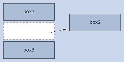
Figure 12.3 Relative Positioning Moves the Element Relative from the Static Position: Subsequent Elements Behave as If the Element Hadn’t Been Positioned
For this purpose, the example from /examples/chapter012/12_1/css/style.css is modified slightly to demonstrate relative positioning:
...
.article01 {
  position: static;
  width: 300px;
  padding: 10px;
  border: 1px solid black;
  background-color: sandybrown;
}
.article02 {
  position: relative;
  top: -75px;
  left: 100px;
  width: 300px;
  padding: 10px;
  border: 1px solid black;
  background-color: bisque;
}
...
Listing 12.3 /examples/chapter012/12_1_3/css/style.css
Here, in the second class selector article02, you’ve set the position to relative using the CSS feature position. This specification now causes the element using this class with class=article02 to move from the current position of top relatively 75 pixels up and from left 100 pixels to the right (see Figure 12.4).
In Figure 12.4, you can see how the paragraph text and all other elements behind the Article 2 element do not get changed in their position. All other elements behave as if the moved element was still in its old place. The example can be found in /examples/chapter012/12_1_3/index.html.
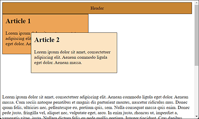
Figure 12.4 Relative Positioning with CSS Offsets the Element with “top”, “bottom”, “right”, and “left” Relative to Itself, and the Gap in the Document Flow Remains
Positive values move the element inward from the corresponding specified edge, while negative values move it outward. You could have achieved the same position via the CSS features, bottom and right:
...
bottom: 20px;
right: -50px;
...
12.1.4 Absolute Positioning (“position: absolute”)
When using absolute positioning, the element gets pulled out of the ordinary document flow. In contrast to relative positioning, all other elements react as if the absolutely shifted element didn’t exist at all. As a result, there’s no longer a gap between the moved and the following elements, as was previously the case with position: relative;. Here, too, the position gets defined with top, bottom, left, and right.
The absolute position here is the upper-left corner of the parent element, which can be positioned using the absolute, fixed, or relative method. If no parent element exists, the position information refers to the top element in the document tree, which is <html>.
In Figure 12.5, you can see that with absolute positioning the element has been moved relative to the enclosing parent element. If there’s no parent element, the element is aligned relative to the viewport, that is, the web browser window.
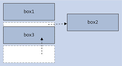
Figure 12.5 Absolute Positioning Moves the Element Relative to the Enclosing Parent Element
In this case, the element is removed from the usual document flow, so that the subsequent elements move up as if there had never been anything in that position.
Take a look at the example with two articles, where the second article element has been positioned via the absolute method:
...
.article01 {
  position: static;
  width: 300px;
  padding: 10px;
  border: 1px solid black;
  background-color: sandybrown;
}
.article02 {
  position: absolute;
  top: 0;
  left: 100px;
  width: 300px;
  padding: 10px;
  border: 1px solid black;
  background-color: bisque;
}
...
Listing 12.4 /examples/chapter012/12_1_4/css/style.css
By specifying absolute in the article02 class selector, the element that uses this class with class=article02 gets completely lifted out of the document flow and is effectively no longer available to the other elements. In the example, the element was moved 0 pixels from the top, that is, not at all, and 100 pixels from the left. The result in Figure 12.6 shows the effect of 0 pixels from the top of the web browser window (or more precisely, the html element) and 100 pixels from the left-hand side of the web browser window.
In addition, you can see that the box is virtually free-floating over the other elements of the web page. The other elements also ignore this box entirely and fill the gap with the element following it in the document flow. In the example, the gap was filled with the following paragraph text by moving it up. The HTML document to run can be found in /examples/chapter012/12_1_4/index.html.
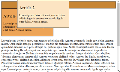
Figure 12.6 The Absolutely Positioned Area Floats Completely Detached above the Web Page
Attention with “position: absolute;” without Width Specification!
If you don’t specify the width of a block and use position: absolute; for positioning, this absolutely positioned element will get displayed with the same width as the content.
In practice, absolute and relative positioning are often combined. A commonly used scenario here is to place a caption over an image, which can be easily done with <figcaption> as the child element and <figure> as the parent element.
...
  <figure>
    <img src="./images/surfer.jpg" alt="Surfer on Snake River" width="400">
    <figcaption>Surfer on Snake River</figcaption>
  </figure>
...
Listing 12.5 /examples/chapter012/12_1_4/index2.html
First, you have to position the parent element <figure> relative to position: relative;. This positioning has no effect yet. <figcaption>, on the other hand, can be lifted out of the document flow using position: absolute;. Once you do that, you can position the caption within <figure> using left, right, bottom, or top—depending on where you want the caption to go. I’ve set left and top to 0 here, which places the caption at the top. If you want to place it at the bottom, you just need to use bottom: 0 instead of top: 0. Here’s the CSS for that (see Listing 12.6).
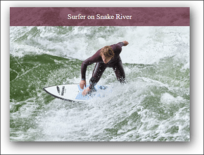
Figure 12.7 Using the Combination of an Absolute and a Relative Position, the Image Caption was Added Here Easily and Quickly
...
figure {
    position: relative;
    width: 400px;
    box-shadow: 4px 6px 22px 1px rgba(0, 0, 0, 0.75);
}

figcaption {
    position: absolute;
    left: 0;
    top: 0;
    width: 100%
    text-align: center;
    color: white;
    background: rgba(100, 28, 52, 0.7);
    padding: 0.75rem;
}
...
Listing 12.6 /examples/chapter012/12_1_4/css/style2.css
12.1.5 Fixed Positioning (“position: fixed”)
Fixed positioning corresponds to the principle of absolute positioning with the absolute value described in the previous section, the only difference being that here an element is fixed and thus no longer scrolled. This way, you practically align the element rigidly to the web browser window (viewport).
Again, you can see in Figure 12.8 how, in the case of fixed positioning, the element is pulled out of the document flow and positioned absolutely, that is, moved relative to the comprehensive element, and the elements following it in the document flow move up. Basically, everything reminds us of absolute positioning; the only difference is that this repositioned element remains fixed and can no longer be scrolled.
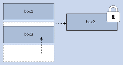
Figure 12.8 For Fixed Positioning, the Element Gets Pulled Out of the Document Flow and Positioned Absolutely. The Only Difference Is That This Element Remains Fixed.
For this purpose, all you need to do is set the CSS feature position from absolute to fixed in /examples/chapter012/12_1_4/css/style.css from the previous section:
...
.article02 {
  position: fixed;
  top: 0;
  left: 100px;
  width: 300px;
  padding: 10px;
  border: 1px solid black;
  background-color: bisque;
}
...
Listing 12.7 /examples/chapter012/12_1_5/css/style.css
At first glance, nothing has changed in Figure 12.9 compared to Figure 12.6. But when you start scrolling the screen, the element set with fixed for the CSS feature position stays in place and doesn’t scroll, as you can see in Figure 12.10. The HTML document to run can be found in /examples/chapter012/12_1_5/index.html.
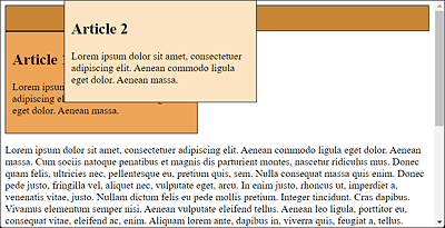
Figure 12.9 At First, Everything Looks the Same with “position: fixed;”
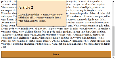
Figure 12.10 When You Start Scrolling the Web Page, the Difference Becomes Obvious Because the Element Won’t Move
In practice, such fixed positioning is suitable, for example, for navigation areas, a fixed header or footer, or a fixed link to the top of the page that is always present at the same position. Here’s a small example, where a link to take visitors back to the top of the document has been placed in a fixed position at the bottom right of the web page:
.up {
  position: fixed;
  bottom: 20px;
  right: 20px;
  padding: 10px;
  border: black 1px solid;
  background-color: orange;
}
Listing 12.8 /examples/chapter012/12_1_5/css/style.css
...
  <body>
      <h1 id="start">Start of page</h1>
      <a href="#start" class="up">Up</a>
      <p> ... </p>
      <p> ... </p>
      <p> ... </p>
  </body>
...
Listing 12.9 /examples/chapter012/12_1_5/index2.html
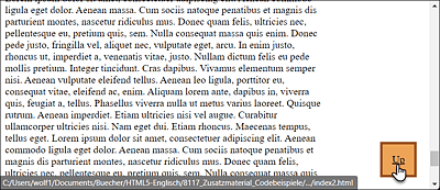
Figure 12.11 With the Fixed Positioning of the “Up” Link at the Bottom Right, You Can Jump Up to the Top of the Page at Any Time
12.1.6 Sticky Positioning (“position: sticky”)
Sticky positioning is a mixture of relative and fixed positioning. When you load the web page, the element behaves like an ordinary element. However, if you use it to hit the edge of the screen when scrolling up or down, the element with position: sticky; will stick there and then behave as with fixed positioning. Let’s look at a simple example:
...
.sticky_h1 {
  position: -webkit-sticky;
  position: sticky;
  top: -1px;
  width: 100%
  background-color: black;
  color: white;
}
Listing 12.10 /examples/chapter012/12_1_6/css/style.css
...
  <body>
    <header class="foothead">Header</header>
      <article class="article01">
        <h1 class="sticky_h1">Article 1</h1>
        <p>Lorem ipsum dolor sit amet ... </p>
      </article>
      <article class="article02">
        <h1 class="sticky_h1">Article 2</h1>
        <p>Lorem ipsum dolor sit amet ... </p>
      </article>
    <footer class="foothead">footer</footer>
  </body>
...
Listing 12.11 /examples/chapter012/12_1_6/index.html
Here, a sticky_h1 class was created for the article headings in an HTML document. The CSS feature position was passed the value sticky. The actual positioning (here, top: -1px) applies once the top of the screen is reached when scrolling down. In the example, you’ll find two longer articles. If you scroll down during this process, the heading will stick to the top of the screen (see Figure 12.13). This continues until you come across the next heading, which in turn makes it stick to the top (see Figure 12.14). This way, you always have the headline of the current article in view. If you scroll the web page all the way up again, this fixation comes off again.
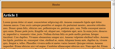
Figure 12.12 The Web Page after Loading: The Headline Is Placed as Usual
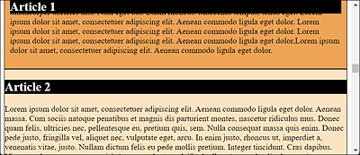
Figure 12.13 When Scrolling Down, the Headline Will Stick to the Top of the Screen Due to “position: sticky;”
A look at https://caniuse.com/#feat=css-sticky shows that at the time this book went into print, support is still beset with some minor problems. However, all modern web browsers can already handle it quite well.
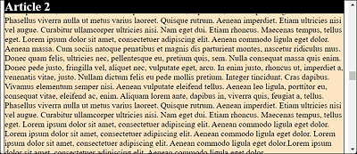
Figure 12.14 The Heading Will Stick until It Encounters Another Heading for Which “position” Also Equals “sticky”