7.5 Other Useful Helpers for Input Fields
This section introduces a few more useful HTML attributes and elements for the input fields. For an initial overview, see Table 7.5.
|
Attribute |
Description |
|---|---|
|
disabled |
Disables input elements |
|
Sets the input element as read only, not editable |
|
|
tabindex |
Presets a tab order when the (Tab) key gets pressed |
|
accesskey |
Determines a shortcut for a form element |
|
<fieldset> |
Groups multiple form elements |
Table 7.5 Useful HTML Attributes and an HTML Element for Input Fields
7.5.1 Disabling Form Elements Using the HTML Attribute “disabled”
You can completely disable a form element using the Boolean HTML attribute disabled. This element is usually displayed in gray or in a paler font to make it clear that it can’t be clicked or edited. This attribute can be used in all form elements such as input fields, dropdown lists, buttons, and radio buttons. Let’s take a look at a simple example:
...
<p>Please select extra options:</p>
<p>
  <input type="checkbox" name="extra" id="c1" value="breakf"
         checked disabled>
  <label for="c1">Breakfast</label><br>
  <input type="checkbox" name="extra" id="c2" value="lunch">
  <label for="c2">Lunch</label><br>
  <input type="checkbox" name="extra" id="c3" value="dinner">
  <label for="c3">dinner</label>
</p>
...
Listing 7.18 /examples/chapter007/7_5_1/index.html
In this example, the checkbox for breakfast has been deactivated. This option isn’t available as an extra, but should still be visible and can’t be deselected. The other two checkboxes, on the other hand, are optional.
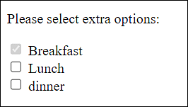
Figure 7.24 The Checkbox for “Breakfast” Has Been Deactivated
7.5.2 Permitting Read-Only for Input Fields Using the “readonly” Attribute
The readonly attribute is also a Boolean standalone attribute and can be used to mark an input field as read only. This attribute is useful for input fields where users should see the content but can’t change it (e.g., taxes, nationality, result of a calculation). This way, you virtually turn an input field into an output field. Although users can no longer edit the field, they can still select its contents and copy it to the clipboard, for example.
7.5.3 Useful Keyboard Shortcuts and Tab Sequence for Input Fields
You can also guide the user by means of the attributes tabindex and accesskey. With the HTML attribute tabindex, you can use the (Tab) key in the HTML form to jump to the individual form elements in the order you specified via tabindex. The form element with the lowest value is jumped to first, followed by the second lowest, and so on to the form element with the highest tabindex value.
The HTML attribute accesskey allows you to specify a keyboard shortcut the visitor can press to jump to a form element. However, the keyboard shortcuts are usually different in each web browser. For example, if you assign accesskey="a" to a form element, you can jump to it by pressing (Alt) + (A) in some web browsers. Other web browsers, in turn, require (Ctrl) + (Alt) + (A), (Ctrl) + (A), or (Alt) + (Shift) + (A).
Let’s take a look at a simple example:
...
<form>
  <label>Text01</label>
  <input type="text"  id="t1" placeholder="Name"
   tabindex="2" accesskey="n"><br>
  <label>Text02</label>
  <input type="email" id="t2" placeholder="Email"
   tabindex="1" accesskey="e"><br>
  <label>Text03</label>
  <input type="text" id="t3" placeholder="Country"
   tabindex="3" accesskey="c"><br><br>
  <input type="submit" tabindex="4">
  <input type="reset" tabindex="5">
</form>
...
Listing 7.19 /examples/chapter007/7_5_3/index.html
Here, the (Tab) key would first jump to the second input field because it has the lowest tabindex value. Pressing the (Tab) key again would lead to the first input field with the tabindex value 2. By pressing the (Tab) key again, you would continue with the third input field, and so on.
You can also access the individual input fields via keyboard shortcuts. With (N), you control the first; with (E), the second; and with (C), the third input field. All of this is to be regarded in relation to the corresponding key combination of your web browser, such as (Ctrl) + (Alt) + (N) in Google Chrome.
7.5.4 Grouping Form Elements Using <fieldset> and <legend>
It can also be very useful to group multiple form elements between <fieldset> and </fieldset>. In between, you can combine multiple form elements into one visual group. Many web browsers frame this area with a line, for example, to make this group visually clear. Nevertheless, the use of <fieldset> isn’t intended for visual formatting, which, as we know, you should never do with HTML elements, but purely for logical grouping. For visual formatting, you should always use CSS. You can also set a heading for this group of elements by using <legend> ... </legend>. Let’s take a look at a simple example:
...
<form>
  <fieldset>
    <legend><h2>Your data</h2></legend>
    <label>Name</label>
    <input type="text"  id="t1" placeholder="Name"><br>
    <label>Email</label>
    <input type="email" id="t2" placeholder="Email"><br>
    <label>Date of birth</label>
    <input type="date" id="t3">
  </fieldset>

  <fieldset>
    <legend><h2>Input</h2></legend>
    <input type="submit">
    <input type="reset">
  </fieldset>
</form>
...
Listing 7.20 /examples/chapter007/7_5_4/index.html
In Figure 7.25, you can see the grouping in the web browser.
Heading in <legend>
Previously, plain text had to be used within a legend element. Since the release of HTML 5.2, heading elements (h1, h2, h3, etc.) can also be placed here. This is useful when you use a group of different sections in a form, which in turn is extremely useful for users who depend on the document outline for navigation.
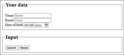
Figure 7.25 A Form with Grouped Form Elements
7.5.5 Progress Display via <progress>
You can use the progress element to define a progress indicator to show the progress of an action such as downloading a file or filling out an HTML form. Figure 7.26 shows such an indicator, which may look different depending on the browser used.
...
<p>
  Progress bar:
  <progress value="33" max="100">Progress: 33%</progress>
</p>
...
Listing 7.21 /examples/chapter007/7_5_5/index.html
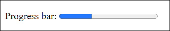
Figure 7.26 Progress Display via <progress>
In practice, you can use the progress element along with JavaScript to visualize the state of a work via the progress bar accordingly. To account for accessibility, the current state of the progress bar should be written between <progress> and </progress>.
The HTML attribute value enables you to specify the number of processed steps, while max indicates how many steps are possible at maximum. The progress bar will be displayed according to these two values. The value of value mustn’t be greater than that of max.
7.5.6 Visualizing Values Using <meter>
Another HTML element you can use to represent values visually is the meter element. The element can be used, for example, to display various measured values. Figure 7.27 shows the meter element in use, which in turn can look different depending on the web browser used.
...
<p>
  <meter value="12" max="100">12 of 100</meter> 12 of 100<br>
  <meter value="0.33">33% of 100%</meter> 33% of 100%<br>
  <meter value="10" min="0" low="25" high="75" max="100">
    20% of 100%
  </meter> 20% of 100%<br>
  <meter value="80" min="0" low="50" optimum="25" high="75" max="100">
    80% of 100%
  </meter> 80% of 100%<br>
</p>
...
Listing 7.22 /examples/chapter007/7_5_6/index.html
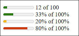
Figure 7.27 Display of Measured Values with <meter>
The meter element is often used together with JavaScript to adjust and visualize a measured value accordingly. Again, for the sake of accessibility, you should write the current measurement value between <meter> and </meter>.
The value attribute enables you to define the current measured value, while max indicates which maximum value is possible. The measured value is visualized according to these two values. The value of value mustn’t be greater than that of max. If no max value is used, this attribute contains the default value 1. Via low, you can set an upper limit of the lower measuring range. The counterpart, which sets the lower limit of the upper measuring range, is high. You can specify an optimum value with optimum; it must be between min and max.