7.4 The HTML Attributes for Input Fields
You’ll also find HTML attributes for the input fields, which helps you to avoid JavaScript validations and to give the user a helping hand with the input. A first brief overview of the attributes can be found in Table 7.4.
|
HTML Attribute |
Description |
|---|---|
|
autofocus |
The field should receive the focus when loading. |
|
autocomplete |
This (de)activates autocompletion of a field or a complete form. |
|
list |
This allows a list of predefined values to be used for input fields. |
|
This allows you to set a maximum or minimum value for the input field. |
|
|
multiple |
Multiple values can be specified in one field. |
|
pattern |
This checks an input against a regular expression passed to pattern. |
|
placeholder |
A text is displayed as a placeholder until the user clicks on the field. |
|
required |
For this attribute, the input field must be filled out so that it can get passed on by the web browser. |
|
step |
This controls the step level for some input fields. |
Table 7.4 Attributes for Input Fields
7.4.1 Setting the Input Focus Using the HTML Attribute “autofocus”
If you pass the autofocus attribute to an input field, the field will immediately receive focus when loaded, for example:
...
<form>
  Text 1 <input type="text" autofocus><br>
  Text 2 <input type="text"><br>
  Text 3 <input type="text">
</form>
...
Listing 7.12 /examples/chapter007/7_4_1/index.html
When this form is loaded in the web browser, the focus is immediately in the first input field, and the user can start typing immediately. However, you should only provide one input field on a web page with this attribute.
7.4.2 (De)activating Autocompletion Using the “autocomplete” Attribute
Almost all current web browsers use some kind of autocompletion for form data. You can use the autocomplete attribute to control whether user input can be saved during the completion process. By default, most web browsers have this service enabled (autocomplete="on"). With autocomplete="off", you can prevent saving the input. By the way, passwords aren’t stored. Here you can either define the attribute in <form>, and the elements it contains inherit the autocomplete status, or you can use the autocomplete status for individual input elements as well.
7.4.3 A List of Suggestions for Using the HTML Attribute “list” and <datalist>
The list attribute for input fields allows you to suggest a list of possible values for the input. You can define such a list in turn using the datalist element. The datalist element gets the list value you set in the input field as id. Let’s take a look at a simple example:
...
<form>
  Title <input list="mylist" name="title"><br>
    <datalist id="mylist">
      <option value="Mr.">
      <option value="Mrs.">
      <option value="Professor">
    </datalist>
</form>
...
Listing 7.13 /examples/chapter007/7_4_3/index.html
Depending on the web browser, you’ll either find a small dropdown menu on the right-hand side of the input field when the field where the suggestions are listed gets the focus. Or a pattern matching the list could be suggested below it during input if autocomplete hasn’t been disabled.
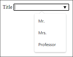
Figure 7.18 A List of Suggestions for the <input> Field
7.4.4 Specifying Minimum and Maximum Values and the Step Size
I’ve already described the HTML attributes min, max, and step several times, for example, when entering numbers with type="number" or the slider type="range", and I’d like to mention them again briefly here. I’ve also shown you, when specifying date and time, that you can use min and max for other values beyond ordinary numbers.
With min or max, you can define the permitted value range for the input type. Thus, the form will never submit a value that’s less than min and greater than max. The step attribute in turn is used to control the step level of the input, for example:
<input type="number" value="50" min="0" max="100" step="5">
Only a value between 0 and 100 can be entered in this input field. The rotating field is incremented or decremented by the value 5.
7.4.5 Selecting or Entering Multiple Values Using “multiple”
The Boolean attribute multiple can be used with <input type="file" multiple> and <input type="email" multiple>, allowing the user to upload multiple files or enter multiple email addresses.
7.4.6 Regular Expressions for Input Fields Using “pattern”
If you want to restrict input using regular expressions, you can do so via the pattern attribute. A classic example is the entry of a five-digit number, as is required in some countries for postal codes. You can formulate such an input field with pattern as follows:
<input type="text" pattern="[0-9]{5}">
The input field is only filled in correctly and transmitted if the pattern that gets entered consists of five digits.
Some input types, such as email, url, or number, already have something like a built-in regular expression built; for them, the web browser checks if the entered format matches the input type. For more commonly used patterns for the HTML attribute pattern, visit http://html5pattern.com.
7.4.7 A Placeholder for an Input Field Using “placeholder”
Another help for the user is placeholder text, which enables you to specify a hint in an input field that disappears when the input field gets the focus, for example:
...
User <input type="text" placeholder="Username"><br>
Password <input type="password" placeholder="Password"><br>
...
Listing 7.14 /examples/chapter007/7_4_7/index.html
Many web browsers set the specified text as a gray placeholder, as shown in Figure 7.19, for example.
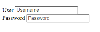
Figure 7.19 The Placeholder in Use
7.4.8 Defining an Input as Required Using the “required” Attribute
The Boolean attribute required is used when an input field must be completed. As long as no input has been made, the web browser won’t submit the form.
7.4.9 Controlling Error Messages for Input Fields
Some HTML elements check for the validity of the input. For example, if you enter an invalid email address for the email input type, the data won’t be sent to the server. Let’s look at a simple example:
...
<form>
  Email <input type="email" placeholder="Email" id="em">
  <label for="em"></label>
  <input type="submit">
</form>
...
Listing 7.15 /examples/chapter007/7_4_9/index.html
If, in this example, you enter an invalid email address and submit the data using the Submit button, you may receive the error message shown in Figure 7.20. However, this message depends on the web browser and operating system and is difficult to change.
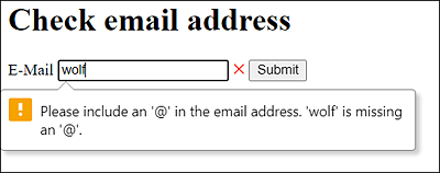
Figure 7.20 The Input Was Invalid
As I just demonstrated with the input type email, other input types such as number, url, or pattern work as well. When the user enters something into such input fields, the web browser recognizes whether the input is valid or invalid. You can format this status using the CSS pseudo-classes :valid and :invalid. In terms of the email address, you could write the following with CSS:
...
<style>
  input[type='email']:invalid + label::after{
    color:red;
    content: " ×";
  }
  input[type='email']:valid + label::after{
    color: green;
    content: " ?";
  }
<style>
...
Listing 7.16 /examples/chapter007/7_4_9/index.html
In this very simple example, a small red “x” will display at the end of the input field during input if the value of the entered email address is still invalid. If the email address is valid, a green check mark will display at the end of the input field. You could have used input:invalid and input:valid here without the input type email, but then all other input fields (if any) would be considered as well. In the example, an empty label element was used to indicate behind the input field with a green check mark or the red “x” whether the input is correct or incorrect.
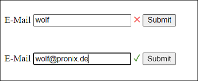
Figure 7.21 Invalid and Valid Email Addresses
The same happens if you’ve provided a field with the attribute required. Again, the error message depends on the operating system and web browser if you submit a form where an input field with required hasn’t been filled out.
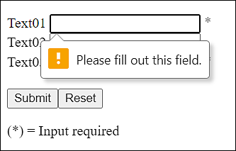
Figure 7.22 The Input Field Was Provided with the “required” Attribute
Again, you can use the CSS pseudo-class :required to style these input fields separately with CSS. A simple example would be to put an asterisk after each of these input fields with the indication that an input in this field is required in any case, for example:
...
<style>
  input:required + label::after{ color: gray; content: " *"; }
<style>
...
<form>
  Text01 <input type="text"  id="t1" required>
  <label for="t1"></label><br>
  Text02 <input type="email" id="t2">
  <label for="t2"></label><br>
  Text03 <input type="email" id="t3" required>
  <label for="t3"></label><br><br>
  <input type="submit"><input type="reset">
</form>
<p>(*) = Input required
...
Listing 7.17 /examples/chapter007/7_4_9/index2.html
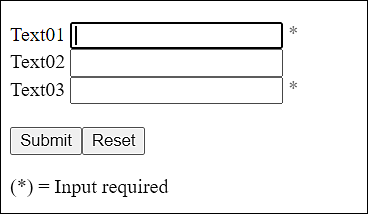
Figure 7.23 An Asterisk Indicates Which Fields Require Input