7.3 Special Types of Input Fields
HTML provides several field types for better input control by the web browser, for example, to specify certain types of data or ranges of values. All new input fields must be written using the <input> tag and the corresponding type attribute. You already know <input type="text"> as a single-line text field or <input type="password">, which is also a single-line text field where the text is hidden.
Table 7.3 lists the HTML input fields in alphabetical order. An example with all types can be found in /examples/chapter007/7_3/index.html.
|
HTML Notation |
Description |
|---|---|
|
<input type="color"> |
Displays a control field with a color selection dialog |
|
<input type="date"> |
Displays a control field for a date specification |
|
Displays a control field for the date, time, and time zone |
|
|
<input type="datetime-local"> |
Displays a control field for date and time without the time zone |
|
<input type="email"> |
Input field for an email address |
|
<input type="month"> |
Field for entering year and month |
|
<input type="number"> |
Text field for the numbers |
|
<input type="range"> |
Text field for a number within a specific range |
|
<input type="search"> |
Input field for the search |
|
<input type="tel"> |
Input field for phone numbers |
|
<input type="time"> |
Input field for the time |
|
<input type="url"> |
Input field for URLs |
|
<input type="week"> |
Input field for the year and calendar week |
Table 7.3 HTML Field Types for Controlled Input
7.3.1 An Input Field for Colors Using <input type="color">
If you use <input type="color">, a user can enter or select a color value via a color selection dialog. To preset the color with a value, you can use the HTML attribute value in the following way:
<input type="color" value="#FF0000">
This way, you’ve defined an input field for colors, which is preset with red color (hex value: #FF0000 = red).
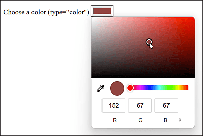
Figure 7.10 The Input Field for Colors in Windows with the Firefox Browser
The Presentation of the New Input Fields Can Vary
Note that the specification doesn’t dictate how web browsers present the various input types. Thus, different web browsers and different systems are likely to mostly use a slightly different user interface of an input field for display.
7.3.2 An Input Field for a Date Using <input type="date">
Finally, <input type="date"> allows you to take users by the hand to query a date. On many websites, you can’t tell exactly whether you should enter DD-MM-YYYY, MM-DD-YYYY, or even YYYY-MM-DD. D stands for day, M for month, and Y for year. The new input type date opens a selection from which the user can choose the date.
Here, too, you can preset the value with value and define the minimum or maximum date specification with min or max. Write the date in the form of YYYY-MM-DD, for example:
<input type="date" value="2023-11-12"
       min="2023-01-01" max="2024-12-30">
This sets an input field for a date that defaults to 11/12/2023. In addition, you restrict a valid selection for the date from 1/1/2023 to 12/30/2024. All other entries are invalid.
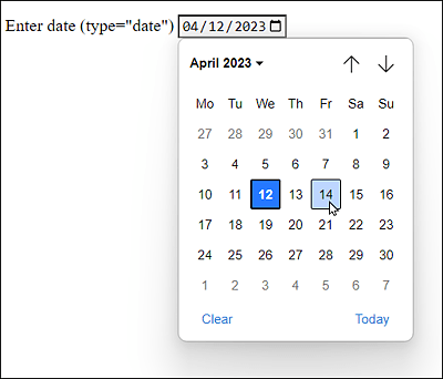
Figure 7.11 The Input Field for a Date in the Chrome Browser
7.3.3 An Input Field for a Time Using <input type="time">
Using <input type="time">, you can enter a time in 24-hour format, which will also be validated. An entry such as 27:15 or 22:61 is thus not possible and is recognized as invalid.
If you want to preset the field with a time, you can use the HTML attribute value, just as you can use the HTML attributes min or max to specify an earliest or latest possible time. This specification must be in the format HH:MM, for example:
<input type="time" value="15:15" min="08:00" max="17:00">
In this example, you’ve set an input field for a time with 15:15. In addition, you’ve limited the time with min and max to 8:00 am and to 5:00 pm, respectively. Everything else is invalid.
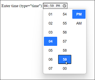
Figure 7.12 Input Field for the Time
7.3.4 Input Fields for Date and Time
You can create a combination of date and time using the input fields <input type="datetime"> or <input type="datetime-local">, where datetime is with time zone specification, and datetime-local is without time zone specification.
You can preset a value here with the HTML attribute value in the format YYYY-MM-DD followed by the capital letter T and the time in the format HH:MM, for example:
<input type="datetime-local" value="2023-11-12T15:15">
This enables you to define an input field for date and time as well as the default with 11/12/2023 at 3:15 pm.
The same is possible with the time zone specification if you set datetime as type. You must define the time zone at the end with either the capital letter Z (for Zulu time) or a specification such as +0100 (Greenwich +1 hour) or -0230 (Greenwich –2.30 hours), for example:
<input type="datetime" value="2023-11-12T15:15+0100">
7.3.5 Input Fields for the Month and the Week
Other date-related input fields are <input type="month"> or <input type="week"> for the input of a month or a calendar week, respectively, including the year. You can also use the HTML attributes value, min, and/or max. You must specify a month in the form YYYY-MM, for example:
<input type="month" value="2023-01">
This allows you to define an input field for a month and the year, presetting the input field with January and 2023.
This works similarly for the input field for the week, where you must use YYYY-WW. A year has a maximum of 52 or 53 calendar weeks, and a week begins on Monday.
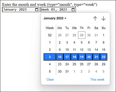
Figure 7.13 Input Fields for the Month and the Week in Use
7.3.6 An Input Field for Searches Using <input type="search">
You can define an input field for a search term using <input type="search">. Visually, such fields are rendered for searches such as ordinary text fields (type="text").
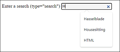
Figure 7.14 Search Input Field
Only when the user starts typing something into the text field does a small “x” appear on the right-hand side of the input field, which enables the user to quickly delete the search term. However, the exact display here also depends on the implementation in various web browsers. In any case, you have a semantic solution for a search input field: <input type="search">.
7.3.7 An Input Field for Email Addresses Using <input type="email">
You can define an input field for email addresses via <input type="email">. When you do this, the web browser will check if the email address has a valid format. For example, you can style this field with the CSS pseudo-classes :valid or :invalid to check whether the entered email address is a valid one, for example:
...
<style>
    input:invalid { background: red; }
    input:valid { background: ivory; }
<style>
...
<input type="email" multiple requried>
In this example, the input field gets displayed in red color (:invalid) if the field doesn’t contain a valid email address. If the entered address is valid, the input field will be displayed in ivory (:valid).
The HTML attribute required is also used very often with this input field because, without this option, an empty field could be submitted to the web server. The HTML attribute multiple also makes it possible to specify more than one email address in the field. The individual email addresses are separated by commas.
Pseudo-Classes “:valid” and “:invalid”
The two pseudo-classes aren’t limited to type="email", but can also be used with other input types. However, I’ve jumped the gun here anyway with CSS regarding a topic I won’t go into more detail until Chapter 8.
7.3.8 An Input Field for a URL Using <input type="url">
You can use <input type="url"> to define an input field for web addresses. As with type="email", the web browser performs a simplified validation of the URL. Other web browsers, on the other hand, list the most recently visited web pages from the history here.
7.3.9 An Input Field for Phone Numbers Using <input type="tel">
<input type="tel"> allows you to define an input field for a phone number. However, no special format is recommended here, nor is there any validation. You aren’t even restricted to enter only digits, and you can also use typical additional characters as in +1-801-123-4567. Smartphones that know this input field display the keyboard for a phone number input at this point. If you really need a specific validation, you must use the pattern attribute to implement it. A great place to start with many ready-made pattern attributes can be found at http://html5pattern.com.
7.3.10 An Input Field for Numbers Using <input type="number">
For a manual input of numbers, you can use the input type <input type="number">. Again, the web browser validates the input to see if it’s a number or not. And again, you can style this field using the CSS pseudo-classes :valid or:invalid, for example, to check whether or not it’s a valid number. Many web browsers display this input field with a spinbox and also the HTML attributes min, max, and step are commonly used. The step attribute enables you to specify by how much the value will increase when you use the rotation field.
Both positive and negative numbers are allowed for input. This also applies to floating point numbers that must be used with a period as the decimal point. The exponential notation with e+, E+, e-, or E- is also allowed.
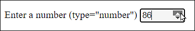
Figure 7.15 An Input Field for Numbers
7.3.11 An Input Field for Numbers of a Certain Range
To implement a slider that can also be used for entering numbers, you can use <input type="range">. Usually, the HTML attributes min, max, and step are used to allow a value in a certain range.
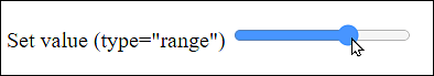
Figure 7.16 A Slider for Entering Numbers
7.3.12 Outputting Values and Calculations Using <output>
The HTML element <output> can be used to output values or the result of a calculation and is something like the counterpart of <input>. Here, we’ll demonstrate the element together with the slider that has been defined using the input element (type="range"):
...
  Adjust slider:
  <input type="range" id="ival" value="50">
  <output id="oval" for="ival">50</output>
...
To demonstrate the output element in practice at all, I had to anticipate a few things here. Without JavaScript, updating the output element is impossible. For this purpose, I added the following JavaScript:
…
   function synchOutput(ev) {
          document.getElementById('oval')
              .value = ev.target.value;
      }
      document.getElementById('ival')
          .addEventListener('input', synchOutput);
…
Via addEventListener(), we virtually listen at the input element with the ID of ival and call the synchOutput() function when a change occurs, as we set the value of the output element with the ID of oval according to the slider. However, this description is strongly abbreviated. JavaScript will be discussed separately later on in this book.
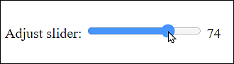
Figure 7.17 The <output> Element Outputs the Current Value of the Slider