7.2 HTML Input Fields for Forms
This section provides an overview of the various classic HTML input fields and the most important attributes for them.
7.2.1 A Single-Line Text Input Field Using <input type="text">
The standalone input element allows you to display a single-line text field where users can enter data via the keyboard. Because you can and will use the input element for many other field types, you should provide it with the type="text" attribute for the single-line text field for clarification (optional). A basic use of <input> for a single-line text input field might look as follows:
...
<form>
Enter your name:
  <input type="text" name="aName" size="30" maxlength="40">
</form>
...
Listing 7.1 /examples/chapter007/7_2_1/index.html
You should use the HTML attribute name for an identifier for each input field, because this name is needed by the PHP script when processing the data to access the entered data of the text field. The name is also very useful when you access the form data with JavaScript. You can use the size attribute to specify the display length in characters and maxlength to specify the actual internally allowed length in characters. You can see the single-line text field in use in Figure 7.1.
If you want to preset the single-line text field with a value and hence visible text, you can do that via the value attribute (e.g., value="John Doe").
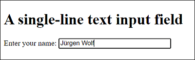
Figure 7.1 A Single-Line Text Input Field
No Line Break
The input element doesn’t create a new paragraph, nor does it break the body text, but gets positioned where you write it.
7.2.2 A Password Input Field Using <input type="password">
If you want to create a single-line text field for passwords, you only need to write type="password" instead of type="text" at the opening <input> tag. This will display the entered characters as asterisks or dots. In HTML, you can create a password field as follows:
Listing 7.2 /examples/chapter007/7_2_2/index.html
Apart from that, everything that has already been described for the text field applies here as well. You can see the single-line password field in Figure 7.2.
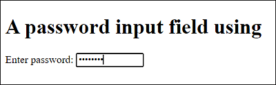
Figure 7.2 A Single-Line Text Input Field for Passwords
Of course, you should be aware that a single-line password field doesn’t get encrypted and can only serve as a protection against screen readers. The entered password itself is transmitted over the internet via HTTP without encryption in clear text. For encrypted communication between the web browser and the web server, HTTPS must be used, and the web server must support this protocol.
7.2.3 A Multiline Text Input Field Using <textarea>
If you need a text field with multiple lines for messages, comments, feedback, or similar, you can use <textarea>...</textarea> for that. If you write text between <textarea> and </textarea>, the multiline text field will be prepopulated with that text. If, on the other hand, you don’t want any prepopulated text, you should leave the area in between empty. With HTML, you can write such a multiline text field as follows:
...
<form>
Your message:
  <textarea  name="txt" rows="15" cols="50" maxlength="2500">
    Enter your message here ...
  </textarea>
</form>
...
Listing 7.3 /examples/chapter007/7_2_3/index.html
In addition, for the multiline text field, you should use the name attribute for an identifier because this identifier is needed by the PHP script to access the entered data for processing. The name is also very useful for accessing this data with JavaScript. You can specify the number of displayed rows of the multiline text field using the rows attribute and the number of characters per row with the cols attribute. It can also be useful to limit the number of characters to be entered with the HTML attribute maxlength. You can see such a multiline text input field in Figure 7.3.
By default, the text gets automatically wrapped at the end of the text input field in the next line. The wrap is purely visual and doesn’t get sent with the data, unless the user really pressed the (Enter) key. You can change this behavior via the HTML attribute wrap. If you change the default setting of the wrap="soft" attribute to wrap="hard", the text will no longer wrap automatically. If the number of characters entered is wider than cols, a crossbar will be inserted to scroll sideways. Pressing (Enter) again will cause a line break.
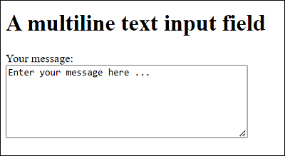
Figure 7.3 A Multiline Text Input Field
7.2.4 A Selection List or Dropdown List Using <select>
You can formulate a selection list or dropdown list where users can choose from different entries via <select>...</select>. The individual options to be selected must be written between <select>...</select> with <option>...</option>. Here’s an example with three different selection lists:
...
<form>
  <p>
  Example 1:<br>
  <select name="topic1">
    <option value="val1">HTML</option>
    <option value="val2" selected>CSS</option>
    <option value="val3">JavaScript</option>
    <option value="val4">React</option>
  </select>
  </p>
  <p>
  Example 2:<br>
  <select multiple name="topic2" size="4">
    <option value="val5">HTML</option>
    <option value="val6" selected>CSS</option>
    <option value="val7">JavaScript</option>
    <option value="val8" selected>React</option>
  </select>
  </p>
  <p>
  Example 3:<br>
  <select multiple name="topic3" size="6">
  <optgroup label="Group 1">
    <option value="val9">HTML</option>
    <option value="val10">CSS</option>
  </optgroup>
  <optgroup label="Group 2">
    <option value="val11">JavaScript</option>
    <option value="val12">React</option>
  </optgroup>
  </select>
  </p>
</form>
...
Listing 7.4 /examples/chapter007/7_2_4/index.html
You can see all three options in Figure 7.4. In the first example, a classic dropdown list is displayed where one item is visible and can be selected. In the second example, four entries are displayed at once because of size="4". The default setting is size="1", which is used to display a dropdown list like in the first example. The last example also shows how to group entries by writing the corresponding group via option elements between <optgroup label="label">...</optgroup>. The label attribute contains the label for the group.
Again, you should use the name attribute in the opening select element for the selection lists. If you want to preselect an option, you can do so using the HTML attribute selected. If you also want to allow holding down the (Ctrl) or (Shift) key to select multiple options, you need to write the HTML attribute multiple in the opening select element. If you use a value for value, this value will be transferred to the web server in the name-value pair. If, on the other hand, you don’t use the value attribute in the option element, the element content that you’ve written between <option> and </option> will be transferred as the value.
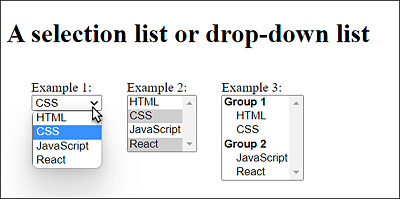
Figure 7.4 Dropdown and Selection Lists in HTML
7.2.5 Creating a Group of Radio Buttons Using <input type="radio">
Radio buttons can also be implemented via the input element. To do this, you need to specify type="radio" in the opening <input> tag. Here’s a small example of how you can use radio buttons in HTML:
...
<form>
  <p>Please select a room:</p>
  <p>
    <input type="radio" name="room" value="budget">Budget<br>
    <input type="radio" name="room" value="standard" checked>Standard<br>
    <input type="radio" name="room" value="deluxe">Deluxe
  </p>
</form>
...
Listing 7.5 /examples/chapter007/7_2_5/index.html
You should provide each radio button with the name attribute. The radio buttons with the same name belong to a group from which the user can select a value, which is usually the purpose of radio buttons. You can use value to specify the value that will be sent to the web server along with the name attribute. If you want to preselect a selection, you can do so using the standalone attribute checked.
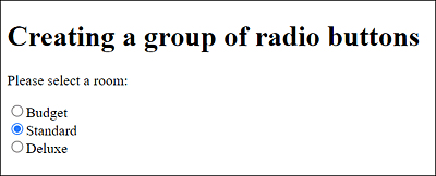
Figure 7.5 Radio Buttons in HTML
7.2.6 Adding a Text Label Using <label>
Between <label> and </label>, you can use a simple text label without any special formatting. That’s nothing special at first, but you can use a label element to make it easier for the user to operate other elements such as radio buttons or checkboxes. For example, if you’ve created a radio button as in Figure 7.5 and want to select it, you have to click exactly on the small radio button. You can make this a bit more comfortable and easier for the user by linking the for attribute with the label element in the case of the radio button. This allows you to select the radio button by clicking on the text label. In practice, you can do this as follows:
...
<form>
  <p>Please select a room:</p>
  <p>
    <input type="radio" name="room" id="r1" value="budget">
    <label for="r1">Budget</label><br>
    <input type="radio" name="room" id="r2" value="standard">
    <label for="r2">Standard</label><br>
    <input type="radio" name="room" id="r3" value="deluxe">
    <label for="r3">Deluxe</label>
  </p>
</form>
...
Listing 7.6 /examples/chapter007/7_2_6/index.html
7.2.7 Using Checkboxes via <input type="checkbox">
Checkboxes can also be displayed via the input element if you use type="checkbox". Unlike radio buttons, checkboxes allow you to select more than one option. You can create such checkboxes in HTML as follows:
...
<form>
  <p>Please select extra options:</p>
  <p>
    <input type="checkbox" name="extra" id="c1" value="breakf">
    <label for="c1">Breakfast</label><br>
    <input type="checkbox" name="extra" id="c2" value="lunch">
    <label for="c2">Lunch</label><br>
    <input type="checkbox" name="extra" id="c3" value="dinner">
    <label for="c3">dinner</label>
  </p>
</form>
...
Listing 7.7 /examples/chapter007/7_2_7/index.html
Again, each checkbox should have a name attribute with an internal identifier name. You can use value to specify the value that will be transferred to the web server when the form is submitted. Figure 7.6 shows the checkboxes in use.
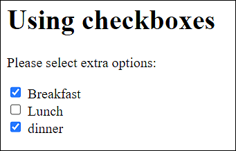
Figure 7.6 The Checkboxes in Use
7.2.8 Using Fields for File Uploads via <input type="file">
If you need a field for a file upload, the input element is again the first choice. For this purpose, you must use type="file". The web browser usually generates a button that, when clicked, displays the local file selection dialog box. Here’s an HTML example of such a file upload:
...
<form method="post" enctype="multipart/form-data">
  <p>Select file:
    <input type="file" name="image" accept="image/*">
  </p>
</form>
...
Listing 7.8 /examples/chapter007/7_2_8/index.html
If you want to determine not only the file name of the selected file, but the entire file or the contents of the file, you must use method=”post” and enctype=”multipart/form-data” with the form element. Otherwise, you should also use the name attribute for an identifier name here. You can also use the accept attribute to allow only certain file types to be uploaded. In the example, image/* stands for graphics. However, this is merely a filter for the file selection dialog box. In practice, it’s still recommended to check the file format on the web server because the accept specification isn’t strictly followed by every web browser.
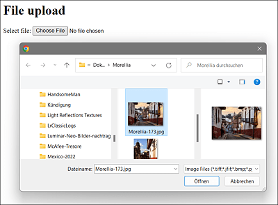
Figure 7.7 The File Upload Dialog Box during Execution
7.2.9 Overview of Various Buttons
Buttons can either be implemented via the button element (e.g., <button>name </button>), or you can use the two classic options with the input element and type="reset" or type="submit". The reset button (<input type="reset">) resets the contents of the form fields within the form to the initial value it contained when the web page was called. The submit button (<input type="submit">), on the other hand, submits the form and sends the entered data to the URL specified with the action attribute in the form element. Here’s a blank HTML example that demonstrates all three forms of a button:
...
<form>
  Your message:<br>
  <textarea  name="txt" rows="15" cols="50" maxlength="2500">
    Enter your message here ...
  </textarea><br>
  <input type="submit" value="Submit" style="width: 80px;">
  <input type="reset" value="Cancel" style="width: 80px;">
  <button type="button">Clickable button</button>
</form>
...
Listing 7.9 /examples/chapter007/7_2_9/index.html
You can see the HTML buttons in Figure 7.8.
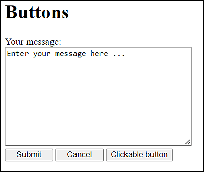
Figure 7.8 Buttons in HTML
It’s also possible to create the submit or reset button with the button element instead of the input element by setting the corresponding attributes there with type="submit" or type="reset", respectively.
Likewise, you can create a button for scripting with <input type="button">. You must specify the name for the button with the value attribute, as is the case with the Submit and Reset buttons. The advantage of <button type="button">... </button> over the standalone <input type="button> is that you can use other HTML code between <button> and </button>, which can also be a graphic link.
7.2.10 Using a Hidden Input Field via <input type="hidden">
If you want to include data in a form that isn’t visible to users, you can use hidden input fields for this purpose. This is quite useful, for example, to send along additional information or values, or the data calculated or added with JavaScript when sending. For this purpose, too, you can use the input element with the type="hidden" attribute, for example:
<input type="hidden" name="subtotal" value="399">
You can specify the data you want to send using the HTML attribute value. The identifier for accessing this value of the hidden input field on the web server must be passed along with the name attribute.
7.2.11 Writing Form Fields outside of <form>...</form>
You also can write the individual form fields that have been combined into a related form not only inside the related boundary of <form> and </form> but also outside the related form element. It doesn’t take much to do that. You only need to use the global id attribute in the opening form element. HTML input fields for forms that you write outside of the associated <form> and </form> require the form attribute along with the id name you wrote in the opening form element.
...
<form id="form1" method="post" action="/test.php">
    Subject: <input type="text" name="subject"><br>
    Your message:<br>
    <textarea  name="txt" rows="15" cols="50" maxlength="2500">
      Enter your message here ...
    </textarea><br>
</form>
...
<p>
  <input type="submit" value="Submit" style="width: 80px;"
   form="form1">
  <input type="reset" value="Cancel" style="width: 80px;"
   form="form1">
</p>
...
Listing 7.10 /examples/chapter007/7_2_11/index.html
7.2.12 Multiple Submit Buttons for Different URLs
It’s also possible to set up multiple submit buttons for a form, so that the form can be submitted with different URLs. For these purposes, two new attributes for input fields of type submit and image have been added with formaction and formmethod, which override the attributes action and method in the opening form element, if those have been written there.
formaction allows you to specify the URL that will be called when the submit button is pressed and to which the form data should be submitted. formmethod is the HTTP request method that should be used to send the data to the server for processing, that is, either GET or POST. The meaning of the two attributes corresponds to the action and method attributes in the opening form element, except that each submit button may have its own formaction and formmethod attribute with different values.
Here’s a simple theoretical example:
...
<form>
  <label for="email">Messages received: </label>
  <input type="email" name="mail" id="email" required>
  <input type="submit" value="for HTML"
   formaction="/scripts/subscribe-html.php"
   formmethod="post">
  <input type="submit" value="for CSS"
   formaction="/scripts/subscribe-css.php"
   formmethod="post">
</form>
...
Listing 7.11 /examples/chapter007/7_2_12/index.html
Instead of action and method in the opening form element, you’ve written formaction and formmethod twice each in the input field of type submit. If you enter an email address here, you can subscribe to either a newsletter for HTML or for CSS news. Either of the two buttons calls a different script.
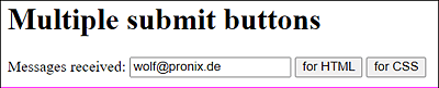
Figure 7.9 Two Submit Buttons, Each Calling Different URLs
Other HTML Attributes
In addition to the HTML attributes formaction and formmethod for the submit button, there are formenctype (corresponding to enctype) for the encoding type and formtarget (corresponding to target) for the target window. In addition, the HTML attribute formnovalid (corresponding to novalidate) can be used as a standalone attribute; this way, you can make sure the input fields won’t get validated when submitted.