11.6 Extending React
Even if you limit yourself to just the basic features of React covered in this chapter so far, you can create reasonably complex single-page applications. But what makes React such a popular development technology is the breadth and diversity of available component libraries. To make use of a library, the developer simply needs to install the package using npm. This section will begin by looking at two component categories that are integral to most React applications
11.6.1 Routing
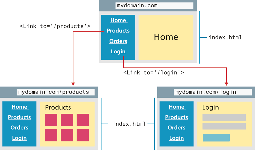
React Router is a package that allows a developer to configure routes. What is a route? In normal HTML, you use hyperlinks (anchor tags) to jump from page to page in your application. But in a single-page application, there is only one page. Using React Router, you can turn links to different pages into links to display different React components. Because users may still wish to make use of bookmarks, React Router will update the path in the browser address bar, as shown in Figure 11.16.
Figure 11.16 React routing in action
React Router, like any component library for React, can be added to your project simply by installing it using npm. For React Router, you can do so via the following command in the terminal:
npm install react-router-domThe React Router package includes quite a few components, but you can get a good sense of how to use it by looking at just three: <BrowserRouter>, <Route>, and <Link>.
To begin, let’s assume you have the following menu component:
const Menu = () => {
  return (
    <ul className="menu">
      <li><a href="home.html">Home</a></li>
      <li><a href="products.html">Products</a></li>
      <li><a href="login.html">Login</a></li>
    </ul>
  );
};
This component still has regular HTML hyperlinks which need to be replaced with routes. To do so, replace the hyperlinks with <Link> elements as shown in Figure 11.16 and Listing 11.10; the to attribute is used to indicate the destination route.
Listing 11.10 Replacing hyperlinks with <Link> elements
import { Link } from 'react-router-dom';

const Menu = () => {
  return (
    <ul className="menu">
      <li><Link to="/">Home</Link></li>
      <li><Link to="/products">Products</Link></li>
      <li><Link to="/login">Login</Link></li>
    </ul>
  );
};
You now need to tell React what component to display when one of these links is clicked on by the user. You do this using the <Route> element, typically within the parent component that will be hosting the different route destinations. Listing 11.11 demonstrates some of the different ways that a parent component can use the <Route> element to indicate what component should be rendered for the links indicated in Listing 11.10.
Listing 11.11 Specifying components to render for different routes
import { Route } from 'react-router-dom';
import Home from './components/Home';
import Dialog from './components/Dialog';
import LoginForm from './components/LoginForm';
import ProductList from './components/ProductList';

const App = () => {
  ...
  return (
    <main>
       <Menu />
       <Route path="/" exact component={Home} /> <Route path="/home" exact component={Home} />
       <Route path="/login" exact
              render= { () => <Dialog>
                                 <LoginForm />
                              </Dialog> } />
       <Route path="/products" exact >
          <ProductList list={products} />
       </Route>
    </main>
  );
}
In the first two uses of Route in Listing 11.11, the link is to an already-defined component. It is also possible to link to a component "created" either via the render attribute (as shown in the third example in Listing 11.11) or as a child element of Route (as shown in the final example). Finally, you will need to wrap this parent component within a <BrowserRouter> in order to keep the routing paths in sync with the browser location bar:
ReactDOM.render(<BrowserRouter><App /></BrowserRouter>,
     document.getElementById('root'));
11.6.2 CSS in React
There are several ways of working with CSS in React. You can continue working with CSS in the familiar manner of using an external CSS file brought in via a <link> element in the <head>. It is also possible to define separate CSS files at the component level (e.g., Header.css used by Header.js) which are then imported, as shown in the following example:
import React from 'react';
import './Header.css';

function Header = props => { ... }
While this looks like the styles defined within Header.css are local to this component, they are not. All the styles defined within Header.css will be merged by the build tool into a single global CSS file. This means it is possible for a class in one CSS file to overwrite an identically-named class in another CSS file.
Due to this drawback, some React developers prefer to use a different approach, one usually referred to as CSS-in-JS. With this approach, styles are defined and applied using CSS syntax but within JavaScript. Perhaps the two most popular of these approaches are the styled-components library and the emotion library.
The styled-components library uses tagged template literals, which we haven’t yet used in this book. Essentially, a tagged template literal is a syntax for calling a function that is passed a template literal. The template literal in this case is a set of CSS rules; the styled functions return a component, and will pass on attributes (such as src and alt) to the underlying HTML element. Listing 11.12 illustrates how styled components can be used. Interestingly, behind-the-scenes, the styled-components library constructs a CSS class with a unique identifier for each set of defined styles. This way you get the benefit of componentizing your styles but don't have to worry about accidentally overwriting your style definitions.
Listing 11.12 Using styled components
import React from 'react';
import styled from 'styled-components';

const ThumbImage = styled.img`
  width: 100px;
  height: 100px;
`;
 const PhotoButton = styled.button`
   padding: 5px;
   font-size: 0.75em;
   border-radius: 3px;
   margin: 0 0.5em;
   min-width: 2.5em;
`;
const PhotoThumb = props => {
   const imgURL = '...';
   return (
      <div>
         <figure>
            <ThumbImage src={imgURL} alt={props.photo.title} />
         </figure>
         <div>
            <h3>{props.photo.title}</h3>
            <P>{props.photo.location.city},
                 {props.photo.location.country}</P>
            <PhotoButton>View</ PhotoButton> <PhotoButton>❤</PhotoButton>
         </div>
      </div>
    );
}
export default PhotoThumb;
11.6.3 Other Approaches to State
Throughout this chapter on React, you have the use of the state feature of components as a mechanism for maintaining changes to data. But as you saw in section 11.3.5, because of the one-way data flow from parents to children, using state in React typically requires the upper-most parent component to house the state variables and all behaviors that can modify this state. This prop-drilling tends to dramatically reduce the encapsulation of React child components, since they become dependent on their ancestors to pass in the data and behaviors they need as props. The props-drilling approach can also be awkward when they are many components in an application that needs access to the same data.
As a consequence, many React developers decide to make use of some other React library for their application’s state. This section will take a brief look at two approaches: the built-in Context Provider in React and the popular third-party React Redux library.
Context Provider
With the release of React Hooks in 2019, the useContext() hook provides a way to centralize data state into a single location known as a context which is available to both functional and class components. At first this approach might seem a little complicated, but in comparison to React Redux, it’s actually pretty straightforward.
The first step is to create a context provider: each bit of centralized state will have its own provider. Listing 11.13 illustrates a context provider for a favorites list. The context provider wraps any number of children components: those children will have access to the data specified by the value attribute (in this case the favorites list and the method for changing it). In other words, the context provider component provides access to the state that is stored in the context object (in Listing 11.13, the variable FavoriteContext), and children of this component will be able (eventually) to access this state. Notice that both the context and the provider must be exported.
Listing 11.13 Defining a context provider
import React, {useState, createContext } from 'react'

// create the context object which will hold the state
export const FavoriteContext = createContext();

// create the object which will provide access to this context
const FavoriteContextProvider = (props) => {
  const [favorites, setFavorites] = useState([]);

  return (
    <FavoriteContext.Provider value={{favorites, setFavorites}} >
        {props.children}
    </FavoriteContext.Provider>
  );
};
export default FavoriteContextProvider;
Once defined, the provider will wrap any child elements that need access to the context state. For instance, an App parent component would use this context as follows:
import FavoriteContextProvider from './contexts/FavoriteContext.js';
...
function App() {
...
return (
<FavoriteContextProvider>
<Header />
<ArtBrowser paintings={paintings}/>
</FavoriteContextProvider>
);
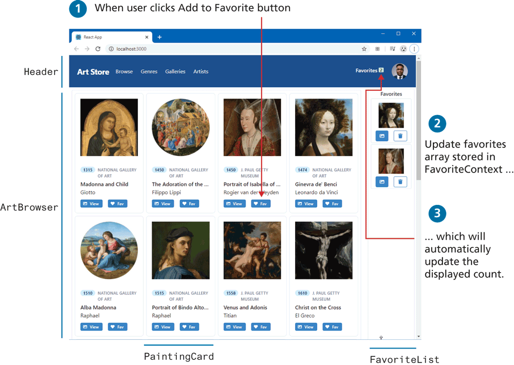
}Now both the Header and the ArtBrowser components (and their children) will have access to the favorite data without the need to pass it via props drilling. Listing 11.14 demonstrates how the Header component displays the current count of the favorites and how the PaintingCard component can update that data. Figure 11.17 illustrates the result in the browser.
Listing 11.14 Using the Context Provider
import React, {useContext} from "react";
import { FavoriteContext } from '../contexts/FavoriteContext.js';
...
const Header = props => {
  const { favorites } = useContext(FavoriteContext);
  ...
  return (
    ...
    Favorites <span>{favorites.length}</span>
    ...
  );
}
const PaintingCard = props => {
  // we are also going to need the setter
   const { favorites, setFavorites } = useContext(FavoriteContext);
  ...
  // function that modifies the context (adds item to favorites)
  const addFav = () => {
      // make sure not already in favorites
      let f = favorites.find( f => f.id === p.paintingID);
      // if not in favorites then add it
      if (! f) {
        const newFavs = [...favorites];
        newFavs.push({id: p.paintingID,
                      filename: p.imageFileName,
                      title: p.title});
        setFavorites(newFavs);
      }
  }
  return (
    ...
    <Button onClick={addFav} >Fav</Button>
    ...
  );
}
Figure 11.17 Context provider in action
React Redux
The Context Provider approach is relatively new to React. Prior to it, most React developers used the third-party React Redux library for centralized state management. If you look for online resources for learning Redux, you will find that there are entire video courses or books just on Redux, so here in this section we can provide only a synopsis.
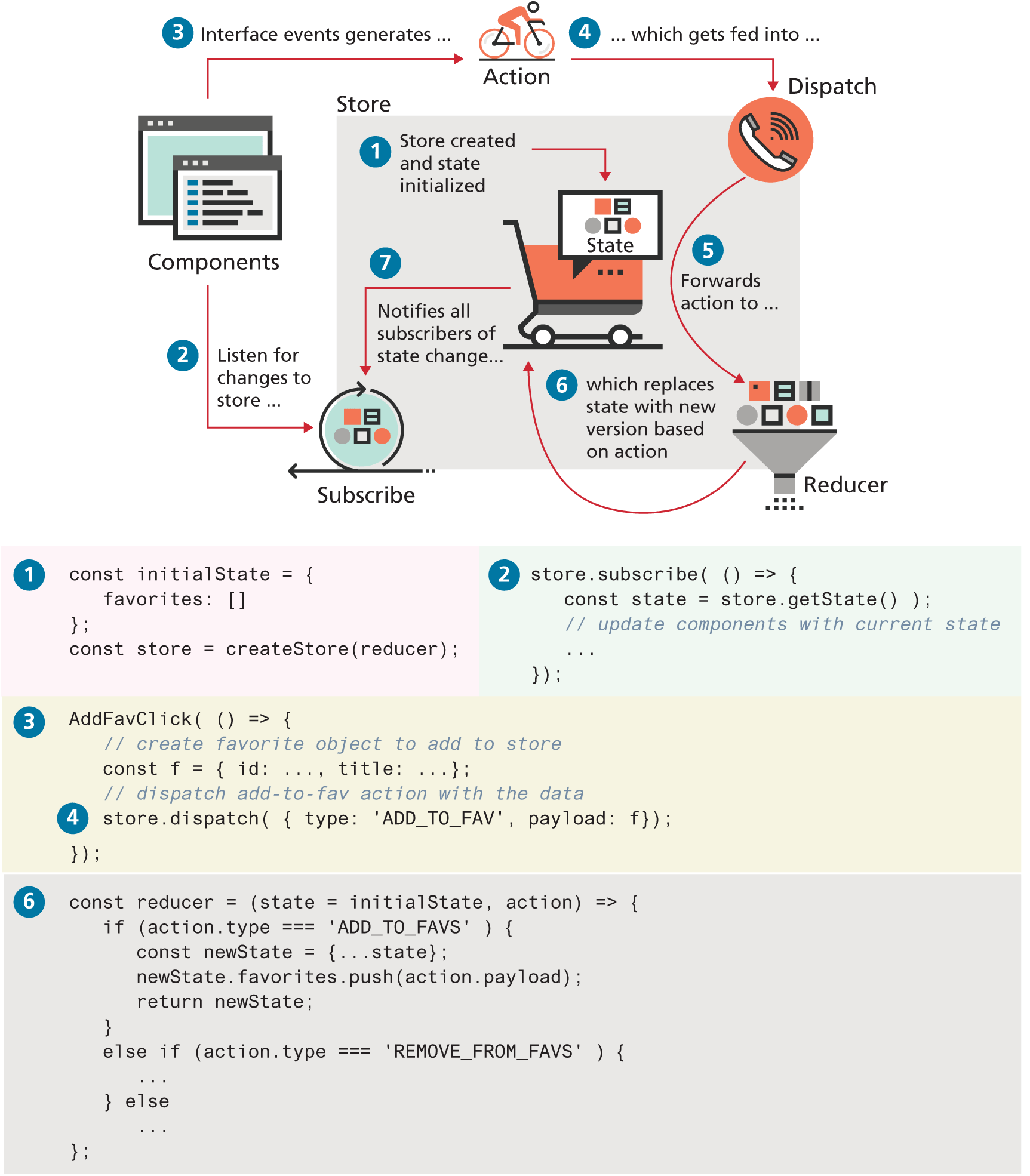
The key idea of Redux is similar to that of the just-discussed Context Providers: namely, to store application state in a single data structure which is held in a storage area known as the store. Your application can read the application state from this store. Unlike the Context Providers approach, in React the state is never mutated (changed) outside of the store. React follows functional programming principles (see nearby Dive Deeper) in that functions never mutate state; instead, functions that create/return new versions of the state are used instead. These functions are called reducers in Redux. How does a reducer “know” which properties of the state to update? A reducer is passed an action which is an object that contains a type property that indicates how the state should be changed.
Figure 11.18 provides an illustration of the general flow and interaction between the different “parts” of Redux, along with some sample code for how they work together. This is certainly not an exhaustive demonstration for how to implement a Redux-based favorites list, but it does (hopefully) give a sense of how to do so. The lab for the chapter does provide a more detailed set of instructions.
Figure 11.18 Redux architecture
Test Your Knowledge #2
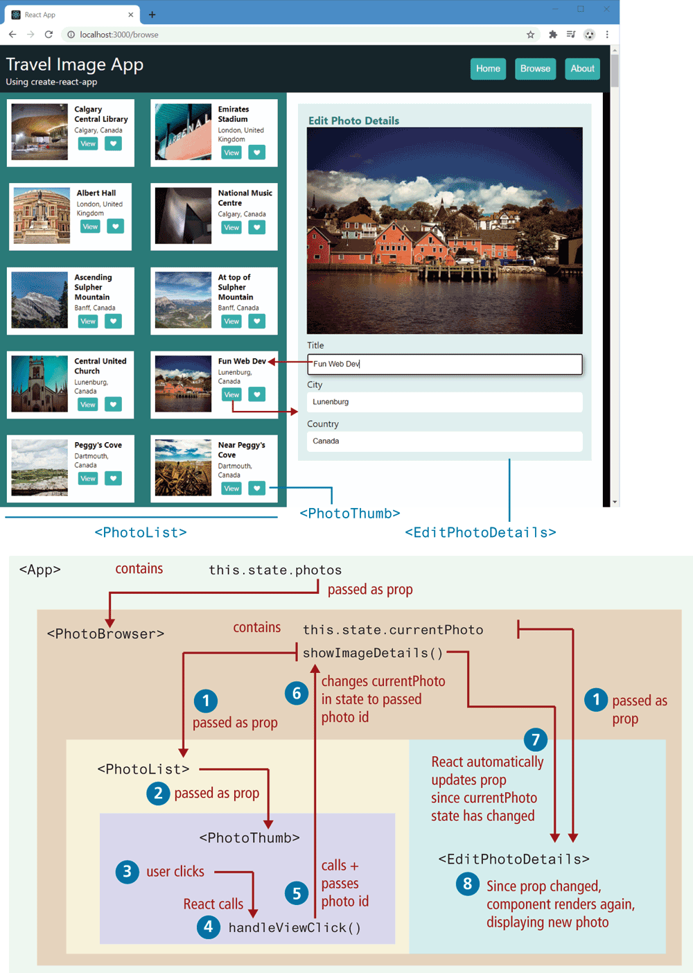
In this exercise, you will create an application with create-react-app that requires both routing and state handling. The HTML that your page must eventually render has been provided in the files lab11b-test02-markup-only.html, home-markup-only.html, about-markup-only.html, and lab11b-test02-styles.css, and can be seen in Figure 11.19. The provided readme file contains URLs for the API and the image file locations. If you are following the labs for this chapter, you will likely have already completed this exercise already.
Use create-react-app to create the starting files for this application.
Create functional components for the components shown in Figure 11.19. Remember that with create-react-app, each component will exist in its own file. To make your source code easier to manage, create a folder named components within the src folder.
Figure 11.19 Completed Test Your Knowledge #2
The data for this exercise can be fetched from the URL in the readme file. You will have to perform the fetch within either the
componentDidMount()handler (if not using Hooks) or theuseEffect()handler (if using Hooks) of the App component, as shown in Section 11.5.1. The supplied single-image.json file can be used to examine the content of a single image returned from this API.As shown in Figure 11.19, the fetched data will need to be passed down via an attribute to the
PhotoBrowsercomponent, which in turn will need to pass it to thePhotoListcomponent. YourPhotoListcomponent should displayPhotoThumbcomponents by looping through the passed photos array data (using themapfunction); be sure to pass a photo object toPhotoThumb. Finally, yourPhotoThumbcomponent can display the title, city, and country data in the photo object that has been provided to it via props. The URL for the thumbnail image is detailed in the readme file. You will append the value of the photo object’sfilenameproperty to that URL to display the thumbnail image.While the styling is in the provided CSS file, use styled-components so that each component has its own encapsulated style definitions. Remember that this will require installing styled-components using npm.
Add a click event handler to the
PhotoThumbcomponent. As shown in Figure 11.19, you will need to implement a handler namedshowImageDetailsin thePhotoBrowserand then pass it via props down throughPhotoListandPhotoThumb.Using controlled form components (see Section 11.3.4), implement the form in
EditPhotoForm. It should populate the fields using the passed photo object. As covered in 11.3.5, the handler that will actually modify the data will have to reside in theAppcomponent.Install the react-router-dom package using npm. Use it to implement the navigation in the header. Implement new components named Home and About (using the provided markup). Modify the
HeaderMenucomponent to set up the appropriate routing. This will require making each button a child within a<Link>element. The render function of theAppcomponent will need to useRouteelements, and the index.js file will need to useBrowserRouter, as shown in Section 11.6.1.