7.7 Chapter Summary
This chapter has covered the sometimes complicated topics of CSS layout. It began with the building blocks of layout in CSS: positioning and floating elements. The chapter also examined different approaches to creating page layouts as well as the recent and vital topic of responsive design. The chapter ended by looking at different types of CSS frameworks and preprocessors that can simplify the process of creating and maintaining complex CSS designs.
7.7.1 Key Terms
block-level elements
box-level elements
containing block
CSS frameworks
fixed positioning
inline elements
normal flow
7.7.2 Review Questions
Describe the differences between relative and absolute positioning.
What is normal flow in the context of CSS?
Describe how block-level elements are different from inline elements.
In CSS, what does floating an element do? How do you float an element?
Write the CSS and HTML to create a two-column layout using flexbox and grid approaches (that is, implement using just flexbox, and then implement using just grid).
What is responsive design? Why is it important?
Explain the role of CSS preprocessors in the web development workflow.
What advantages do a CSS naming convention provide?
How are transitions different from animations?
7.7.3 Hands-On Practice
Project 1: Book CRM
Difficulty Level: Intermediate
Overview
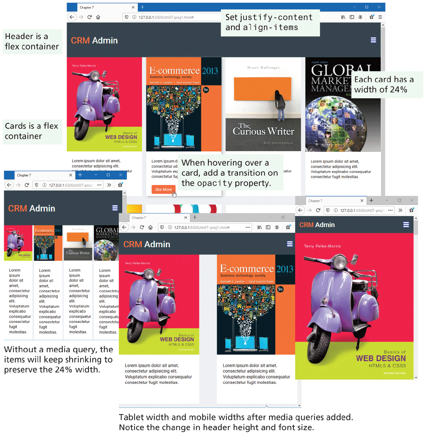
Use flexbox and media queries to create a responsive layout as shown in Figure 7.47. Add in some simple transition and filter effects.
Figure 7.47 Completed Project 1
Instructions
Examine ch07-proj1.html in the browser. You will be modifying the CSS only.
Begin modifying ch07-proj1.css by using flex layout for the
<header>element. Set thejustify-contentproperty of the<header>so that its content (the<h1>and the<img>) spaces itself out to the left and right edges of its flex container. To vertically align the heading and image within the header, set thealign-itemsproperty as well. See Figure 7.13 for guidance.Right now each card fills the entire width of the available space. Change the width of the card class to 24%. By taking less than a quarter of the available space, we will eventually be able to fit four cards on a row.
Use flexbox mode for the
containerclass. Set itsalign-itemsandjustify-contentproperties tocenter.Use flexbox mode for the
cardsclass. Set itsjustify-contentproperty so that its items space themselves out to the left and right edges of its flex container just as you did with the header. When you test this step, examine the book images when you shrink the browser width: notice how they extend beyond the card width.Set the
max-widthproperty of the card images to 100%. This will ensure these images scale themselves down to fit available space in their container. Test by shrinking the browser width.Add a saturation filter of 150% when hovering over any of the book covers. Add a drop shadow (use
box-shadow) when hovering over the card. Set the initialopacityof the button in the card to0. Set the opacity of the button to 1 when the user hovers anywhere over the card; in addition, add a 1 second transition on the opacity property.When you resize the browser, the flex containers will continue to shrink in order to maintain four columns because you set the width to 24% in step 3. Add a media query for mobile-sized screens (below 480px) and for tablet-sized screens (between 481px and 768px). For mobile screens, set the card width to 100% and for tablet screens, set the width to 45%.
Finally, fine tune the tablet and mobile settings by increasing the
--card-font-sizevariable to100%within the media query for those two widths. For mobile portrait, also shrink the size of the header by changing the--header-font-sizevariable to24pxand the--header-heightproperty to4em. For tablet, set the--header-heightproperty to5em.
Guidance and Testing
Break this problem down into smaller steps. Begin first with header, then the cards, then add in the media queries. For each of the instruction steps, test each change you make.
Take another look at Figure 7.12. A flexbox container positions items within its container along the major axis. To modify how the container positions items within the container, you use the properties shown in Figure 7.13.
Be sure to test your page at different browser widths. To test mobile widths, you may need to make use of the browser’s device toolbar.
Project 2: Difficulty Level: Intermediate
Difficulty Level: Intermediate
Overview
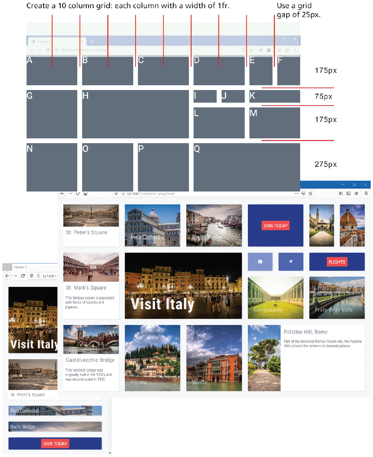
Use grid layout mode and media queries to create the complex layout shown in Figure 7.48. Read the Guidance and Testing section first before starting this project.
Figure 7.48 Completed Project 2
Instructions
Examine ch07-proj2.html in the browser.
Begin modifying ch07-proj2.css by setting up the grid so that it appears similar to that shown in Figure 7.48. Notice that it uses a 10-column grid with a constant grid size of
1fr. It has four rows with the heights indicated in the figure. The grid gap is 25px. Some of the cells span multiple columns or multiple rows. You can achieve this using grid areas or usingspanwith thegrid-rowandgrid-columnproperties. If using the later approach, you can specify the grid position for each individual cell, or set up styles for spanning rows and columns and then assign them to the cells as needed, as shown in the following:.widthDouble { grid-column: span 2; } ... <div class="widthDouble" id="a">Now you need to set the styling for the grid cells (i.e., the top-level
<div>elements within the container). Grid cells B, C, E, F, H, L, M, O, P, and Q havebackground-imagesset via CSS. Cells D, I, J, and K have background colors: two with buttons and two with icons from the font-awesome icon library. Each cell should use flex layout for its contents.The images within cells A, G, and N are not set via
background-imagebut are<img>elements. The other text will need to be added to the different elements in the HTML.Add media queries for tablet widths and for mobile widths. You can use 850px and 1100px as your device settings. For tablet and mobile widths, reduce the font size of your text. For mobile widths only, switch to single column and multiple rows (thus each grid row will contain a single cell); each row can have the same height as the non-mobile version, or you can create custom heights for each row.
Guidance and Testing
Break this problem down into smaller steps. Begin by constructing the grid structure, as shown in the first screen capture in Figure 7.48 (and described in step 2 above). Then start adding in background images and colors. Finally add in the text content and the relevant styling.
Be sure to test at different browser widths. Some developers like beginning with mobile first; others like doing the media queries last.
Project 3: CSS Grid
Difficulty Level: Advanced
Overview
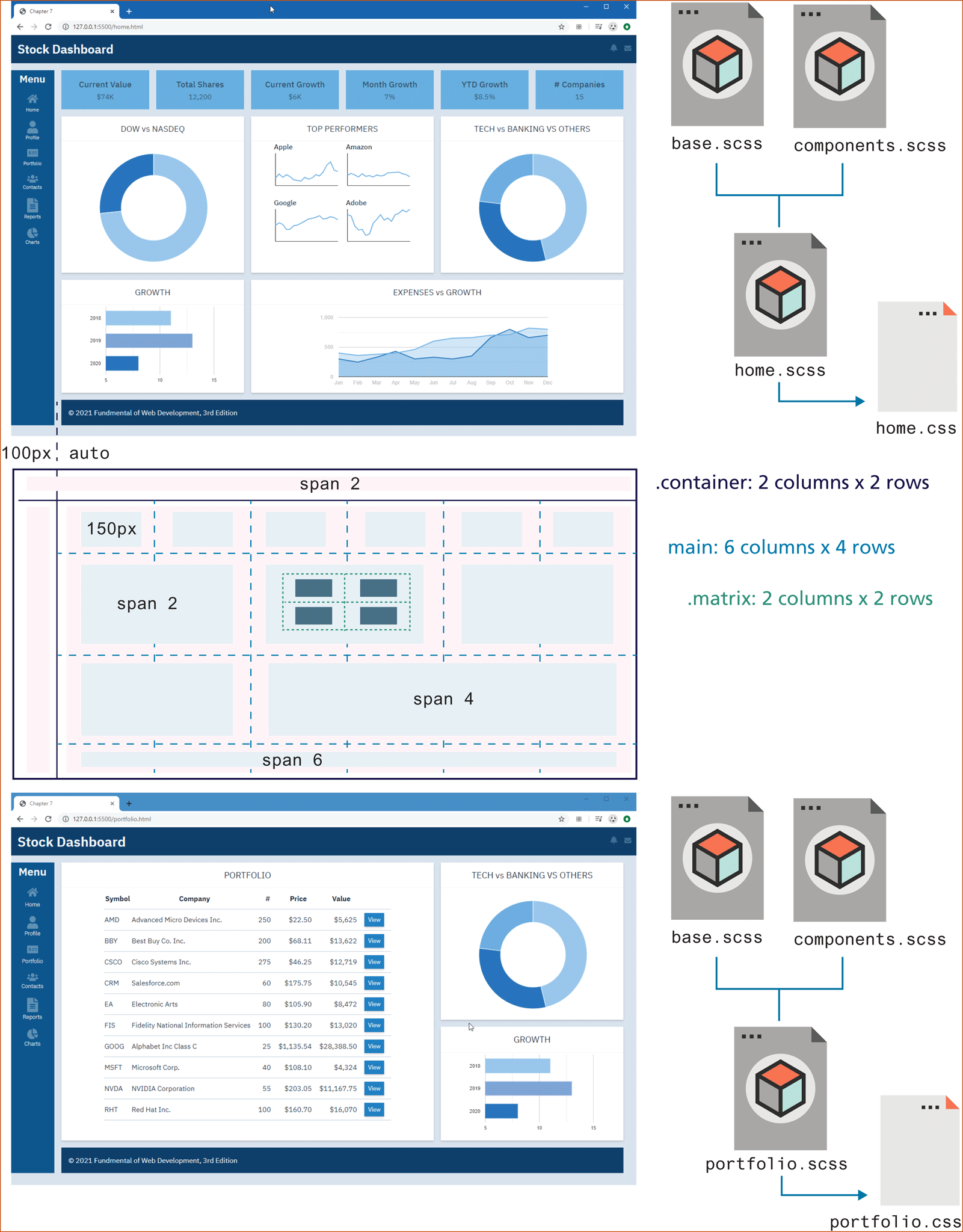
In this project, you will need to implement the layout and styling for two pages (home.html and portfolio.html) using Sass so that they appear as in Figure 7.49. The two pages make use of grid and flex. The charts are provided as eight static image files. The icons are a series of SVG files. Read the Guidance and Testing section first before starting this project.
Figure 7.49 Completed Project 3
Instructions
You will likely need a series of nested grids to implement the layouts for these pages. While there are multiple ways to implement this layout, the instructions here provide a relatively clear approach. The top level (in the markup contained within
<div class="container">) contains two rows of two columns each; the first row spans both columns. The other content fits into the second row. Agrid-gapof1emwas used throughout.The header is best laid out using flexbox. The icons should always be flush on the right side of the browser window.
The content inside the left-side navigation bar can be styled in different ways using grid layout, flexbox layout, or simple box formatting (
margin,padding, etc.). If you haven’t done any flexbox, we would recommend using it just to get some practice with it. Flexbox is often used to style content within a CSS grid cell.The main content (inside the
<main>element) will consist of another nested grid with six columns and four rows. Use the CSSrepeat()function along withminmax(). Make the minimum size 150px and the maximum between 150px and 250px.Some of the individual cells will have to span multiple columns. The footer row spans all six columns.
The four Top Performer charts will be within another new nested grid with two rows and columns.
The portfolio pages uses a slightly different layout but also uses grids.
Guidance and Testing
Since this project is focused on using Sass, you should already feel relatively comfortable with CSS.
Ideally, you will create your styling directly within Sass. Once you become comfortable with Sass, you will likely find you are more productive in it than in straight CSS.
Since you will likely be making numerous changes, you may want to have Sass watch for changes in your SCSS files. For instance, for the home page, you would use the following command (if you are using the CLI):
sass -watch home.scss home.cssOne of the key advantages of Sass is that you can break your CSS into multiple files. We recommend putting general style rules (such as style resets and color and size variables) in a module file named base.scss. Define component styles such as header, footer, widgets, and the aside in a module file named components.scss. Then create Sass files (home.scss and portfolio.scss) for each of the pages you have to create; use @import statements in each of these two pages to add your two modules. You have been provided some initial variables in the supplied base.scss file.
7.7.4 References
1 https:/
/ developer.mozilla.org/ en-US/ docs/ Web/ CSS/ CSS_Grid_Layout/ Relationship_of_Grid_Layout 3 Luke Wroblewski, “Multi-Device Layout Patterns” [Online]. http:/
/ www.lukew.com/ ff/ entry.asp?1514. 4 Pete LePage, “Responsive web design patterns” [online]. https:/
/ developers.google.com/ web/ fundamentals/ design-and-ui/ responsive/ patterns/ ?hl=en 7 Susan Robertson, “Creating Style Guides” [Online]. http:/
/ alistapart.com/ article/ creating-style-guides.