7.5 CSS Effects
CSS3 added several powerful new additions to CSS. You may remember from the previous chapter that the W3C subdivided CSS3 into a variety of different CSS3 modules, some of which have made it to official W3C Recommendations, while others are still in Draft Mode (but may be strongly supported already by browsers). In this section, we will look at four more CSS3 modules that have become broadly popular amongst designers: transformations, filters, transitions, and animations.
7.5.1 Transforms
CSS transforms provide additional ways to change the size, position, and even the shape of HTML elements. As you can see from Figure 7.35, CSS transforms allow you to rotate, skew, transform (move), and scale an element.
Figure 7.35 CSS transforms
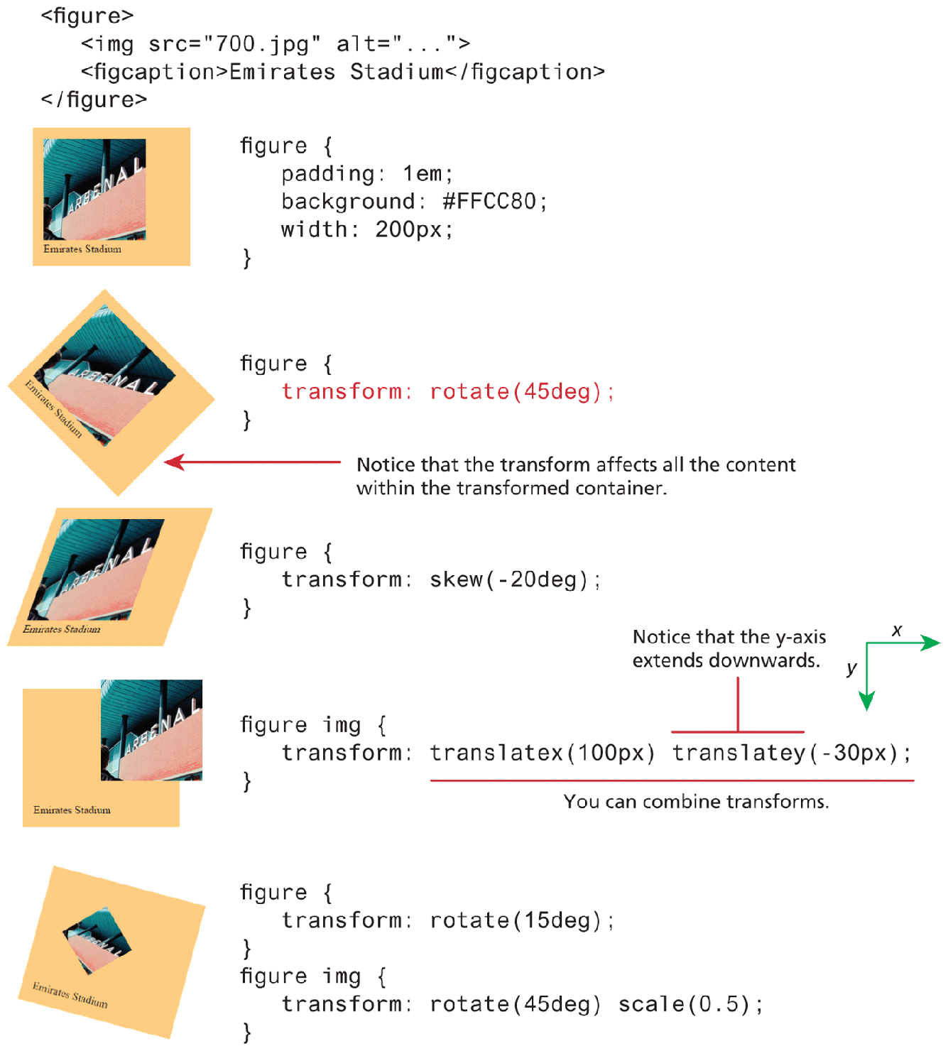
If you are only interested in the scale and translate functionality, you may be wondering whether they are preferable in comparison to the traditional CSS techniques (i.e., using position along with top, left, etc. properties) covered in the positioning section. While there is some disagreement among experts online, we would say that the positioning properties make more sense when used for page layout purposes, while the translate functions are best for making smaller manipulations on individual elements, perhaps as part of an animation sequence (covered later in the Transitions section of this chapter).
There are some additional, more specialized transformation functions. In particular, it is possible to transform an element in 3D space using the perspective(), rotate3d(), scale3d(), and translate3d() functions (along with associated x, y, and z versions, such as rotateX(), rotateY(), and rotateZ() functions).
You might be wondering why a 3D transformation would be useful on a 2D web page. A 3D transform on a square doesn’t suddenly make it appear as a cube. They do, however, provide a way for a developer to create the illusion of 3D space.
This illusion of 3D space happens due to the perspective property. This property is used to specify the distance in pixels between the z-plane (that is, the figurative depth “into” the screen) of a container element and the user. By setting a perspective value, the 2D child items of that container on the screen will be projected by the browser “as if” they had moved further away (that is smaller) from the viewer, as shown by Figure 7.36.
Figure 7.36 CSS3 perspective
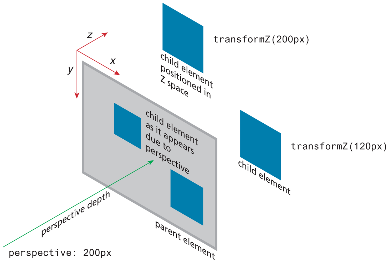
You might be wondering about the usefulness of 3D transforms. One of the most common uses of perspective and 3D transforms is to create the illusion of depth in animations. For instance, in the lab exercise for the animation section later in the chapter, there is a “card flipping” animation. When the user moves the mouse over an image, it appears to flip over, displaying the caption for the image. That illusion of a 2D rectangle flipping over is due to the perspective and 3D transform properties.
7.5.2 Filters
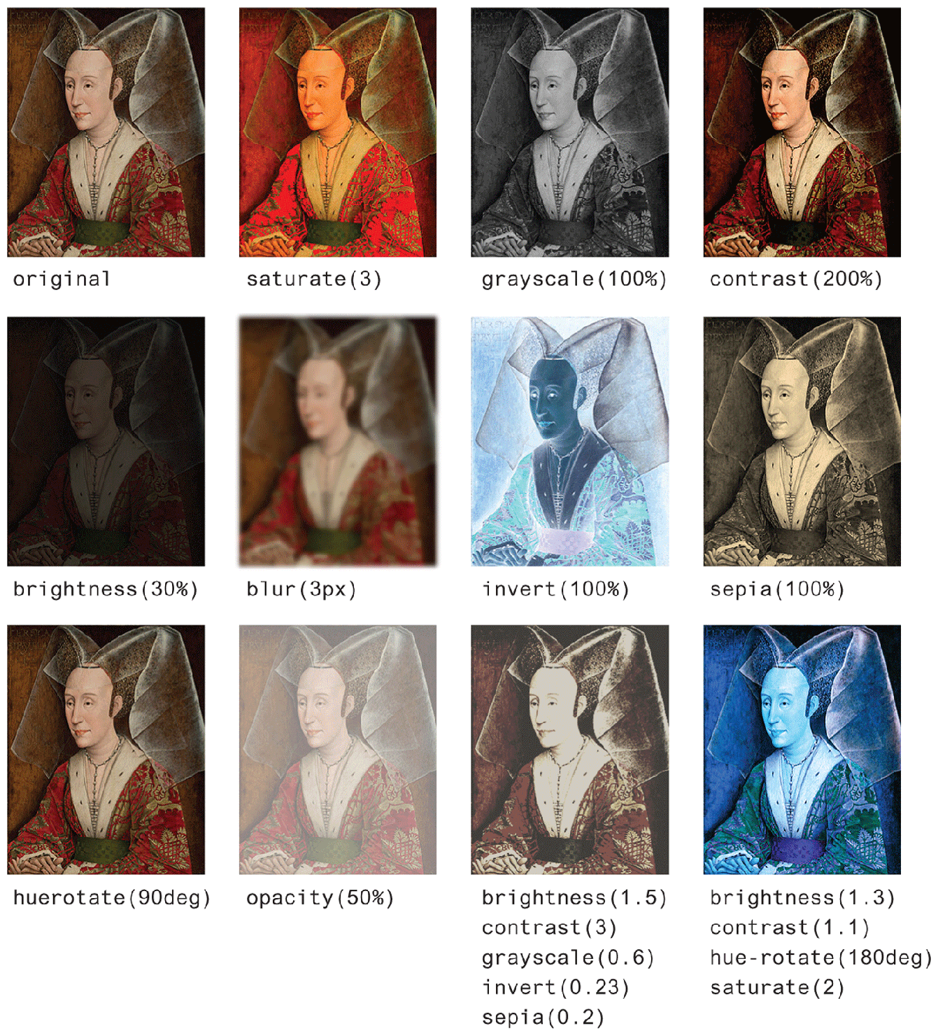
Filters provide a way to modify how an image appears in the browser. If you have used a program like Adobe Photoshop, you may already be familiar with the idea of filters. The filters available in CSS operate in a similar way. Filters are specified by using the filter property and then one or more filter functions are specified, as shown in Listing 7.4.
Listing 7.4 Using a filter
#someImage {
   filter: grayscale(100%);
}
#anotherImage {
   /* multiple filters are space separated */
   filter: blur(5px) hue-rotate(60deg) saturate(2);
}
As you can see in Listing 7.4, some filter functions take a percentage value—the saturate(2) example in the listing is the same as saturate(200%)—while others take degrees or pixels. Figure 7.37 illustrates the main CSS filters.
Figure 7.37 CSS filters in action
 Pro Tip
When you are constructing a demo page but don’t have images available yet, or you want an image of a particular size but don’t care what the image is actually about (perhaps you are constructing a layout and will be getting the images later), you can make use of one of several different image placeholder services. One of the most commonly used is placehold.it; to use it, you simply specify the size needed in your request:
<img src="http://placehold.it/250x500">
This provides you with a plain gray rectangle image with the dimensions labeled within it. If you would prefer a real image, consider using placeimg.com or lorempixel.com which provides you with a random image within a category. And if you absolutely need nothing but cute cat images, then consider placekitten.com!
7.5.3 Transitions
Transitions are a powerful new feature of CSS3. Normally, changing a CSS property (via a style rule or using JavaScript) takes effect immediately. Transitions provide a way to indicate that a property change will take effect across a length of time. In other words, using CSS transitions, you can animate different CSS properties. While not all properties can be used in transitions, over 100 can be. Table 7.3 lists the different transition properties.
Table 7.3 Transition Properties5
| Property | Description |
|---|---|
transition |
Short-hand property in the following format:
|
transition-delay |
The delay time in seconds before the animation begins. |
transition-duration |
How long in seconds for the transition to complete. |
transition-property |
The name of the CSS property to which the transition is applied. |
transition- timing-function |
The function that defines how the intermediate steps in the transition are calculated. CSS defines a variety of different easing functions which define the rate of the transition. |
Creating a transition is, in some ways, quite straightforward. You have to specify four bits of information (two of which are optional). They are:
The CSS property which will be transitioned.
The duration of the transition.
The easing function to use, which changes the speed and style of the transition (optional).
How long to delay before starting the transition (optional).
Needless to say, it is tricky illustrating a transition, which is a change across time, in the printed medium. Figure 7.38 illustrates one of the simplest transitions. In it, instead of a color changing immediately upon entering or exiting the hover state, we use a transition to change the background color of a sample button across half a second.
Figure 7.38 A simple background-color transition on a button
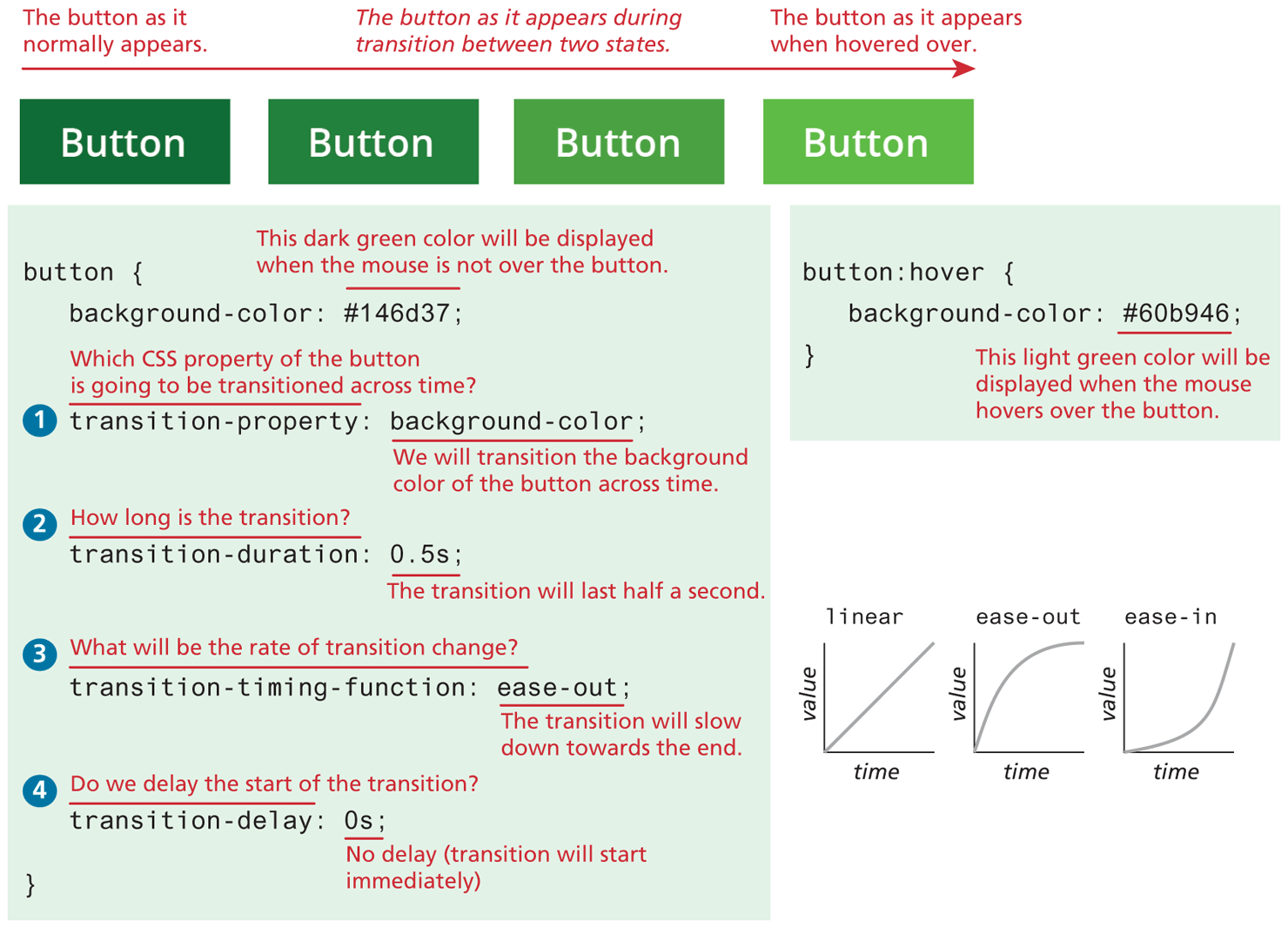
If you test this, notice that the transition happens both on the hover and the leave hover states.
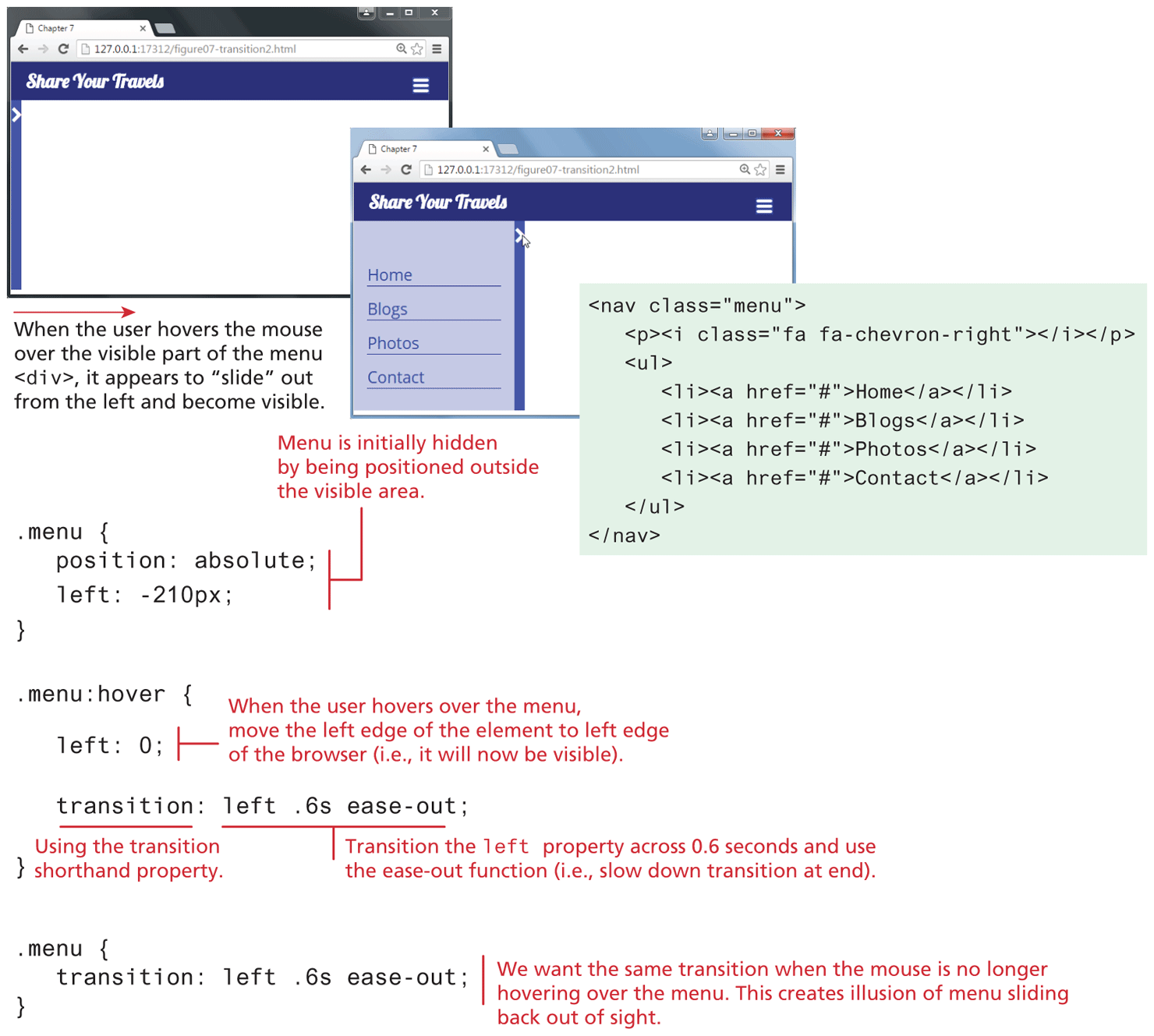
Let’s construct a (seemingly) more complicated transition. Looking at Figure 7.39, we are animating an entire <div>. When the user hovers over the right border or icon of the menu <div>, we transition the left property to a new value, thus moving the element from its initial location off-screen so that it becomes visible.
Figure 7.39 A sliding menu transition
Both of these transitions examples are actually pretty straightforward in that we are only transitioning a single property across time. It is possible, however, to create more complicated transitions in which several properties are changing. Figure 7.40 illustrates how you can use the all keyword to transition all changed properties for an element across time.
Figure 7.40 Transitioning several properties
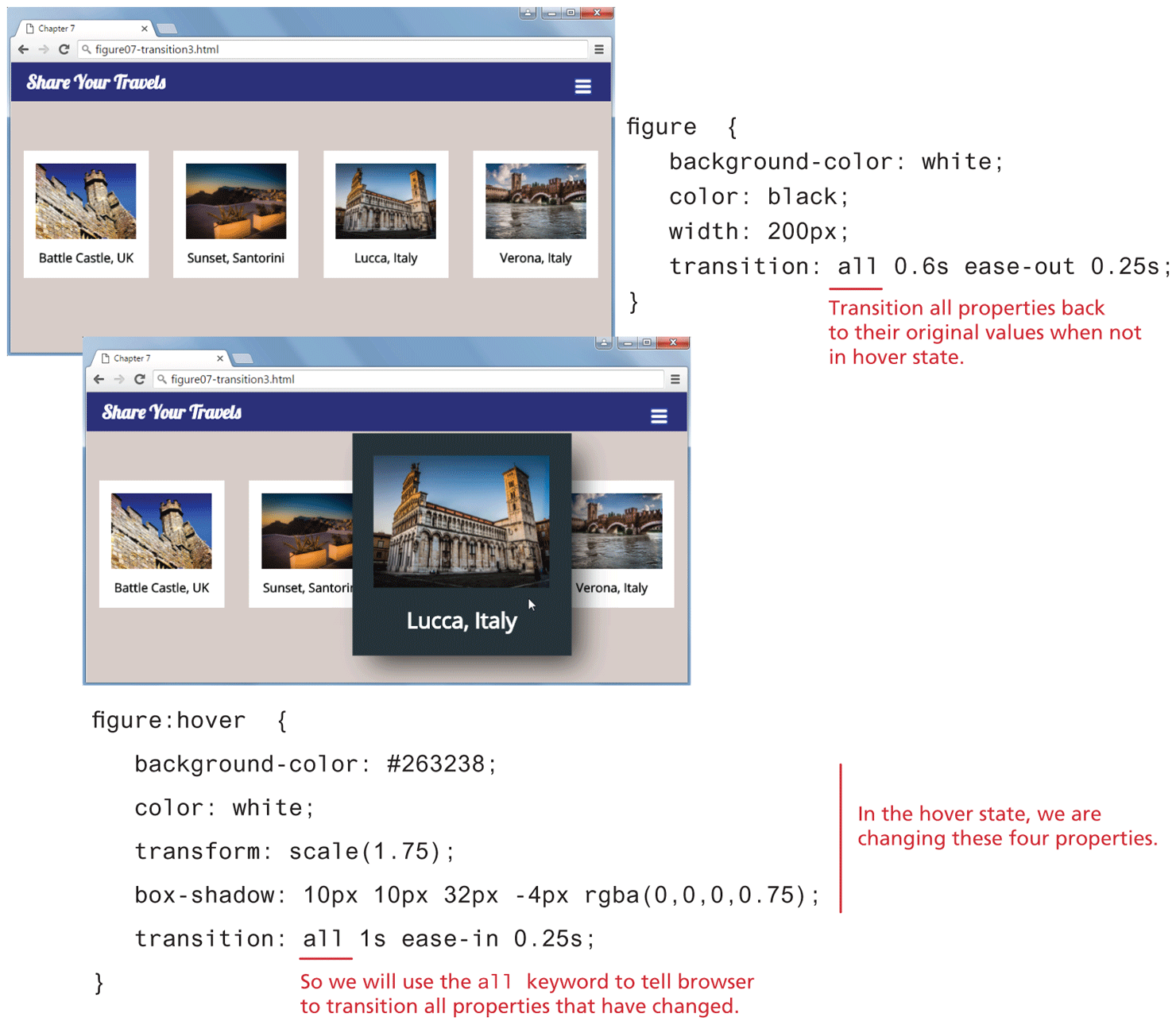
While using the all keyword certainly simplifies your transition CSS, it is inefficient from a performance standpoint: your browser now has to “listen” to all properties of the transition. A more performance-efficient transition specification for that shown in Figure 7.40 would list just the transitioned properties separated by commas:
transition: background-color 1s ease-in 0.25s,
             color 1s ease-in 0.25s,
             transform 1s ease-in 0.25s,
             box-shadow 1s ease-in 0.25s;
 Note
Note
You may be wondering if all transitions have to use the :hover pseudo state since all three examples here made use of it. The answer is no, they don’t. But without recourse to JavaScript, there are limits to how we can trigger a transition effect. Once you learn JavaScript in the next several chapters, you will have the knowledge needed to attach transitions to a variety of different events.
7.5.4 Animations
The animation property can be used to animate other CSS properties. CSS animations are a powerful supplement to JavaScript-based animations but require no programming.
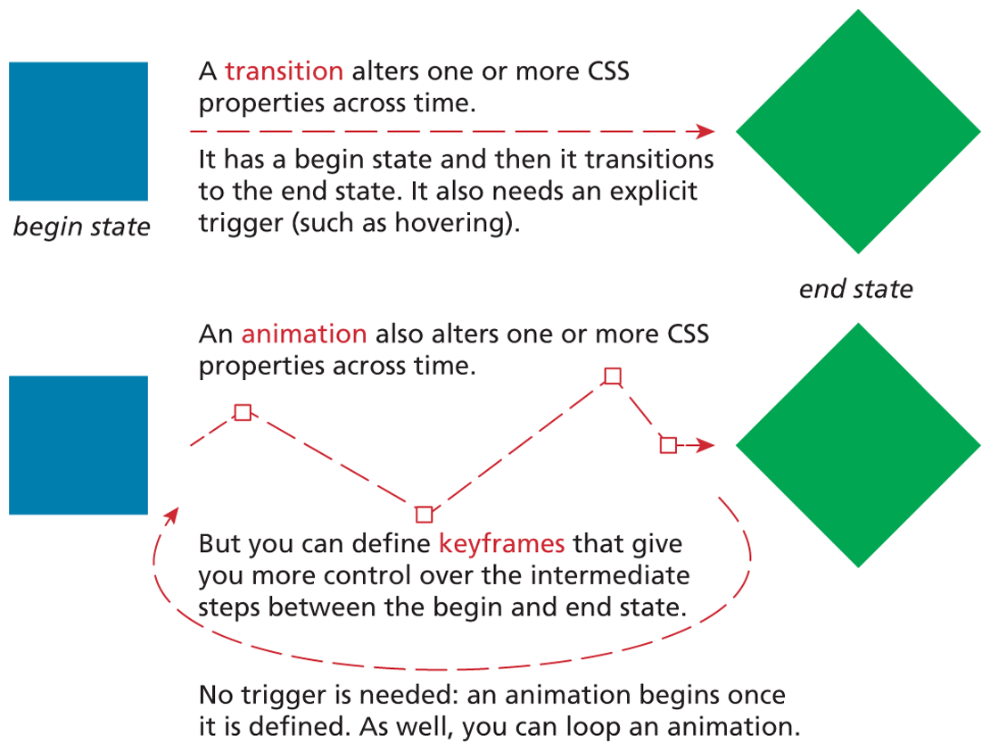
You may be wondering how animations differ from transitions. As can be seen in Figure 7.41, a transition alters one or more properties between a start state and an end state. An animation also does that, but it allows a designer more control over the intermediate steps between the start and ending state. You do this by specifying keyframe states. As well, animations can repeat one or more (even infinite) times.
Figure 7.41 Transitions versus animations
To animate an element in CSS, you have to do the following:
Define a set of keyframe rules using the
@keyframeskeyword.Assign the various animation properties to the element to be animated. These are listed in Table 7.4.
Table 7.4 Main Animation Properties6
| Property | Description |
|---|---|
animation |
Short hand property in the following format:
|
animation-delay |
The delay time in seconds before the animation begins. |
animation-direction |
Specifies whether the animation plays in normal forward direction or in reverse. |
animation-duration |
The length of time that an animation takes to complete one cycle. |
animation-iteration-count |
The number of times the animation should play. The default is 1. You can also specify the keyword infinite to play the animation repeatedly. |
animation-name |
The name of the @keyframes rule set. |
animation-play-state |
Specifies whether the animation is running or paused. |
animation-fill-mode |
Specifies a state for when the animation is not playing (before it starts of after it’s over). |
animation-timing-function |
CSS defines a variety of different easing functions which defines the acceleration of the animation. |
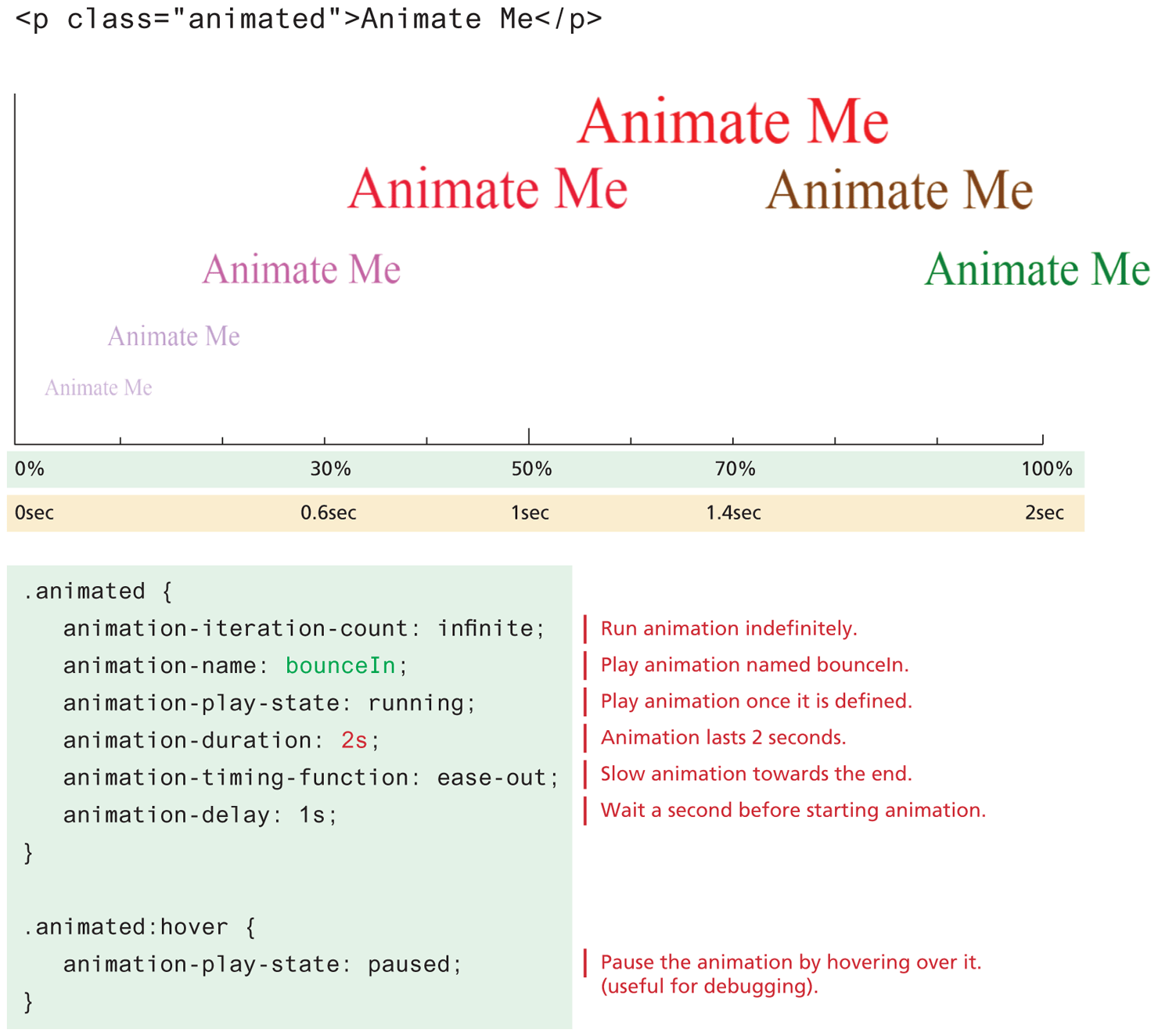
Let us begin with a simple animation. The first step is to define a set of keyframe rules. Listing 7.5 illustrates an example set of rules. Notice that it consists of multiple style rules; each keyframe is a percentage value (you can also use the keywords from instead of 0% and to instead of 100%) and defines the transition state at a point in time in the animation. This particular keyframe set animates a block of text, changing its size, opacity, and color over time. It will create the illusion of text “bouncing” in onto the page.
Listing 7.5 An example animation
@keyframes bounceIn {
   0% {
      transform: scale(0.1);
      color: blue;
      opacity: 0;
   }
   70% {
      transform: scale(1.4);
      color: red;
      opacity: 1;
   }
   100% {
      color: green;
      transform: scale(1);
   }
}
Once a keyframe set is defined, you can then reference it via the animation-name property. Like with transitions, you can customize aspects of the animation via the properties shown in Table 7.4.
Figure 7.42 illustrates how the keyframe set shown in Listing 7.5 is used to animate a block of text. In reality, the animation slides left then right; the figure staggers the text on the y-axis merely for readability. The diagram also shows how the percentages in the keyframe set are related to the animation-duration property.
Figure 7.42 Animation example
Pro Tip
Perhaps the easiest way to use animations is to make use of an animation library such as animate.css, magic animations, or hover.css. These open-source libraries are simply a series of animation properties plus keyframe rule sets along with CSS classes that reference them.