7.4 Responsive Design
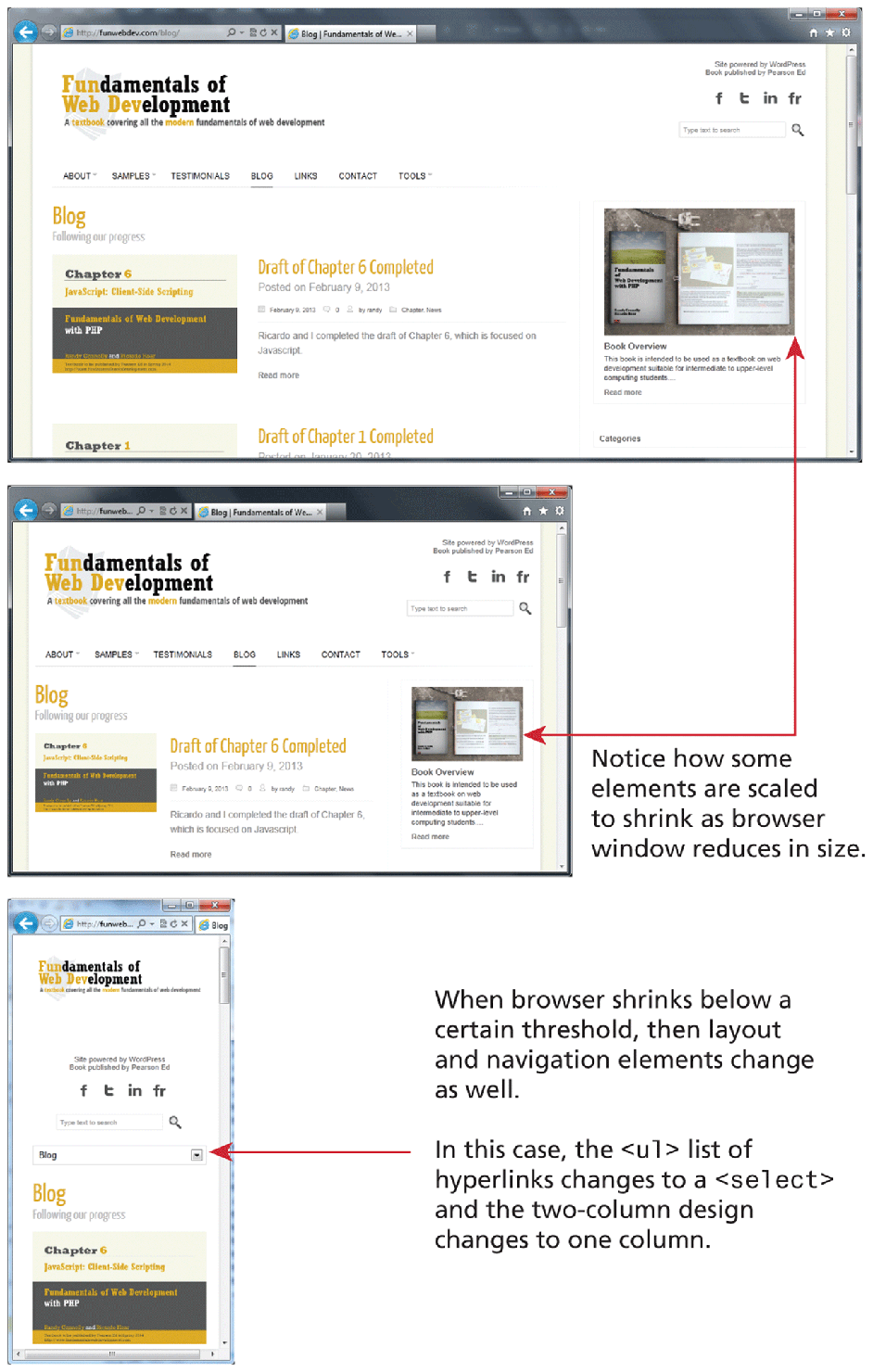
In the past several years, a lot of attention has been given to so-called responsive layout designs. In a responsive design, the page “responds” to changes in the browser size that go beyond simple percentage scaling of widths. In a responsive layout, smaller images will be served and navigation elements will be replaced as the browser window shrinks, as can be seen in Figure 7.26.
Figure 7.26 Responsive layouts
There are many books devoted to responsive design, so this chapter can only provide a very brief overview of how it works. There are four key components that make responsive design work. They are:
Creating a flexible grid (or flexbox) based layout
Setting viewports via the
<meta>tagCustomizing the CSS for different viewports using media queries
Scaling images to the viewport size
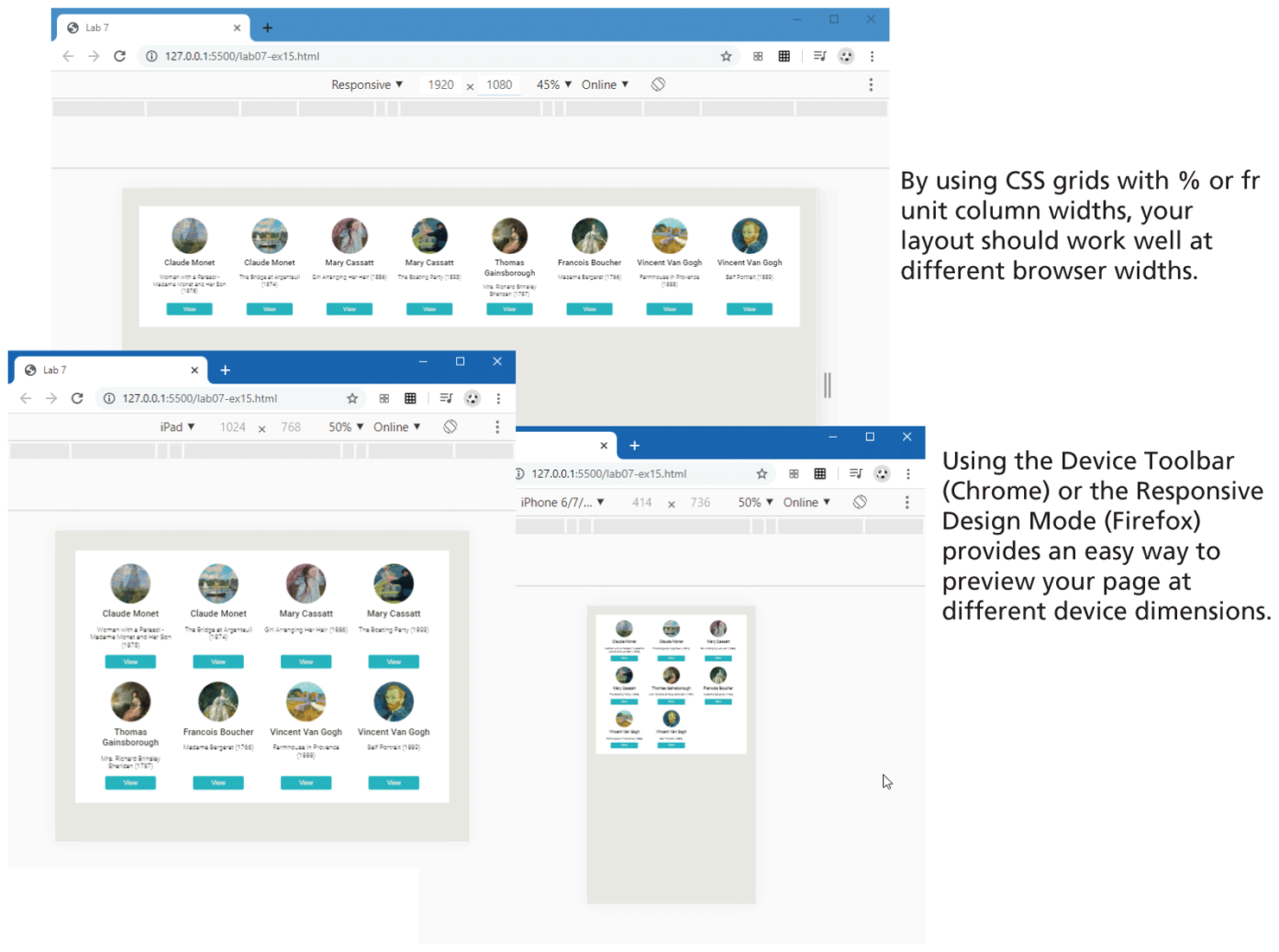
Responsive designs begin with a flexible layout, that is, one in which most elements have their widths specified as percentages or fr units. The flexbox and grid layout models are especially well suited for constructing flexible layouts suitable for responsive design. For instance, Figure 7.27 illustrates how the grid layout from Section 7.3.6 works regardless of the browser widths because the grid-template-columns property used the repeat function along with the fr unit. The figure also shows how the device toolbar available within the Dev Tools in Chrome (the same capability is also in FireFox) can be used to preview different device rendering.
Figure 7.27 Flexible layout adapting to browser widths
 Note
Note
One of the most influential recent approaches to web design is sometimes referred to as mobile-first design. As the name suggests, the main principle in this approach is that the first step in the design and implementation of a new website should be the design and development of its mobile version (rather than as an afterthought as is often the case).
The rationale for the mobile-first approach lies not only in the increasingly larger audience whose principal technology for accessing websites is a smaller device such as a phone or a tablet. Focusing first on the mobile platform also forces the designers and site architects to focus on the most important component of any site: the content. Due to the constrained sizes of these devices, the key content must be highlighted over the many extraneous elements that often litter the page for sites designed for larger screens.
7.4.1 Setting Viewports
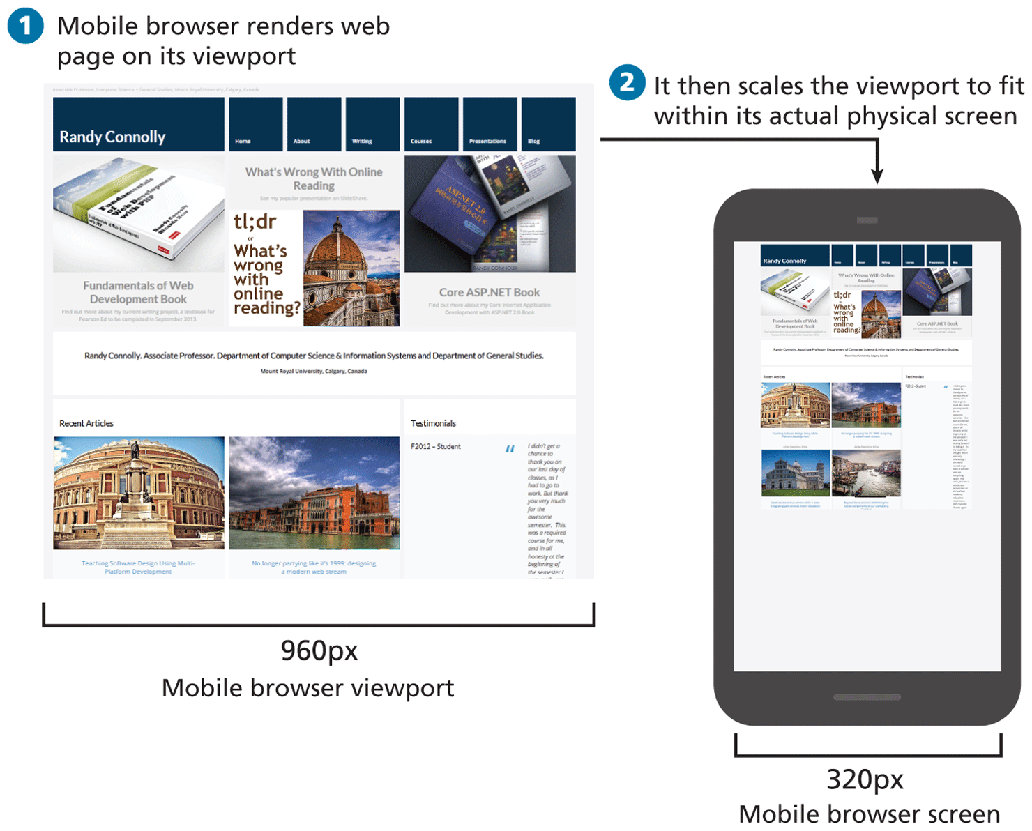
The browser’s viewport is the part of the browser window that displays web content. Mobile browsers will by default scale a web page down to fit the width of the screen. This made sense in the early years of smartphones, since many sites did not have a mobile version. Figure 7.28 illustrates the default scaling that a browser will perform for a site. As you can see, this generally results in a viewing experience that works but is very difficult to read and use.
Figure 7.28 Mobile scaling (without viewport)
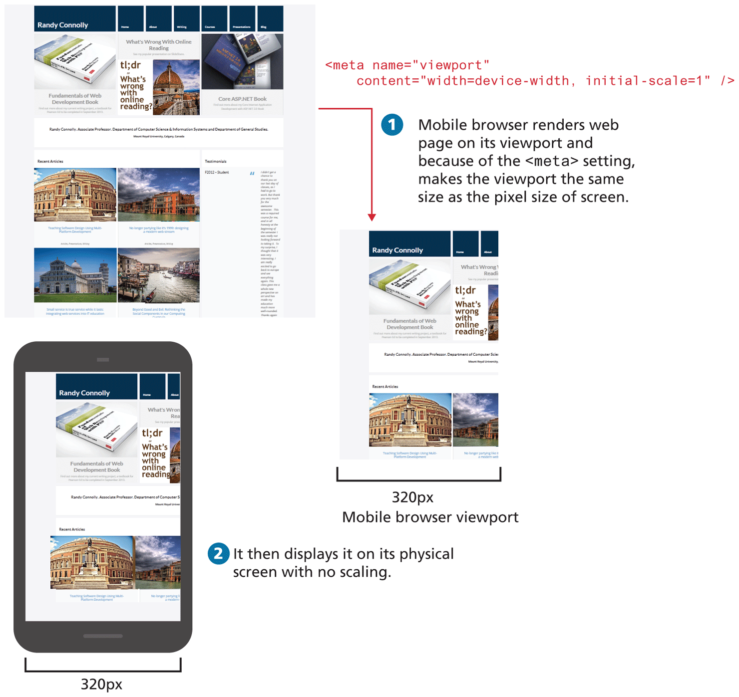
To better solve this problem, the mobile Safari browser introduced the viewport <meta> tag as a way for developers to control the size of that initial viewport. If the developer has created a responsive site similar to that shown in Figure 7.26, one that will scale to fit a smaller screen, she may not want the mobile browser to render it on the full-size viewport. The web page can tell the mobile browser the viewport size to use via the viewport <meta> element, as shown in Listing 7.3.
Listing 7.3 Setting the viewport
<html>
<head>
<meta name="viewport" content="width=device-width, initial-scale=1" />
In Listing 7.3, the width attribute controls the size of the viewport, while initial-scale sets the zoom level. That is, this <meta> element tells the browser that no additional scaling is needed and to make the viewport as many pixels wide as the device screen width. This means that if the device has a screen that is 320 px wide, the viewport width will be 320 px; if the screen is 480 px (for instance, in landscape mode), then the viewport width will be 480 px. The result will be similar to that shown in Figure 7.29.
Figure 7.29 Setting the viewport
Note
It is worth emphasizing that what Figure 7.28 illustrates is that if an alternate viewport is not specified via the <meta> element, then the mobile browser will try to render a scaled version of the full desktop site.
However, since only setting the viewport as in Figure 7.29 cropped the content, setting the viewport is only one step in creating a responsive design. There needs to be a way to transform the look of the site for the smaller screen of the mobile device; this is the job of the next key component of responsive design, media queries.
7.4.2 Media Queries
The next key component of responsive designs is CSS media queries. A media query is a way to apply style rules based on the medium that is displaying the file. You can use these queries to determine the capabilities of the device, and then define CSS rules to target that device. (Media queries are not supported by Internet Explorer 8 and earlier.)
Figure 7.30 illustrates the syntax of a typical media query. These queries are Boolean expressions and can be added to your CSS files or to the <link> element to conditionally use a different external CSS file based on the capabilities of the device.
Figure 7.30 Sample media query
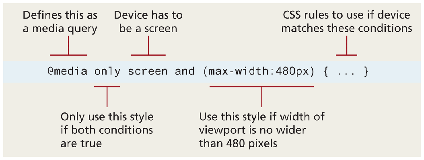
Table 7.2 is a partial list of the browser features you can examine with media queries. Many of these features have min- and max- versions.
Table 7.2 Browser Features You Can Examine with Media Queries
| Feature | Description |
|---|---|
width |
Width of the viewport |
height |
Height of the viewport |
device-width |
Width of the device |
device-height |
Height of the device |
orientation |
Whether the device is portrait or landscape |
color |
The number of bits per color |
Contemporary responsive sites will typically provide CSS rules for phone displays first, then tablets, then desktop monitors, an approach called progressive enhancement, in which a design is adapted to progressively more advanced devices, an approach you will also see in the JavaScript chapter. Figure 7.31 illustrates how a responsive site might use media queries to provide progressive enhancement.
Figure 7.31 Media queries in action
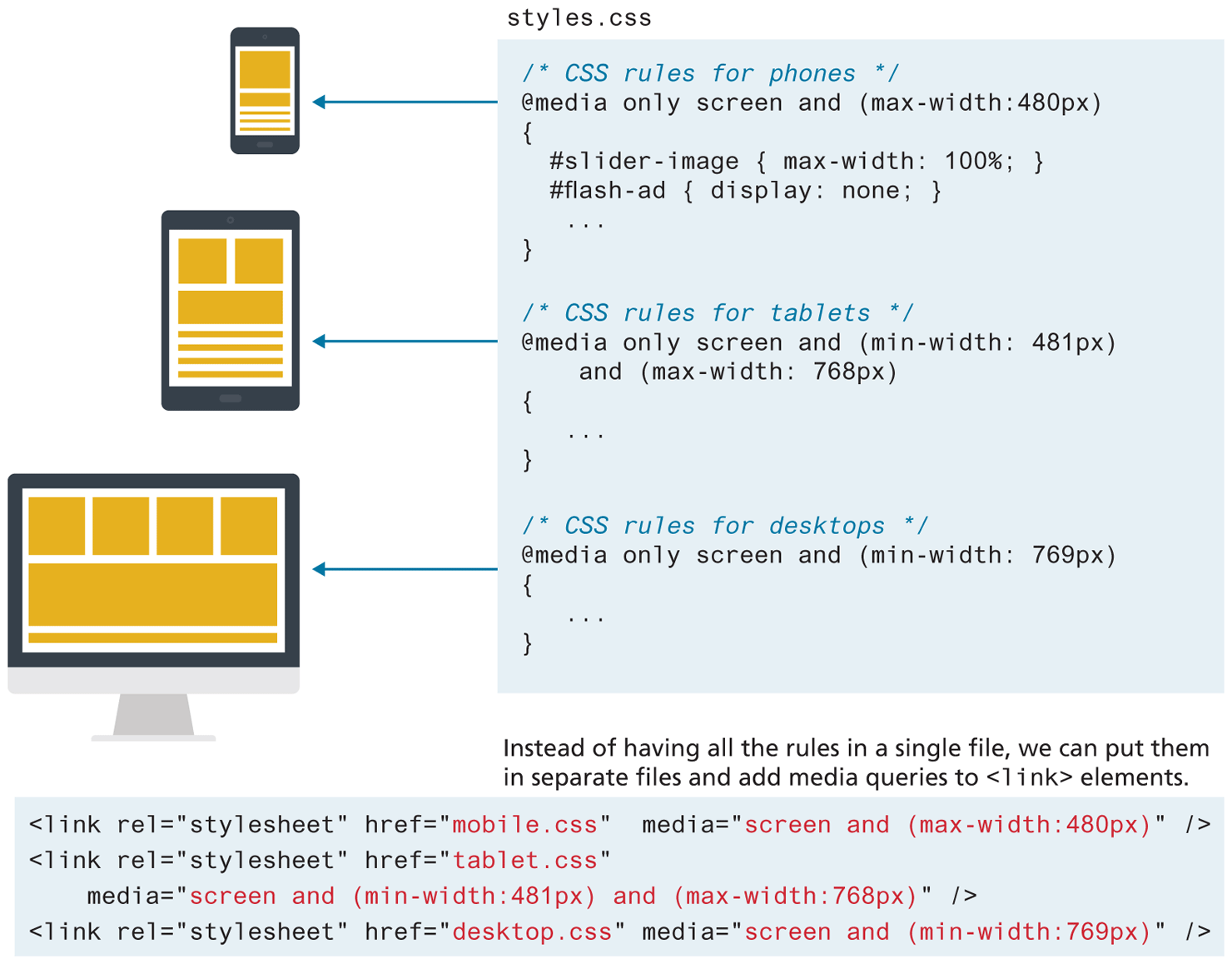
Notice that the smallest device is described first, while the largest device is described last. Since later rules in the source code override earlier rules, this provides progressive enhancement, meaning that as the display grows you can have CSS rules that take advantage of the larger space. Notice as well that these media queries can be within your CSS file or within the <link> element; the later requires more HTTP requests but results in more manageable CSS files.
7.4.3 Scaling Images
Making images scale in size is actually quite straightforward, in that you simply need to specify the following rule:
img {
   max-width: 100%;
}
Of course this does not change the downloaded size of the image; it only shrinks or expands its visual display to fit the size of the containing parent element (or the browser window if no parent), never expanding beyond its actual dimensions. Students are often tempted to define a height, which usually changes the aspect ratio distorting the image. Using height:auto, though not necessary, satisfies the inclination to add height. More sophisticated responsive designs will serve different sized images based on the viewport size; using this approach, mobile users with smaller screens will receive smaller files and thus the page will be quicker to download.
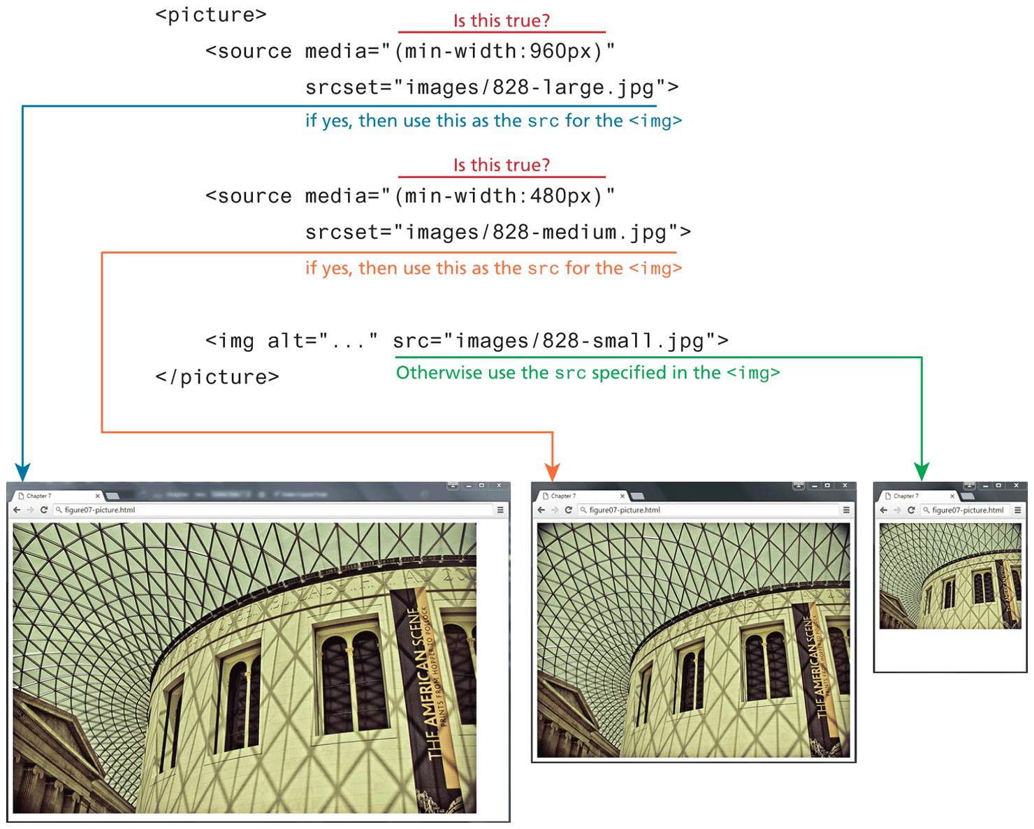
HTML5.1 defines the new <picture> element as an elegant way to do this task via markup. The <picture> element is a container that lets the designer specify multiple <img> elements; the browser will determine which <img> to use based on the viewport size. Figure 7.33 illustrates how the <picture> element can be used to serve an appropriate-sized image for different device sizes. Notice that each <source> child element uses a media query.
Figure 7.33 The <picture> element and responsive design
 Pro Tip
Websites often want to add embedded videos from services such as YouTube. These embedded videos can sometimes be tricky to integrate in a responsive mode because they often make use of <iframe> elements to do so.
For instance, at the time of writing (spring 2020), the current embed tag provided by YouTube for one of the videos for the second edition of this book is
<iframe width="560" height="315
src="https:/What is an iframe? An iframe is an HTML element that allows one web site page to be viewed inside another page. In the early days of the web, <iframe> elements were often used for one site to display another’s site within theirs. Developers often had to add “iframe busting” JavaScript to break their site out of these other iframes. Thankfully, this use of iframes has more or less disappeared, but they are still used for embedding things like videos.
As you can see from the above YouTube iframe, these videos want to be displayed at very specific dimensions. What if you wanted to display at a smaller size for mobile users? The following bit of CSS will ensure the video will scale up or down and maintain the proper aspect ratio:
.video-container {
   padding-bottom: 56.25%; /* or calc(315/560) */
   height: 0;
}
iframe { width: 100%; height: 100% }
Why 56.25%? That is the height (315) divided by the width (560).
Test Your Knowledge #3
Modify lab07-test03.html by adding CSS in lab07-test03.css to implement the layout shown in Figure 7.34 (some of the styling as already been provided).
Figure 7.34 Completed Test Your Knowledge #3
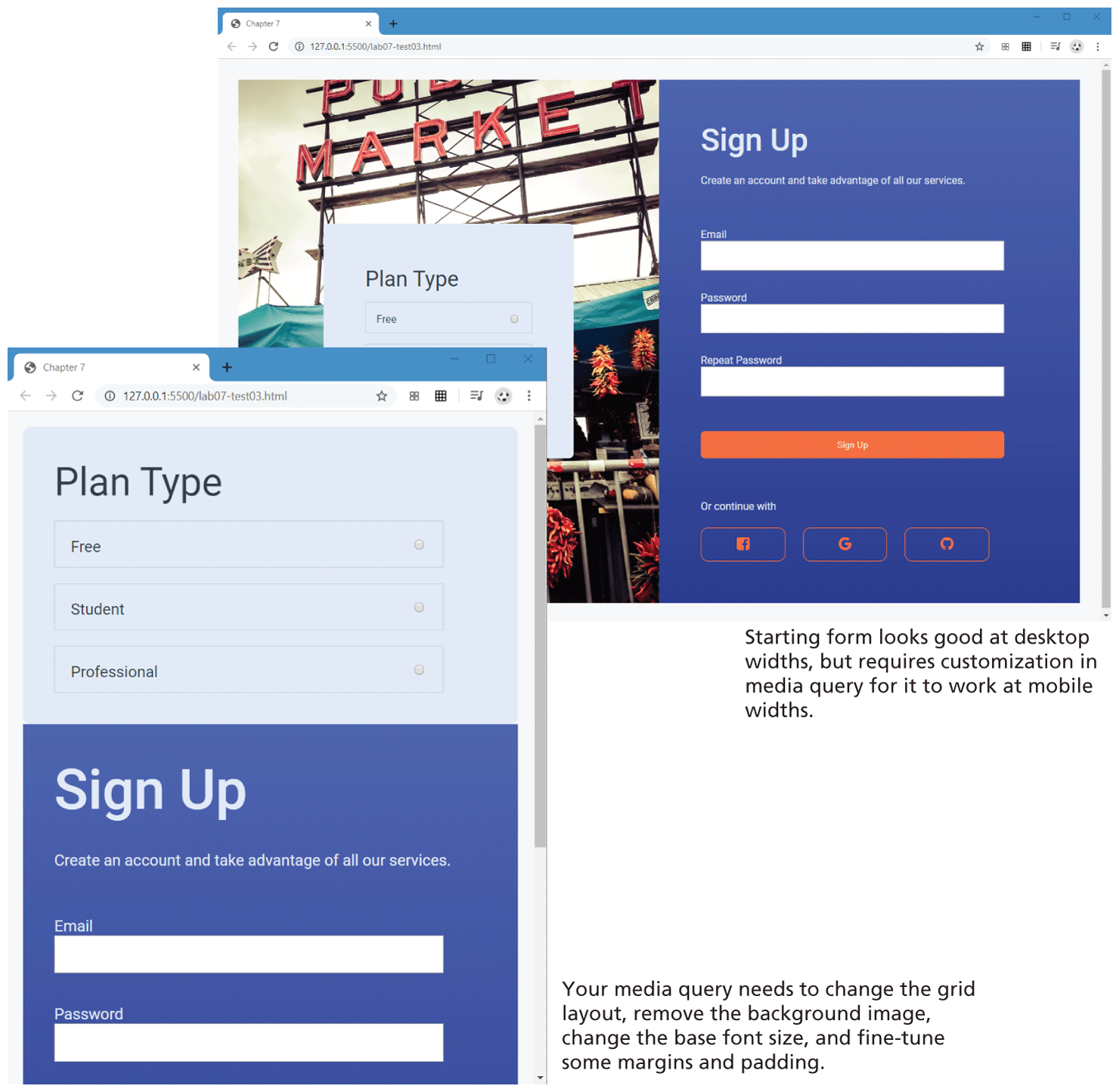
You have been provided with a signup form layout that looks similar to the top screen in Figure 7.34. It uses a two-column grid layout (and flex within the grid cells). You need to add a media query that changes to a one-column grid when the browser width is below 1000 pixels. The second screen in Figure 7.34 illustrates how it should appear at the smaller browser widths.
Your media query will have to change the
marginandgrid-template-columnsproperties of thecontainerclass. TheformImageclass will also need to be modified in the media query so that it no longer has a background image and instead has a background-color.It is quite common to increase the font size for smaller layouts. This can result in a lot of changes, but because the CSS uses variables, you only need to change the
--base-font-sizevariable to120%in your media query and all the other font sizes will also change. You will also need to change a few paddings and margins also (because of the use of CSS variables you should be able to simply make use of the--space-medand--spacing-smallvariables for those changes).