7.3 Grid Layout
Designers have long desired the ability to construct a layout based on a set number of rows and columns. In the early years of CSS, designers frequently made use of HTML tables as way to implement these types of. Unfortunately this not only added a lot of additional non-semantic markup, but also typically resulted in pages that didn’t adapt to different sized monitors or browser widths. CSS Frameworks such as Bootstrap became popular partly because they provided a relatively painless and dependable way of creating grid-based layouts. Nonetheless, designers have long wanted an easier way to create grid layouts in native CSS, and for this reason, when CSS Grid finally had wide-spread browser support by mid-2017, it was greeted with enthusiasm.
Grid layout is adjustable, powerful, and, compared to floats, positioning, and even flexbox, is relatively easy to learn and use. It allows you to divide any container into a series of cells within rows and columns. Block-level child content will by default be automatically placed into available cells; you can also instead manually indicate which content will appear in which cells.
7.3.1 Specifying the Grid Structure
Figure 7.17 illustrates how grid layout works with block-level elements. Each block-level child in a parent container whose display property is set to grid will be automatically placed into a grid cell (this automatic placement into cells is often referred to as an implicit grid). If no grid-template-columns property is set, then the grid will only contain a single column, and thus the output will be more or less similar to normal block layout flow. Notice that rows will automatically be added to the grid based on the content.
Figure 7.17 Introducing grid display
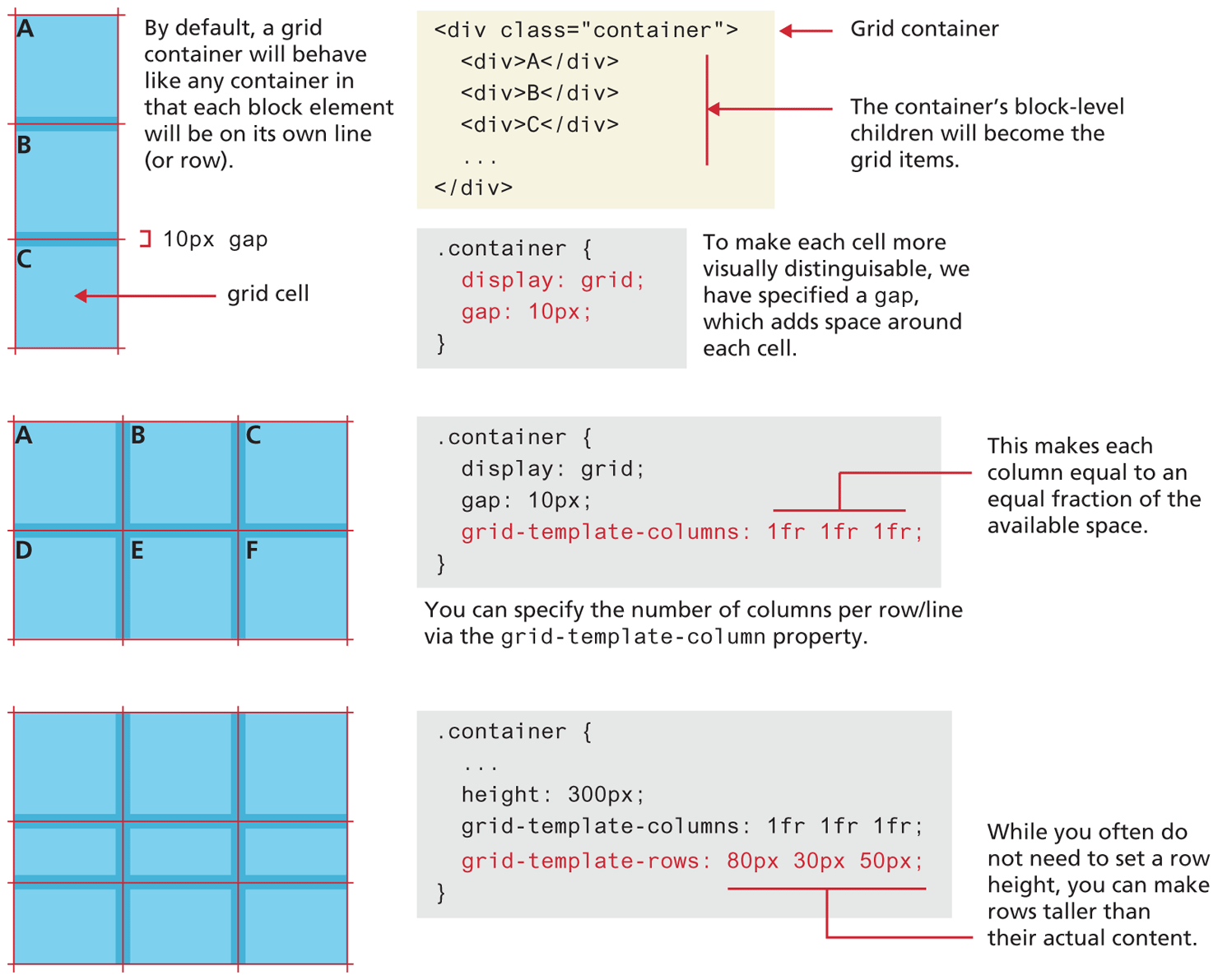
The grid-template-columns is used for adding columns to the parent container by specifying each column’s width. There are a lot of possible options for this property. In the middle example in Figure 7.17, column widths are specified using the fr unit. This unit provides a way to flexibly size a column based on available space. It indicates a width that is a fraction of the available space in the grid container. So, for instance, imagine the following two examples:
grid-template-columns: 1fr 1fr;
grid-template-columns: 3fr 1fr;
In the first example, each of the two columns will be equal in size. But in the second example, the first column will take up ¾ of the available space and the second will take up ¼.
Figure 7.17 also illustrates that you can specify row heights via the grid-template-rows property. Just like with specifying columns, you can also use the fr unit.
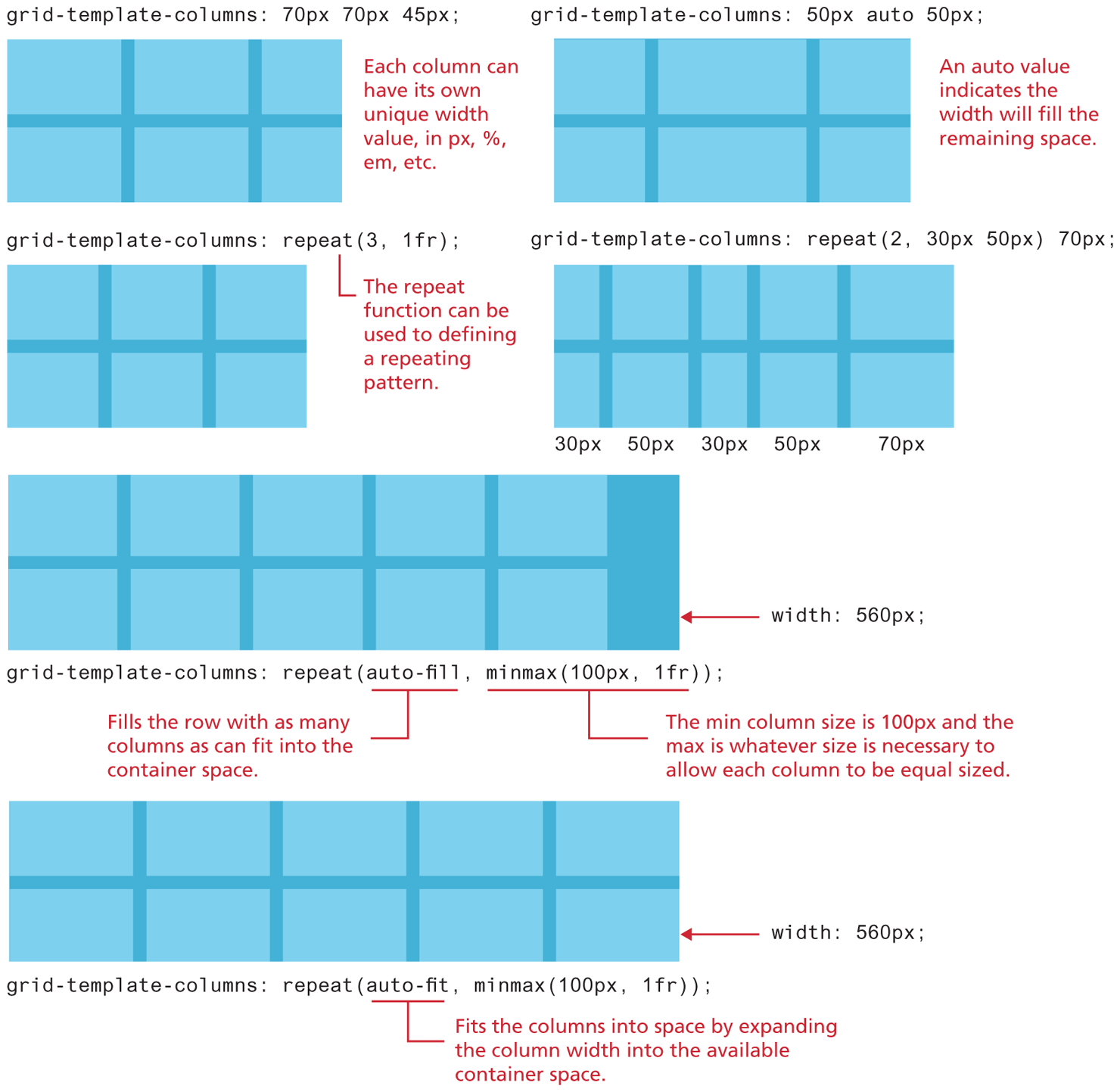
Figure 7.18 illustrates some of the additional sizing flexibility available with grids. Column widths (or row heights, since the same techniques can be used with grid-template-rows as well) can be specified in a wide range of sizing units, including px and %. The CSS repeat() function provides a way to specify repeating patterns of columns. In conjunction with the CSS minmax() function, you can easily lay out a repeated pattern of objects (for instance, images or cards) into rows and columns. To do the same thing in older CSS frameworks like Bootstrap typically required adding multiple row <div> elements as well as explicit column <div> elements. CSS grids provide a much cleaner solution. Listing 7.1 contrasts the markup needed in Bootstrap with the markup (and CSS) needed for CSS grids to implement a grid of images with two rows and three columns. The listing doesn’t show you the many lines of CSS that Bootstrap uses for its own container, row, and col classes. In Listing 7.1, why is the last line of CSS required? Remember, unlike flexbox, which works the same with inline and block elements, grid layout automatically puts block elements into grid cells, so the last line of CSS is required to turn the <img> elements into block-level elements.
Figure 7.18 Specifying column widths
Listing 7.1 Comparing Bootstrap grid with CSS Grid
<!-- Bootstrap 4 Approach -->
<div class="container">
  <div class="row">
    <div class="col"><img src=1.gif /></div>
    <div class="col"><img src=2.gif /></div>
    <div class="col"><img src=3.gif /></div>
  </div>
  <div class="row">
    <div class="col"><img src=4.gif /></div>
    <div class="col"><img src=5.gif /></div>
    <div class="col"><img src=6.gif /></div>
  </div>
</div>

<!-- CSS Grid Approach -->
<div class="container">
  <img src=1.gif />
  <img src=2.gif />
  <img src=3.gif />
  <img src=4.gif />
  <img src=5.gif />
  <img src=6.gif />
</div>
<!-- CSS for grid approach -->
.container {
  display: grid;
  grid-template-columns: repeat(auto-fit, minmax(100px, 1fr);
}
.container img { display: block; }
7.3.2 Explicit Grid Placement
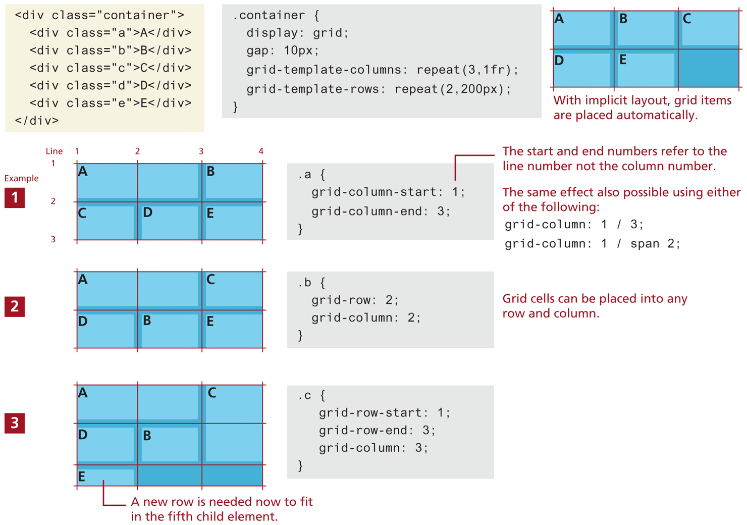
By default, child block-level elements are placed into grid cells automatically, or implicitly. It is possible however to populate grid cells explicitly. Figure 7.19 illustrates one of the ways this can be achieved: by setting grid row and column properties within individual cells. In the first example in Figure 7.19, notice that the first child element within the grid container has explicit grid-column-start and grid-column-end properties (set using line numbers), which makes the content span two cells. In the second example, the “B” child element is pulled out of its “normal” position, and explicitly placed into the second row and second column, while in the third example, the “C” child element spans two rows. Notice that in the third example, a new row is added to the grid using its auto-placement algorithm, in which the height of a new row is determined by its content if there isn’t a grid-template-row setting already set for it.
Figure 7.19 Using explicit grid item placement
7.3.3 Cell Properties
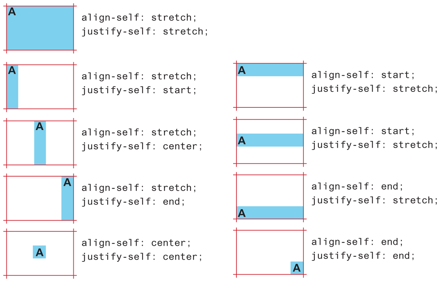
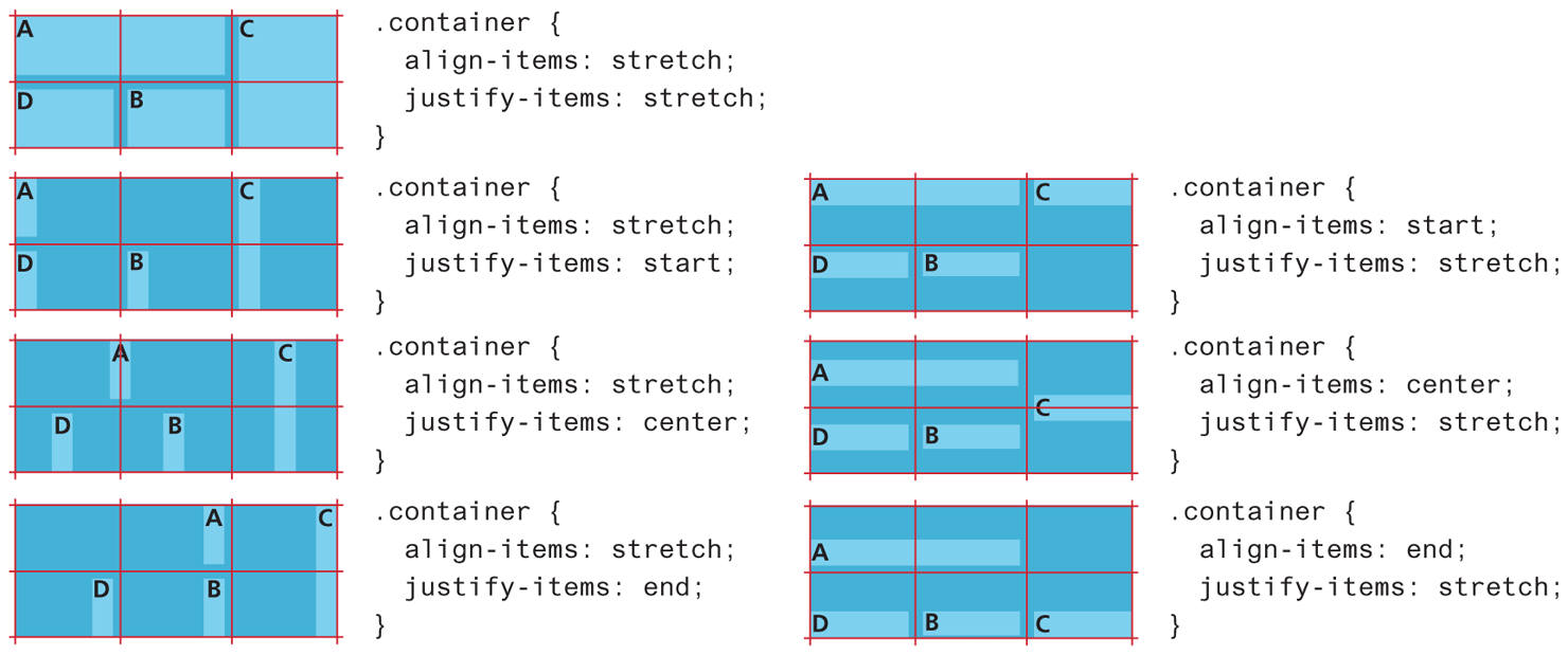
Just as flexbox introduced new layout properties to elements within a flex container, so too does grid have properties for child elements. Figure 7.20 illustrates two of the main cell properties: align-self and justify-self, which control the cell content’s horizontal and vertical alignment within its grid container.
Figure 7.20 Aligning content within grid cell
You can also control cell alignment within a grid container using align-items and justify-items, as shown in Figure 7.21.
Figure 7.21 Aligning content within grid container
7.3.4 Nested Grids
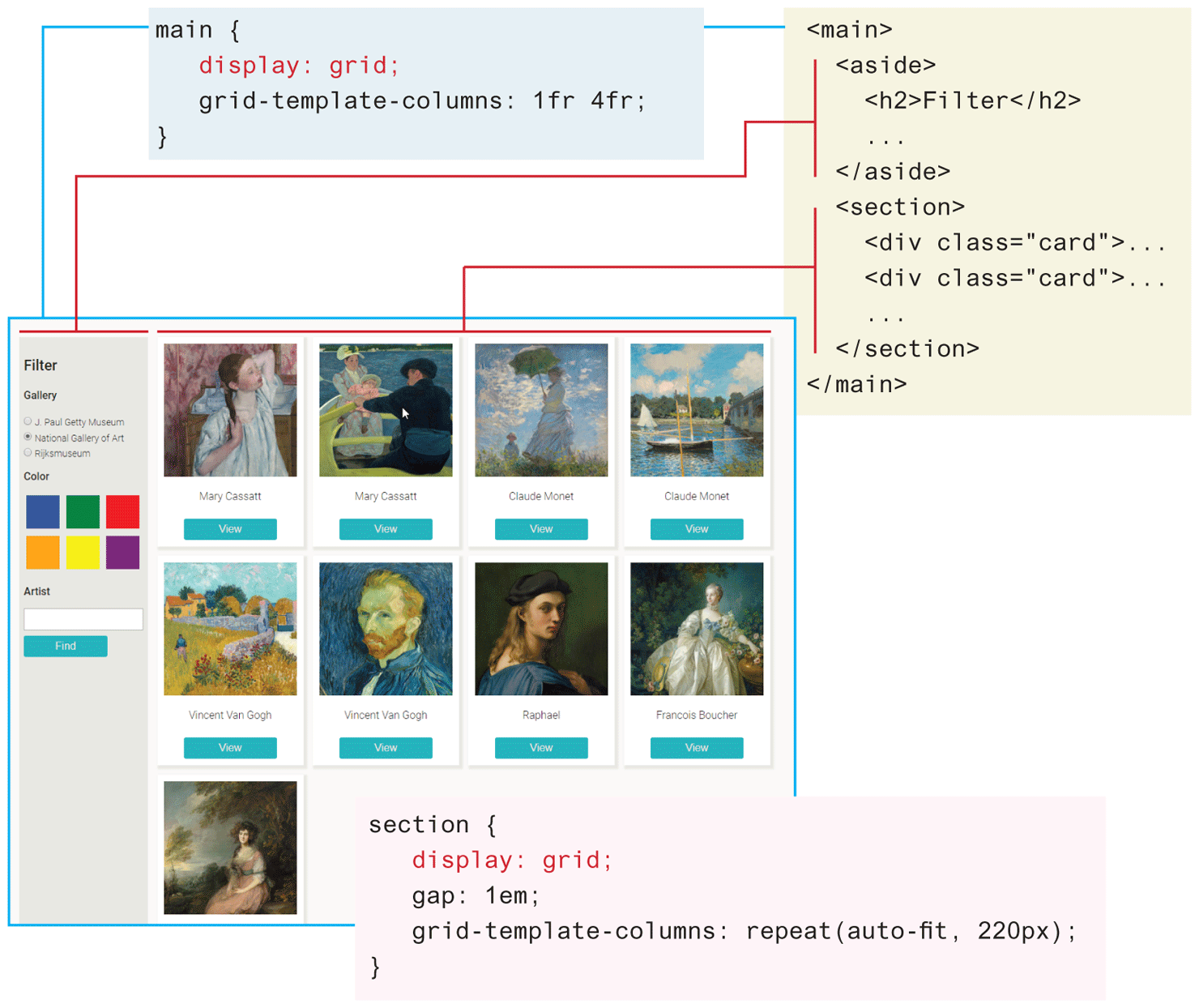
Any container element can have its display property set to grid. This means that grids can be nested within one another. Indeed, this is quite common. Figure 7.22 illustrates just how easy and flexible grid layout can be. The <main> container uses grid and contains just two columns, one for the filters and one for the cards. The <section> contain uses grid to layout the painting cards. As can be seen in the figure, it only takes a few lines of CSS to create a flexible nested grid. Using the CSS repeat() function with auto-fit means the number of card grid items will grow or shrink depending on the space available. If the browser window is wide, then five or six or more cards will be shown; if the window is mobile width, only one or two cards will be visible.
Figure 7.22 Nested grids
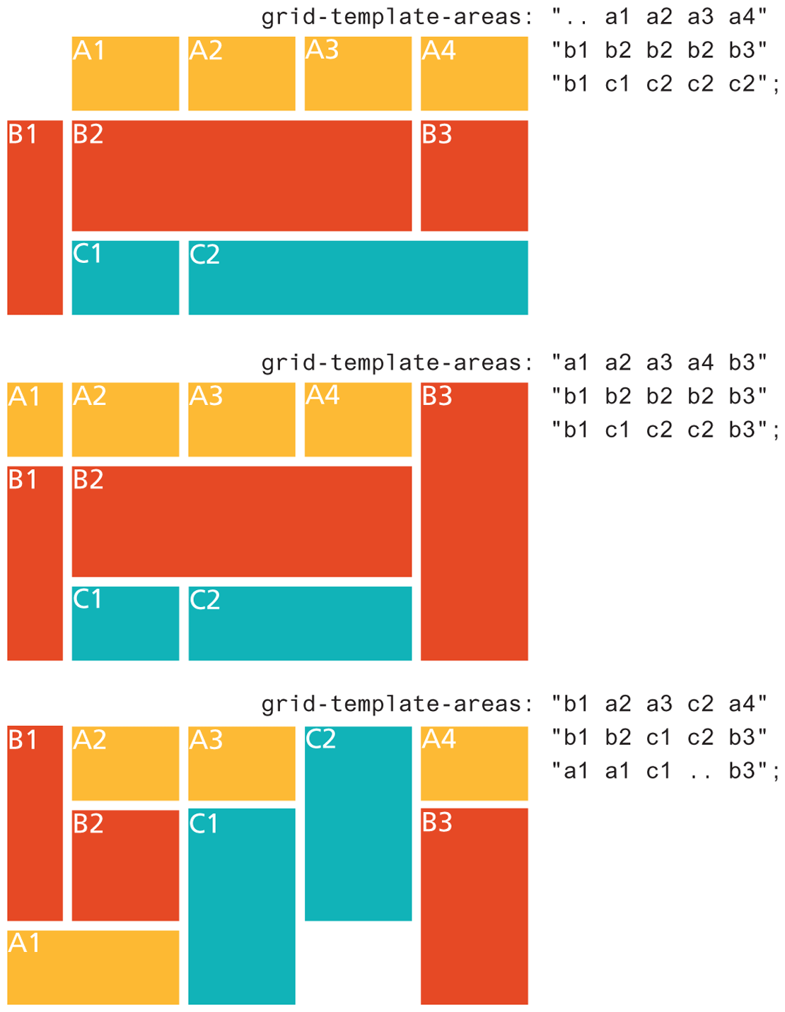
7.3.5 Grid Areas
Figures 7.18 and 7.19 illustrate how to define grid structure using row and column line numbers. As an alternative, you can instead use names.
You assign your own names to grid items using the grid-area property, and then define the structure of your grid using the grid-template-areas property. You can still use grid-template-columns and grid-template-rows for specifying sizes. The key rule to remember for grid-template-areas is that you must describe the entire grid; that is, every cell in the grid must either have a name or be explicitly specified as empty using one or more period (“.”) characters (you can use multiple periods to make them more noticeable). Listing 7.2 provides an example of using grid areas.
Listing 7.2 Using grid areas
<style>
.container {
   grid-gap: 10px;
   display: grid;
   grid-template-rows: 100px 150px 100px;
   grid-template-columns: 75px 1fr 1fr 1fr 1fr;
   grid-template-areas: ". a1 a2 a3 a4"
                        "b1 b2 b2 b2 b3"
                        "b1 c1 c2 c2 c2";
}
.a1 { grid-area: a1; }
.a2 { grid-area: a2; }
.a3 { grid-area: a3; }
.a4 { grid-area: a4; }

.b1 { grid-area: b1; }
.b2 { grid-area: b2; }
.b3 { grid-area: b3; }

.c1 { grid-area: c1; }
.c2 { grid-area: c2; }
</style>
...
<section class="container">
  <div class="yellow a1">A1</div>
  <div class="yellow a2">A2</div>
  <div class="yellow a3">A3</div>
  <div class="yellow a4">A4</div>
  <div class="orange b1">B1</div>
  <div class="orange b2">B2</div>
  <div class="orange b3">B3</div>
  <div class="cyan c1">C1</div>
  <div class="cyan c2">C2</div>
</section>
The results, shown in Figure 7.23, illustrates just how flexible and powerful grid areas can be once you’re comfortable with the syntax (note that the figure uses two periods to indicate empty cells in order to line up the area names). As you can see, you can modify just the grid-template-areas property and get very different layouts.
Figure 7.23 Using grid areas
7.3.6 Grid and Flexbox Together
Sometimes grid and flexbox layout are considered as competing solutions to implementing a layout. A more helpful way to thinking about these two layout modes is that they each have their strengths and these strengths can be combined.
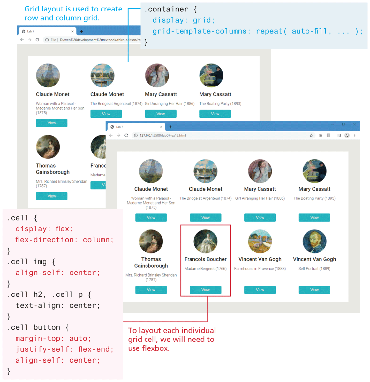
Most web page layouts are focused on two axes, on both rows and columns. As such, grid layout is ideal for constructing the layout structure of your page (or your container’s layout). Flexbox is ideal for layout along a single axis, either a row or a column. As you saw in Section 7.2.2, flexbox is perfect for centering elements within a container or making a container’s content stretch to fill its available space. Thus, flexbox is often ideal for laying out the contents of a grid cell.
Figure 7.24 illustrates an example of combining the two layout modes. Grid is used to create the four column by two row layout (though with different browser widths the number of rows and columns will vary) shown in the first screen capture. Notice that in the first screen, the cells vary in their height. In the second screen, Flexbox is used to ensure that each grid cell has the same height along with center alignment.
Figure 7.24 Using grid and flex together
Test Your Knowledge #2
Modify lab07-test02.html by adding CSS in lab07-test02.css to implement the layout shown in Figure 7.25 (some of the styling as already been provided).
Figure 7.25 Completed Test Your Knowledge #2
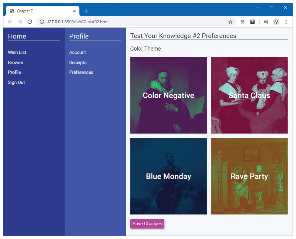
This layout will require two nested grids. Create the outer grid that will have one row and three columns containing the
<nav>,<aside>, and<main>elements. There should be no grid gap, and the first two columns should have a minimum size of 80px and a maximum size of 200px. The third column should fill the remaining space. To make the grid fill the entire vertical space, set the height of the container to 100vh.The inner grid containing the four image squares should consist of two columns and rows. The images in the background of each square are 250px by 250px.
To center the text within each square, use flex layout along with
align-itemsandjustify-content.