7.2 Flexbox Layout
In the last section, you learned that complex multi-column layouts could be created with floats and/or positioning, but it was a bit of a hack in the sense that neither the float nor position property were designed to achieve that outcome. Furthermore, one of the most common design requirements—namely, centering a child element horizontally and vertically within a container—was an unreasonably difficult undertaking with the CSS available to designers in the early 2010s.
Due to these drawbacks, browsers and the W3C CSS specification eventually added two new display property settings: flex (usually referred to as flexbox) and grid. Flexbox layout, which by 2015 was implemented by all the major contemporary browsers, was designed for layout in one dimension (a row or a column). Grid layout, which by mid-2017 was also supported by the major browsers, was designed for layout in two dimensions. Because they are display properties, these two layout modes can be assigned to any element.
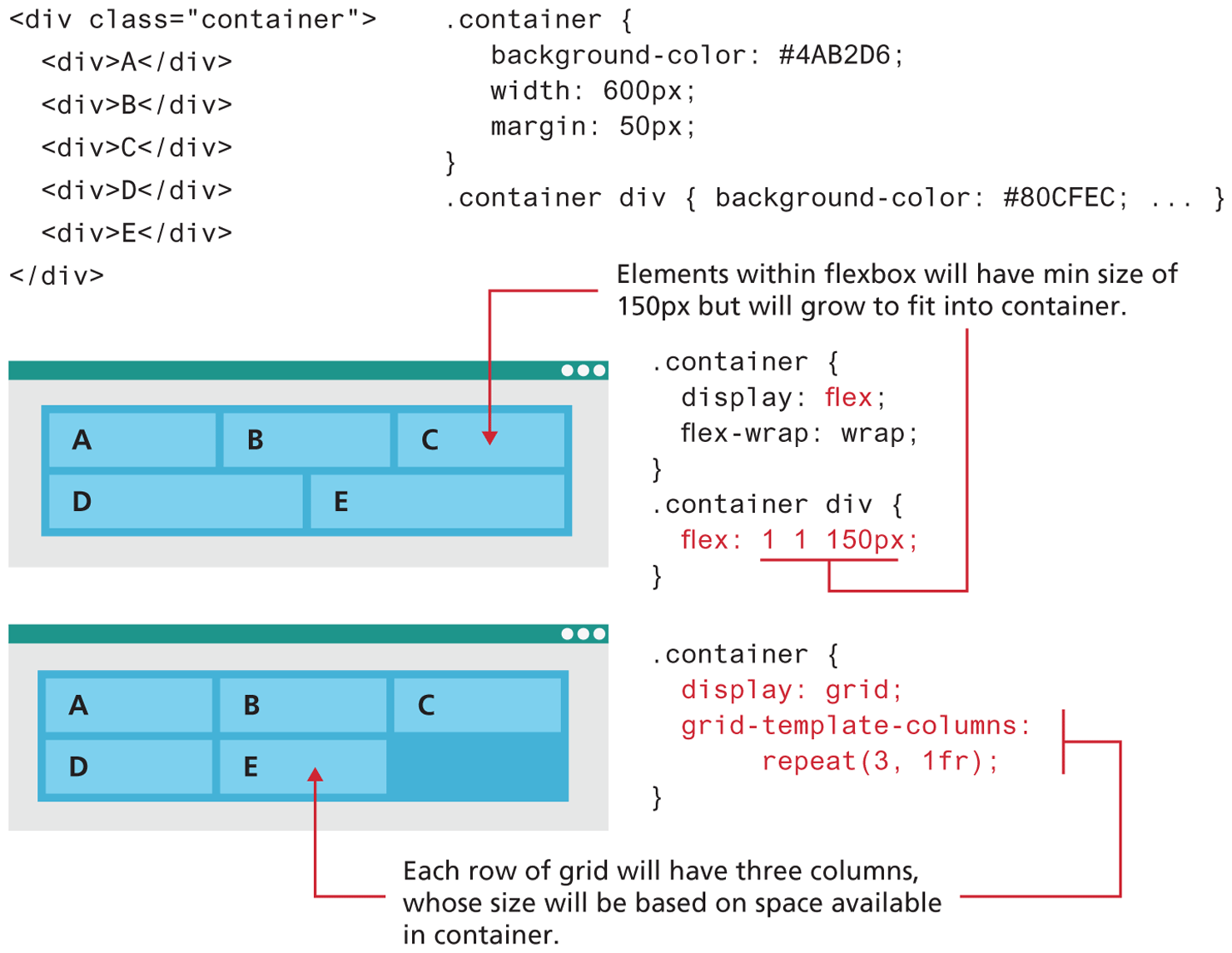
While these layout modes share some styling properties, it is important to understand how they differ (grid layout will be covered in Section 7.3). Figure 7.10 illustrates how flex and grid would display the same content.1
Figure 7.10 Comparing flex and grid layout
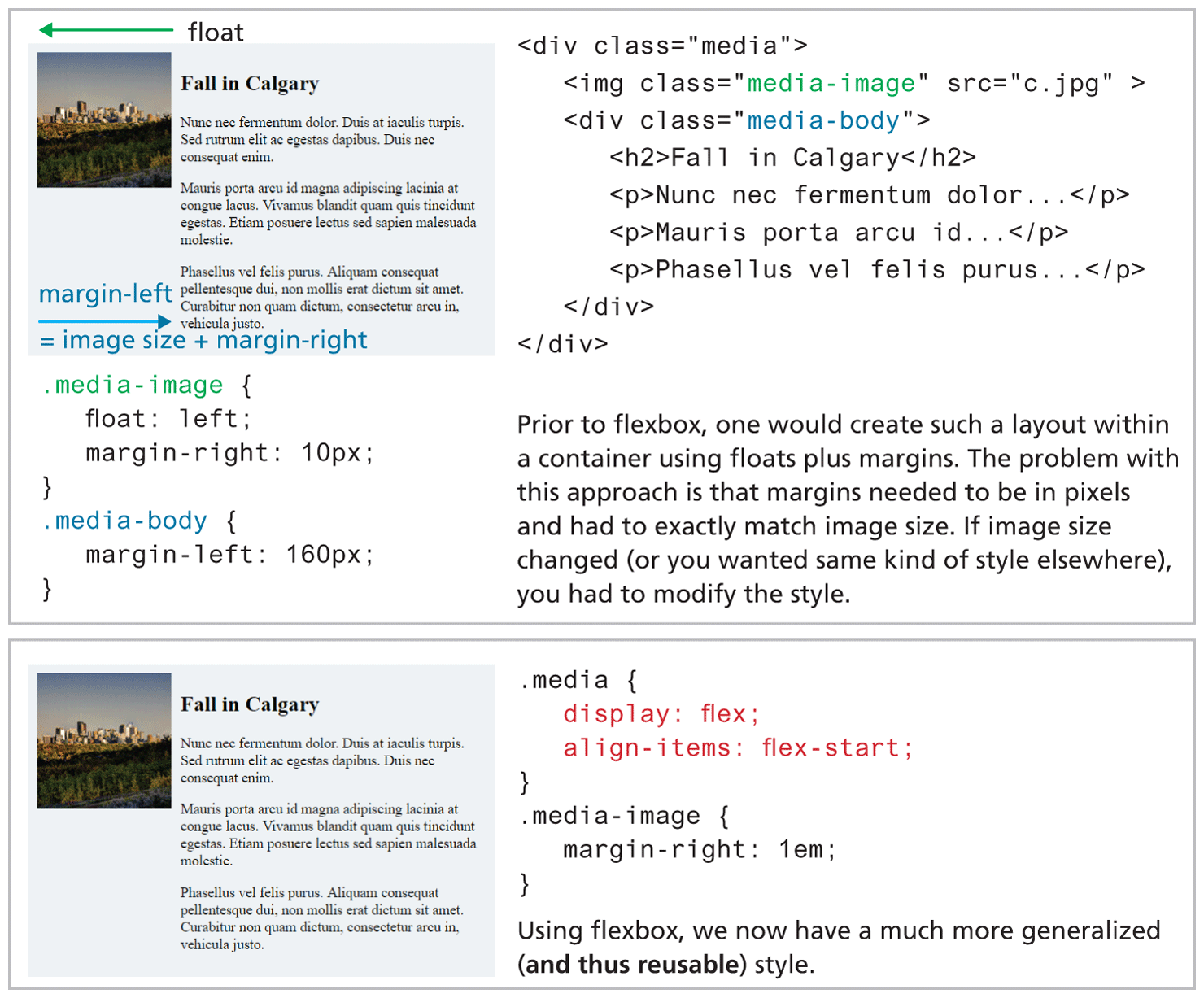
For this reason, a new flexible box (or flexbox) display mode was provided in CSS. Figure 7.11 illustrates how flexbox solves a very common design problem: placing two elements within two columns within a container. The older approach using floats requires margin settings using pixels based on the size of the image. While this does work, it doesn’t scale very well. That is, what if we wanted the same display but with larger or smaller images? Flexbox provides a simpler way to construct a layout that is more maintainable and far less brittle (though many students find flexbox equally hard to learn).
Figure 7.11 Using flexbox to simplify layout
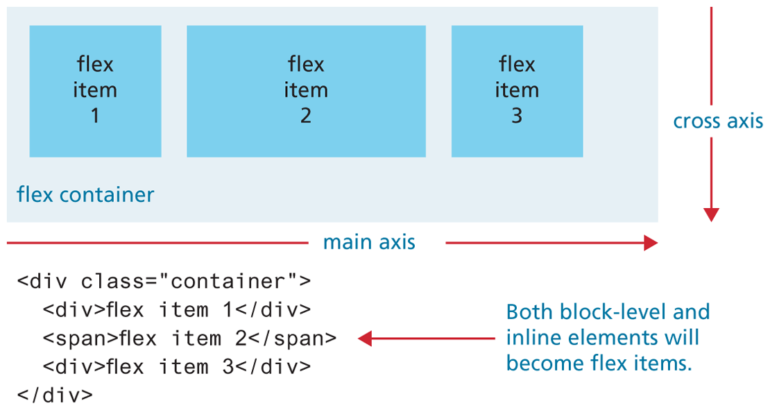
7.2.1 Flex Containers and Flex Items
So how does flexbox work? The first step in learning flexbox is recognizing that there are two places in which you will be assigning flexbox properties: the flex container and the flex items within the container. Figure 7.12 illustrates how a flex container not surprisingly contains flex items. Notice as well that the flex items are positioned in source order along a single main axis. So what would happen if we added a fourth item to this container? You can control this behavior via the flex-wrap property, but by default the new item would wrap to a new line in the direction of the cross axis.
Figure 7.12 Flex containers and items
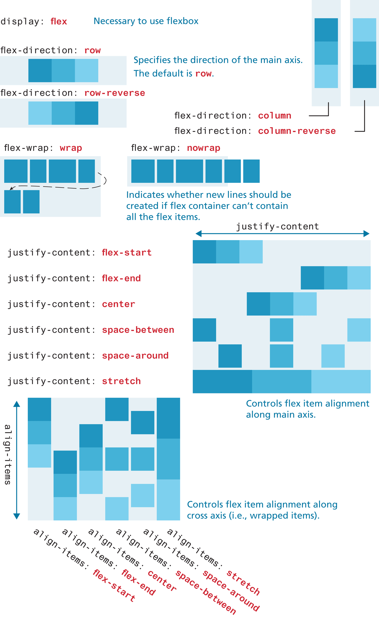
As can be seen in Figure 7.13, the parent container must have its display property set to flex. You can change the main axis from being a row to being a column, as well as the wrap behavior. Figure 7.13 also demonstrates the align-items and justify-content properties, that control how items are aligned within a container.
Figure 7.13 The flexbox container (parent) properties
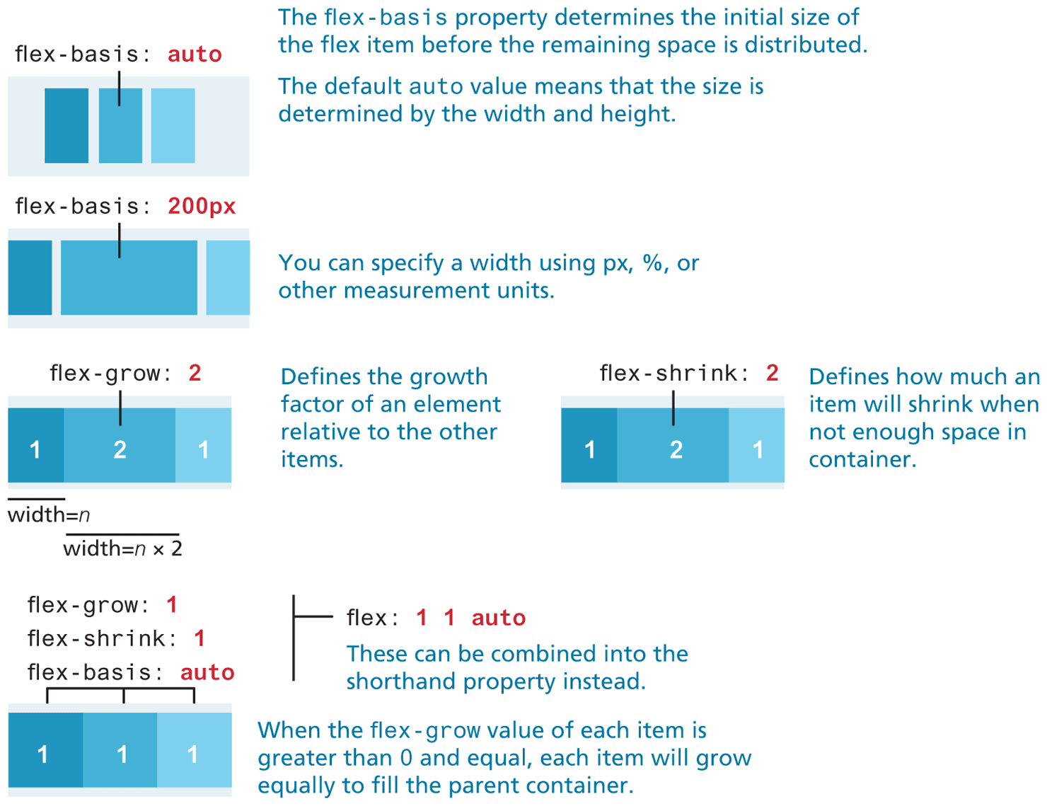
Individual flex items within the container also have their own flexbox properties; the most important of these are shown in Figure 7.14.
Figure 7.14 The flexbox item (child) properties
7.2.2 Use Cases for Flexbox
In Section 7.3, you will learn more about the new grid layout mode, which allows a developer to lay out block-level elements in rows and columns, in contrast to flexbox, which distributes both inline and block elements along a single axis. From the author’s experience, most students find grid layout mode easier to learn and use than flex mode. Nonetheless, there are some key use cases for flex.2
Aligning an item horizontally and vertically within a container has always been a tricky problem with CSS; flexbox makes this process much easier. The nearby Essential Solution illustrates how to center a child within a parent container using flexbox. It also illustrates that flexbox works from the content out. That is, with flexbox, the content decides how much space it needs and its parent decides how to fit it based on space available on that line (or column). As you will discover in Section 7.3, this can be an important technique for creating responsive designs that work equally well on smaller mobile browsers.
Flexbox is often used to construct a horizontal navigation bar, since flex can distribute items evenly along a row. Similarly, flex is very helpful within data entry forms, especially for aligning labels, input controls, and buttons. Essential Solution #2 shows how one can simply construct an adaptable horizontal menu using flexbox.
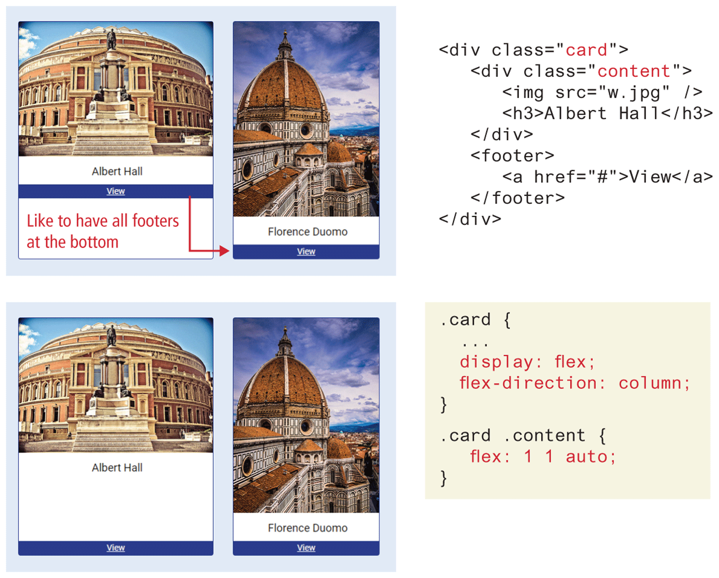
Flexbox is also used for so-called card layout. In a card component, you typically have a footer that has to sit at the bottom of the card after the rest of the card content. If the card content is of variable height, without flex, the footer would move to be just below the content; flex can make the card content area grow, as shown in Figure 7.15.
Figure 7.15 Implementing a card layout using flexbox
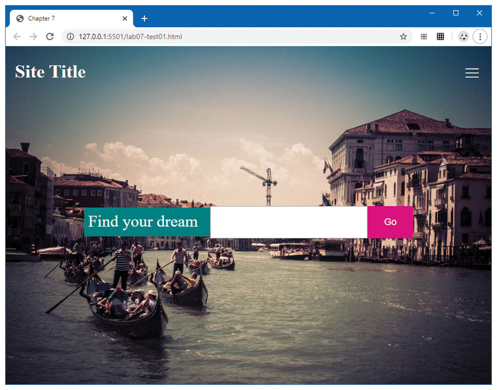
Test Your Knowledge #1
Modify lab07-test01.html by adding CSS in lab07-test01.css to implement the layout shown in Figure 7.16 (some of the styling as already been provided).
Set the background image on the
<body>tag. Set theheightto100vhso it will always fill the entire viewport. Set thebackground-coverandbackground-positionproperties (see Chapter 4 for a refresher if needed).For the header, set its display to
flex. Setjustify-contenttospace-betweenandalign-itemstocenter. This will make the<h2>and the<nav>elements sit on the same line, but will expand to be aligned with the outside edges.To center the form in the middle of the viewport, set the
displayof the<main>element toflex, andalign-itemsandjustify-contentstocenter. Do the same for the<form>element.Fine-tune the size of the form elements by setting the
flex-basisof label to 16em, the search box to 36em, and the submit button to 10em. The final result should look similar to that shown in Figure 7.16.
Figure 7.16 Completed Test Your Knowledge #1