7.1 Older Approaches to CSS Layout
In Chapter 4, you learned that CSS elements are either block or inline. Block-level elements such as <p>, <div>, <h2>, <ul>, and <table> are each contained on their own line. Because block-level elements begin with a line break (that is, they start on a new line), without additional CSS intervention, two block-level elements can’t exist on the same line. Block-level elements also use the normal CSS box model, in that they have margins, paddings, background colors, and borders.
Inline elements do not form their own blocks but instead are displayed within lines. Normal text in an HTML document is inline, as are elements such as <em>, <a>, <img>, and <span>. Inline elements line up next to one another horizontally from left to right on the same line; when there isn’t enough space left on the line, the content moves to a new line. Also, certain box model properties (width, height, and top and bottom margins) are ignored for inline elements.
In Chapter 4 you also encountered a third display mode: inline-block, which allows elements to sit on the same line (or wrap to the next one), and have box model properties such as width, height, and margins. The display property in CSS provides a mechanism for the developer to change an element to block, inline, or inline-block.
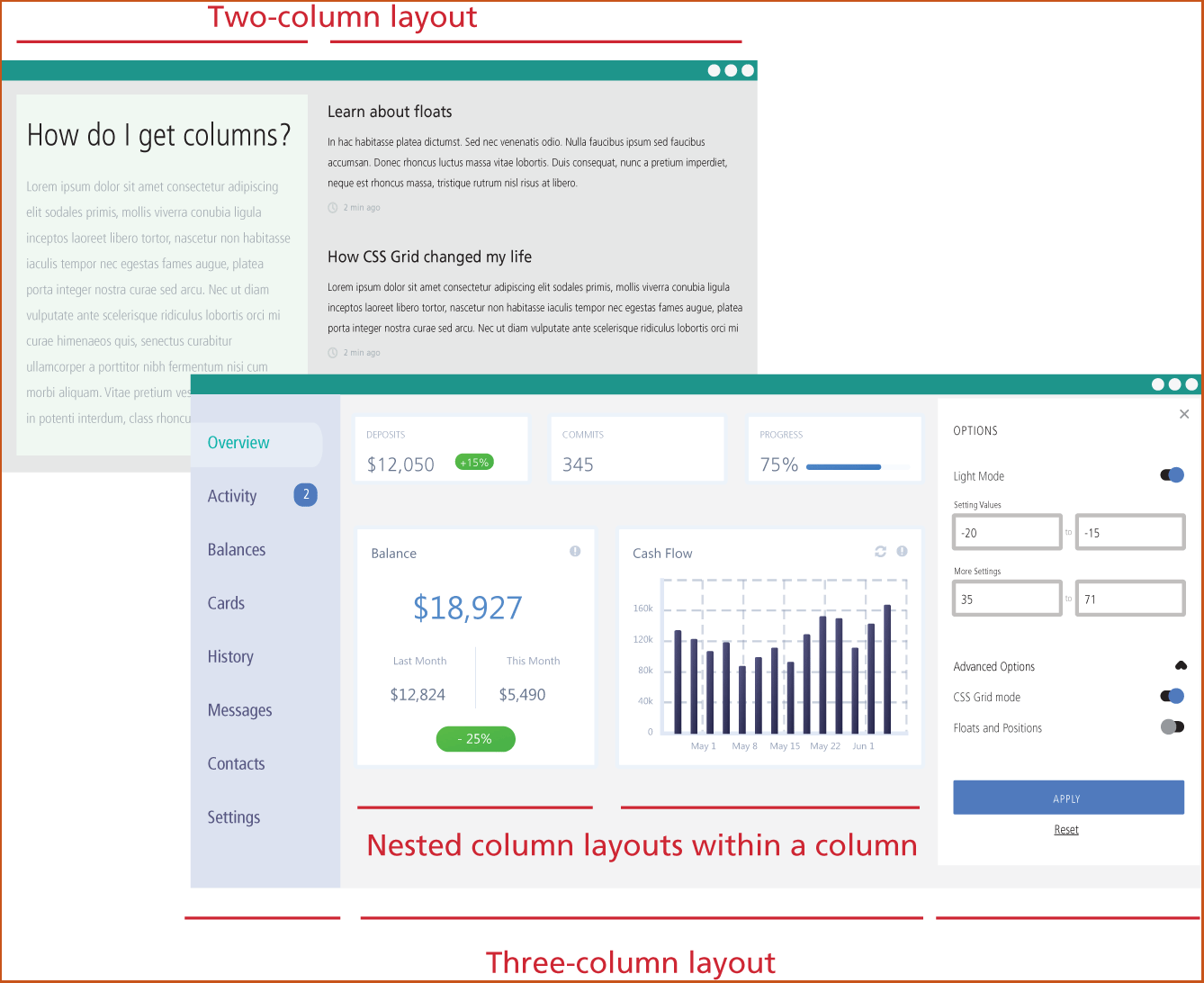
These three modes do not by themselves provide a way to create more complex layouts in which there are two or three (or more) columns of independent content which sit horizontally from each other. In Figure 7.1, in the top two-column layout, the two columns need to be independent of each other in that the height of the first column should have no effect on the second column and vice versa. While the inline-block display mode allows two elements to sit side by side, one can’t easily create the multi-column layouts shown in Figure 7.1 with it.
Figure 7.1 Layout columns
For the first 20 years of CSS, designers had to “hack” together these types of layouts using floats and/or positioning. There are now newer approaches (flexbox and grid display modes) that make this type of layout much easier to implement. The first and second edition of this book spent 22 pages to cover how to create multi-column layouts in CSS using floats and positioning, which until about 2016, were the approach CSS designers had to learn in order to achieve these layouts.
In the next two sections, you will learn how to use flexbox and grid display modes. Nonetheless, there may be times when you may have to support legacy CSS so it makes sense to spend a few pages to learn the basics of floats and positioning.
7.1.1 Floating Elements
It is possible to displace an element out of its position in the normal flow via the CSS float property. An element can be floated to the left or floated to the right. When an item is floated, it is moved all the way to the far left or far right of its containing block and the rest of the content is “reflowed” around the floated element, as can be seen in Figure 7.2.
Figure 7.2 Floating an element
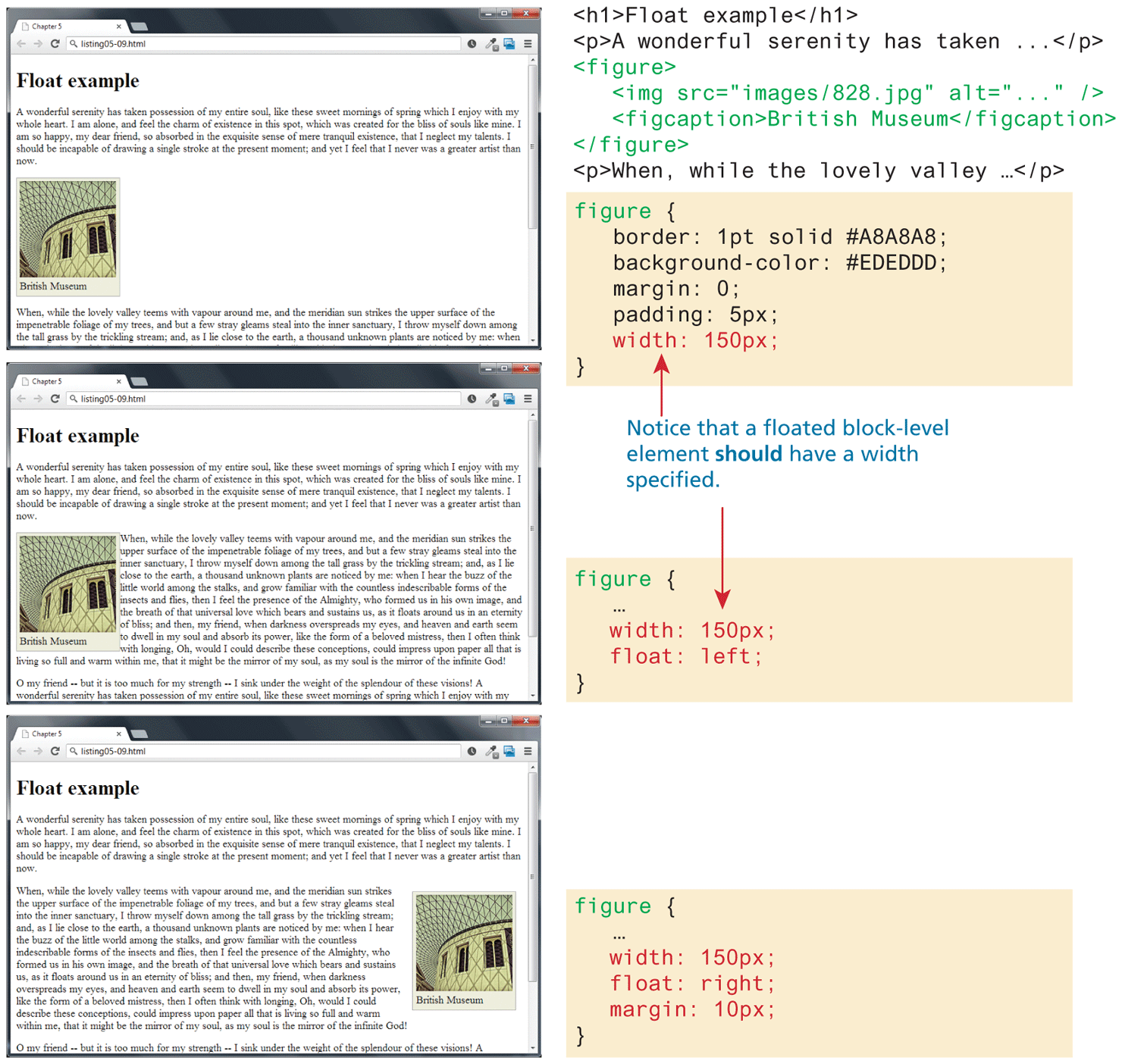
Notice that a floated block-level element should have a width specified; if you do not, then normally (depending on the browser) the width will be set to auto, which will mean it implicitly fills the entire width of the containing block, and there thus will be no room available for content to flow around the floated item. Also note in the final example in Figure 7.2 that the margins on the floated element are respected by the content that surrounds that surrounds it.
There are several common problems encountered with using the float property. The first is that the margins for floated elements do not collapse, which means floated block level elements behave differently than non-floated elements. The second (and more serious) problem with floats is that when a parent element contains only floated child elements, the parent element essentially disappears because the browser assumes that it no longer has a height.
7.1.2 Positioning Elements
Another “traditional” way to move elements out of their regular position in the normal flow is via positioning. In fact, it is possible to move an element outside the browser viewport so it is not visible, or to position an element so it is always visible even when the rest of the page is scrolled.
The position property is used to specify the type of positioning, and the possible values are shown in Table 7.1. The left, right, top, and bottom properties are used to indicate the distance the element will move; the effect of these properties varies depending upon the position property.
Table 7.1 Position values
| Value | Description |
|---|---|
| absolute | The element is removed from normal flow and positioned in relation to its nearest positioned ancestor. |
| fixed | The element is fixed in a specific position in the window even when the document is scrolled. |
| relative | The element is moved relative to where it would be in the normal flow. |
| static | The element is positioned according to the normal flow. This is the default. |
| sticky | The element is positioned in according to the normal flow, and then offset relative to its nearest scrolling ancestor. This is used to allow an item to scroll, and then stay fixed in position once its scroll position is reached. |
In relative positioning an element is displaced out of its normal flow position and moved relative to where it would normally have been placed. The other content around the relatively positioned element “remembers” the element’s old position in the flow; thus the space the element would have occupied is preserved, as is the rest of the document’s flow, as shown in Figure 7.3.
Figure 7.3 Relative positioning
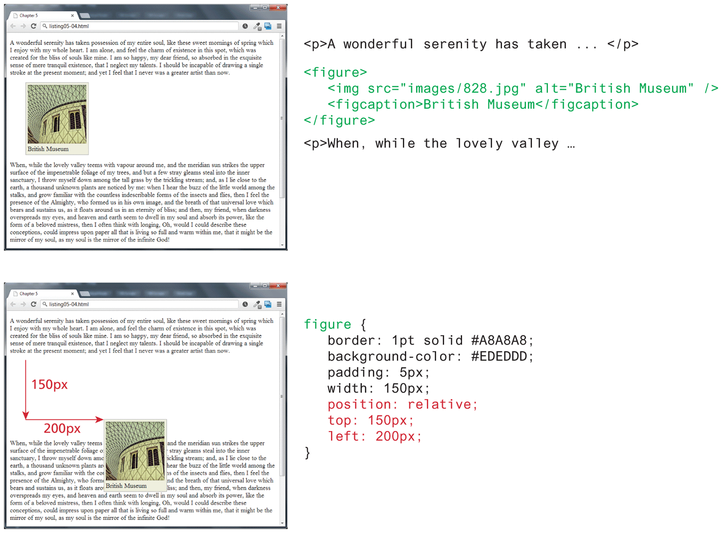
As a consequence, the repositioned element now overlaps other content: that is, the <p> element following the <figure> element does not change to accommodate the moved <figure> as one might expect.
When an element is positioned using absolute positioning, it is removed completely from normal flow. Thus, unlike with relative positioning, space is not left for the moved element, as it is no longer in the normal flow. Its position is moved in relation to the top left corner of its container block. In the example shown in Figure 7.4, the container block is the <body> element. Like with the relative positioning example, the moved block can now overlap content in the underlying normal flow.
Figure 7.4 Absolute positioning
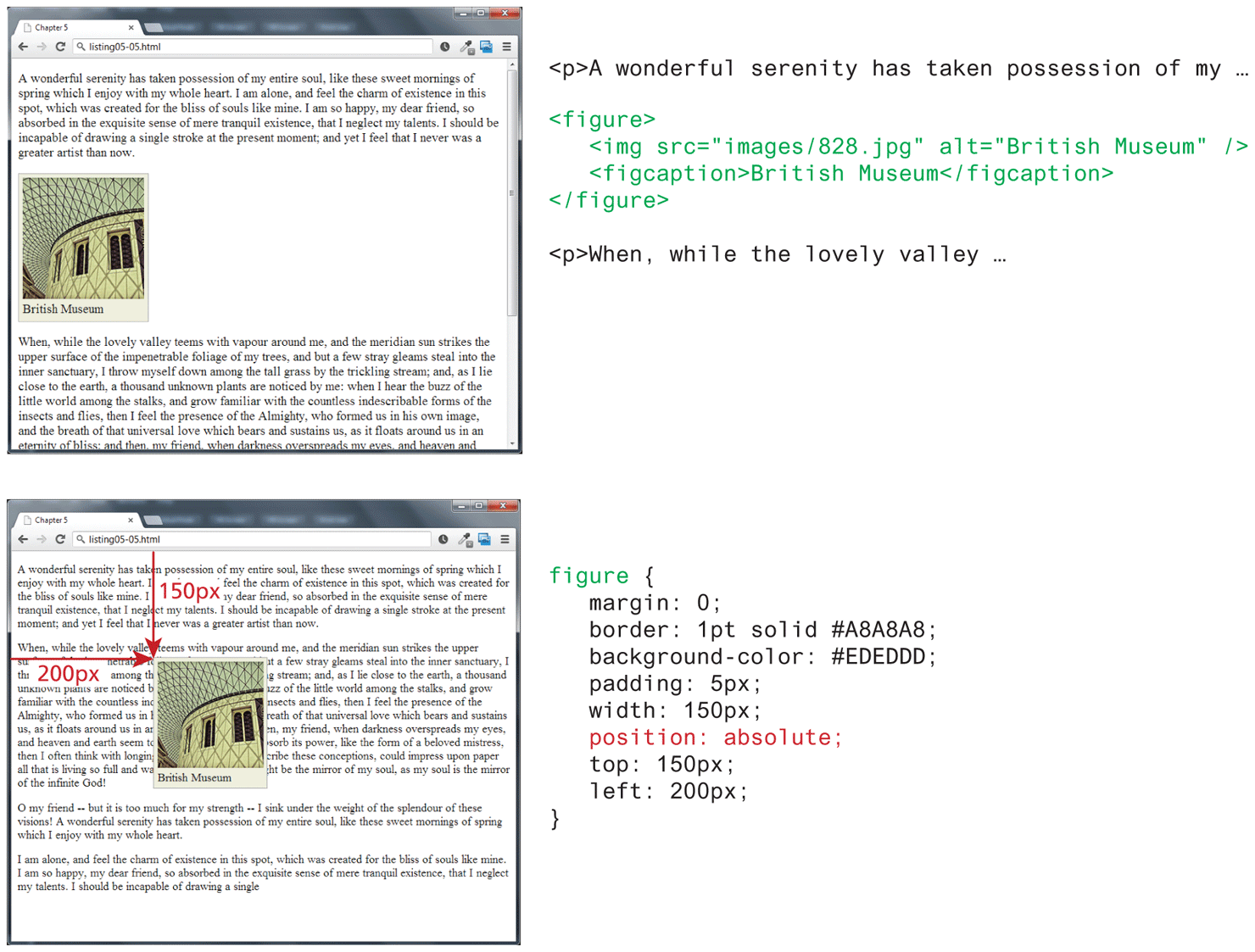
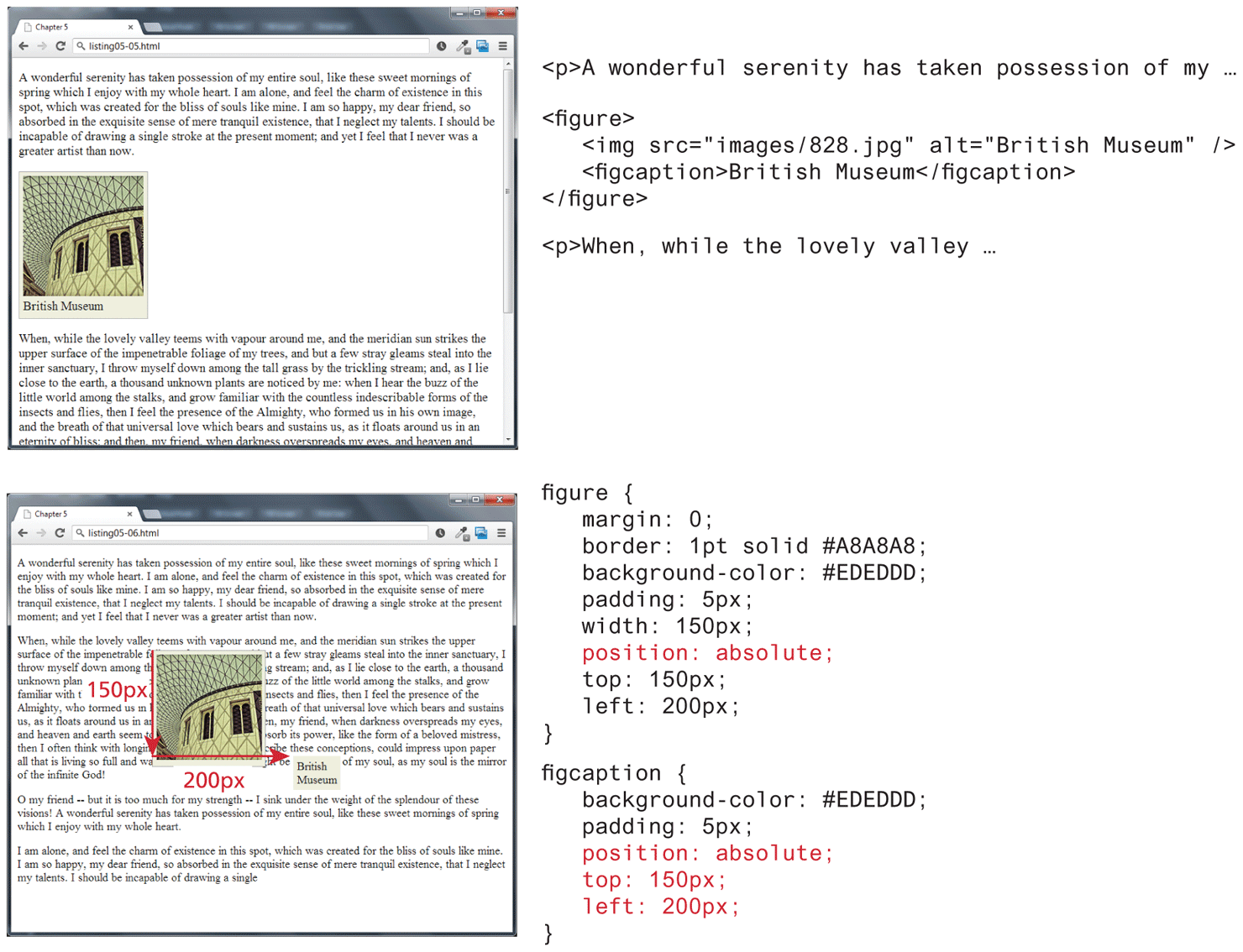
While this example is fairly clear, absolute positioning can get confusing. An element moved via absolute position is actually positioned relative to its nearest positioned ancestor container (that is, a block-level element whose position is fixed, relative, absolute, or sticky). In the example shown in Figure 7.5, the <figcaption> is absolutely positioned; it is moved 150 pixels down and 200 pixels to the left of its nearest positioned ancestor, which happens to be its parent (the <figure> element).
Figure 7.5 Absolute position is relative to nearest positioned ancestor container
7.1.3 Overlapping and Hiding Elements
One of the more common design tasks with CSS is to place two elements on top of each other, or to selectively hide and display elements. Even with newer flexbox and grid layout modes, positioning is still commonly used for both of these tasks.
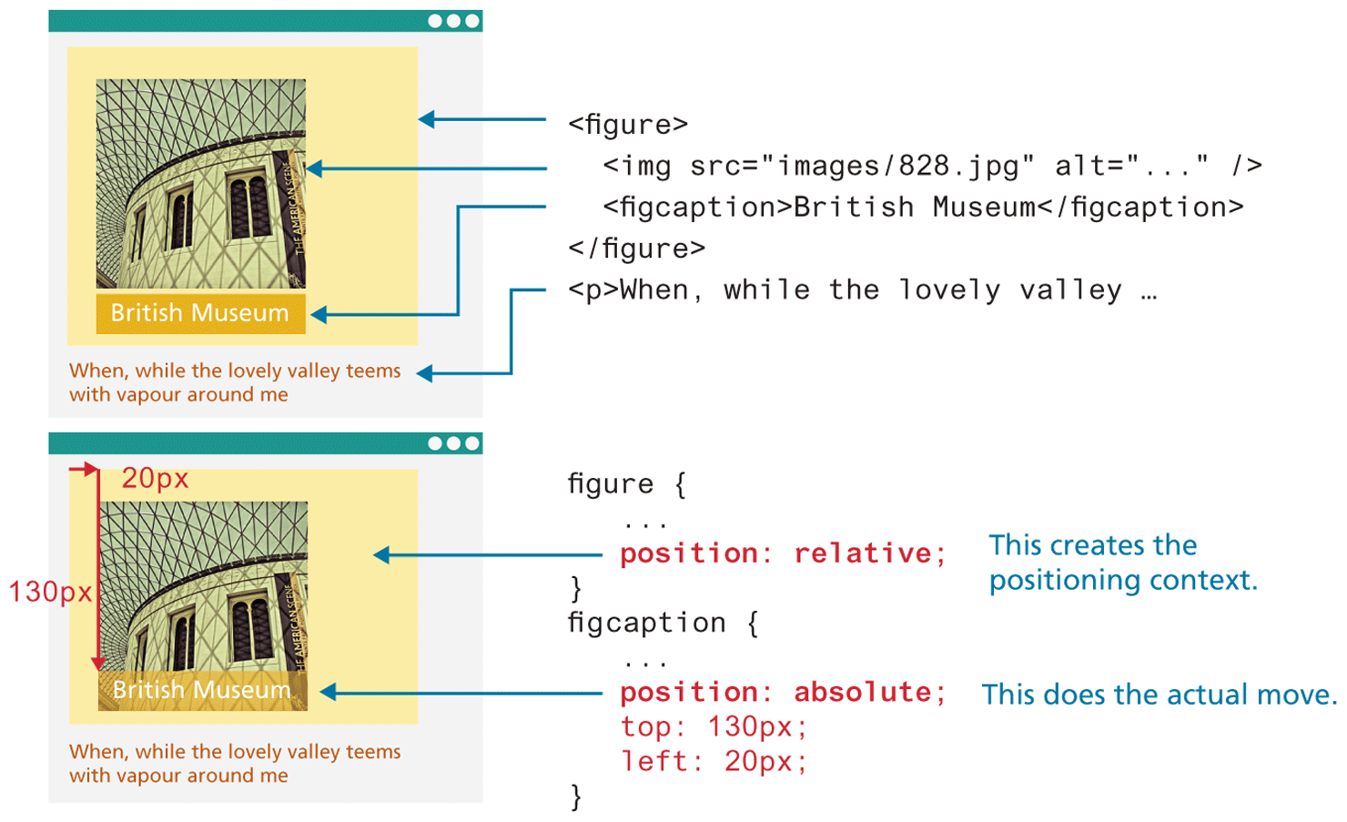
In such a case, relative positioning is used to create the positioning context for a subsequent absolute positioning move. Recall that absolute positioning is positioning in relation to the closest positioned ancestor. This doesn’t mean that you actually have to move the ancestor; you just set its position to relative. In Figure 7.6, the caption is positioned on top of the image; it doesn’t matter where the image appears on the page, its position over the image will always be the same.
Figure 7.6 Using relative and absolute positioning
This technique can be used in many different ways. Figure 7.7 illustrates another example of this technique. In it, an image that is the same size as the underlying one is placed on top of the other image using absolute positioning. Since most of this new image contains transparent pixels (transparency was covered in Chapter 6), it only covers part of the underlying image.
Figure 7.7 Using the display property
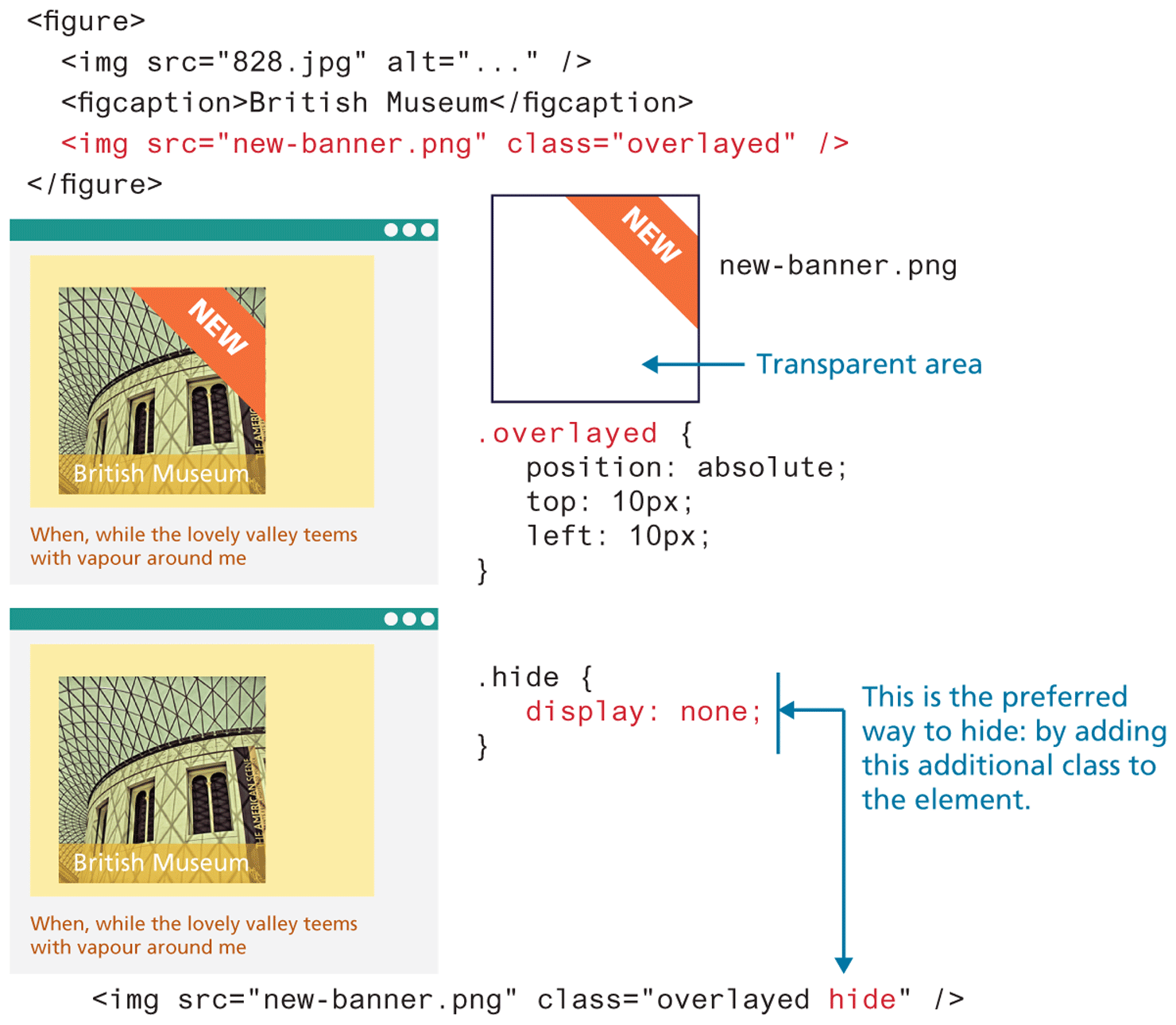
But imagine that this new banner is only to be displayed some of the time. You can hide this image using the display property, as shown in Figure 7.7. You might think that it makes no sense to set the display property of an element to none, but this property is frequently set programmatically in JavaScript, perhaps in response to user actions or some other logic.
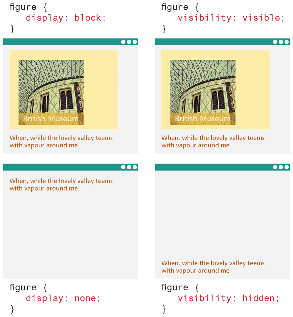
There are in fact two different ways to hide elements in CSS: using the display property and using the visibility property. The display property takes an item out of the flow: it is as if the element no longer exists. The visibility property just hides the element, but the space for that element remains. Figure 7.8 illustrates the difference between the two properties.
Figure 7.8 Comparing display to visibility
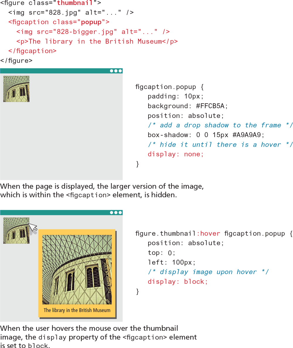
While these two properties are often set programmatically via JavaScript, it is also possible to make use of these properties without programming using pseudo-classes like :hover. Figure 7.9 demonstrates how the combination of absolute positioning, the:hover pseudo-class, and the display property can be used to display a larger version of an image (as well as other markup) when the mouse hovers over the thumbnail version of the image. This technique is also commonly used to create sophisticated tool tips for elements.
Figure 7.9 Using hover with display
 Note
Note
Using the display:none and visibility:hidden properties on a content element also makes it invisible to screen readers as well (i.e., the content will not be spoken by the screen reader software). If the hidden content is meant to be accessible to screen readers, then another hiding mechanism (such as large negative margins) will be needed.