6.5 Working with Color
If you are learning web development within a program that focuses on design, you will no doubt find (or have found) yourself spending a great deal of time learning about color relationships and color psychology. For instance, the way we perceive a color changes based on the other colors that are in close proximity. Similarly, colors can evoke certain emotions and impressions, many of which are culturally determined. Artists and color experts have codified many of the relationships between colors and have given names and attributes to these color relationships. A full elaboration of these relationships is beyond the scope of this book.
Every year when I’m marking assignments from my students, I often think, “These colors are terrible . . . I need to spend more time teaching color.” I teach in a program that focuses mainly on programming, and every semester I am reminded of the fact that programmers are not always the best judges of good color combinations.
On real-world projects, you might have a visual designer who will handle color decisions. But for smaller projects, you will likely need to make those decisions yourself. One of the attractions of CSS frameworks for many developers is that the color work has already been decided. But what if you are not happy with the rather bland color combinations in these frameworks (or you’re not using one)?
6.5.1 Picking Colors
If you are not completely confident in your ability to pick harmonious color combinations, there is a variety of online tools such as paletton.com, colordesigner.io, and colormind.io, that can help you somewhat in this regard. These sites or tools tend to give you five or six colors that exist in some type of algorithmic color relationship and do tend to look quite harmonious together.
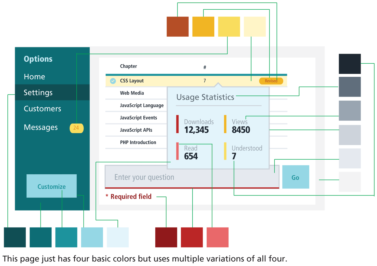
But as Adam Wathan and Steve Schoger in their book Refactoring UI note, these tools are a bit of a trap. You actually need both fewer than and more than the five or six colors provided by these tools. That is, most web user interfaces typically need six or seven (or even 8 to 10) variations of three or four colors, as can be seen in Figure 6.36.
Figure 6.36 Practical color in web interfaces
 Note
Note
This section on color is based on a small subset of the color chapter in the excellent book Refactoring UI by Adam Wathan and Steve Schoger (refactoringui.com) and is used with their permission. This book is an excellent and practical guide to contemporary web design and highly recommended.
6.5.2 Define Shades
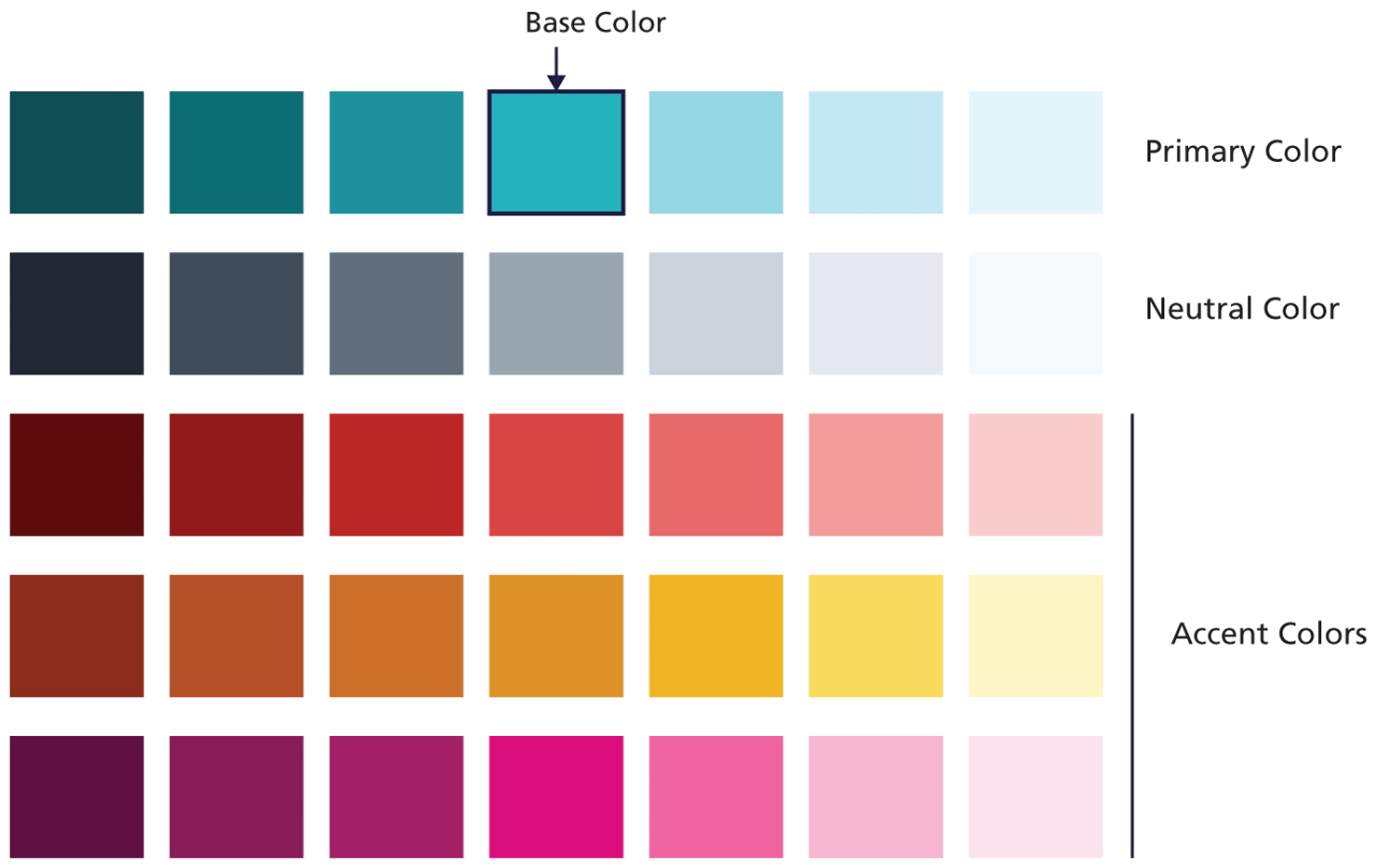
A sensible first step then when starting on a web project is to define the shades you need, starting with your primary color. Figure 6.37 illustrates an example starting palette. The beginning point was the base color, which you can see is in the middle of the row of sample primary colors.
Figure 6.37 Example starting color palette
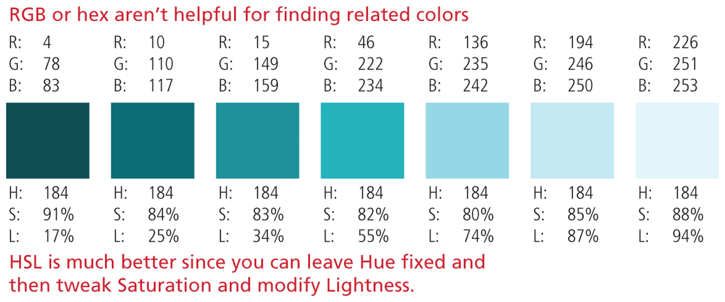
How then do you come up with your shades? Working with HSL instead of RGB or hex codes makes this task much easier. You can come up with variations of your base color simply by adjusting the saturation and brightness values of your chosen hue, as shown in Figure 6.38.
Figure 6.38 Using HSL
Some more recent CSS frameworks come preconfigured with sample shades. Google Materials-based frameworks usually have 9 shades for 19 different colors; Tailwind CSS comes with 9 shades of 10 different colors.
Once you have your shades defined, you can codify them within a set of CSS variables or as utility classes, as shown in Listing 6.1.
Listing 6.1 Using color shades with CSS
/* Define primary colors via CSS variables, using hsl or hex.
    By convention, numbers 100, 200, etc indicate shades */
:root {
   --color-primary-100: hsl(184,88%, 94%);
   --color-primary-200: #87EAF2;
   --color-primary-300: #38BEC9;
   --color-primary-400: #14919B;
   --color-primary-500: #0A6C74;
}

/* Use variables where needed */
header {
   background-color: var(--color-primary-500);
   color: var(--color-primary-100);
}

/* Alternately, define colors in utility classes */
.bg-primary-100 {
   background-color: #E0FCFF;
}
.bg-primary-500 {
   background-color: #0A6C74;
}
.text-primary-100 {
   color: #E0FCFF;
}

/* Switch to HTML to show how to use utility color classes */
<article class="bg-primary-500 text-primary-100">
 Pro Tip
Color is an obvious way to draw attention to some aspect of your user interface or the information within it. However, users with color blindness may not be able to see certain colors (multiple distinct colors, for instance, might appear similarly muddy brown or even identical).
For this reason, your interface shouldn’t rely completely on color. You can achieve similar effects through contrast of light and dark shades of a single color. Something as simple as printing your pages on a monochrome printer, can provide some quick cues about the potential discernability of your colors for color-blind users. Even better, try using a color blindness simulator to preview how your color combinations appear for the different forms of color blindness.