5.6 Styling and Designing Forms
By default, each browser displays form controls using platform-native styling. This means that a form control could very well look different on an iPhone compared to a Windows desktop computer. While making use of the default control styles does make some sense, nonetheless it’s quite common to customize the look of these controls in order to create something that fits the visual design of the rest of the site.
5.6.1 Styling Form Elements
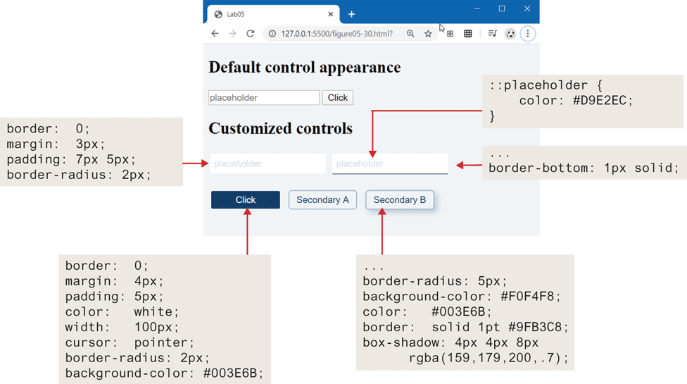
CSS now provides a reasonably comprehensive ability to customize the look of the different HTML form controls. For many years, creating a customized look to a radio button or checkbox often required additional <span> and <div> elements and some complicated CSS. Things are a bit better today (in 2020 when this chapter was revised), though the CSS for customizing some controls is still nontrivial.
Let’s begin with the common text and button controls. A common styling change is to eliminate the borders and add in rounded corners and padding. Why padding? It adds some space between the user’s input values and the borders of the control. Figure 5.31 illustrates some common styles approaches for these controls. Notice that in the customized text input control, there is space around the placeholder (and input text had we shown that) and the outside edge of the control, while with the default control, there is no space between the border and the placeholder.
Figure 5.31 Styling text and buttons controls
Input elements within forms are often associated with labels. These are typically to the left or above the input element. By default, form elements are inline-block elements, which means they have padding and margin but sit on the same line. Labels, however, are inline, so they need to be changed to block or inline-block if you wish to add padding or margins. Figure 5.32 illustrates several approaches to combining labels with form elements.
Figure 5.32 Working with labels
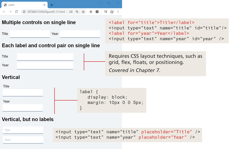
Which one is preferable? It depends. The version that doesn’t use labels works best when there is a lack of design space; however, once the user enters content into the field, she loses information about what content is supposed to be in it because the helpful placeholder text is gone. The labels to the left of the field create a helpful visual separation between labels and input elements; however, such a design rarely is possible for mobile browsers in portrait orientation. The labels above the field work equally well for mobile and desktop clients; however, they use more vertical space (which is at a premium with the typical landscape-orientation desktop and laptop monitors), thus will likely require the user to scroll in order to see all the fields.
In Chapter 7, you will learn about CSS layout, which allows you, for instance, to position labels and form elements in multiple aligned columns. Customizing the appearance and behavior of radio buttons, checkboxes, and select lists requires lengthly and relatively complicated CSS styling and is beyond the scope of this book.
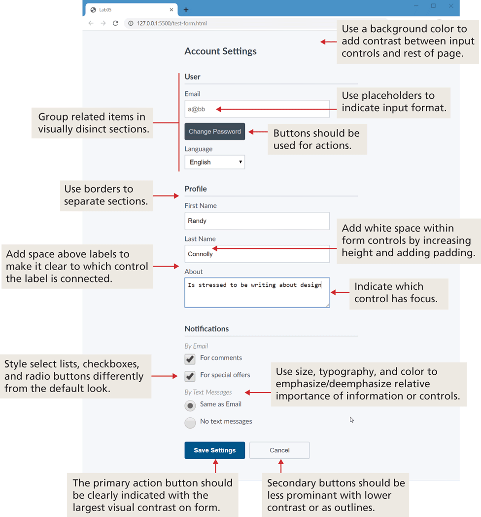
5.6.2 Form Design
Whether they be search forms, contact forms, login forms, registration forms, user preference forms, or any edit/insert data forms, most sites typically require multiple forms. In the world of the web, forms are the main way for users to deliver data to a site. As such, a well-designed form communicates to a user that the site values their time and data. For this reason, it is worth spending at least a little time learning some simple guidelines for making your forms look attractive.
Perhaps the first and most important rule is to style your form elements so they look different from the default settings. Figure 5.33 describes and illustrates a small set of straightforward additional precepts for improving the design of your data-entry forms.
Figure 5.33 Form design guidelines