5.4 Form Control Elements
Despite the wide range of different form input types in HTML5, there are only a relatively small (but growing) number of form-related HTML elements, as shown in Table 5.2. This section will examine how these elements are typically used.
Table 5.2 Form-Related HTML Elements
| Type | Description |
|---|---|
<button> |
Defines a clickable button. |
<datalist> |
An HTML5 element that defines lists of pre-defined values to use with input fields. |
<fieldset> |
Groups related elements in a form together. |
<form> |
Defines the form container. |
<input> |
Defines an input field. HTML5 defines over 20 different types of input. |
<label> |
Defines a label for a form input element. |
<legend> |
Defines the label for a fieldset group. |
<optgroup> |
Defines a group of related options in a multi-item list. |
<option> |
Defines an option in a multi-item list. |
<output> |
Defines the result of a calculation. |
<select> |
Defines a multi-item list. |
<textarea> |
Defines a multiline text entry box. |
5.4.1 Text Input Controls
Most forms need to gather text information from the user. Whether it is a search box or a login form or a user registration form, some type of text input is usually necessary. Table 5.3 lists the different text input controls.
Table 5.3 Text Input Controls
| Type | Description |
|---|---|
email |
Creates a single-line text entry box suitable for entering an email address. This is an HTML5 element. Some devices (such as the iPhone) will provide a specialized keyboard for this element. Some browsers will perform validation when form is submitted.
|
password |
Creates a single-line text entry box for a password (which masks the user entry as bullets or some other character)
|
search |
Creates a single-line text entry box suitable for a search string. This is an HTML5 element. Some browsers on some platforms will style search elements differently or will provide a clear field icon within the text box.
|
tel |
Creates a single-line text entry box suitable for entering a telephone. This is an HTML5 element. Since telephone numbers have different formats in different parts of the world, current browsers do not perform any special formatting or validation. Some devices may, however, provide a specialized keyboard for this element.
|
text |
Creates a single-line text entry box.
|
textarea |
Creates a multiline text entry box. You can add content text or if using an HTML5 browser, placeholder text (hint text that disappears once user begins typing into the field).
|
url |
Creates a single-line text entry box suitable for entering a URL. This is an HTML5 element. Some devices may provide a specialized keyboard for this element. Some browsers also perform validation on submission.
|
 Pro Tip
Query strings can make a URL quite long. While the HTTP protocol does not specify a limit to the size of a query string, browsers and servers do impose practical limitations. For instance, the maximum length of a URL for Internet Explorer is 2083 bytes, while the Apache web server limits the URL to about 8000 bytes.
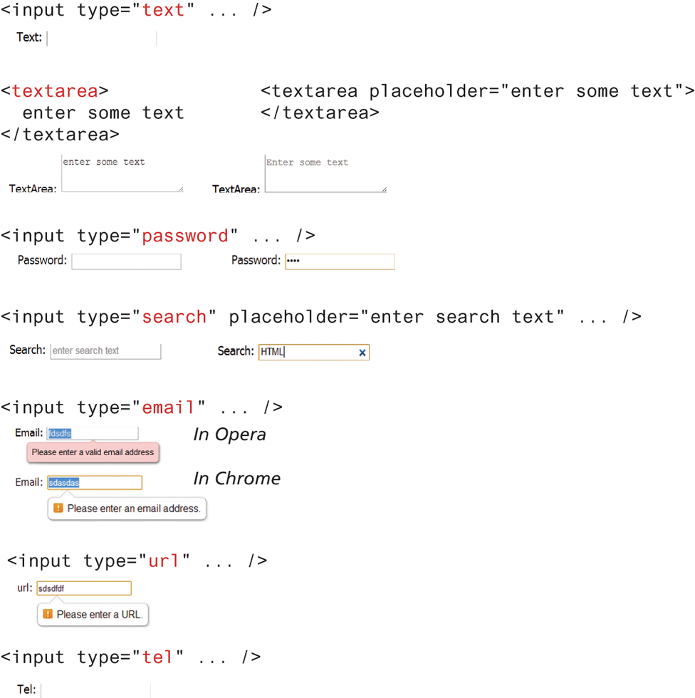
While some of the HTML5 text elements are not uniformly supported by all browsers, they still work as regular text boxes in older browsers. Figure 5.16 illustrates the various text element controls and some examples of how they look in selected browsers.
Figure 5.16 Text input controls
5.4.2 Choice Controls
Forms often need the user to select an option from a group of choices. HTML provides several ways to do this.
Pro Tip
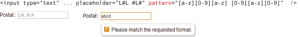
HTML5 added some helpful additions to the form designer’s repertoire. The first of these is the pattern attribute for text controls. This attribute allows you to specify a regular expression pattern that the user input must match. You can use the placeholder attribute to provide guidance to the user about the expected format of the input. Figure 5.17 illustrates a sample pattern for a Canadian postal code. You will learn more about regular expressions in Chapter 9.
Figure 5.17 Using the pattern attribute
Another addition is the required attribute, which allows you to tell the browser that the user cannot leave the field blank but must enter something into it. If the user leaves the field empty, then the browser will display a message.
The autofocus attribute can be added to the one form element on the page that should automatically have the focus (i.e., it will be selected or have the cursor in it) when the page loads.
The autocomplete attribute is also a new addition to HTML5. It tells the browser whether the control (or the entire form if placed within the <form> element) should have autocomplete enabled, which allows the browser to display predictive options for the element based on previously entered values.
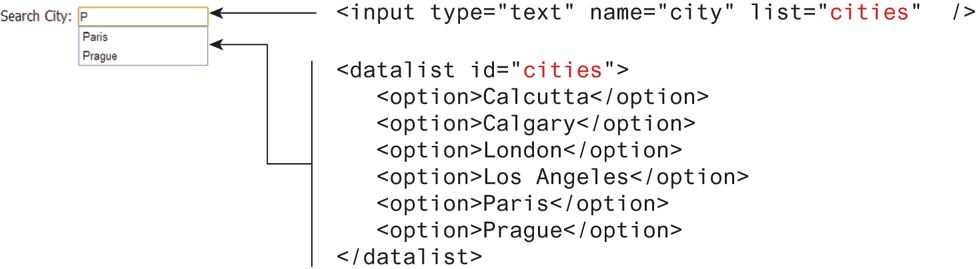
The new <datalist> element is another new addition to HTML5. This element allows you to define a list of elements that can appear in a drop-down autocomplete style list for a text element. This can be helpful for situations in which the user must have the ability to enter anything but is often entering one of a handful of common elements. In such a case, the <datalist> can be helpful. Figure 5.18 illustrates a sample usage.
Figure 5.18 Using the <datalist> element
It should be noted that there is a variety of JavaScript-based autocomplete solutions that are often better choices than the HTML5 <datalist> since they work on multiple browsers (the <datalist> is not supported by all browsers) and provide better customization.
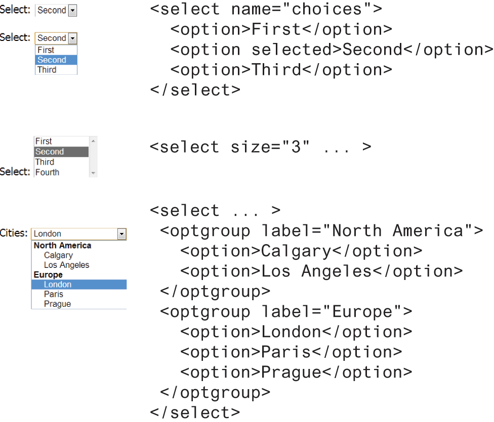
Select Lists
The <select> element is used to create a multiline box for selecting one or more items. The options (defined using the <option> element) can be hidden in a drop-down list or multiple rows of the list can be visible. Option items can be grouped together via the <optgroup> element. The selected attribute in the <option> makes it a default value. These options can be seen in Figure 5.19.
Figure 5.19 Using the <select> element
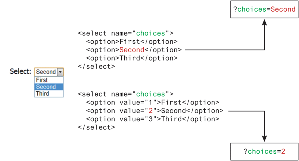
The value attribute of the <option> element is used to specify what value will be sent back to the server in the query string when that option is selected. The value attribute is optional; if it is not specified, then the text within the container is sent instead, as can be seen in Figure 5.20.
Figure 5.20 The value attribute
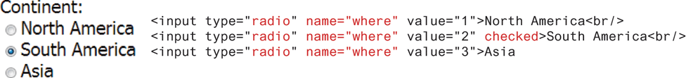
Radio Buttons
Radio buttons are useful when you want the user to select a single item from a small list of choices and you want all the choices to be visible. As can be seen in Figure 5.21, radio buttons are added via the <input type="radio"> element. The buttons are made mutually exclusive (i.e., only one can be chosen) by sharing the same name attribute. The checked attribute is used to indicate the default choice, while the value attribute works in the same manner as with the <option> element.
Figure 5.21 Radio buttons
Checkboxes
A checkbox is used for obtaining a yes/no or on/off response from the user. As can be seen in Figure 5.22, checkboxes are added via the <input type="checkbox"> element. You can also group checkboxes together by having them share the same name attribute. Each checked checkbox will have its value sent to the server.
Figure 5.22 Checkbox buttons
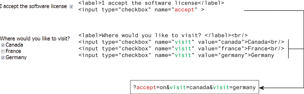
As with radio buttons, the checked attribute can be used to set the default value of a checkbox.
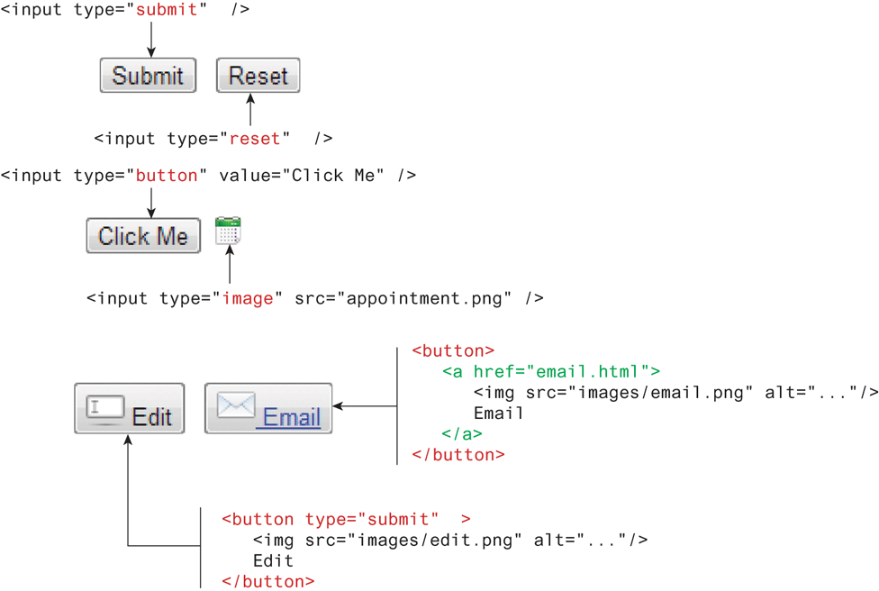
5.4.3 Button Controls
HTML defines several different types of buttons, which are shown in Table 5.4. As can be seen in that table, there is some overlap between two of the button types. Figure 5.23 demonstrates some sample button elements.
Table 5.4 Button Elements
| Type | Description |
|---|---|
<input type="submit"> |
Creates a button that submits the form data to the server. |
<input type="reset"> |
Creates a button that clears any of the user’s already entered form data. |
<input type="button"> |
Creates a custom button. This button may require JavaScript for it to actually perform any action. |
<input type="image"> |
Creates a custom submit button that uses an image for its display. |
<button> |
Creates a custom button. The You can turn the button into a submit button by using the |
Figure 5.23 Example button elements
5.4.4 Specialized Controls
There are two important additional special-purpose form controls that are available in all browsers. The first of these is the <input type="hidden"> element, which will be covered in more detail in Chapter 15 on State Management. The other specialized form control is the <input type="file"> element, which is used to upload a file from the client to the server. The usage and user interface for this control are shown in Figure 5.24. The precise look for this control can vary from browser to browser and from platform to platform.
Figure 5.24 File upload control (in Chrome)
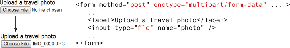
Notice that the <form> element must use the post method and must include the enctype="multipart/form-data" attribute as well. As we have seen in the section on query strings, form data is URL encoded (i.e., enctype="application/x-www-form-urlencoded"). However, files cannot be transferred to the server using normal URL encoding, hence the need for the alternative enctype attribute.
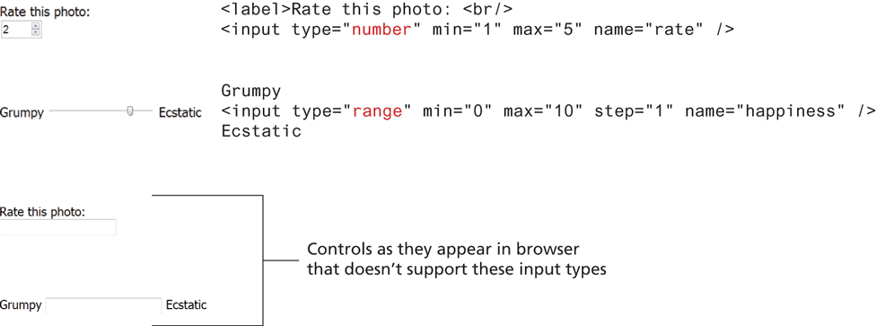
Number and Range
HTML5 introduced two new controls for the input of numeric values. When input via a standard text control, numbers typically require validation to ensure that the user has entered an actual number, and because the range of numbers is infinite, the entered number has to be checked to ensure it is not too small or too large.
The number and range controls provide a way to input numeric values that eliminates the need for client-side numeric validation (for security reasons you would still check the numbers for validity on the server). Figure 5.25 illustrates the usage and appearance of these numeric controls.
Figure 5.25 Number and range input controls
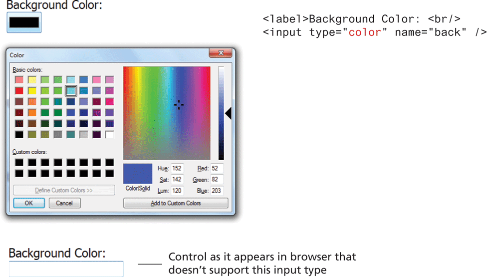
Color
Not every web page needs the ability to get color data from the user, but when it is necessary, the HTML5 color control provides a convenient interface for the user, as shown in Figure 5.27.
Figure 5.27 Color input control
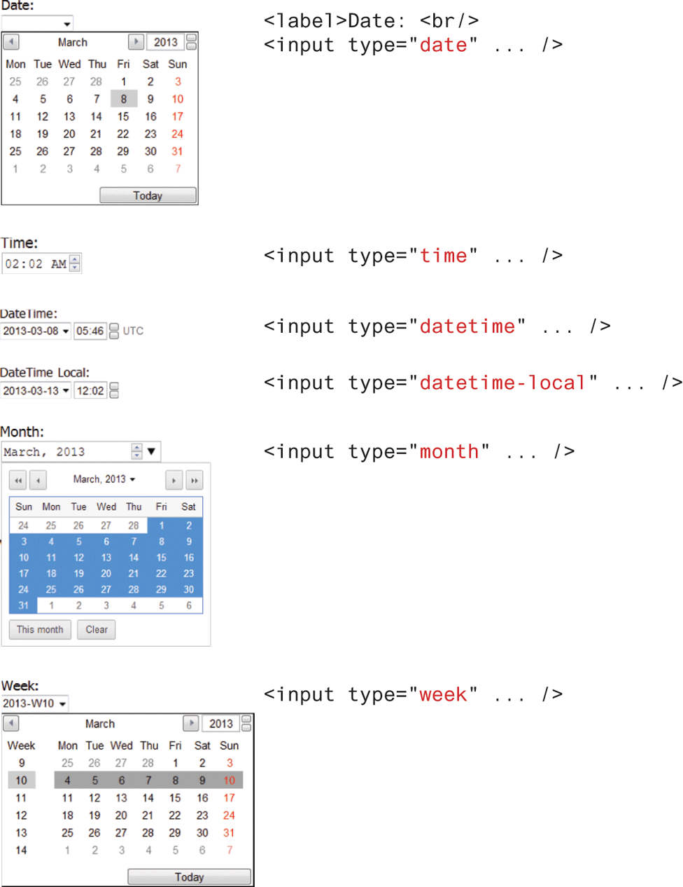
5.4.5 Date and Time Controls
Asking the user to enter a date or time is a relatively common web development task. Like with numbers, dates and times often need validation when gathering this information from a regular text input control. From a user’s perspective, entering dates can be tricky as well; you probably have wondered at some point in time when entering a date into a web form what format to enter it in, whether the day comes before the month, whether the month should be entered as an abbreviation or a number, and so on. The new date and time controls in HTML try to make it easier for users to input these tricky date and time values.
Table 5.5 lists the various HTML5 date and time controls. Their usage and appearance in the browser are shown in Figure 5.28.
Table 5.5 HTML5 Date and Time Controls
| Type | Description |
|---|---|
date |
Creates a general date input control. The format for the date is “yyyy-mm-dd.” |
time |
Creates a time input control. The format for the time is “HH:MM:SS,” for hours:minutes:seconds. |
datetime |
Creates a control in which the user can enter a date and time. |
datetime-local |
Creates a control in which the user can enter a date and time without specifying a time zone. |
month |
Creates a control in which the user can enter a month in a year. The format is “yyyy-mm.” |
week |
Creates a control in which the user can specify a week in a year. The format is “yyyy-W##.” |
Figure 5.28 Date and time controls
 Note
Note
There are four additional form elements that we have not covered here. The <progress> and <meter> elements can be used to provide feedback to users but require JavaScript to function dynamically. The <output> element can be used to hold the output from a calculation. This could be used in a form as a way, for instance, to semantically mark up a subtotal or a count of the number of items in a shopping cart. Finally, the <keygen> element can be used to hold a private key for public-key encryption.
Test Your Knowledge #2
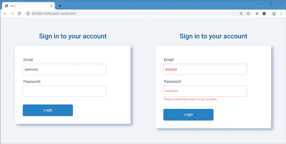
Modify lab05-test02.html and lab05-test02.css to implement the forms shown in Figure 5.29. The second form is the same as the first except it has some additional markup and styling to indicate error states.
The form consists of two input elements, a button, and labels. Be sure to set the
typetoemailandpasswordfor the two input elements. The second form will be the same as the first, except you will add a<p>element for the error message but some type of error class to theinputelements.The colors are defined within the provided variables file variables-palette-2.css. While you can set margins and widths using pixels or em or % units, you could also make use of the
calc()function and the supplied--element-spacingvariable so that your spacing is a factor of that variable. This creates consistency.Try to get your styling to look pretty similar to the examples shown in Figure 5.29.
Figure 5.29 Completed Test Your Knowledge #2