4.8 CSS Frameworks and Variables
Not every web developer enjoys working with CSS. We hope that after working through the pages in this chapter and the exercises in its accompanying lab, you are feeling reasonably confident working with the properties associated with the CSS box model and text formatting. We have, alas, only covered the beginnings of CSS in this chapter: Chapter 5 covers the CSS for working with forms and tables, while Chapter 7 covers layout, transitions, and animations as well. If you are not feeling overwhelmed yet by CSS, you might be by the end of Chapter 7.
As well, being able to do something with CSS versus using it effectively to create an attractive page can be two very distinct abilities. Effectively using CSS is a specialized skill. Visual design is also a very specialized skill. In many web development operations, the people writing the CSS are often also people who are highly competent in visual design. But not every development operation is large enough to have that type of division of labor.
Test Your Knowledge #3
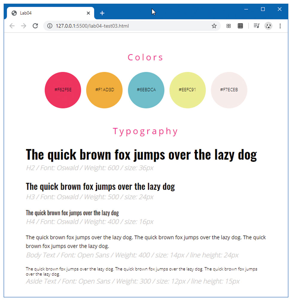
You have been provided markup in lab04-test03.html. You cannot modify the markup, so this will require working with selectors. The markup includes links to two Google Fonts.
This exercise focuses on text and character styles. The final result should look similar to that shown in Figure 4.38.
For the
<h1>elements, use afont-weightof500,letter-spacingof5px, acolorofdeeppinkand center align the text.To complete the
<span>circles, set theborder-radiusto50%, thefont-sizeto12px, and transform the content to upper case via thetext-transformproperty.Each colored circle
<span>has its own class name (e.g.,color1,color2). Define these classes and set thebackground-colorto be the same as the span label.Define the
detailsclass. It should have afont-sizeof16px, be silver and italic.Define each of the elements (
h2,h3,h4) and classes (bodytextandasidetext). The style definitions for font, size, weight, and line height are contained in the markup itself.
Figure 4.38 Completed Test Your Knowledge #3 competent
4.8.1 What is a CSS Framework?
While larger web development companies often have several dedicated CSS experts and/or visual designers who handle this part of the web development workflow, smaller web development companies do not have this option. So as an alternative to mastering both the many complexities of CSS and getting an acceptable visual design, some developers instead use an already developed CSS framework.
A CSS framework is a set of CSS classes or other software tools that make it easier to use and work with CSS. Early CSS frameworks such as Blueprint and 960 became popular chiefly as a way to more easily create complex grid-based layouts without the hassles of floats or positioning. More sophisticated subsequent CSS Frameworks such as Bootstrap (https:/
Table 4.11 Popular CSS Frameworks
| Name | Current Version (Year Started) | Category |
|---|---|---|
| Bootstrap | 4.4 (2011) | Component/Comprehensive |
| Foundation | 6.6 (2012) | Component/Comprehensive |
| SemanticUI | 2.4 (2013) | Component/Comprehensive |
| Materialize | 1.0 (2014) | Component/Comprehensive |
| Bulma | 0.8 (2016) | Component/Comprehensive |
| UIKit | 3.4 (2013) | Lightweight |
| PureCSS | 2.0 (2013) | Lightweight |
| Picnic CSS | 6.5 (2015) | Lightweight |
| Tachyons | 4.12 (2015) | Utility-First |
| Purple3 | 1.1 (2015) | Utility-First |
| Tailwind CSS | 1.4 (2017) | Utility-First |
The key advantage of CSS frameworks for some developers is that they do not need to be especially proficient at visual design to achieve passable, even aesthetically pleasing web front-ends. One key drawback is related to the main benefit: namely, because these frameworks are so easy to use, sites created with them tend to look the same. It is, however, possible to customize these frameworks using CSS preprocessors.
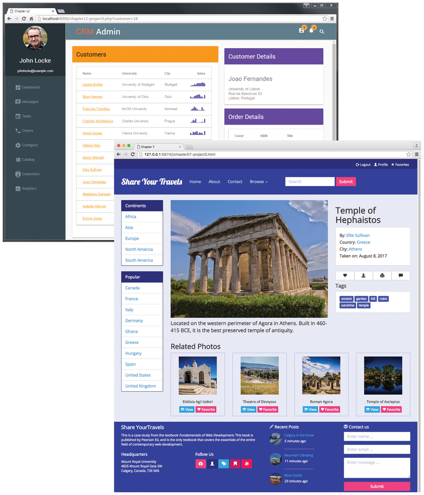
Bootstrap, which was originally created by designers at Twitter, has become extraordinarily popular, especially among developers who do not enjoy working with CSS. Like the other component/comprehensive CSS frameworks listed in Table 4.11, Bootstrap provides built-in component classes to create common user interface widgets, such as popovers, tooltips, cards, and navigation bars. Figure 4.39 illustrates sample pages created using nothing but the built-in classes in Materialize and Bootstrap.
Figure 4.39 Examples using only Materialize and Bootstrap classes
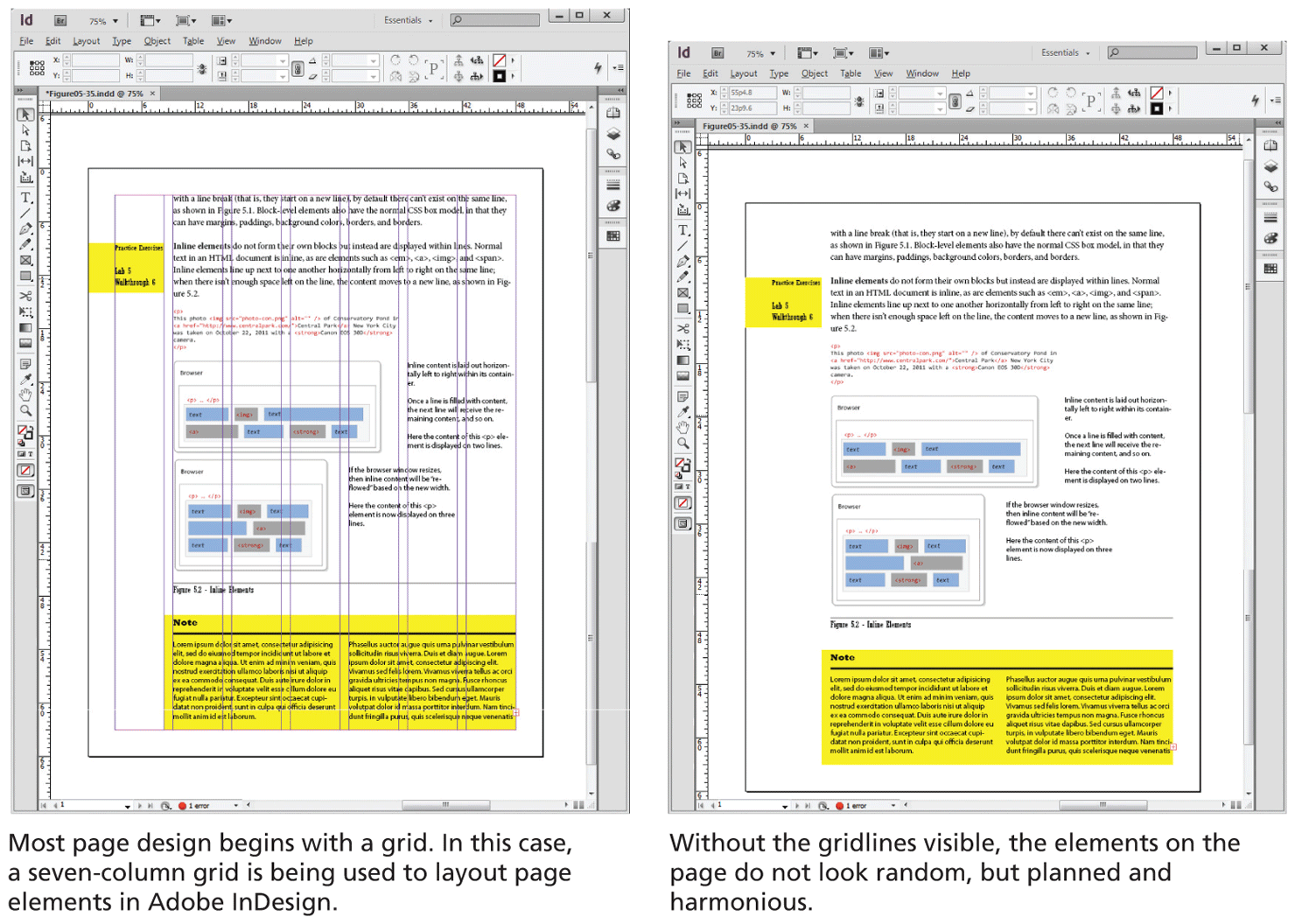
As mentioned earlier, one of the key capabilities of most CSS Frameworks is a grid system. Print designers typically use grids as a way to achieve visual uniformity in a design. In print design, the very first thing a designer may do is to construct, for instance, a 5- or 7- or 12-column grid in a page layout program like InDesign or Quark Xpress. The rest of the document, whether it be text or graphics, will be aligned and sized according to the grid, as shown in Figure 4.40.
Figure 4.40 Using a grid in print design
Looking at Table 4.11, you will notice that many of these frameworks began in the years between 2011 and 2013. At that time, creating a multi-column layout in CSS was quite complicated (the first edition of this textbook, written in 2013, covered it quite superficially but still took over 20 pages to do so); following a grid was even more complicated. CSS Frameworks became popular in this milieu because it covered up this complexity and provided a 12-column grid (via <div> elements with classes defined by the framework) that visually standardized page designs. For instance, Listing 4.5 illustrates a three-column layout using Bootstrap.
Listing 4.5 Three-column layout in Bootstrap
<head>
<link href="bootstrap.css" rel="stylesheet">
</head>
<body>
  <div class="container">
    <div class="row">
      <div class="col-md-2">
          left column
      </div>
      <div class="col-md-7">
          main content
      </div>
      <div class="col-md-3">
          right column
      </div>
    </div>
  </div>
<body>
Since that time, CSS has added both flexbox and grid layout modes (covered in Chapter 7), which provide a relatively easy way to create column or grid layouts in vanilla CSS. Of course, to do so, the developer needs to know how to use these newer CSS features.
As mentioned earlier, comprehensive CSS frameworks also provide pre-styled component classes. For instance, Listing 4.6 provides an example using the Bootstrap Card component, which displays an image, heading, description, and a button within a content container.
Listing 4.6 Using a sample Bootstrap Card component
<div class="card" >
  <img class="card-img-top" src="picture.jpg" >
  <div class="card-body">
    <h5 class="card-title">Card Title</h5>
    <p class="card-text">Description text</p>
    <button class="btn btn-primary">Button text</button>
  </div>
</div>
The learning curve for these comprehensive frameworks moves from learning CSS to also learning the framework. While it does take some time to learn these framework classes (or, more likely, copy and paste them from their documentation), they do speed up the process of creating the visual design of a site. Thus, they are ideal for rapid prototyping of site ideas. Some of the examples in this book will make use of these frameworks.
As mentioned earlier, a key drawback to these frameworks is that most sites using them tend to look pretty similar. Why is this the case? While a developer can customize the default component styling, doing so is generally time consuming and requires in-depth knowledge of both CSS and CSS pre-processors. If you are a developer with this type of knowledge, it's likely easier to create a custom look by writing vanilla CSS from scratch. As a result, most developers who are using, say, Bootstrap, tend to stick with the default styling, making most Bootstrap sites to look pretty similar.
Nonetheless, visual uniqueness is not always important: for instance, within internal sites or web apps used only within a company. In these cases, rapid development or well-understood and documented classes might be more important than aesthetics: here, comprehensive CSS frameworks can be especially appealing to a development team interested in rapid prototyping.
To reduce both the learning curve and the visual “sameness” of comprehensive frameworks, some developers prefer instead to use very minimal, lightweight CSS frameworks that just supply a grid system (CSS grid layout has only been widely supported by browsers since about 2018) and some simple typographical styling. With this approach, the designer is still expected to create the visual look of the user interface through custom CSS but lets the framework handle layout and ensure typographical consistency.
More recently, some designers and developers have switched over to utility-first frameworks such as Tailwind CSS (https:/
Listing 4.7 Constructing a Card using Tailwind CSS
<div class="max-w-sm rounded overflow-hidden shadow-lg">
  <img class="w-full" src="picture.jpg" >
  <div class="px-6 py-4">
    <div class="font-bold text-xl mb-2">Card Title</div>
    <p class="text-gray-700 text-base">Description Text</p>
    <button class="bg-blue-500 hover:bg-blue-700 text-white font-bold py-2 px-4 rounded">Button text</button>
  </div>
</div>
Certainly, a great deal of additional information has moved down into the markup. Compared to Listing 10.9 the markup here is much more complicated; but unlike the Bootstrap example, its design is much more customized. If you look at the <button> in Listing 4.7, you compose a particular visual look by adding in the utility classes that you need within the markup rather than styling elements or creating and styling new classes in the CSS. For instance, you could create a similar looking button to that in Listing 4.7 by writing the following custom CSS:
button {
  display: inline-block;
  padding: 2px 4px;
  border: 0;
  border-radius: 3px;
  font-weight: 600;
  color: white;
  background-color: #4299e1;
}
button:hover {
  color: #cccccc;
  background-color: #2b6cb0;
}
So what’s preferable, the custom CSS for the button, or the button styled via numerous utility classes? Of course, the utility-class approach adds a new layer of learning for the developer, but its advocates argue that this approach is ideal for quickly constructing custom designs (once you learn it) and that it works well with new styling approaches within JavaScript frameworks (which we will cover in Chapter 11).
4.8.2 CSS Variables
Once you style more than a simple page in CSS, you will begin to realize that duplication of styles is both a necessary design feature (you want consistency of design features throughout a site) and a problem for developers (how do you ensure consistency without copying and pasting?). In Listing 4.8 you can see how design features such as colors, spacing, and borders, often appear numerous times within a single file.
Listing 4.8 Duplicate property values in CSS
header {
   background-color: #431c5d;
   color:            #e05915;
   padding:          4px;
   box-shadow:       6px 5px 20px 1px rgba(0,0,0,0.22);
   margin:           0;
}
header button {
   background-color: #e05915;
   border-radius:    5px;
   border-color:     #e6e9f0;
   padding:          4px;
   color:            #e6e9f0;
   font-size:        18px;
   margin-top:       9px;
}
#results {
   background-color: #431c5d;
   font-size:        18px;
   border-radius:    5px;
   padding:          4px;
   box-shadow:       6px 5px 20px 1px rgba(0,0,0,0.22);
}
While the cascade helps in this regard, many property values (for instance, backgrounds, padding, margins, and borders) in CSS are not inheritable. For many years, the common solution to this particular problem was to of a special tool called a CSS preprocessor (which we will examine in Chapter 7).
In the last few years, CSS has added a feature that helps in this regard called CSS Variables (also called custom properties). You can define variables (which must begin with a double hyphen) at the top of your CSS file usually within a special :root pseudo-class selector, and then reference those variables as property values using the var() CSS function. Listing 4.9 illustrates an improved version of the styling in Listing 4.8.
Listing 4.9 Using CSS variables
:root {
   --bg-color-main: #431c5d;
   --bg-color-secondary: #e05915;
   --fg-color-main: #e6e9f0;
   --radius-boxes: 5px;
   --padding-boxes: 4px;
   --fontsize-default: 18px;
   --shadow-color: rgba(0,0,0,0.22);
   --dropshadow: 6px 5px 20px 1px var(--shadow-color);
}
header {
   background-color: var(--bg-color-main);
   color:            var(--bg-color-secondary);
   padding:          var(--padding-boxes);
   box-shadow:       var(--dropshadow);
   margin:           0;
}
header button {
    background-color: var(--bg-color-secondary);
    border-radius:    var(--radius-boxes);
    border-color:     var(--fg-color-main);
    padding:          var(--padding-boxes);
    color:            var(--fg-color-main);
    font-size:        var(--fontsize-default);
    margin-top:       calc( --fontsize-default / 2 );
}
#results {
    background-color: var(--bg-color-main);
    font-size:        var(--fontsize-default:);
    border-radius:    var(--radius-boxes);
    padding:          var(--padding-boxes);
    box-shadow:       var(--dropshadow);
}
Notice as well the use of the CSS calc() function, which forces the browser to calculate the specific property value. In Listing 4.9, the margin-top property is set to half the current font size. Combining this function with CSS variables allows you to write your CSS in a way that is more adaptable and easier to customize.