4.7 CSS Text Styling
CSS provides two types of properties that affect text. The first we call font properties because they affect the font and its appearance. The second type of CSS text properties are referred to here as paragraph properties since they affect the text in a similar way no matter which font is being used.
Many of the most common font properties as shown in Table 4.9 will at first glance be familiar to anyone who has used a word processor. There is, however, a range of interesting potential problems when working with fonts on the web (as compared to a word processor).
Table 4.9 Font Properties
| Property | Description |
|---|---|
font |
A combined shorthand property that allows you to set the family, style, size, variant, and weight in one property. While you do not have to specify each property, you must include at a minimum the font size and font family. In addition, the order is important and must be:
|
font-family |
Specifies the typeface/font (or generic font family) to use. More than one can be specified. |
font-size |
The size of the font in one of the measurement units. |
font-style |
Specifies whether italic, oblique (i.e., skewed by the browser rather than a true italic), or normal. |
font-variant |
Specifies either small-caps text or none (i.e., regular text). |
font-weight |
Specifies either normal, bold, bolder, lighter, or a value between 100 and 900 in multiples of 100, where larger number represents weightier (i.e., bolder) text. |
4.7.1 Font Family
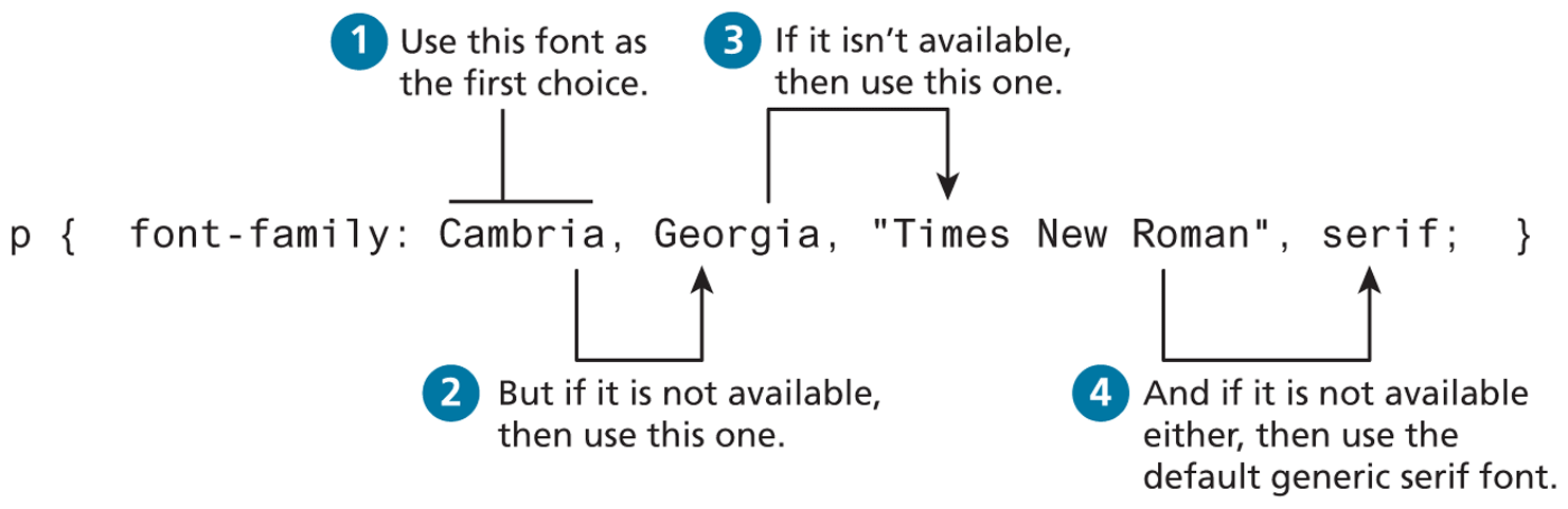
The first of these problems involves specifying the font family. A word processor on a desktop machine can make use of any font that is installed on the computer; browsers are no different. However, just because a given font is available on the web developer’s computer does not mean that that same font will be available for all users who view the site. For this reason, it is conventional to supply a so-called web font stack—that is, a series of alternate fonts to use in case the original font choice is not on the user’s computer. As you can see in Figure 4.31, the alternatives are separated by commas; as well, if the font name has multiple words, then the entire name must be enclosed in quotes.
Figure 4.31 Specifying the font family
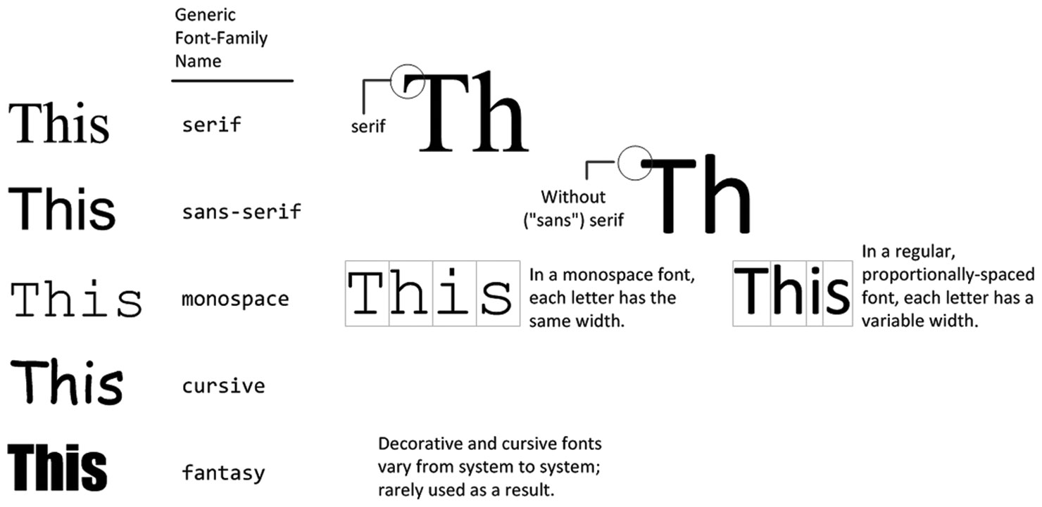
Notice the final generic font family choice in Figure 4.31. The font-family property supports five different generic families; the browser supports a typeface from each family. The different generic font families are shown in Figure 4.32.
Figure 4.32 The different font families
While there is no real limit to the number of fonts that one can specify with the font-family property, in practice, most developers will typically choose three or four stylistically similar fonts.
One common approach is to make your font stack contain, in this order, the following: ideal, alternative, common, and then generic. Take for instance, the following font stack:
font-family { "Hoefler Text", Cambria, "Times New Roman", serif; }You might love the appearance of Hoefler Text, which is installed on most Macs, so it is your ideal choice for your site; however, it is not installed on very many PCs or Android devices. Cambria is on most PC and Mac computers and is your alternative choice. Times New Roman is installed on almost all PCs and Macs, so it is a safe common choice, but because you would prefer Cambria to be used instead of Times New Roman, you placed Cambria first. Finally, Android or Blackberry users might not have any of these fonts, so you finished the font stack with the generic serif since all your other choices are all serif fonts.
Websites such as http:/
Another factor to think about when putting together a font stack is the x-height (i.e., the height of the lowercase letters, which is generally correlated to the width of the characters) of the different typefaces, as that will have the most impact on things such as characters per line and hence word flow.
4.7.2 Font Sizes
Another potential problem with web fonts is font sizes. In a print-based program such as a word processor, specifying a font size is unproblematic. Making some text 12 pt will mean that the font’s bounding box (which in turn is roughly the size of its characters) will be 1/6 of an inch tall when printed, while making it 72 pt will make it roughly one inch tall when printed. However, as we saw in Section 4.2.3, absolute units such as points and inches do not translate very well to pixel-based devices. Somewhat surprisingly, pixels are also a problematic unit. Newer mobile devices in recent years have been increasing pixel densities so that a given CSS pixel does not correlate to a single device pixel.
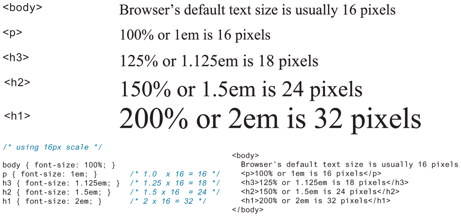
So while sizing with pixels provides precise control, if we wish to create web layouts that work well on different devices, we should learn to use relative units such as em units or percentages for our font sizes (and indeed for other sizes in CSS as well). One of the principles of the web is that the user should be able to change the size of the text if he or she so wishes to do so; using percentages or em units ensures that this user action will “work,” and not break the page layout.
When used to specify a font size, both em units and percentages are relative to the parent’s font size. This takes some getting used to. Figure 4.33 illustrates a common set of percentages and their em equivalents to scale elements relative to the default 16-px font size.
Figure 4.33 Using percents and em units for font sizes
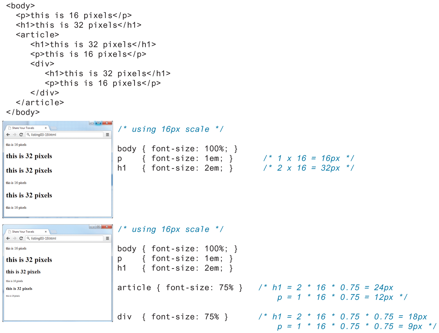
While this looks pretty easy to master, things unfortunately can quickly become quite complicated. Remember that percents and em units are relative to their parents. Figure 4.34 illustrates how in reality it can quickly become difficult to calculate actual sizes when there are nested elements. As you can see in the second screen capture in Figure 4.34, changing the <article> element’s size changes the size of the <p> and <h1> elements within it, thereby falsifying their claims to be 16 and 32 px in size!
Figure 4.34 Complications in calculating percents and em units
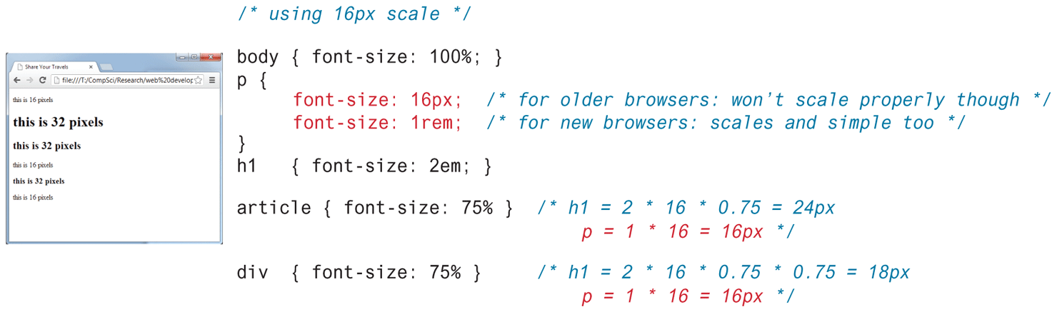
For this reason, CSS3 now supports a new relative measure, the rem (for root em unit). This unit is always relative to the size of the root element (i.e., the <html> element). However, since early versions of Internet Explorer (prior to IE9) do not support the rem units, you need to provide some type of fallback for those browsers, as shown in Figure 4.35. To muddy the picture even more, some developers have begun to advocate again for using the pixel as the unit of measure in CSS. Why? Because modern browsers provide built-in scaling/zooming that preserve layout regardless of whether the CSS is using pixels, ems, or rems.
Figure 4.35 Using rem units
4.7.3 Font Weight
Until Google Fonts made web fonts available to the masses, font-weight was typically set to either normal or bold. But now developers have ready access to font families with many variants.
For instance, in Figure 4.36, you can see the popular Open Sans font has five different weights: light, regular, semi-bold, bold, and extra bold. Within your CSS you specify which of these weights by using their numeric value, which typically ranges from 100 and 900, with larger numbers bolder than lower numbers, as shown in the following:
p {  font-weight: 400; }
strong { font-weight: 800 ; }
If you wish to use these alternate weights with a web font, you must download the weight variant via the <link> element (as shown on right side of Figure 4.36).
4.7.4 Paragraph Properties
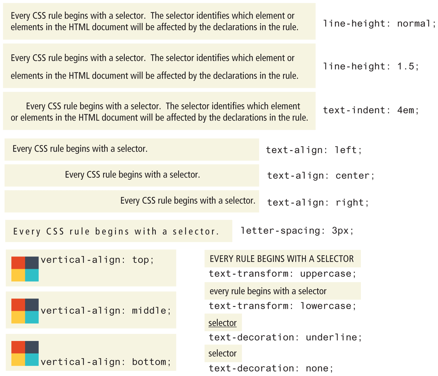
Just as there are properties that affect the font in CSS, there is also a range of CSS properties that affect text independently of the font. Many of the most common text properties are shown in Table 4.10, and like the earlier font properties, many of these will be familiar to anyone who has used a word processor. Figure 4.37 illustrates several of these properties.
Table 4.10 Text Properties
| Property | Description |
|---|---|
letter-spacing |
Adjusts the space between letters. Can be the value normal or a length unit. |
line-height |
Specifies the space between baselines (equivalent to leading in a desktop publishing program). The default value is normal, but can be set to any length unit. Can also be set via the shorthand font property. |
list-style-image |
Specifies the URL of an image to use as the marker for unordered lists. |
list-style-type |
Selects the marker type to use for ordered and unordered lists. Often set to none to remove markers when the list is a navigational menu or a input form. |
text-align |
Aligns the text horizontally in a container element in a similar way as a word processor. Possible values are left, right, center, and justify. |
text-decoration |
Specifies whether the text will have lines below, through, or over it. Possible values are: none, underline, overline, line-through, and blink. Hyperlinks by default have this property set to underline. |
text-direction |
Specifies the direction of the text, left-to-right (ltr) or right-to-left (rtl). |
text-indent |
Indents the first line of a paragraph by a specific amount. |
text-shadow |
A new CSS3 property that can be used to add a drop shadow to a text. |
text-transform |
Changes the capitalization of text. Possible values are none, capitalize, lowercase, and uppercase. |
vertical-align |
Aligns inline, inline-block, or table text or images vertically in a container element. Most common values are: top, bottom, and middle. It can’t be used to vertically align block-level elements. |
word-spacing |
Adjusts the space between words. Can be the value normal or a length unit. |
Figure 4.37 Sample text properties