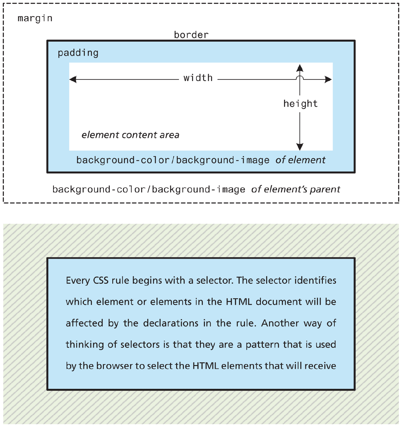
4.6 The Box Model
In CSS, all HTML elements exist within an element box shown in Figure 4.17 (also known as the box model). In order to become proficient with CSS, you must become familiar with the box model.
Figure 4.17 CSS box model
4.6.1 Block versus Inline Elements
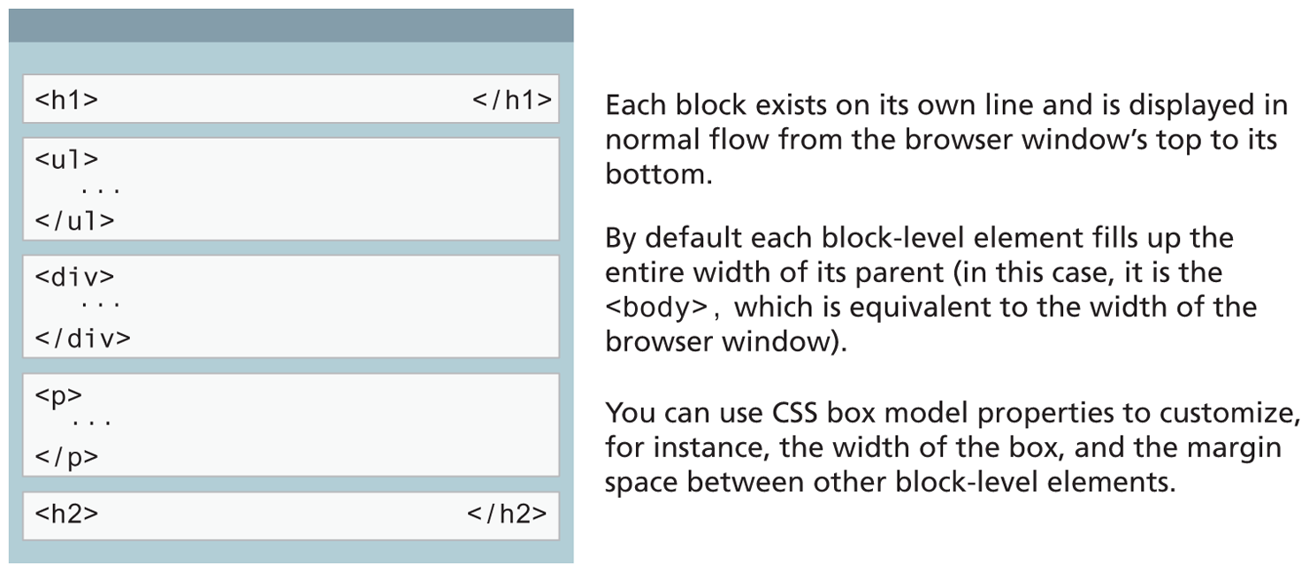
Within CSS there are two types of element boxes: block level and inline boxes. Block-level elements such as <p>, <div>, <h2>, <ul>, and <table> are each contained on their own line. Because block-level elements begin with a line break (that is, they start on a new line), without styling, two block-level elements can’t exist on the same line, as shown in Figure 4.18. Block-level elements use the normal CSS box model, in that they have margins, paddings, background colors, and borders.
Figure 4.18 Block-level elements
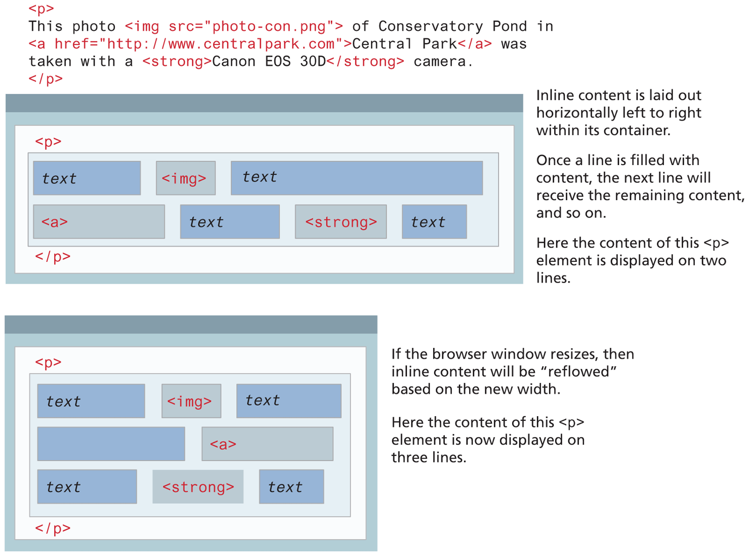
Inline elements do not form their own blocks but instead are displayed within lines. Normal text in an HTML document is inline, as are elements such as <em>, <a>, <img>, and <span>. Inline elements line up next to one another horizontally from left to right on the same line; when there isn’t enough space left on the line, the content moves to a new line, as shown in Figure 4.19.
Figure 4.19 Inline elements
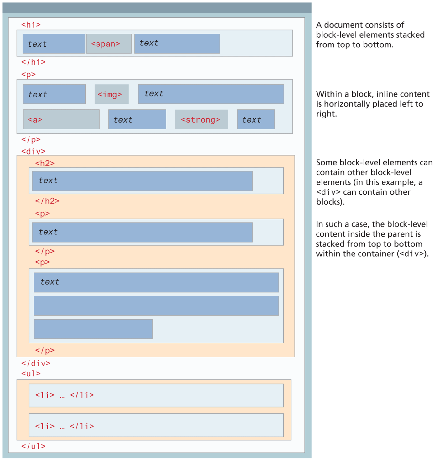
In a document with normal flow, block-level elements and inline elements work together as shown in Figure 4.20. Block-level elements will flow from top to bottom, while inline elements flow from left to right within a block. If a block contains other blocks, the same behavior happens: the child blocks flow from the top to the bottom of the parent block.
Figure 4.20 Block and inline elements together
It is possible to change whether an element is block-level or inline via the CSS display property. Consider the following three CSS rules:
span { display: block; }
li { display: inline; }
img { display: inline-block; }
These rules will make all <span> elements behave like block-level elements, all <li> elements like inline (that is, each list item will be displayed on the same line), and all <img> elements that will flow like inline elements but which have a block element box.
4.6.2 Background
As can be seen in Figure 4.17, the background of an element fills an element out to its border (if it has one, that is). In contemporary web design, it has become extremely common to use CSS to display purely presentational images (such as background gradients and patterns, decorative images, etc.) rather than using the <img> element. Table 4.7 lists the most common background properties.
Table 4.7 Common Background Properties
| Property | Description |
|---|---|
background |
A combined shorthand property that allows you to set multiple background values in one property. While you can omit properties with the shorthand, do remember that any omitted properties will be set to their default value. |
background-attachment |
Specifies whether the background image scrolls with the document (default) or remains fixed. Possible values are: fixed, scroll, local. |
background-color |
Sets the background color of the element. You can use any of the techniques shown in Table 4.2 for specifying the color. |
background-image |
Specifies the background image (which is generally a jpeg, gif, or png file) for the element. Note that the URL is relative to the CSS file and not the HTML. Gradient color fills (covered in Chapter 7) can also be specified with this property. |
background-origin |
Sets the beginning location of the image within its parent. |
background-position |
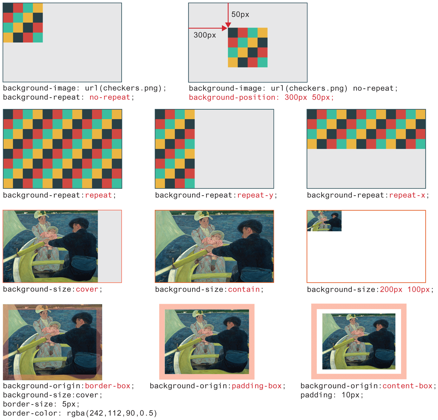
Specifies where on the element the background image will be placed. Some possible values include: bottom, center, left, and right. You can also supply a pixel or percentage numeric position value as well. When supplying a numeric value, you must supply a horizontal/vertical pair; this value indicates its distance from the top left corner of the element, as shown in Figure 4.21. |
background-repeat |
Determines whether the background image will be repeated. This is a common technique for creating a tiled background (it is in fact the default behavior), as shown in Figure 4.21. Possible values are: repeat, repeat-x, repeat-y, and no-repeat. |
background-size |
Sets the size of the image and how the image should fill the space within the parent. |
While background colors are relatively straightforward, background images are a bit more complicated. Figure 4.21 illustrates how some of the different background image properties interact.
Figure 4.21 Background image properties
4.6.3 Borders and Box Shadow
Borders and shadows provide a way to visually separate elements. You can put borders around all four sides of an element, or just one, two, or three of the sides. Table 4.8 lists the various border and shadow properties and Figure 4.22 illustrates several of these properties in action.
Table 4.8 Border Properties
| Property | Description |
|---|---|
border |
A combined shorthand property that allows you to set the style, width, and color of a border in one property. The order is important and must be:
|
border-style |
Specifies the line type of the border. Possible values are:
|
border-width |
The width of the border in a unit (but not percents). A variety of keywords ( |
border-color |
The color of the border in a color unit. |
border-radius |
The radius of a rounded corner. |
border-image |
The URL of an image to use as a border. |
box-shadow |
Adds a shadow effect to an element. The values are as follows:
|
Figure 4.22 Border and shadow properties
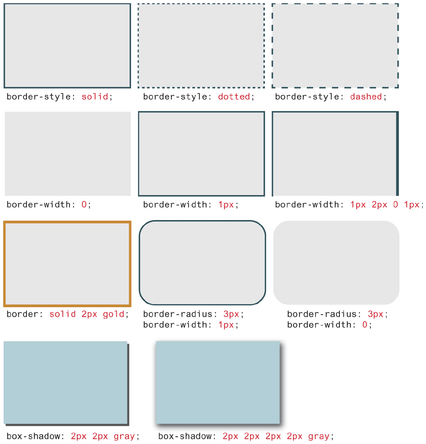
Border widths are perhaps the one exception to the general advice against using the pixel measure. Using em units or percentages for border widths can result in unpredictable widths as the different browsers use different algorithms (some round up, some round down) as the zoom level increases or decreases. For this reason, border widths are almost always set to pixel units.
The box-shadow property provides a way to add shadow effects around an element’s box. To set the shadow, you specify x and y offsets, along with optional blur, spread, inset, and color settings.
4.6.4 Margins and Padding
Margins and padding are essential properties for adding white space to a web page, which can help differentiate one element from another. Figure 4.23 illustrates how these two properties can be used to provide spacing and element differentiation.
Figure 4.23 Borders, margins, and padding provide element spacing and differentiation
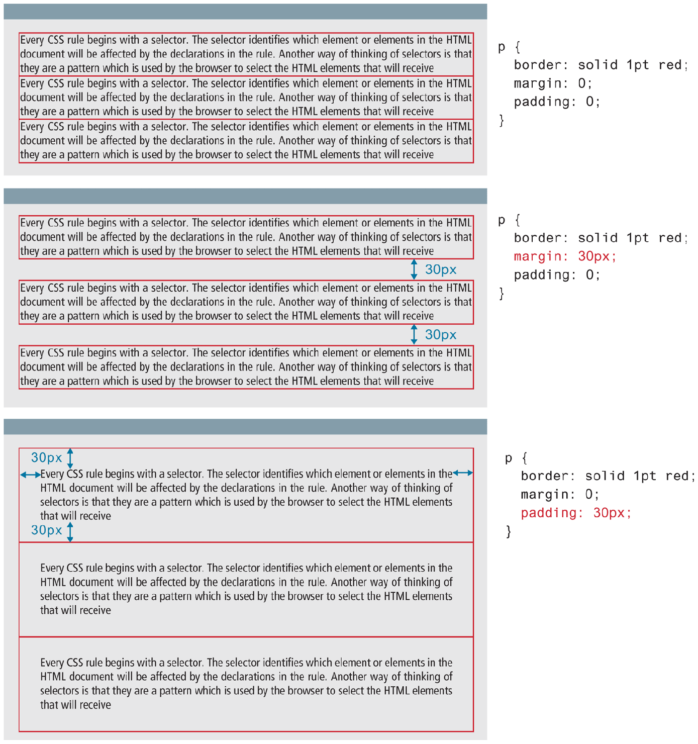
As you can see in Figures 4.17 and 4.23, margins add spacing around an element’s content, while padding adds spacing within elements. Borders divide the margin area from the padding area.
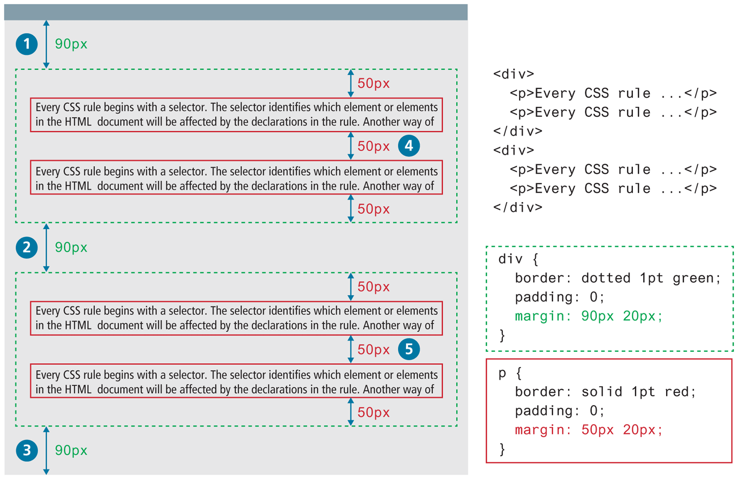
There is a very important thing to notice about the margins in Figure 4.23. Did you notice that the space between paragraphs one and two and between two and three is the same as the space before paragraph one and after paragraph three? This is due to the fact that adjoining vertical margins collapse.
Figure 4.24 illustrates how adjoining vertical margins collapse in the browser. If overlapping margins did not collapse, then margin space for  would be 180 px (90 px for the bottom margin of the first
 <div> + 90 px for the top margin of the second <div>), while the margins for  and
and  would be 100 px. However, as you can see in Figure 4.24, this is not the case.
Figure 4.24 Collapsing vertical margins
The W3C specification defines this behavior as collapsing margins:
In CSS, the adjoining margins of two or more boxes (which might or might not be siblings) can combine to form a single margin. Margins that combine this way are said to collapse, and the resulting combined margin is called a collapsed margin.
What this means is that when the vertical margins of two elements touch, only the largest margin value of the elements will be displayed, while the smaller margin value will be collapsed to zero. Horizontal margins, on the other hand, never collapse.
To complicate matters even further, there is a large number of special cases in which adjoining vertical margins do not collapse (see the W3C Specification for more detail). From our experience, collapsing (or not collapsing) margins are one of the main problems (or frustrations) that our students face when working with CSS.
 Note
Note
With border, margin, and padding properties, it is possible to set the properties for one or more sides of the element box in a single property, or to set them individually using separate properties. For instance, we can set the side properties individually:
border-top-color: red;          /* sets just the top side */
border-right-color: green;      /* sets just the right side */
border-bottom-color: yellow;    /* sets just the bottom side */
border-left-color: blue;        /* sets just the left side */
Alternately, we can set all four sides to a single value via:
border-color: red; /* sets all four sides to red */Or we can set all four sides to different values via:
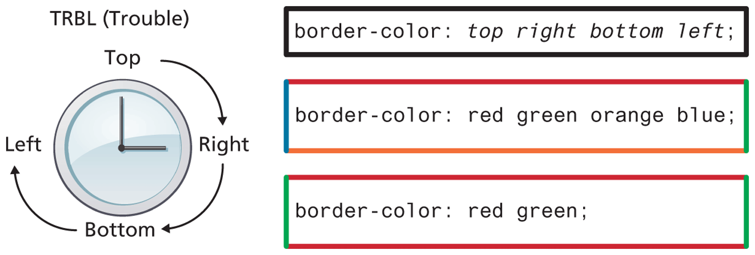
border-color: red green orange blue;When using this multiple values shortcut, they are applied in clockwise order, starting at the top. Thus the order is top right bottom left, as shown in Figure 4.25. The mnemonic TRouBLe might help you memorize this order.
Figure 4.25 CSS TRBL (Trouble) shortcut
Another shortcut is to use just two values; in this case the first value sets top and bottom, while the second sets the right and left.
border-color: red yellow; /* top+bottom=red, right+left=yellow */4.6.5 Box Dimensions
As you have already learned, block-level elements have width and height properties. They also have a min-width, min-height, max-width, and max-height properties as well. These min and max versions allow the designer to specify a size that an element cannot go under or over. Why are these necessary?
One reason is that a width or a height might be specified as a % of its parent container. For very large or very small displays, this % value might make the element too large or too small. One solution is to specify an additional min or max width/height value for the element.
All in all, box dimensions frequently confound new CSS authors. Why is this the case?
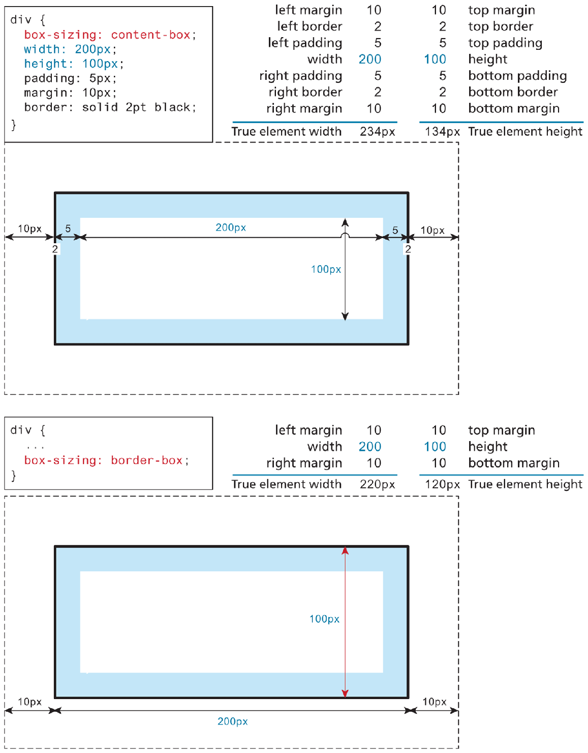
One reason is that only block-level elements and nontext inline elements such as images have a width and height that you can specify. By default (in CSS this is the auto value), the width and height of elements is the actual size of the content. For text, this is determined by the font size and font face; for images, the width and height of the actual image in pixels.
Since the width and the height only refer to the size of the content area, the total size of an element is equal to the size of its content area plus the sum of its padding, borders, and margins. This is something that tends to give beginning CSS students trouble. Figure 4.26 illustrates the default content-box element sizing behavior. It also shows the newer alternative border-box approach, which is more intuitive. Indeed, many developers now add a set of rules to the beginning of their CSS that makes border-box the box-sizing model for all elements.
Figure 4.26 Calculating an element’s true size
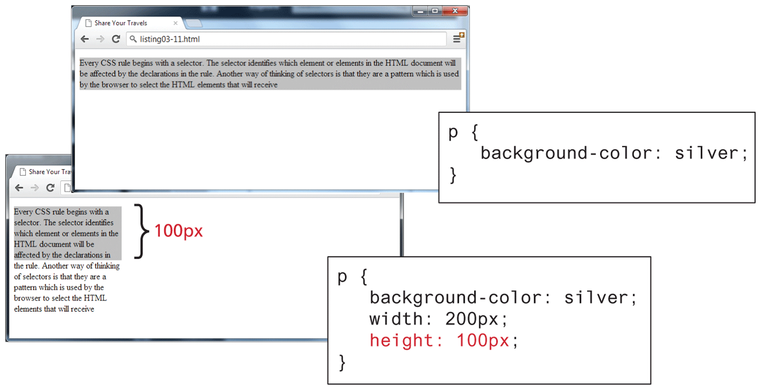
For block-level elements such as <p> and <div> elements, there are limits to what the width and height properties can actually do. You can shrink the width, but the content still needs to be displayed, so the browser may very well ignore the height that you set. As you can see in Figure 4.27, the default width is the browser viewport. But in the second screen capture in the image, with the changed width and height, there is not enough space for the browser to display all the content within the element. So while the browser will display a background color of 200 × 100 px (i.e., the size of the element as set by the width and height properties), the height of the actual textual content is much larger (depending on the font size).
Figure 4.27 Limitations of height property
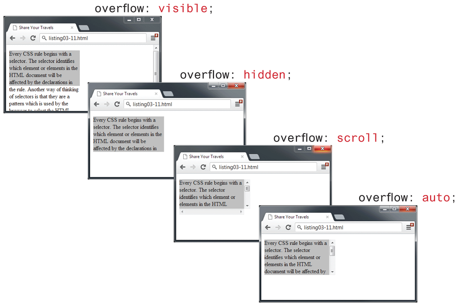
It is possible to control what happens with the content if the box’s width and height are not large enough to display the content using the overflow property, as shown in Figure 4.28.
Figure 4.28 Overflow property
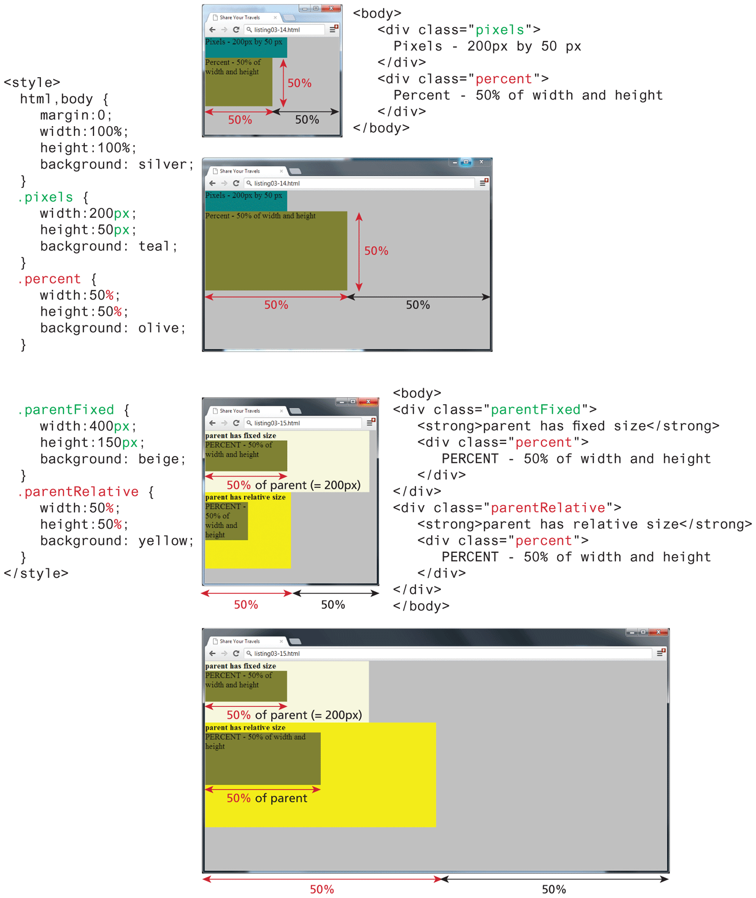
While the example CSS in Figure 4.27 uses pixels for its measurement, some contemporary designers prefer to use percentages or em units for widths and heights. When you use percentages, the size is relative to the size of the parent element, while using ems makes the size of the box relative to the size of the text within it. The rationale behind using these relative measures is to make one’s design scalable to the size of the browser or device that is viewing it. Figure 4.29 illustrates how percentages will make elements respond to the current size of the browser.
Figure 4.29 Box sizing via percents
One of the problems with using percentages as the unit for sizes is that as the browser window shrinks too small or expands too large (for instance, on a wide-screen monitor), elements might become too small or too large. You can put absolute pixel constraints on the minimum and maximum sizes via the min-width, min-height, max-width, and max-height properties.
Test Your Knowledge #2
You have been provided markup in lab04-test02.html. You cannot modify the markup, so this will require working with selectors. This time, you will also be defining the styles within styles/lab04-test02.css so that it looks similar to that shown in Figure 4.30.
Figure 4.30 Completed Test Your Knowledge #2

This exercise requires you to use margins, paddings, and borders. It’s not important to make it exact, but do try to get it close.
Set the
background-imageproperty of the<header>image along with thebackground-sizeproperty.For the three colored boxes, you will need to make use of the
nth-child()pseudo class selector to give each box its own background color. In Chapter 7, you will learn about how to implement horizontal layouts with block-level elements. For now, you can get the<div>elements to sit horizontally next to each other by setting their display property toinline-block.