4.2 CSS Syntax
A CSS document consists of one or more style rules. A rule consists of a selector that identifies the HTML element or elements that will be affected, followed by a series of property:value pairs (each pair is also called a declaration), as shown in Figure 4.2.
Figure 4.2 CSS syntax
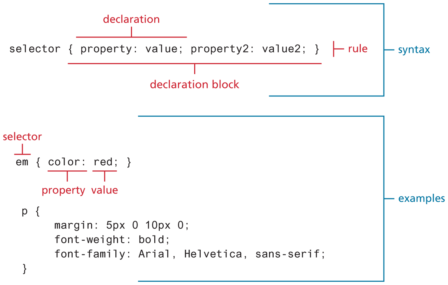
The series of declarations is also called the declaration block. As one can see in the illustration, a declaration block can be together on a single line or spread across multiple lines. The browser ignores white space (i.e., spaces, tabs, and returns) between your CSS rules so you can format the CSS however you want. Notice that each declaration is terminated with a semicolon. The semicolon for the last declaration in a block is in fact optional. However, it is sensible practice to also terminate the last declaration with a semicolon as well; that way, if you add rules to the end later, you will reduce the chance of introducing a rather subtle and hard-to-discover bug.
4.2.1 Selectors
Every CSS rule begins with a selector. The selector identifies which element or elements in the HTML document will be affected by the declarations in the rule. Another way of thinking of selectors is that they are a pattern that is used by the browser to select the HTML elements that will receive the style. As you will see later in this chapter, there are a variety of ways to write selectors.
4.2.2 Properties
Each individual CSS declaration must contain a property. These property names are predefined by the CSS standard. The CSS2.1 recommendation defines over a hundred different property names, so some type of reference guide, whether in a book, online, or within your web development software, can be helpful.5 This chapter and the next one on CSS (Chapter 7) will only be able to cover most of the common CSS properties. Table 4.1 lists many of the most commonly used CSS properties. Properties marked with an asterisk contain multiple subproperties not listed here (e.g., border-top, border-top-color, border-top-width, etc.).
Table 4.1 Common CSS Properties
| Property Type | Property |
|---|---|
| Fonts |
|
| Text |
|
| Color and background |
|
| Borders |
|
| Spacing |
|
| Sizing |
|
| Layout |
|
| Lists |
|
Effects |
|
4.2.3 Values
Each CSS declaration also contains a value for a property. The unit of any given value is dependent upon the property. Some property values are from a predefined list of keywords. Others are values such as length measurements, percentages, numbers without units, color values, and URLs.
Colors would seem at first glance to be the clearest of these units. But as we will see in more detail in Chapter 6, color can be a complicated thing to describe. CSS supports a variety of different ways of describing color; Table 4.2 lists the different ways you can describe a color value in CSS.
Table 4.2 Color Values
| Method | Description | Example |
|---|---|---|
| Name | Use one of 17 standard color names. CSS3 has 140 standard names. |
|
| RGB | Uses three different numbers between 0 and 255 to describe the red, green, and blue values of the color. |
|
| Hexadecimal | Uses a six-digit hexadecimal number to describe the red, green, and blue value of the color; each of the three RGB values is between 0 and FF (which is 255 in decimal). Notice that the hexadecimal number is preceded by a hash or pound symbol (#). |
|
| RGBa | This defines a partially transparent background color. The “a” stands for “alpha,” which is a term used to identify a transparency that is a value between 0.0 (fully transparent) and 1.0 (fully opaque). |
|
| HSL | Allows you to specify a color using Hue Saturation and Light values. This is available only in CSS3. HSLA is also available as well. |
|
Just as there are multiple ways of specifying color in CSS, so too there are multiple ways of specifying a unit of measurement. As we will see later in Section 4.7, these units can sometimes be complicated to work with. When working with print design, we generally make use of straightforward absolute units such as inches or centimeters and picas or points. However, because different devices have differing physical sizes as well as different pixel resolutions and because the user is able to change the browser size or its zoom mode, these absolute units don’t always make sense with web element measures.
Table 4.3 lists the different units of measure in CSS. Some of these are relative units, in that they are based on the value of something else, such as the size of a parent element. Others are absolute units, in that they have a real-world size. Unless you are defining a style sheet for printing, it is recommended you avoid using absolute units. Pixels are perhaps the one popular exception (though, as we shall see later, there are also good reasons for avoiding the pixel unit). In general, most of the CSS that you will see uses either px, em, or % as a measure unit.
Table 4.3 Common Units of Measure Values
| Unit | Description | Type |
|---|---|---|
| px | Pixel. In CSS2 this is a relative measure, while in CSS3 it is absolute (1/96 of an inch). | Relative (CSS2) Absolute (CSS3) |
| em | Equal to the computed value of the font-size property of the element on which it is used. When used for font sizes, the em unit is in relation to the font size of the parent. | Relative |
| % | A measure that is always relative to another value. The precise meaning of % varies depending upon the property in which it is being used. | Relative |
| ex | A rarely used relative measure that expresses size in relation to the x-height of an element’s font. | Relative |
| ch | Another rarely used relative measure; this one expresses size in relation to the width of the zero (“0”) character of an element’s font. | Relative (CSS3 only) |
| rem | Stands for root em, which is the font size of the root element. Unlike em, which may be different for each element, the rem is constant throughout the document. |
Relative (CSS3 only) |
| vw, vh | Stands for viewport width and viewport height. Both are percentage values (between 0 and 100) of the viewport (browser window). This allows an item to change size when the viewport is resized. |
Relative (CSS3 only) |
| in | Inches | Absolute |
| cm | Centimeters | Absolute |
| mm | Millimeters | Absolute |
| pt | Points (equal to 1/72 of an inch) | Absolute |
| pc | Pica (equal to 1/6 of an inch) | Absolute |
 Note
Note
It is often helpful to add comments to your style sheets. Comments take the form:
/* comment goes here */
Real-world CSS files can quickly become quite long and complicated. It is a common practice to locate style rules that are related together, and then indicate that they are related via a comment. For instance:
/* main navigation */
nav#main { … }
nav#main ul { … }
nav#main ul li { … }
/* header */
header { … }
h1 { … }
Comments can also be a helpful way to temporarily hide any number of rules, which can make debugging your CSS just a tiny bit less tedious.