Long description
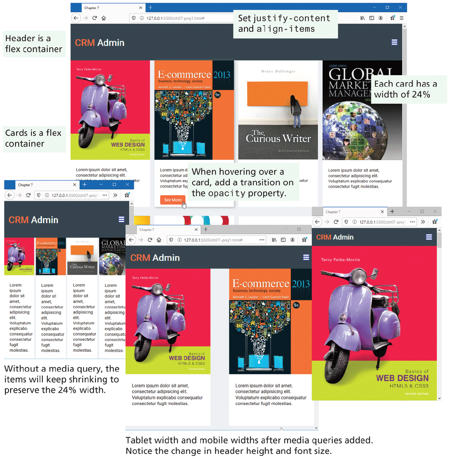
Browser Window 1 shows a web page that has a level-1 heading that reads, C R M Admin. The heading is placed in a rectangular block that spreads across the window. The block is labeled Header is a flex container. There are 4 vertical blocks placed in 4 columns below the heading, each displaying different images and text. The vertical blocks are labeled Cards is a flex container. The top of the web page has a highlighted text that reads, Set justify hyphen content and align hyphen items. A highlighted text to the right of the fourth vertical block indicates that Each card has a width of 24 percent. The second vertical block has a button labeled See More at the bottom. A link cursor is shown over the button. The link cursor indicates that When hovering over a card, add a transition on the opacity property.
Browser Window 2 shows the web page and contents as displayed in Browser Window 1 but with a reduced size. This indicates that Without a media query, the items will keep shrinking to preserve the 24 percentage width.
Browser Window 3 displays the web page shown in Browser Window1 on a tab screen, where the vertical blocks are placed in 2 rows and 2 columns.
Browser Window 4 displays the web page shown in Browser Window 1 on a mobile screen, where the vertical blocks are shown in a single column. The layout of Browser Window 3 and Browser Window 4 indicate that Tablet width and mobile widths after media queries added. Notice the change in the header height and font size.
Back