Long description
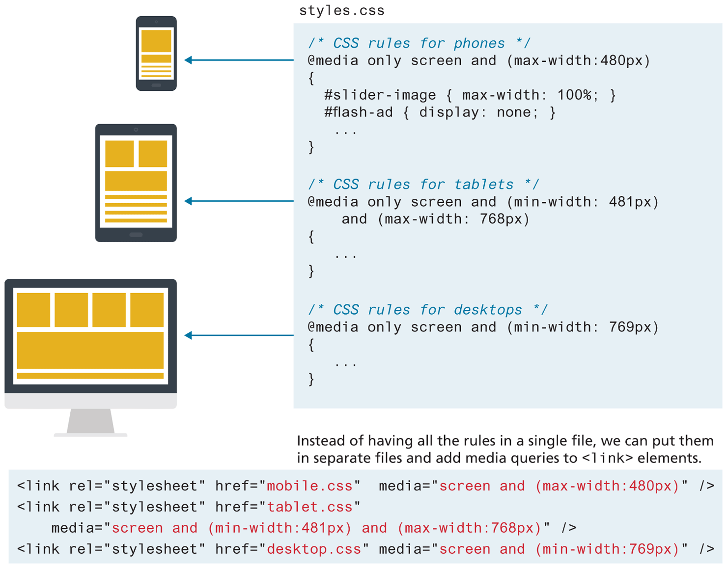
Set 1 consists of 18 lines of C S S code named style dot c s s. Line 1: forward slash asterisk CSS rules for phones asterisk forward slash at indentation level 1. Line 2: @media only screen and open parenthesis max hyphen width colon 480 p x close parenthesis at indentation level 0. Line 3: open curly brace at indentation level 0. Line 4: hash slider hyphen image open curly brace max hyphen width colon 100 percentage semicolon close curly brace at indentation level 1. Line 5: hash flash hyphen ad open curly brace display colon none semicolon close curly brace at indentation level 1. Line 6: Ellipsis. Line 7: close curly brace at indentation level 0. An arrow from lines 1 to 7 points to a mobile screen at the left that represents how the H T M L code will be rendered in the mobile browser screen. Line 8: forward slash asterisk CSS rules for tablets asterisk forward slash. Line 9: @media only screen and open parenthesis min hyphen width colon 481px close parenthesis at indentation level 0. Line 10: and open parenthesis max hyphen width colon 768px close parenthesis at indentation level 1. Line 11: open curly brace at indentation level 0. Line 12: dots. Line 13: close curly brace at indentation level 0. An arrow from lines 8 to 13 points to a tablet screen at the left that represents how the H T M L code will be rendered in the tablet browser screen. Line 14: forward slash asterisk CSS rules for desktops asterisk forward slash at indentation level 0. Line 15: @media only screen and open parenthesis min hyphen width: 769 p x close parenthesis at indentation level 0. Line 16: open curly brace at indentation level 0. Line 17: dots. Line 18: close curly brace at indentation level 0. An arrow from lines 14 to 18 points to a computer screen at the left that represents how the H T M L code will be rendered in the computer browser screen.
Note: Instead of having all the rules in a single file, we can put them in separate files and add media queries to open angle bracket link close angle bracket elements.
Set 2 consists of four lines of H T M L code. Line 1: open angle bracket link r e l equals open double quotes stylesheet close double quotes h r e f equals open double quotes mobile dot c s s close double quotes media equals open double quotes screen and open parenthesis max hyphen width colon 480px close parenthesis close double quotes forward slash close angle bracket at indentation level 0. Line 2: open angle bracket link r e l equals open double quotes stylesheet close double quotes h ref equals open double quotes tablet dot c s s close double quotes at indentation level 0. Line 3: media equals open double quotes screen and open parenthesis min hyphen width colon 481 p x close parenthesis and open parenthesis max hyphen width colon 768 p x close parenthesis close double quotes forward slash close angle bracket at indentation level 1. Line 4: open angle bracket link r e l equals open double quotes stylesheet close double quotes h r e f equals open double quotes desktop dot c s s close double quotes media equals open double quotes screen and open parenthesis min hyphen width: 769px close parenthesis close double quotes forward slash close angle bracket.
Back