Long description
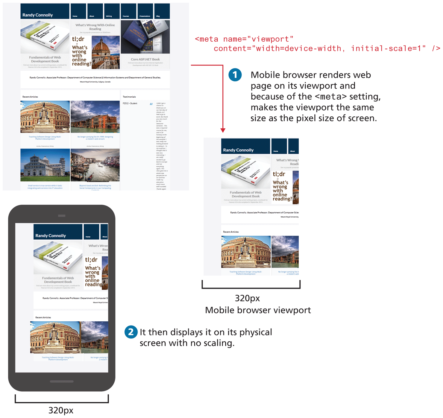
Image 1 at the top of the figure shows a Web page that has multiple tabs, images and text. The block of code is placed at the right of the image and reads as follows: open angular bracket meta name equals open double quotes viewport close double quotes content equals open double quotes width equals device hyphen width comma initial hyphen scale equals 1 close double quotes forward slash close angular bracket.
An arrow from Image 1 points to Image 2 placed at the bottom right of image 1.
Step 1: Mobile browser renders web page on its viewport and because of the open angular bracket meta close angular bracket setting, makes the viewport the same size as the pixel size of screen.
Image 2 labeled Mobile browser viewport shows the Web page shown in Image 1 but it has been resized to be able to fit in a Mobile Browser. The width of the mobile browser viewport is marled 320 p x.
Step 2: It then displays it on its physical screen with no scaling.
Image 3 shows a mobile phone displaying the same web page seen in Image 2. The web page content looks as it is scaled to fit the Mobile browser. The width of the mobile screen is marked 320 p x.
Back