Long description
Back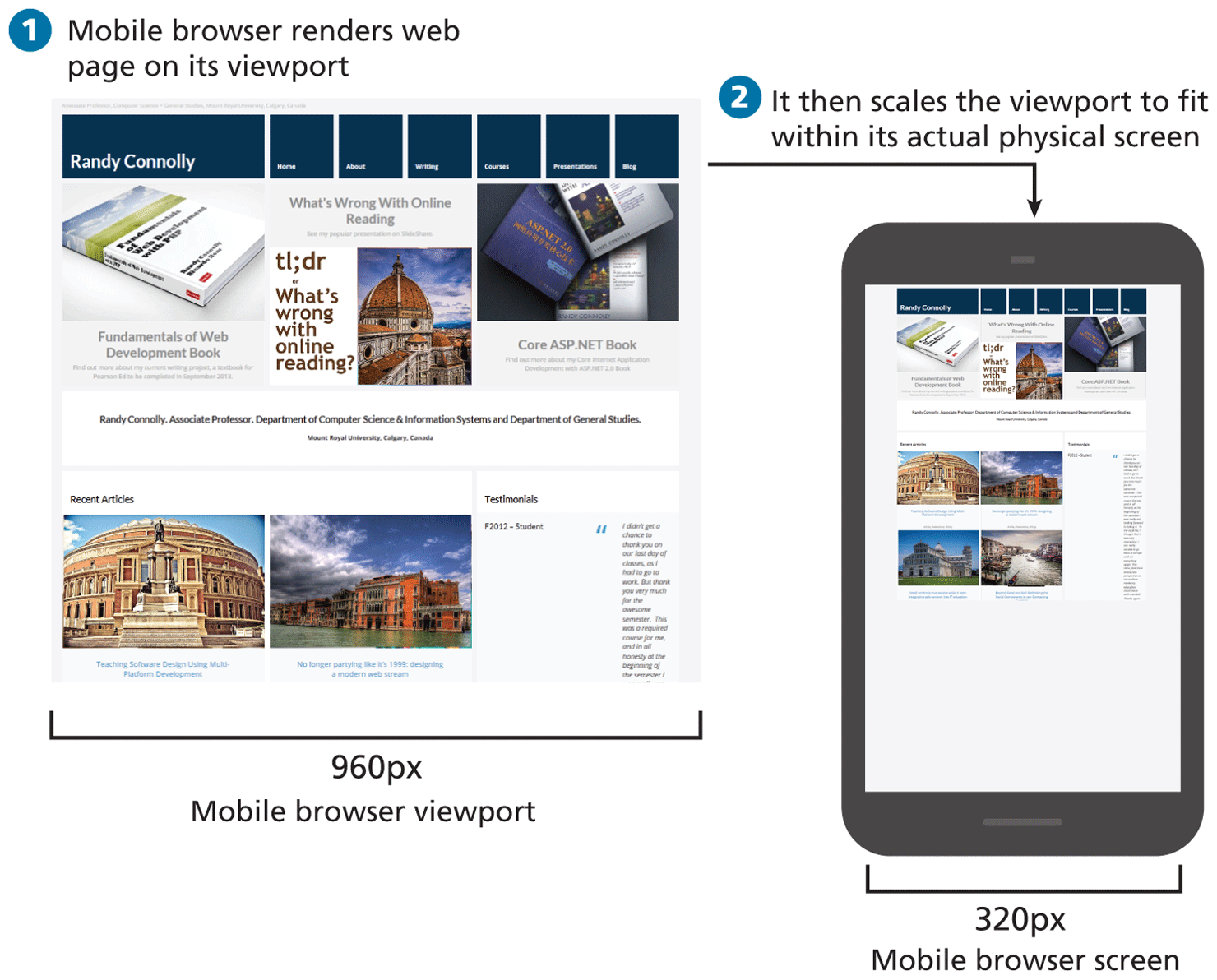
Step 1: Mobile browser renders web page on its viewport.
Step 1 shows web page of a mobile browser on its viewport containing multiple sections, images and text. The width of the mobile browser viewport is 960 p x.
Step 2: It then scales the viewport to fit within its actual physical screen.
Step 2 shows the web page of a mobile browser containing multiple sections, images and text. The width of the mobile browser screen is marked 320 p x. The displayed contents and the layout are same to the web page of step 1 but appear much smaller.
Back