Long description
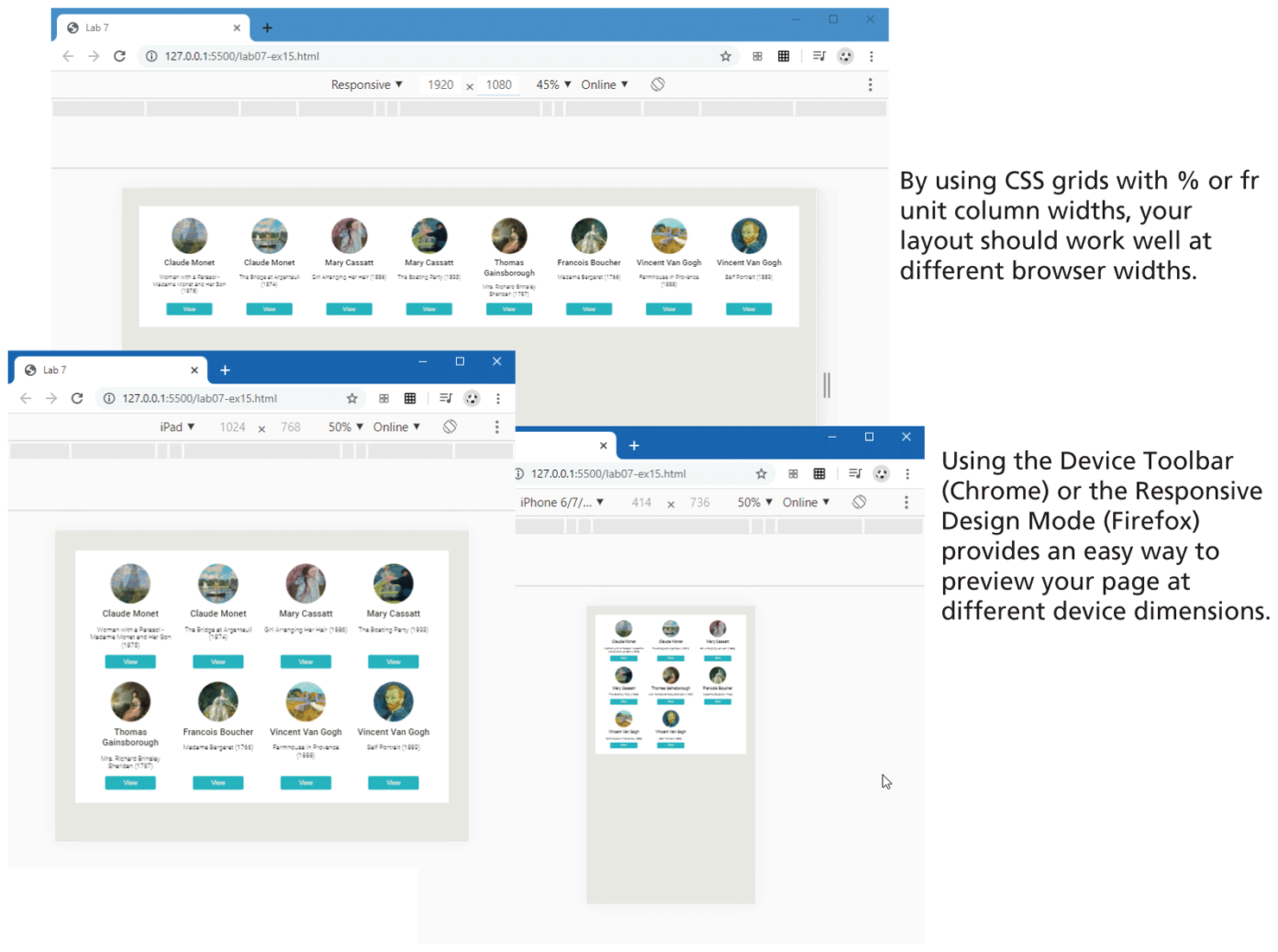
Browser Window 1 shows a row of 8 images placed side-by-side within 8 circles. A few lines of text and a button are placed below each image. The images and the contents are equally spaced from each other. Note: By using C S S grids with percentage or f r unit column widths, your layout should work well at different browser widths.
Browser Window 2 overlaps the Browser Window 1 at the bottom left corner. The browser window shows 8 images placed within 8 circles in two rows and four columns. A few lines of text and a button are placed below each image. The images and the contents are equally spaced from each other. The image and text appear much larger than the content in Browser Window 1.
Browser Window 3 overlaps the Browser Window 1 at the bottom right corner. The browser window shows 8 images placed within 8 circles in three rows and three columns. The last row shows only two images. A few lines of text and a button are placed below each image. The images and the contents are equally spaced from each other. The image and text appear much smaller than the content in Browser Window 1 and 2.
Note: Using the Device Toolbar open parenthesis Chrome close parenthesis or the Responsive Design Mode open parenthesis Firefox close parenthesis provides an easy way to preview your page at different device dimensions.
Back