Long description
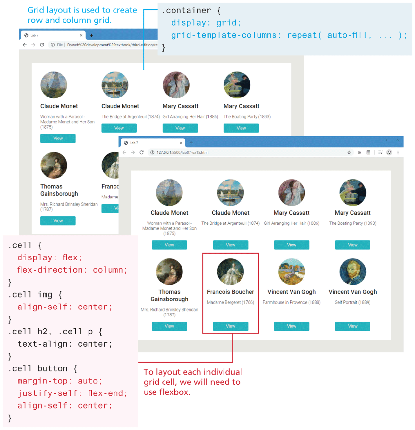
Browser Window 1 shows a page containing 8 images inside a circle arranged in 2 rows and 4 columns. There is a title, text and, button labeled View below each image. Note: Grid layout is used to create row and column grid. The block of code corresponding to the grid layout reads as follows: Line 1: dot container open curly brace at indentation 0. Line 2: display colon grid semicolon at indentation 1. Line 3: grid hyphen template hyphen columns colon repeat open parenthesis auto hyphen fill comma ellipsis close parenthesis semicolon at indentation 1. Line 4: Close curly brace at indentation 0.
Browser Window 2 shows a page containing the same images and layout of contents as shown in browser window 1. One of the images followed by the title, text, and View button are highlighted within a red box indicating its selection. Note: To layout each individual grid cell, we will need to use flexbox. The block of code corresponding to the highlighted section reads as follows. Line 1: dot cell open curly brace at indentation 0. Line 2: display colon flex semicolon at indentation 1. Line 3: flex hyphen direction colon column semicolon at indentation 1. Line 4: Close curly brace at indentation 0. Line 5: dot cell i m g open curly brace at indentation 0. Line 6: align hyphen self colon center semicolon at indentation 1. Line 7: close curly brace at indentation 0. Line 8: dot cell h 2 comma dot cell p open curly brace in indentation 0. Line 9: text hyphen align colon center semicolon at indentation 1. Line 10: close curly brace at indentation 0. Line 11: dot cell button open curly brace at indentation 0. Line 12: margin hyphen top colon auto semicolon at indentation 1. Line 13: justify hyphen self colon flex hyphen end semicolon at indentation 1. Line 14: align hyphen self colon center semicolon at indentation 1. Line 15: close curly brace at indentation 0.
Back