Long description
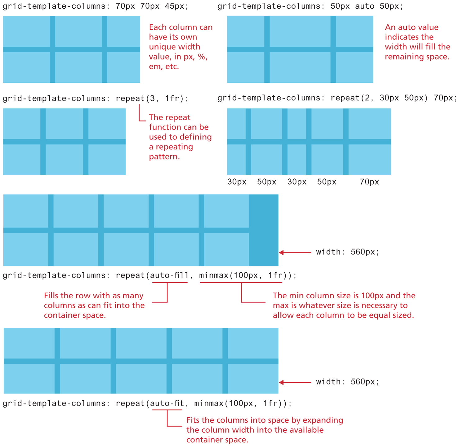
The first grid container is a rectangular box divided into 2 rows and 3 columns. The rows and columns are separated by equal space. The width of the third column is slightly lesser than the first two columns. The corresponding column property is grid hyphen template hyphen columns colon 70 p x 70 p x 45 p x semicolon. Note: Each column can have its own unique width value, in p x, percentage, e m, etc.
The second grid container is a rectangular box divided into 2 rows and 3 columns. The rows and columns are separated by equal space. The width of the second column is slightly more than the first and the third columns. The corresponding column property is grid hyphen template hyphen columns colon 50 p x auto 50 p x semicolon. Note: An auto value indicates the width will fill the remaining space.
The third grid container is a rectangular box divided into 2 rows and 3 columns. The rows and columns are separated by equal space. The width of all the columns are the same. The corresponding column property is grid hyphen template hyphen columns colon repeat open parenthesis 3, 1 f r close parenthesis semicolon. Note: The repeat function can be used to defining a repeating pattern.
The fourth grid container is a rectangular box divided into 2 rows and 5 columns. The rows and columns are separated by equal space. The width of the first and third columns are same. The width of the second and fourth columns are slightly more than the width of the first and third columns. The width of the fifth column is more than the width of the rest of the columns. The width of the columns are written below the grid from left to right as follows: 30 p x, 50 p x, 30 p x, and 70 p x. The corresponding column property is grid hyphen template hyphen columns colon repeat open parenthesis 2, 30 p x 50 p x close parenthesis 70 p x semicolon.
The fifth grid container is a rectangular box divided into 2 rows and 5 columns. The rows and columns are separated by equal space. There is an extra space at the right end of the fifth column and the edge of grid container. The width of all the columns are the same. The width of the entire grid is labeled width colon 560 p x. The corresponding column property is grid hyphen template hyphen columns colon repeat open parenthesis auto hyphen fill, minmax open parenthesis 100 p x, 1 f r close parenthesis close parenthesis semicolon. Note: auto hyphen fill fills the row with as many columns as can fit into the container space. minmax open parenthesis 100 p x, 1 f r close parenthesis indicates that the min column size is 100 p x and the max is whatever size is necessary to allow each column to be equal sized.
The sixth grid container is a rectangular box divided into 2 rows and 5 columns. The rows and columns are separated by equal space. The width of all the columns are the same. The width of the entire grid is labeled width colon 560 p x. The corresponding column property is grid hyphen template hyphen columns colon repeat open parenthesis auto hyphen fit, minmax open parenthesis 100 p x, 1 f r close parenthesis close parenthesis semicolon. Note: auto hyphen fit fits the columns into space by expanding the column width into the available container space.
Back