Long description
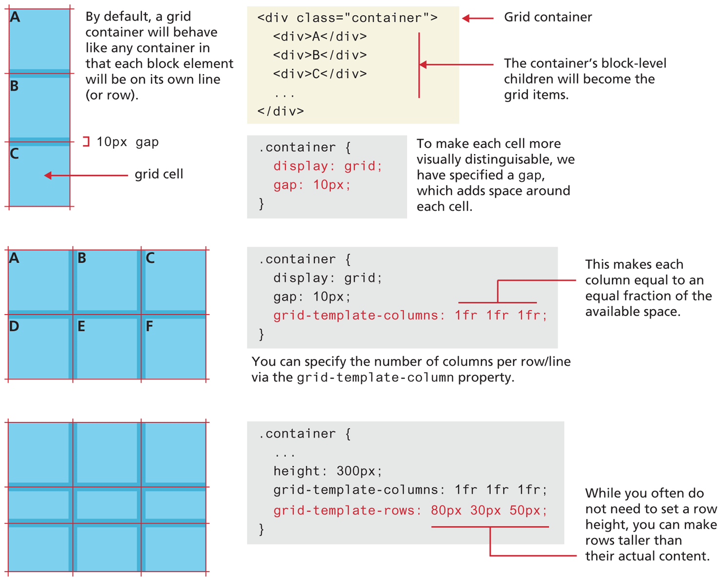
The first grid container is a rectangular box divided into three equal parts in three rows. Each part is a square box labeled grid cell. The three grid cells are labeled “A”, B, and C, respectively.
Note: There is a grid-gap of 10 p x between the highlights of each cell. By default, a grid container will behave like any container in that each block element will be on its own line (or row).
The first block of code is at the right side of the first grid container and reads as follows.
Line 1 at indentation level 0: open angle bracket div class equals open double quotes container close double quotes close angle bracket.
Line 2at indentation level 1: open angle bracket div close angle bracket “A” open angle bracket forward slash div close angle bracket.
Line 3 at indentation level 1: open angle bracket div close angle bracket B open angle bracket forward slash div close angle bracket.
Line 4 at indentation level 1: open angle bracket div close angle bracket C open angle bracket forward slash div close angle bracket.
Line 5 at indentation level 1: dot dot dot.
Line 6 at indentation level 0: open angle bracket forward slash close angle bracket.
Note: Line 1 indicates Grid container. Lines 2 to 4 indicate that the container’s block-level children will become the grid items.
The second block of code is placed below the first block of code and reads as follows.
Line 1 at indentation level 0: dot container open curly brace.
Line 2 at indentation level 1: display colon grid semicolon.
Line 3 at indentation level 1: grid hyphen gap colon 10 p x semicolon.
Line 4 at indentation level 0: close curly brace.
Note: To make each cell more visually distinguishable, we have specified a grid-gap, which adds space around each cell.
The second grid container is a rectangular box divided into six equal parts in two rows and three columns. The six grid cells are labeled “A”, B, C, D, E, and F, respectively.
The third block of code is placed at the right side of the second grid container and reads as follows.
Line 1 at indentation level 0: dot container open curly brace.
Line 2 at indentation level 1: display colon grid semicolon.
Line 3 at indentation level 1: grid hyphen gap colon 10 p x semicolon.
Line 4 at indentation level 1: grid hyphen template hyphen columns colon 1 f r 1 f r 1 f r semicolon.
Line 5 at indentation level 0: close curly brace.
Note: 1 f r 1 f r 1 f r makes each column equal to an equal fraction of the available space. You can specify the number of columns per row/line via the grid-template-column property.
The third grid container is a horizontal rectangular box that consists of three rows and three columns. The first row is taller than the third row which is taller than the second row.
The fourth block of code is placed at the right side of the third grid container and reads as follows.
Line 1 at indentation level 0: dot container open curly brace.
Line 2 at indentation level 1: dot dot dot.
Line 3 at indentation level 1: height colon 300 p x semicolon.
Line 4 at indentation level 1: grid hyphen template hyphen columns colon 1 f r 1 f r 1 f r semicolon.
Line 5 at indentation level 1: grid hyphen template hyphen rows colon 80 p x 30 p x 50 p x semicolon.
Line 6 at indentation level 0: close curly brace.
Note: 80 p x 30 p x 50 p x indicates that while you often do not need to set a row height, you can make rows taller than their actual content.
Back