Long description
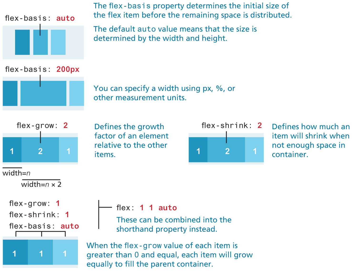
The first flex container is a rectangular box oriented horizontally with three elements placed side-by-side separated by a small space. The elements show shades of blue starting from the dark shade at the left to the lightest shade at the right. The elements are aligned to the center of the rectangular box. The flex property corresponding to the element at the center is flex hyphen basis colon auto.
Note: The flex hyphen basis property determines the initial size of the flex item before the remaining space is distributed. The default auto value means that the size is determined by the width and height.
The second flex container is a rectangular box oriented horizontally with three elements placed side-by-side separated by a small space. The elements show shades of blue starting from the dark shade at the left to the lightest shade at the right. The elements are spread across the rectangular box such that the element in the center has a width, which is three times the size of the elements at the left and right. The flex property corresponding to the element at the center is flex hyphen basis colon 200 p x.
Note: You can specify a width using p x, percentage, or other measurement units.
The third flex container is a rectangular box oriented horizontally with three numbered elements placed side-by-side that are close to each other. The element in the left is numbered 1, the element in the center is labeled 2, and the element in the right is labeled 1. The elements show shades of blue starting from the dark shade at the left to the lightest shade at the right. The elements are spread across the rectangular box such that the element in the center has a width, which is twice the size of the elements at the left and right. The flex property corresponding to the element at the center is flex hyphen grow colon 2. The width of the element numbered 1 equals n. The width of the element numbered 2 equals n multiplied by 2.
Note: Defines the growth factor of an element relative to the other items.
The fourth flex container is a rectangular box oriented horizontally with three numbered elements placed side-by-side that are close to each other. The element in the left is numbered 1, the element in the center is labeled 2, and the element in the right is labeled 1. The elements show shades of blue starting from the dark shade at the left to the lightest shade at the right. The elements are spread across the rectangular box such that the element in the center has a width, which is twice the size of the elements at the left and right. The element at the right slightly spreads outside the rectangular box. The flex property corresponding to the element at the center is flex hyphen shrink colon 2.
Note: Defines how much an item will shrink when not enough space in container.
The fifth flex container is a rectangular box oriented horizontally with three numbered elements placed side-by-side that are close to each other. The elements are all numbered 1. The elements show shades of blue starting from the dark shade at the left to the lightest shade at the right. The elements are spread across the rectangular box with the equal widths. The flex properties corresponding to the elements from left to right are as follows. flex hyphen grow colon 1, flex hyphen shrink colon 1, and flex hyphen basis colon auto.
The flex properties can be combined into the shorthand property instead as flex colon 1 1 auto. Note: When the flex hyphen grow value of each item is greater than 0 and equal, each item will grow equally to fill the parent container.
Back