Long description
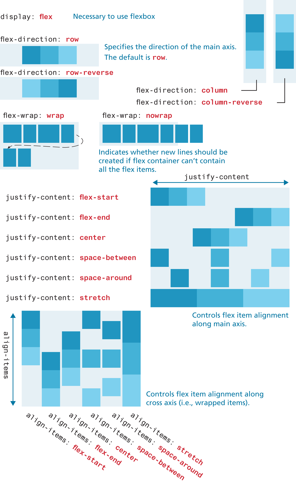
Note: display colon flex is necessary to use flexbox.
The first flex container is a rectangular box oriented horizontally with three elements placed side-by-side close to each other. The elements show shades of blue starting from the dark shade at the left to the lightest shade at the right. The corresponding flex property is flex hyphen direction colon row. The second flex container is a rectangular box oriented horizontally with three elements placed side-by-side, close to each other. The elements show shades of blue starting from the light shade at the left to the darkest shade at the right. The corresponding flex property is flex hyphen direction colon row hyphen reverse. Note: Specifies the direction of the main axis. The default is row.
The third flex container is a rectangular box oriented vertically with three elements placed one below the other, close to each other. The elements show shades of blue starting from the dark shade at the top to the lightest shade at the bottom. The corresponding flex property is flex hyphen direction colon column.
The fourth flex container is a rectangular box oriented vertically with three elements placed one below the other, close to each other. The elements show shades of blue starting from the light shade at the top to the darkest shade at the bottom. The corresponding flex property is flex hyphen direction colon column hyphen reverse.
The fifth flex container is a rectangular box oriented horizontally with elements placed in two rows. The first row consists of four elements of different sizes and the second row consists of two elements of same sizes. The elements are shaded blue. A dashed arrow points from the fourth element in the first row to the first element in the second row. The corresponding flex property is flex hyphen wrap colon wrap.
The sixth flex container is a rectangular box oriented horizontally with six elements placed in one row. The elements are shaded blue. The last two elements are placed outside the flex container. The corresponding flex property is flex hyphen wrap colon no wrap. Note: Indicates whether new lines should be created if flex container can’t contain all the flex items.
Six rows of flex properties are placed at the left, below the fifth and sixth flex containers that correspond to the flex elements placed in the seventh flex container at the right. The seventh flex container is a square that consists of elements placed in six rows. A double-headed arrow labeled justify hyphen content is placed at the top of the square. The first row shows three elements placed close to each other aligned to the left of the container. The elements show shades of blue starting from the dark shade at the left to the lightest shade at the right. The corresponding flex property is justify hyphen content colon flex hyphen start. The second row shows three elements placed close to each other aligned to the right of the container. The elements show shades of blue starting from the dark shade at the left to the lightest shade at the right. The corresponding flex property is justify hyphen content colon flex hyphen end. The third row shows three elements placed close to each other aligned to the center of the container. The elements show shades of blue starting from the dark shade at the left to the lightest shade at the right. The corresponding flex property is justify hyphen content colon center. The fourth row shows three elements placed away from each other, where the first element is aligned to the left, the second element is aligned to the center, and the third element is aligned to the right of the container. The space between the element at the center and the element at the left and right is twice the width of each element. The elements show shades of blue starting from the dark shade at the left to the lightest shade at the right. The corresponding flex property is justify hyphen content colon space hyphen between. The fifth row shows three elements placed away from each other, where the first element is aligned to the left, the second element is aligned to the center, and the third element is aligned to the right of the container. The elements are placed equidistant from each other and the sides of the container. The elements show shades of blue starting from the dark shade at the left to the lightest shade at the right. The corresponding flex property is justify hyphen content colon space hyphen around. The sixth row shows three elements that are stretched and placed close to each other. The elements show shades of blue starting from the dark shade at the left to the lightest shade at the right. The corresponding flex property is justify hyphen content colon stretch. The seventh flex container has a note that reads, Controls flex item alignment along main axis.
Six columns of flex properties are placed at the left, below the flex properties that correspond to the eighth flex container. The eighth flex container is a square that consists of elements placed in six columns. A double-headed arrow labeled align hyphen items is placed at the left of the square. The first column shows three elements placed one below the other aligned to the top of the container. The elements show shades of blue starting from the dark shade at the top to the lightest shade at the bottom. The corresponding flex property is align hyphen items colon flex hyphen start. The second column shows three elements placed one below the other aligned to the bottom of the container. The elements show shades of blue starting from the dark shade at the top to the lightest shade at the bottom. The corresponding flex property is align hyphen items colon flex hyphen end. The third column shows three elements placed one below the other aligned to the center of the container. The elements show shades of blue starting from the dark shade at the top to the lightest shade at the bottom. The corresponding flex property is align hyphen items colon center. The fourth column shows three elements placed away from each other, where the first element is aligned to the top, the second element is aligned to the center, and the third element is aligned to the bottom of the container. The elements are placed equidistant from each other. The elements show shades of blue starting from the dark shade at the top to the lightest shade at the bottom. The corresponding flex property is align hyphen items colon space hyphen between. The fifth column shows three elements placed equidistant from each other and the top and bottom of the container. The elements show shades of blue starting from the dark shade at the top to the lightest shade at the bottom. The corresponding flex property is align hyphen items colon space hyphen around. The sixth column shows three elements that are stretched and placed close to each other. The elements show shades of blue starting from the dark shade at the top to the lightest shade at the bottom. The corresponding flex property is justify hyphen content colon stretch. The eighth flex container has a note that reads, Controls flex item alignment along cross axis (i.e., wrapped items).
Back