Long description
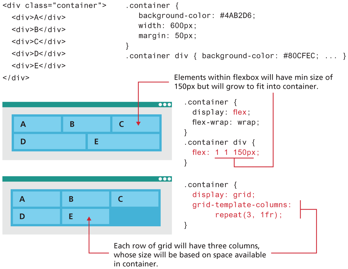
A block of code used for both the flex and grid layout reads as follows. Line 1: open angle bracket div class equals open double quotes container close double quotes close angle bracket at indentation level 0. Line 2: open angle bracket div close angle bracket “A” open angle bracket forward slash div close angle bracket at indentation level 1. Line 3: open angle bracket div close angle bracket B open angle bracket forward slash div close angle bracket at indentation level 1. Line 4: open angle bracket div close angle bracket C open angle bracket forward slash div close angle bracket at indentation level 1. Line 5: open angle bracket div close angle bracket D open angle bracket forward slash div close angle bracket at indentation level 1. Line 6: open angle bracket div close angle bracket E open angle bracket forward slash div close angle bracket at indentation level 1. Line 7: open angle bracket forward slash div close angle bracket at indentation level 0.
The C S S block of code for the layouts read as follows. Line 1: dot container open curly brace at indentation level 0. Line 2: background hyphen color colon hash 4 "A” B 2 0 6 semicolon at indentation level 1. Line 3: width colon 600 p x semicolon at indentation level 1. Line 4: margin colon 50 p x semicolon at indentation level 1. Line 5: close curly brace at indentation level 0. Line 6: dot container div open curly brace background hyphen color colon hash 80 C F E C semicolon ellipsis close curly brace at indentation level 0.
The first browser window consists of a flexbox with 5 cells placed in two rows. The first row consists of 3 cells that are of the same width. The second row consists of 2 cells that are of the same width. The elements placed in the first row from left to right are “A”, B, and C. The elements placed in the second row from left to right are D and E. The elements are aligned to the left side of the cells. Note: Elements within flexbox will have min size of 150 p x but will grow to fit into container. The corresponding C S S block of code reads as follows. Line 1: dot container open curly brace at indentation level 0. Line 2: display colon flex semicolon at indentation level 1. Line 3: flex hyphen wrap colon wrap semicolon at indentation level 1. Line 4: close curly brace at indentation level 0. Line 5: dot container div open curly brace at indentation level 0. Line 6: flex colon 1 1 150 p x semicolon at indentation level 1. Line 7: close curly brace at indentation level 0.
The second browser window is placed below the first browser window and consists of a flexbox with 5 cells placed in two rows. The first row consists of 3 cells that are of the same width. The second row consists of 3 cells that are of the same width. The third cell in the second row is empty. The elements placed in the first row from left to right are “A”, B, and C. The elements placed in the second row from left to right are D and E. The elements are aligned to the left side of the cells. Note: Each row of grid will have three columns, whose size will be based on space available in container. The corresponding C S S block of code reads as follows. Line 1: container open curly brace at indentation level 0. Line 2: display colon grid semicolon at indentation level 1. Line 3: grid-template hyphen columns colon at indentation level 1. Line 4: repeat open parenthesis 3 comma 1 f r close parenthesis semicolon at indentation level 2. Line 5: close curly brace at indentation level 0.
Back