20 Monitoring
Monitoring is primarily used to detect failures that impact users in production and trigger notifications (alerts) sent to human operators responsible for mitigating them. The other critical use case for monitoring is to provide a high-level overview of the system’s health through dashboards.
In the early days, monitoring was used mostly as a black-box approach to report whether a service was up or down, without much visibility of what was going on inside. Over the years, it has evolved into a white-box approach as developers started to instrument their code to emit application-level measurements to answer whether specific features worked as expected. This was popularized with the introduction of statsd by Etsy, which normalized collecting application-level measurements.
Blackbox monitoring is still in use today to monitor external dependencies, such as third-party APIs, and validate how the users perceive the performance and health of a service from the outside. A common approach is to periodically run scripts that send test requests to external API endpoints and monitor how long they took and whether they were successful. These scripts are deployed in the same regions the application’s users are and hit the same endpoints they do. Because they exercise the system’s public surface from the outside, they can catch issues that aren’t visible from within the application, like connectivity problems. These scripts are also useful to detect issues with APIs that aren’t exercised often by users.
Blackbox monitoring is good at detecting the symptoms when something is broken; in contrast, white-box monitoring can help identify the root cause of known hard-failure modes before users are impacted. As a rule of thumb, if you can’t design away a hard-failure mode, you should add monitoring for it. The longer a system has been around, the better you will understand how it can fail and what needs to be monitored.
20.1 Metrics
A metric is a numeric representation of information measured over a time interval and represented as a time-series, like the number of requests handled by a service. Conceptually, a metric is a list of samples, where each sample is represented by a floating-point number and a timestamp.
Modern monitoring systems allow a metric to be tagged with a set of key-value pairs called labels, which increases the dimensionality of the metric. Essentially, every distinct combination of labels is a different metric. This has become a necessity as modern services can have a large amount of metadata associated with each metric, like datacenter, cluster, node, pod, service, etc. High-cardinality metrics make it easy to slice and dice the data, and eliminate the instrumentation cost of manually creating a metric for each label combination.
A service should emit metrics about its load, internal state, and availability and performance of downstream service dependencies. Combined with the metrics emitted by downstream services, this allows operators to identify problems quickly. This requires explicit code changes and a deliberate effort by developers to instrument their code.
For example, take a fictitious HTTP handler that returns a resource. There is a whole range of questions you will want to be able to answer once it’s running in production1:
def get_resource(id):
  resource = self._cache.get(id)  # in-process cache
  # Is the id valid?
  # Was there a cache hit?
  # How long has the resource been in the cache?

  if resource is not None:
    return resource

  resource = self._repository.get(id)
  # Did the remote call fail, and if so, why?
  # Did the remote call timeout?
  # How long did the call take?

  self._cache[id] = resource
  # What's the size of the cache?

  return resource
  # How long did it take for the handler to run?
Now, suppose we want to record the number of requests our service failed to handle. One way to do that is with an event-based approach — whenever a service instance fails to handle a request, it reports a failure count of 1 in an event2 to a local telemetry agent, e.g.:
{
  "failureCount": 1,
  "serviceRegion": "EastUs2",
  "timestamp": 1614438079
}
The agent batches these events and emits them periodically to a remote telemetry service, which persists them in a dedicated data store for event logs. For example, this is the approach taken by Azure Monitor’s log-based metrics.
As you can imagine, this is quite expensive since the load on the backend increases with the number of events ingested. Events are also costly to aggregate at query time — suppose you want to retrieve the number of failures in North Europe over the past month; you would have to issue a query that requires fetching, filtering, and aggregating potentially trillions of events within that time period.
Is there a way to reduce costs at query time? Because metrics are time-series, they can be modeled and manipulated with mathematical tools. The samples of a time-series can be pre-aggregated over pre-specified time periods (e.g., 1 second, 5 minutes, 1 hour, etc.) and represented with summary statistics such as the sum, average, or percentiles.
For example, the telemetry backend can pre-aggregate metrics over one or more time periods at ingestion time. Conceptually, if the aggregation (i.e., the sum in our example) were to happen with a period of one hour, we would have one failureCount metric per serviceRegion, each containing one sample per hour, e.g.:
"00:00", 561,
"01:00", 42,
"02:00", 61,
...
The backend can create multiple pre-aggregates with different periods. Then at query time, the pre-aggregated metric with the best period that satisfies the query is chosen. For example, CloudWatch (the telemetry backend used by AWS) pre-aggregates data as it’s ingested.
We can take this idea one step further and also reduce ingestion costs by having the local telemetry agents pre-aggregate metrics on the client side.
Client and server-side pre-aggregation drastically reduces bandwidth, compute, and storage requirements for metrics. However, it comes at a cost; operators lose the flexibility to re-aggregate metrics after they have been ingested, as they no longer have access to the original events that generated them. For example, if a metric is pre-aggregated over a period of time of 1 hour, it can’t later be re-aggregated over a period of 5 min without the original events.
Because metrics are mainly used for alerting and visualization purposes, they are usually persisted in pre-aggregated form in a time-series data store since querying pre-aggregated data can be several order of magnitudes more efficient than the alternative.
20.2 Service-level indicators
As mentioned earlier, one of the main use cases for metrics is alerting. That doesn’t mean we should create alerts for every possible metric out there — for example, it’s useless to be alerted in the middle of the night because a service had a big spike in memory consumption a few minutes earlier. In this section, we will discuss one specific metric category that lends itself well for alerting.
A service-level indicator (SLI) is a metric that measures one aspect of the level of service provided by a service to its users, like the response time, error rate, or throughput. SLIs are typically aggregated over a rolling time window and represented with a summary statistic, like average or percentile.
SLIs are best defined with a ratio of two metrics, good events over total number of events, since they are easy to interpret: 0 means the service is broken and 1 that everything is working as expected (see Figure 20.1). As we will see later in the chapter, ratios also simplify the configuration of alerts.
These are some commonly used SLIs for services:
- Response time — The fraction of requests that are completed faster than a given threshold.
- Availability — The proportion of time the service was usable, defined as the number of successful requests over the total number of requests.
- Quality — The proportion of requests served in an un-degraded state (assuming the system degrades gracefully).
- Data completeness (for storage systems) — The proportion of records persisted to a data store that can be successfully accessed later.
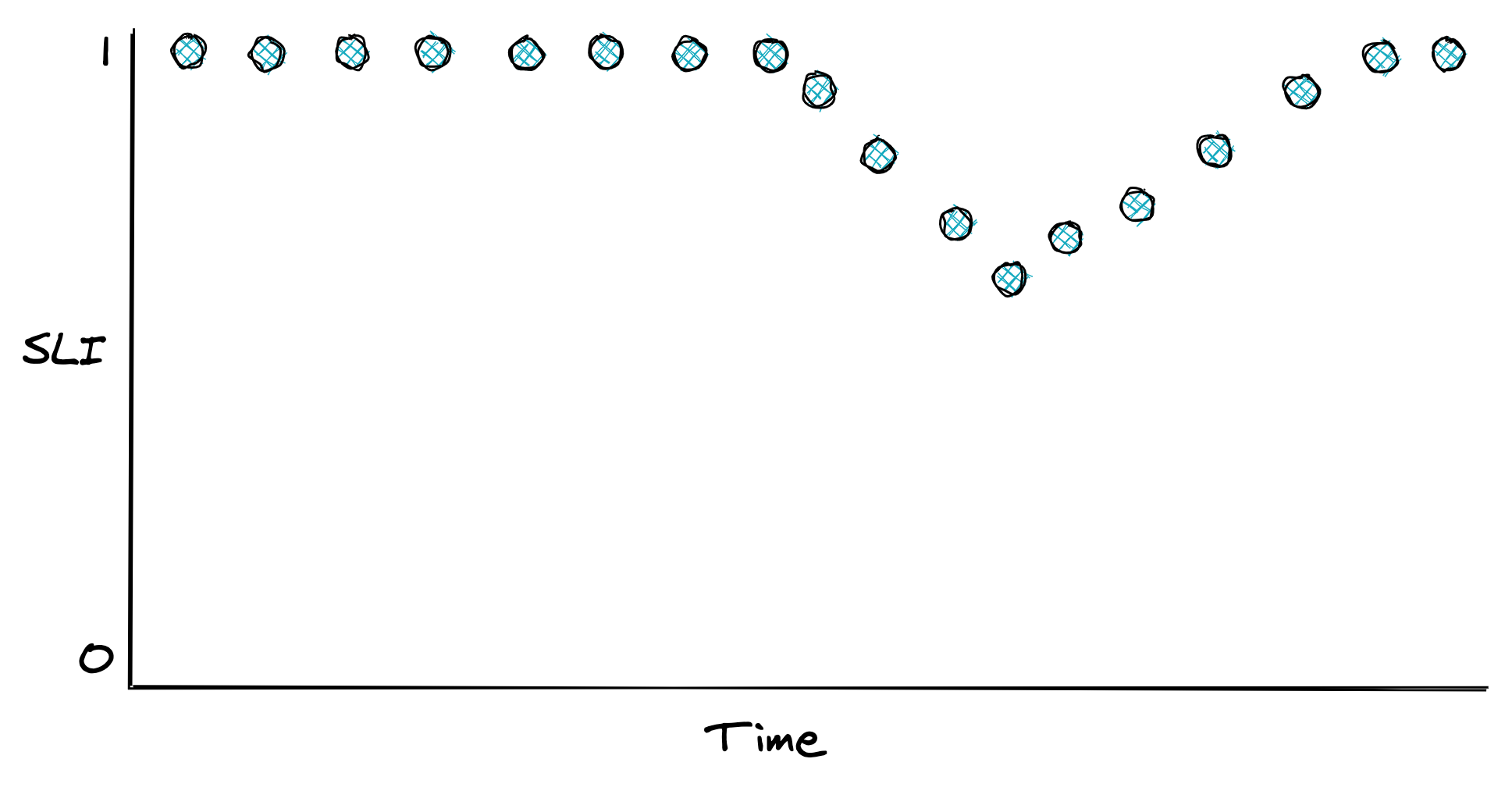
Figure 20.1: An SLI defined as the ratio of good events over the total number of events.
Once you have decided what to measure, you need to decide where to measure it. Take the response time, for example. Should you use the metric reported by the service, load balancer, or clients? In general, you want to use the one that best represents the experience of the users. And if that’s too costly to collect, pick the next best candidate. In the previous example, the client metric is the more meaningful one, as that accounts for delays in the entire path of the request.
Now, how should you measure response times? Measurements can be affected by various factors that increase their variance, such as network timeouts, page faults, or heavy context switching. Since every request does not take the same amount of time, response times are best represented with a distribution, which tend to be right-skewed and long-tailed.
A distribution can be summarized with a statistic. Take the average, for example. While it has its uses, it doesn’t tell you much about the proportion of requests experiencing a specific response time. All it takes is one extreme outlier to skew the average. For example, if 100 requests are hitting your service, 99 of which have a response time of 1 second and one of 10 min, the average is nearly 7 seconds. Even though 99% of the requests experience a response time of 1 second, the average is 7 times higher than that.
A better way to represent the distribution of response times is with percentiles. A percentile is the value below which a percentage of the response times fall. For example, if the 99th percentile is 1 second, then 99 % of requests have a response time below or equal to 1 second. The upper percentiles of a response time distribution, like the 99th and 99.9th percentiles, are also called long-tail latencies. In general, the higher the variance of a distribution is, the more likely the average user will be affected by long-tail behavior3.
Even though only a small fraction of requests experience these extreme latencies, it impacts your most profitable users. They are the ones that make the highest number of requests and thus have a higher chance of experiencing tail latencies. Several studies have shown that high latencies can negatively affect revenues. A mere 100-millisecond delay in load time can hurt conversion rates by 7 percent.
Also, long-tail behaviors left unchecked can quickly bring a service to its knees. Suppose a service is using 2K threads to serve 10K requests per second. By Little’s Law, the average response time of a thread is 200 ms. Suddenly, a network switch becomes congested, and as it happens, 1% of requests are being served from a node behind that switch. That 1% of requests, or 100 requests per second out of the 10K, starts taking 20 seconds to complete.
How many more threads does the service need to deal with the small fraction of requests having a high response time? If 100 requests per second take 20 seconds to process, then 2K additional threads are needed to deal just with the slow requests. So the number of threads used by the service needs to double to keep up with the load!
Measuring long-tail behavior and keeping it under check doesn’t just make your users happy, but also drastically improves the resiliency of your service and reduces operational costs. When you are forced to guard against the worst-case long-tail behavior, you happen to improve the average case as well.
20.3 Service-level objectives
A service-level objective (SLO) defines a range of acceptable values for an SLI within which the service is considered to be in a healthy state (see Figure 20.2). An SLO sets the expectation to its users of how the service should behave when it’s functioning correctly. Service owners can also use SLOs to define a service-level agreement (SLA) with their users — a contractual agreement that dictates what happens when an SLO isn’t met, typically resulting in financial consequences.
For example, an SLO could define that 99% of API calls to endpoint X should complete below 200 ms, as measured over a rolling window of 1 week. Another way to look at it, is that it’s acceptable for up to 1% of requests within a rolling week to have a latency higher than 200 ms. That 1% is also called the error budget, which represents the number of failures that can be tolerated.
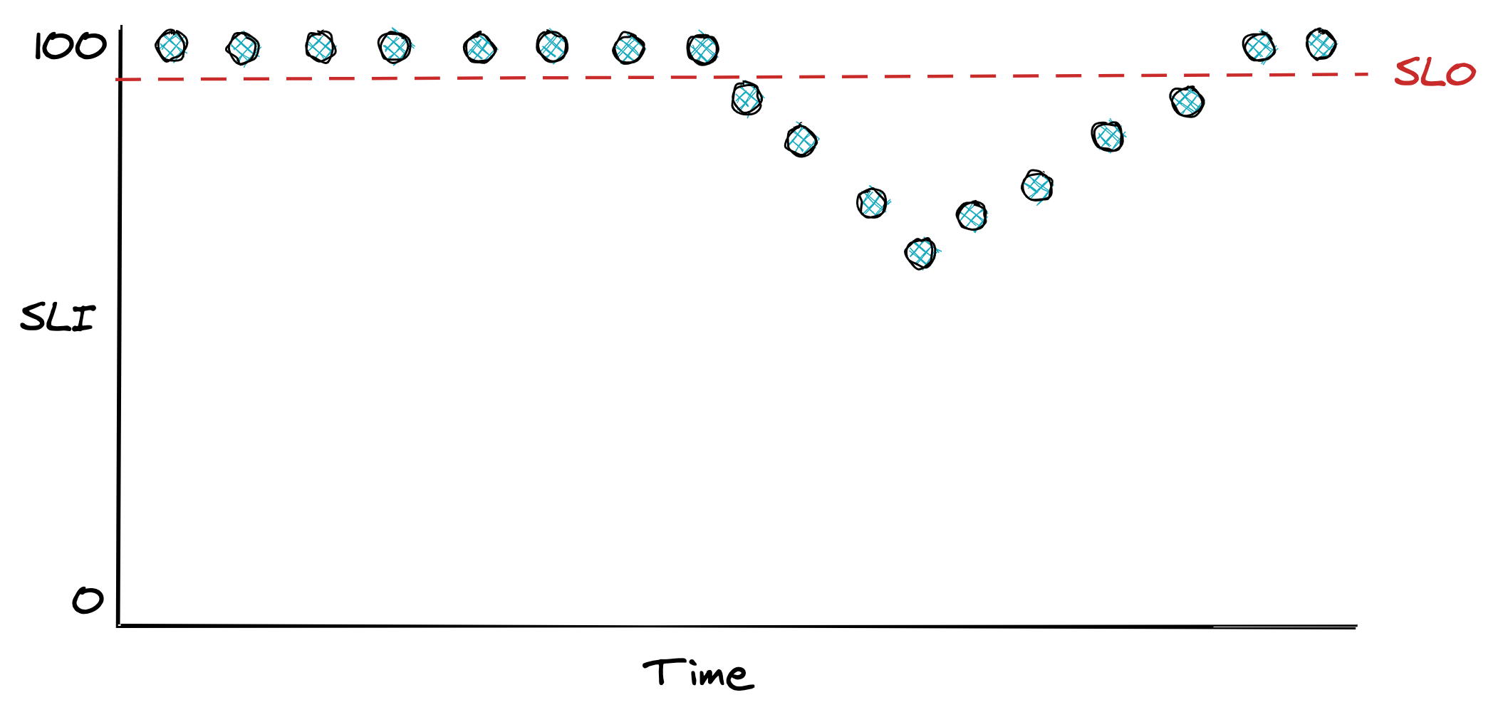
Figure 20.2: An SLO defines the range of acceptable values for an SLI.
SLOs are helpful for alerting purposes and help the team prioritize repair tasks with feature work. For example, the team can agree that when an error budget has been exhausted, repair items will take precedence over new features until the SLO is restored. Also, an incident’s importance can be measured by how much of the error budget has been burned. An incident that burned 20% of the error budget needs more afterthought than one that burned only 1%.
Smaller time windows force the team to act quicker and prioritize bug fixes and repair items, while longer windows are better suited to make long-term decisions about which projects to invest in. Therefore it makes sense to have multiple SLOs with different window sizes.
How strict should SLOs be? Choosing the right target range is harder than it looks. If it’s too loose, you won’t detect user-facing issues; if it’s too strict, you will waste engineering time micro-optimizing and get diminishing returns. Even if you could guarantee 100% reliability for your system, you can’t make guarantees for anything that your users depend on to access your service that is outside your control, like their last-mile connection. Thus, 100% reliability doesn’t translate into a 100% reliable experience for users.
When setting the target range for your SLOs, start with comfortable ranges and tighten them as you build up confidence. Don’t just pick targets that your service meets today that might become unattainable in a year after the load increases; work backward from what users care about. In general, anything above 3 nines of availability is very costly to achieve and provides diminishing returns.
How many SLOs should you have? You should strive to keep things simple and have as few as possible that provide a good enough indication of the desired service level. SLOs should also be documented and reviewed periodically. For example, suppose you discover that a specific user-facing issue generated lots of support tickets, but none of your SLOs showed any degradations. In that case, they are either too relaxed, or you are not measuring something that you should.
SLOs need to be agreed on with multiple stakeholders. Engineers need to agree that the targets are achievable without excessive toil. If the error budget is burning too rapidly or has been exhausted, repair items will take priority over features. Product managers have to agree that the targets guarantee a good user experience. As Google’s SRE book mentions: “if you can’t ever win a conversation about priorities by quoting a particular SLO, it’s probably not worth having that SLO.”
Users can become over-reliant on the actual behavior of your service rather than the published SLO. To mitigate that, you can consider injecting controlled failures in production — also known as chaos testing — to “shake the tree” and ensure the dependencies can cope with the targeted service level and are not making unrealistic assumptions. As an added benefit, injecting faults helps validate that resiliency mechanisms work as expected.
20.4 Alerts
Alerting is the part of a monitoring system that triggers an action when a specific condition happens, like a metric crossing a threshold. Depending on the severity and the type of the alert, the action triggered can range from running some automation, like restarting a service instance, to ringing the phone of a human operator who is on-call. In the rest of this section, we will be mostly focusing on the latter case.
For an alert to be useful, it has to be actionable. The operator shouldn’t spend time digging into dashboards to assess the alert’s impact and urgency. For example, an alert signaling a spike in CPU usage is not useful as it’s not clear whether it has any impact on the system without further investigation. On the other hand, an SLO is a good candidate for an alert because it quantifies its impact on the users. The SLO’s error budget can be monitored to trigger an alert whenever a large fraction of it has been consumed.
Before we can discuss how to define an alert, it’s important to understand that there is a trade-off between its precision and recall. Formally, precision is the fraction of significant events over the total number of alerts, while recall is the ratio of significant events that triggered an alert. Alerts with low precision are noisy and often not actionable, while alerts with low recall don’t always trigger during an outage. Although it would be nice to have 100% precision and recall, you have to make a trade-off since improving one typically lowers the other.
Suppose you have an availability SLO of 99% over 30 days, and you would like to configure an alert for it. A naive way would be to trigger an alert whenever the availability goes below 99% within a relatively short time window, like an hour. But how much of the error budget has actually been burned by the time the alert triggers?
Because the time window of the alert is one hour, and the SLO error budget is defined over 30 days, the percentage of error budget that has been spent when the alert triggers is . Is it really critical to be notified that 0.14% of the SLO’s error budget has been burned? Probably not. In this case, you have high recall, but low precision.
You can improve the alert’s precision by increasing the amount of time its condition needs to be true. The problem with it is that now the alert will take longer to trigger, which will be an issue when there is an actual outage. The alternative is to alert based on how fast the error budget is burning, also known as the burn rate, which lowers the detection time.
The burn rate is defined as the percentage of the error budget consumed over the percentage of the SLO time window that has elapsed — it’s the rate of increase of the error budget. Concretely, for our SLO example, a burn rate of 1 means the error budget will be exhausted precisely in 30 days; if the rate is 2, then it will be 15 days; if the rate is 3, it will be 10 days, and so on.
By rearranging the burn rate’s equation, you can derive the alert threshold that triggers when a specific percentage of the error budget has been burned. For example, to have an alert trigger when an error budget of 2% has been burned in a one-hour window, the threshold for the burn rate should be set to 14.4:
To improve recall, you can have multiple alerts with different thresholds. For example, a burn rate below 2 could be a low-severity alert that sends an e-mail and is investigated during working hours. The SRE workbook has some great examples of how to configure alerts based on burn rates.
While you should define most of your alerts based on SLOs, some should trigger for known hard-failure modes that you haven’t had the time to design or debug away. For example, suppose you know your service suffers from a memory leak that has led to an incident in the past, but you haven’t managed yet to track down the root-cause or build a resiliency mechanism to mitigate it. In this case, it could be useful to define an alert that triggers an automated restart when a service instance is running out of memory.
20.5 Dashboards
After alerting, the other main use case for metrics is to power real-time dashboards that display the overall health of a system.
Unfortunately, dashboards can easily become a dumping ground for charts that end up being forgotten, have questionable usefulness, or are just plain confusing. Good dashboards don’t happen by coincidence. In this section, I will present some best practices on how to create useful dashboards.
The first decision you have to make when creating a dashboard is to decide who the audience is and what they are looking for. Given the audience, you can work backward to decide which charts, and therefore metrics, to include.
The categories of dashboards presented here (see Figure 20.3) are by no means standard but should give you an idea of how to organize dashboards.
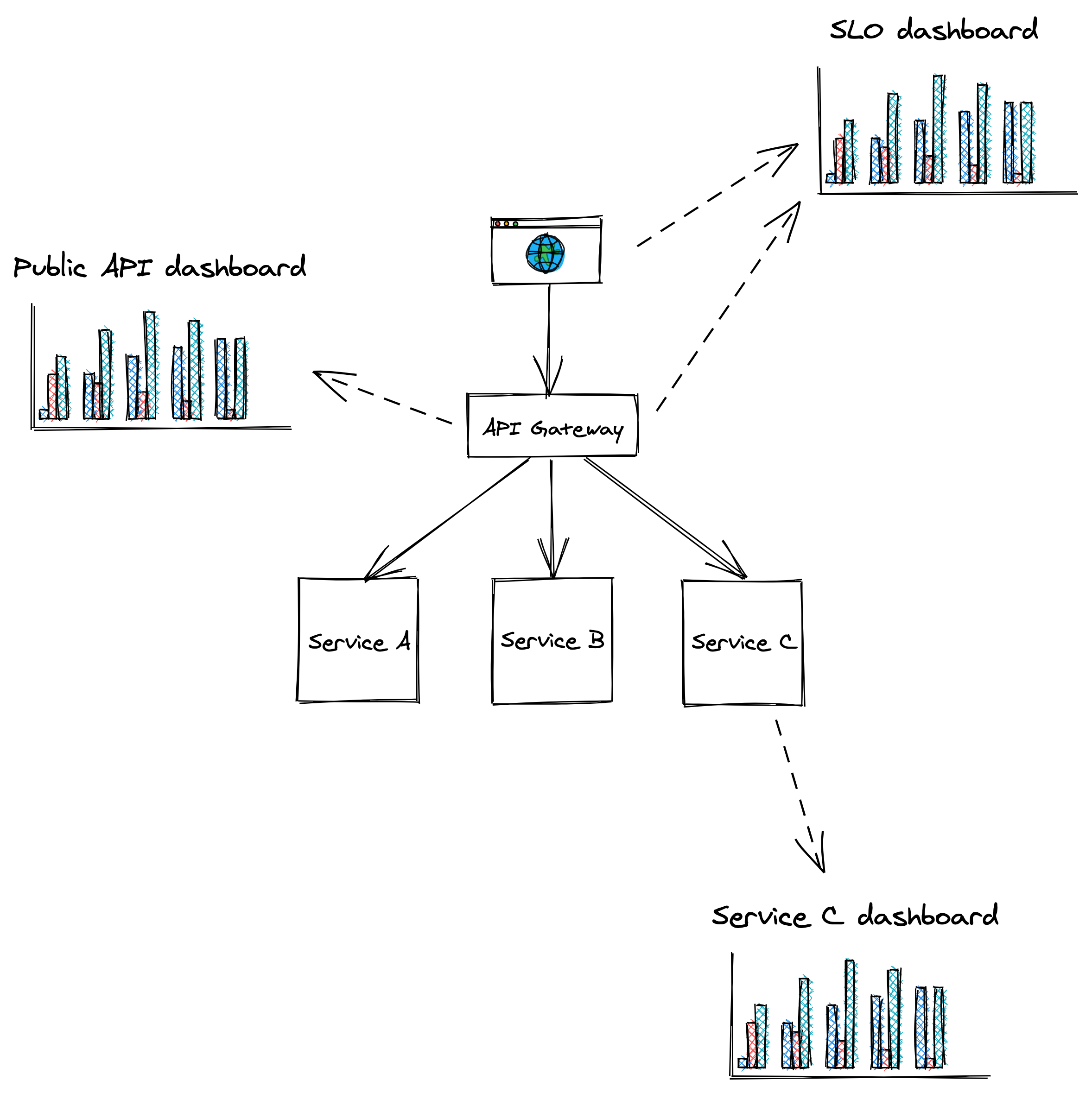
Figure 20.3: Dashboards should be tailored to their audience.
SLO dashboard
The SLO summary dashboard is designed to be used by various stakeholders from across the organization to gain visibility into the system’s health as represented by its SLOs. During an incident, this dashboard quantifies the impact it’s having on users.
Public API dashboard
This dashboard displays metrics about the system’s public API endpoints, which helps operators identifying problematic paths during an incident. For each endpoint, the dashboard exposes several metrics related to request messages, request handling and response messages, like:
- Number of requests received or messaged pulled from a messaging broker, size of requests, authentication issues, etc.
- Request handling duration, availability and response time of external dependencies, etc.
- Counts per response type, size of responses, etc.
Service dashboard
A service dashboard displays service-specific implementation details, which require a deep understanding of its inner workings. Unlike the previous dashboards, this one is primarily used by the team that owns the service.
Beyond service-specific metrics, a service dashboard should also contain metrics for upstream dependencies like load balancers and messaging queues, and downstream dependencies like data stores.
This dashboard offers a first entry point into the behavior of a service when debugging. As we will later learn when discussing observability, this high-level view is just the starting point. The operator typically drills down into the metrics by segmenting them further, and eventually reaches for raw logs and traces to get more detail.
20.5.1 Best practices
As new metrics are added and old ones removed, charts and dashboards need to be modified and be kept in-sync across multiple environments like staging and production. The most effective way to achieve that is by defining dashboards and charts with a domain-specific language and version-control them just like code. This allows updating dashboards from the same pull request that contains related code changes without needing to update dashboards manually, which is error-prone.
As dashboards render top to bottom, the most important charts should always be located at the very top.
Charts should be rendered with a default timezone, like UTC, to ease the communication between people located in different parts of the world when looking at the same data.
Similarly, all charts in the same dashboard should use the same time resolution (e.g., 1 min, 5 min, 1 hour, etc.) and range (24 hours, 7 days, etc.). This makes it easy to correlate anomalies across charts in the same dashboard visually. You should pick the default time range and resolution based on the most common use case for a dashboard. For example, a 1-hour range with a 1-min resolution is best to monitor an ongoing incident, while a 1-year range with a 1-day resolution is best for capacity planning.
You should keep the number of data points and metrics on the same chart to a minimum. Rendering too many points doesn’t just slow downloading charts, but also makes them hard to interpret and spot anomalies.
A chart should contain only metrics with similar ranges (min and max values); otherwise, the metric with the largest range can completely hide the others with smaller ranges. For that reason, it makes sense to split related statistics for the same metric into multiple charts. For example, the 10th percentile, average and 90th percentile of a metric can be displayed in one chart, while the 0.1th percentile, 99.9th percentile, minimum and maximum in another.
A chart should also contain useful annotations, like:
- a description of the chart with links to runbooks, related dashboards, and escalation contacts;
- a horizontal line for each configured alert threshold, if any;
- a vertical line for each relevant deployment.
Metrics that are only emitted when an error condition occurs can be hard to interpret as charts will show wide gaps between the data points, leaving the operator wondering whether the service stopped emitting that metric due to a bug. To avoid this, emit a metric using a value of zero in the absence of an error and a value of 1 in the presence of it.
20.6 On-call
A healthy on-call rotation is only possible when services are built from the ground up with reliability and operability in mind. By making the developers responsible for operating what they build, they are incentivized to reduce the operational toll to a minimum. They are also in the best position to be on-call since they are intimately familiar with the system’s architecture, brick walls, and trade-offs.
Being on-call can be very stressful. Even when there are no call-outs, just the thought of not having the same freedom usually enjoyed outside of regular working hours can cause anxiety. This is why being on-call should be compensated, and there shouldn’t be any expectations for the on-call engineer to make any progress on feature work. Since they will be interrupted by alerts, they should make the most out of it and be given free rein to improve the on-call experience, for example, by revising dashboards or improving resiliency mechanisms.
Achieving a healthy on-call is only possible when alerts are actionable. When an alert triggers, to the very least, it should link to relevant dashboards and a run-book that lists the actions the engineer should take, as it’s all too easy to miss a step when you get a call in the middle of the night4. Unless the alert was a false positive, all actions taken by the operator should be communicated into a shared channel like a global chat, that’s accessible by other teams. This allows others to chime in, track the incident’s progress, and make it easier to hand over an ongoing incident to someone else.
The first step to address an alert is to mitigate it, not fix the underlying root cause that created it. A new artifact has been rolled out that degrades the service? Roll it back. The service can’t cope with the load even though it hasn’t increased? Scale it out.
Once the incident has been mitigated, the next step is to brainstorm ways to prevent it from happening again. The more widespread the impact was, the more time you should spend on this. Incidents that burned a significant fraction of an SLO’s error budget require a postmortem.
A postmortem’s goal is to understand an incident’s root cause and come up with a set of repair items that will prevent it from happening again. There should also be an agreement in the team that if an SLO’s error budget is burned or the number of alerts spirals out of control, the whole team stops working on new features to focus exclusively on reliability until a healthy on-call rotation has been restored.
The SRE books provide a wealth of information and best practices regarding setting up a healthy on-call rotation.