17
Working with APIs

In this chapter, you’ll learn how to write a self-contained program that generates a visualization based on data it retrieves. Your program will use an application programming interface (API) to automatically request specific information from a website and then use that information to generate a visualization. Because programs written like this will always use current data to generate a visualization, even when that data might be rapidly changing, the visualization will always be up to date.
Using an API
An API is a part of a website designed to interact with programs. Those programs use very specific URLs to request certain information. This kind of request is called an API call. The requested data will be returned in an easily processed format, such as JSON or CSV. Most apps that use external data sources, such as apps that integrate with social media sites, rely on API calls.
Git and GitHub
We’ll base our visualization on information from GitHub (https://github.com), a site that allows programmers to collaborate on coding projects. We’ll use GitHub’s API to request information about Python projects on the site, and then generate an interactive visualization of the relative popularity of these projects using Plotly.
GitHub takes its name from Git, a distributed version control system. Git helps people manage their work on a project in a way that prevents changes made by one person from interfering with changes other people are making. When you implement a new feature in a project, Git tracks the changes you make to each file. When your new code works, you commit the changes you’ve made, and Git records the new state of your project. If you make a mistake and want to revert your changes, you can easily return to any previously working state. (To learn more about version control using Git, see Appendix D.) Projects on GitHub are stored in repositories, which contain everything associated with the project: its code, information on its collaborators, any issues or bug reports, and so on.
When users on GitHub like a project, they can “star” it to show their support and keep track of projects they might want to use. In this chapter, we’ll write a program to automatically download information about the most-starred Python projects on GitHub, and then we’ll create an informative visualization of these projects.
Requesting Data Using an API Call
GitHub’s API lets you request a wide range of information through API calls. To see what an API call looks like, enter the following into your browser’s address bar and press ENTER:
https://api.github.com/search/repositories?q=language:python+sort:starsThis call returns the number of Python projects currently hosted on GitHub, as well as information about the most popular Python repositories. Let’s examine the call. The first part, https://api.github.com/, directs the request to the part of GitHub that responds to API calls. The next part, search/repositories, tells the API to conduct a search through all the repositories on GitHub.
The question mark after repositories signals that we’re about to pass an argument. The q stands for query, and the equal sign (=) lets us begin specifying a query (q=). By using language:python, we indicate that we want information only on repositories that have Python as the primary language. The final part, +sort:stars, sorts the projects by the number of stars they’ve been given.
The following snippet shows the first few lines of the response:
{
❶   "total_count": 8961993,
❷   "incomplete_results": true,
❸   "items": [
    {
      "id": 54346799,
      "node_id": "MDEwOlJlcG9zaXRvcnk1NDM0Njc5OQ==",
      "name": "public-apis",
      "full_name": "public-apis/public-apis",
      --snip--
You can see from the response that this URL is not primarily intended to be entered by humans, because it’s in a format that’s meant to be processed by a program. GitHub found just under nine million Python projects as of this writing ❶. The value for "incomplete_results" is true, which tells us that GitHub didn’t fully process the query ❷. GitHub limits how long each query can run, in order to keep the API responsive for all users. In this case it found some of the most popular Python repositories, but it didn’t have time to find all of them; we’ll fix that in a moment. The "items" returned are displayed in the list that follows, which contains details about the most popular Python projects on GitHub ❸.
Installing Requests
The Requests package allows a Python program to easily request information from a website and examine the response. Use pip to install Requests:
$ python -m pip install --user requestsIf you use a command other than python to run programs or start a terminal session, such as python3, your command will look like this:
$ python3 -m pip install --user requestsProcessing an API Response
Now we’ll write a program to automatically issue an API call and process the results:
python_repos.py
import requests

# Make an API call and check the response.
❶ url = "https://api.github.com/search/repositories"
url += "?q=language:python+sort:stars+stars:>10000"

❷ headers = {"Accept": "application/vnd.github.v3+json"}
❸ r = requests.get(url, headers=headers)
❹ print(f"Status code: {r.status_code}")

# Convert the response object to a dictionary.
❺ response_dict = r.json()

# Process results.
print(response_dict.keys())
We first import the requests module. Then we assign the URL of the API call to the url variable ❶. This is a long URL, so we break it into two lines. The first line is the main part of the URL, and the second line is the query string. We’ve included one more condition to the original query string: stars:>10000, which tells GitHub to only look for Python repositories that have more than 10,000 stars. This should allow GitHub to return a complete, consistent set of results.
GitHub is currently on the third version of its API, so we define headers for the API call that ask explicitly to use this version of the API, and return the results in the JSON format ❷. Then we use requests to make the call to the API ❸. We call get() and pass it the URL and the header that we defined, and we assign the response object to the variable r.
The response object has an attribute called status_code, which tells us whether the request was successful. (A status code of 200 indicates a successful response.) We print the value of status_code so we can make sure the call went through successfully ❹. We asked the API to return the information in JSON format, so we use the json() method to convert the information to a Python dictionary ❺. We assign the resulting dictionary to response_dict.
Finally, we print the keys from response_dict and see the following output:
Status code: 200
dict_keys(['total_count', 'incomplete_results', 'items'])
Because the status code is 200, we know that the request was successful. The response dictionary contains only three keys: 'total_count', 'incomplete_results', and 'items'. Let’s take a look inside the response dictionary.
Working with the Response Dictionary
With the information from the API call represented as a dictionary, we can work with the data stored there. Let’s generate some output that summarizes the information. This is a good way to make sure we received the information we expected, and to start examining the information we’re interested in:
python_repos.py
import requests

# Make an API call and store the response.
--snip--

# Convert the response object to a dictionary.
response_dict = r.json()
❶ print(f"Total repositories: {response_dict['total_count']}")
print(f"Complete results: {not response_dict['incomplete_results']}")

# Explore information about the repositories.
❷ repo_dicts = response_dict['items']
print(f"Repositories returned: {len(repo_dicts)}")

# Examine the first repository.
❸ repo_dict = repo_dicts[0]
❹ print(f"\nKeys: {len(repo_dict)}")
❺ for key in sorted(repo_dict.keys()):
    print(key)
We start exploring the response dictionary by printing the value associated with 'total_count', which represents the total number of Python repositories returned by this API call ❶. We also use the value associated with 'incomplete_results', so we'll know if GitHub was able to fully process the query. Rather than printing this value directly, we print its opposite: a value of True will indicate that we received a complete set of results.
The value associated with 'items' is a list containing a number of dictionaries, each of which contains data about an individual Python repository. We assign this list of dictionaries to repo_dicts ❷. We then print the length of repo_dicts to see how many repositories we have information for.
To look closer at the information returned about each repository, we pull out the first item from repo_dicts and assign it to repo_dict ❸. We then print the number of keys in the dictionary to see how much information we have ❹. Finally, we print all the dictionary’s keys to see what kind of information is included ❺.
The results give us a clearer picture of the actual data:
Status code: 200
❶ Total repositories: 248
❷ Complete results: True
Repositories returned: 30

❸ Keys: 78
allow_forking
archive_url
archived
--snip--
url
visiblity
watchers
watchers_count
At the time of this writing, there are only 248 Python repositories with over 10,000 stars ❶. We can see that GitHub was able to fully process the API call ❷. In this response, GitHub returned information about the first 30 repositories that match the conditions of our query. If we want more repositories, we can request additional pages of data.
GitHub’s API returns a lot of information about each repository: there are 78 keys in repo_dict ❸. When you look through these keys, you’ll get a sense of the kind of information you can extract about a project. (The only way to know what information is available through an API is to read the documentation or to examine the information through code, as we’re doing here.)
Let’s pull out the values for some of the keys in repo_dict:
python_repos.py
--snip--
# Examine the first repository.
repo_dict = repo_dicts[0]

print("\nSelected information about first repository:")
❶ print(f"Name: {repo_dict['name']}")
❷ print(f"Owner: {repo_dict['owner']['login']}")
❸ print(f"Stars: {repo_dict['stargazers_count']}")
print(f"Repository: {repo_dict['html_url']}")
❹ print(f"Created: {repo_dict['created_at']}")
❺ print(f"Updated: {repo_dict['updated_at']}")
print(f"Description: {repo_dict['description']}")
Here, we print the values for a number of keys from the first repository’s dictionary. We start with the name of the project ❶. An entire dictionary represents the project’s owner, so we use the key owner to access the dictionary representing the owner, and then use the key login to get the owner’s login name ❷. Next, we print how many stars the project has earned ❸ and the URL for the project’s GitHub repository. We then show when it was created ❹ and when it was last updated ❺. Finally, we print the repository’s description.
The output should look something like this:
Status code: 200
Total repositories: 248
Complete results: True
Repositories returned: 30

Selected information about first repository:
Name: public-apis
Owner: public-apis
Stars: 191493
Repository: https://github.com/public-apis/public-apis
Created: 2016-03-20T23:49:42Z
Updated: 2022-05-12T06:37:11Z
Description: A collective list of free APIs
We can see that the most-starred Python project on GitHub as of this writing is public-apis. Its owner is an organization with the same name, and it has been starred by almost 200,000 GitHub users. We can see the URL for the project’s repository, its creation date of March 2016, and that it was updated recently. Additionally, the description tells us that public-apis contains a list of free APIs that programmers might be interested in.
Summarizing the Top Repositories
When we make a visualization for this data, we’ll want to include more than one repository. Let’s write a loop to print selected information about each repository the API call returns so we can include them all in the visualization:
python_repos.py
--snip--
# Explore information about the repositories.
repo_dicts = response_dict['items']
print(f"Repositories returned: {len(repo_dicts)}")

❶ print("\nSelected information about each repository:")
❷ for repo_dict in repo_dicts:
    print(f"\nName: {repo_dict['name']}")
    print(f"Owner: {repo_dict['owner']['login']}")
    print(f"Stars: {repo_dict['stargazers_count']}")
    print(f"Repository: {repo_dict['html_url']}")
    print(f"Description: {repo_dict['description']}")
We first print an introductory message ❶. Then we loop through all the dictionaries in repo_dicts ❷. Inside the loop, we print the name of each project, its owner, how many stars it has, its URL on GitHub, and the project’s description:
Status code: 200
Total repositories: 248
Complete results: True
Repositories returned: 30

Selected information about each repository:

Name: public-apis
Owner: public-apis
Stars: 191494
Repository: https://github.com/public-apis/public-apis
Description: A collective list of free APIs

Name: system-design-primer
Owner: donnemartin
Stars: 179952
Repository: https://github.com/donnemartin/system-design-primer
Description: Learn how to design large-scale systems. Prep for the system
  design interview.  Includes Anki flashcards.
--snip--

Name: PayloadsAllTheThings
Owner: swisskyrepo
Stars: 37227
Repository: https://github.com/swisskyrepo/PayloadsAllTheThings
Description: A list of useful payloads and bypass for Web Application Security
  and Pentest/CTF
Some interesting projects appear in these results, and it might be worth looking at a few. But don’t spend too much time here, because we’re about to create a visualization that will make the results much easier to read.
Monitoring API Rate Limits
Most APIs have rate limits, which means there’s a limit to how many requests you can make in a certain amount of time. To see if you’re approaching GitHub’s limits, enter https://api.github.com/rate_limit into a web browser. You should see a response that begins like this:
{
  "resources": {
    --snip--
❶     "search": {
❷       "limit": 10,
❸       "remaining": 9,
❹       "reset": 1652338832,
      "used": 1,
      "resource": "search"
    },
    --snip--
The information we’re interested in is the rate limit for the search API ❶. We see that the limit is 10 requests per minute ❷ and that we have 9 requests remaining for the current minute ❸. The value associated with the key "reset" represents the time in Unix or epoch time (the number of seconds since midnight on January 1, 1970) when our quota will reset ❹. If you reach your quota, you’ll get a short response that lets you know you’ve reached the API limit. If you reach the limit, just wait until your quota resets.
Visualizing Repositories Using Plotly
Let’s make a visualization using the data we’ve gathered to show the relative popularity of Python projects on GitHub. We’ll make an interactive bar chart: the height of each bar will represent the number of stars the project has acquired, and you’ll be able to click the bar’s label to go to that project’s home on GitHub.
Save a copy of the program we’ve been working on as python_repos_visual.py, then modify it so it reads as follows:
python_repos_visual.py
import requests
import plotly.express as px

# Make an API call and check the response.
url = "https://api.github.com/search/repositories"
url += "?q=language:python+sort:stars+stars:>10000"

headers = {"Accept": "application/vnd.github.v3+json"}
r = requests.get(url, headers=headers)
❶ print(f"Status code: {r.status_code}")

# Process overall results.
response_dict = r.json()
❷ print(f"Complete results: {not response_dict['incomplete_results']}")

# Process repository information.
repo_dicts = response_dict['items']
❸ repo_names, stars = [], []
for repo_dict in repo_dicts:
    repo_names.append(repo_dict['name'])
    stars.append(repo_dict['stargazers_count'])

# Make visualization.
❹ fig = px.bar(x=repo_names, y=stars)
fig.show()
We import Plotly Express and then make the API call as we have been doing. We continue to print the status of the API call response so we’ll know if there is a problem ❶. When we process the overall results, we continue to print the message confirming that we got a complete set of results ❷. We remove the rest of the print() calls because we’re no longer in the exploratory phase; we know we have the data we want.
We then create two empty lists ❸ to store the data we’ll include in the initial chart. We’ll need the name of each project to label the bars (repo_names) and the number of stars to determine the height of the bars (stars). In the loop, we append the name of each project and the number of stars it has to these lists.
We make the initial visualization with just two lines of code ❹. This is consistent with Plotly Express’s philosophy that you should be able to see your visualization as quickly as possible before refining its appearance. Here we use the px.bar() function to create a bar chart. We pass the list repo_names as the x argument and stars as the y argument.
Figure 17-1 shows the resulting chart. We can see that the first few projects are significantly more popular than the rest, but all of them are important projects in the Python ecosystem.
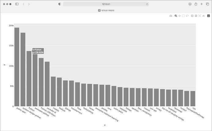
Figure 17-1: The most-starred Python projects on GitHub
Styling the Chart
Plotly supports a number of ways to style and customize the plots, once you know the information in the plot is correct. We’ll make some changes in the initial px.bar() call and then make some further adjustments to the fig object after it’s been created.
We’ll start styling the chart by adding a title and labels for each axis:
python_repos_visual.py
--snip--
# Make visualization.
title = "Most-Starred Python Projects on GitHub"
labels = {'x': 'Repository', 'y': 'Stars'}
fig = px.bar(x=repo_names, y=stars, title=title, labels=labels)

❶ fig.update_layout(title_font_size=28, xaxis_title_font_size=20,
        yaxis_title_font_size=20)

fig.show()
We first add a title and labels for each axis, as we did in Chapters 15 and 16. We then use the fig.update_layout() method to modify specific elements of the chart ❶. Plotly uses a convention where aspects of a chart element are connected by underscores. As you become familiar with Plotly’s documentation, you’ll start to see consistent patterns in how different elements of a chart are named and modified. Here we set the title font size to 28 and the font size for each axis title to 20. The result is shown in Figure 17-2.
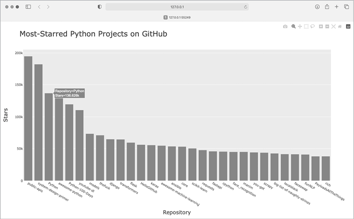
Figure 17-2: A title has been added to the main chart, and to each axis as well.
Adding Custom Tooltips
In Plotly, you can hover the cursor over an individual bar to show the information the bar represents. This is commonly called a tooltip, and in this case, it currently shows the number of stars a project has. Let’s create a custom tooltip to show each project’s description as well as the project’s owner.
We need to pull some additional data to generate the tooltips:
python_repos_visual.py
--snip--
# Process repository information.
repo_dicts = response_dict['items']
❶ repo_names, stars, hover_texts = [], [], []
for repo_dict in repo_dicts:
    repo_names.append(repo_dict['name'])
    stars.append(repo_dict['stargazers_count'])

    # Build hover texts.
❷     owner = repo_dict['owner']['login']
    description = repo_dict['description']
❸     hover_text = f"{owner}<br />{description}"
    hover_texts.append(hover_text)

# Make visualization.
title = "Most-Starred Python Projects on GitHub"
labels = {'x': 'Repository', 'y': 'Stars'}
❹ fig = px.bar(x=repo_names, y=stars, title=title, labels=labels,
        hover_name=hover_texts)

fig.update_layout(title_font_size=28, xaxis_title_font_size=20,
        yaxis_title_font_size=20)

fig.show()
We first define a new empty list, hover_texts, to hold the text we want to display for each project ❶. In the loop where we process the data, we pull the owner and the description for each project ❷. Plotly allows you to use HTML code within text elements, so we generate a string for the label with a line break (<br />) between the project owner’s username and the description ❸. We then append this label to the list hover_texts.
In the px.bar() call, we add the hover_name argument and pass it hover_texts ❹. This is the same approach we used to customize the label for each dot in the map of global earthquake activity. As Plotly creates each bar, it will pull labels from this list and only display them when the viewer hovers over a bar. Figure 17-3 shows one of these custom tooltips.
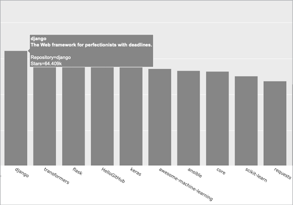
Figure 17-3: Hovering over a bar shows the project’s owner and description.
Adding Clickable Links
Because Plotly allows you to use HTML on text elements, we can easily add links to a chart. Let’s use the x-axis labels as a way to let the viewer visit any project’s home page on GitHub. We need to pull the URLs from the data and use them when generating the x-axis labels:
python_repos_visual.py
--snip--
# Process repository information.
repo_dicts = response_dict['items']
❶ repo_links, stars, hover_texts = [], [], []
for repo_dict in repo_dicts:
    # Turn repo names into active links.
    repo_name = repo_dict['name']
❷     repo_url = repo_dict['html_url']
❸     repo_link = f"<a href='{repo_url}'>{repo_name}</a>"
    repo_links.append(repo_link)

    stars.append(repo_dict['stargazers_count'])
    --snip--

# Make visualization.
title = "Most-Starred Python Projects on GitHub"
labels = {'x': 'Repository', 'y': 'Stars'}
fig = px.bar(x=repo_links, y=stars, title=title, labels=labels,
        hover_name=hover_texts)

fig.update_layout(title_font_size=28, xaxis_title_font_size=20,
        yaxis_title_font_size=20)

fig.show()
We update the name of the list we’re creating from repo_names to repo_links to more accurately communicate the kind of information we’re putting together for the chart ❶. We then pull the URL for the project from repo_dict and assign it to the temporary variable repo_url ❷. Next, we generate a link to the project ❸. We use the HTML anchor tag, which has the form <a href='URL'>link text</a>, to generate the link. We then append this link to repo_links.
When we call px.bar(), we use repo_links for the x-values in the chart. The result looks the same as before, but now the viewer can click any of the project names at the bottom of the chart to visit that project’s home page on GitHub. Now we have an interactive, informative visualization of data retrieved through an API!
Customizing Marker Colors
Once a chart has been created, almost any aspect of the chart can be customized through an update method. We’ve used the update_layout() method previously. Another method, update_traces(), can be used to customize the data that’s represented on a chart.
Let’s change the bars to a darker blue, with some transparency:
--snip--
fig.update_layout(title_font_size=28, xaxis_title_font_size=20,
        yaxis_title_font_size=20)

fig.update_traces(marker_color='SteelBlue', marker_opacity=0.6)

fig.show()
In Plotly, a trace refers to a collection of data on a chart. The update_traces() method can take a number of different arguments; any argument that starts with marker_ affects the markers on the chart. Here we set each marker’s color to 'SteelBlue'; any named CSS color will work here. We also set the opacity of each marker to 0.6. An opacity of 1.0 will be entirely opaque, and an opacity of 0 will be entirely invisible.
More About Plotly and the GitHub API
Plotly’s documentation is extensive and well organized; however, it can be hard to know where to start reading. A good place to start is with the article “Plotly Express in Python,” at https://plotly.com/python/plotly-express. This is an overview of all the plots you can make with Plotly Express, and you can find links to longer articles about each individual chart type.
If you want to understand how to customize Plotly charts better, the article “Styling Plotly Express Figures in Python” will expand on what you’ve seen in Chapters 15–17. You can find this article at https://plotly.com/python/styling-plotly-express.
For more about the GitHub API, refer to its documentation at https://docs.github.com/en/rest. Here you’ll learn how to pull a wide variety of information from GitHub. To expand on what you saw in this project, look for the Search section of the reference in the sidebar. If you have a GitHub account, you can work with your own data as well as the publicly available data from other users’ repositories.
The Hacker News API
To explore how to use API calls on other sites, let’s take a quick look at Hacker News (https://news.ycombinator.com). On Hacker News, people share articles about programming and technology and engage in lively discussions about those articles. The Hacker News API provides access to data about all submissions and comments on the site, and you can use the API without having to register for a key.
The following call returns information about the current top article as of this writing:
https://hacker-news.firebaseio.com/v0/item/31353677.jsonWhen you enter this URL in a browser, you’ll see that the text on the page is enclosed by braces, meaning it’s a dictionary. But the response is difficult to examine without some better formatting. Let’s run this URL through the json.dumps() method, like we did in the earthquake project in Chapter 16, so we can explore the kind of information that’s returned about an article:
hn_article.py
import requests
import json

# Make an API call, and store the response.
url = "https://hacker-news.firebaseio.com/v0/item/31353677.json"
r = requests.get(url)
print(f"Status code: {r.status_code}")

# Explore the structure of the data.
response_dict = r.json()
response_string = json.dumps(response_dict, indent=4)
❶ print(response_string)
Everything in this program should look familiar, because we’ve used it all in the previous two chapters. The main difference here is that we can print the formatted response string ❶ instead of writing it to a file, because the output is not particularly long.
The output is a dictionary of information about the article with the ID 31353677:
{
    "by": "sohkamyung",
❶     "descendants": 302,
    "id": 31353677,
❷     "kids": [
        31354987,
        31354235,
        --snip--
    ],
    "score": 785,
    "time": 1652361401,
❸     "title": "Astronomers reveal first image of the black hole
        at the heart of our galaxy",
    "type": "story",
❹     "url": "https://public.nrao.edu/news/.../"
}
The dictionary contains a number of keys we can work with. The key "descendants" tells us the number of comments the article has received ❶. The key "kids" provides the IDs of all comments made directly in response to this submission ❷. Each of these comments might have comments of their own as well, so the number of descendants a submission has is usually greater than its number of kids. We can see the title of the article being discussed ❸ and a URL for the article being discussed as well ❹.
The following URL returns a simple list of all the IDs of the current top articles on Hacker News:
https://hacker-news.firebaseio.com/v0/topstories.jsonWe can use this call to find out which articles are on the home page right now, and then generate a series of API calls similar to the one we just examined. With this approach, we can print a summary of all the articles on the front page of Hacker News at the moment:
hn_submissions.py
from operator import itemgetter

import requests

# Make an API call and check the response.
❶ url = "https://hacker-news.firebaseio.com/v0/topstories.json"
r = requests.get(url)
print(f"Status code: {r.status_code}")

# Process information about each submission.
❷ submission_ids = r.json()
❸ submission_dicts = []
for submission_id in submission_ids[:5]:
    # Make a new API call for each submission.
❹     url = f"https://hacker-news.firebaseio.com/v0/item/{submission_id}.json"
    r = requests.get(url)
    print(f"id: {submission_id}\tstatus: {r.status_code}")
    response_dict = r.json()

    # Build a dictionary for each article.
❺     submission_dict = {
        'title': response_dict['title'],
        'hn_link': f"https://news.ycombinator.com/item?id={submission_id}",
        'comments': response_dict['descendants'],
    }
❻     submission_dicts.append(submission_dict)

❼ submission_dicts = sorted(submission_dicts, key=itemgetter('comments'),
                            reverse=True)

❽ for submission_dict in submission_dicts:
    print(f"\nTitle: {submission_dict['title']}")
    print(f"Discussion link: {submission_dict['hn_link']}")
    print(f"Comments: {submission_dict['comments']}")
First, we make an API call and print the status of the response ❶. This API call returns a list containing the IDs of up to 500 of the most popular articles on Hacker News at the time the call is issued. We then convert the response object to a Python list ❷, which we assign to submission_ids. We’ll use these IDs to build a set of dictionaries, each of which contains information about one of the current submissions.
We set up an empty list called submission_dicts to store these dictionaries ❸. We then loop through the IDs of the top 30 submissions. We make a new API call for each submission by generating a URL that includes the current value of submission_id ❹. We print the status of each request along with its ID, so we can see whether it’s successful.
Next, we create a dictionary for the submission currently being processed ❺. We store the title of the submission, a link to the discussion page for that item, and the number of comments the article has received so far. Then we append each submission_dict to the list submission_dicts ❻.
Each submission on Hacker News is ranked according to an overall score based on a number of factors, including how many times it’s been voted on, how many comments it’s received, and how recent the submission is. We want to sort the list of dictionaries by the number of comments. To do this, we use a function called itemgetter() ❼, which comes from the operator module. We pass this function the key 'comments', and it pulls the value associated with that key from each dictionary in the list. The sorted() function then uses this value as its basis for sorting the list. We sort the list in reverse order, to place the most-commented stories first.
Once the list is sorted, we loop through the list ❽ and print out three pieces of information about each of the top submissions: the title, a link to the discussion page, and the number of comments the submission currently has:
Status code: 200
id: 31390506    status: 200
id: 31389893    status: 200
id: 31390742    status: 200
--snip--

Title: Fly.io: The reclaimer of Heroku's magic
Discussion link: https://news.ycombinator.com/item?id=31390506
Comments: 134

Title: The weird Hewlett Packard FreeDOS option
Discussion link: https://news.ycombinator.com/item?id=31389893
Comments: 64

Title: Modern JavaScript Tutorial
Discussion link: https://news.ycombinator.com/item?id=31390742
Comments: 20
--snip--
You would use a similar process to access and analyze information with any API. With this data, you could make a visualization showing which submissions have inspired the most active recent discussions. This is also the basis for apps that provide a customized reading experience for sites like Hacker News. To learn more about what kind of information you can access through the Hacker News API, visit the documentation page at https://github.com/HackerNews/API.
Summary
In this chapter, you learned how to use APIs to write self-contained programs that automatically gather the data they need and use that data to create a visualization. You used the GitHub API to explore the most-starred Python projects on GitHub, and you also looked briefly at the Hacker News API. You learned how to use the Requests package to automatically issue an API call and how to process the results of that call. We also introduced some Plotly settings that further customize the appearance of the charts you generate.
In the next chapter, you’ll use Django to build a web application as your final project.