16
Downloading Data

In this chapter, you’ll download datasets from online sources and create working visualizations of that data. You can find an incredible variety of data online, much of which hasn’t been examined thoroughly. The ability to analyze this data allows you to discover patterns and connections that no one else has found.
We’ll access and visualize data stored in two common data formats: CSV and JSON. We’ll use Python’s csv module to process weather data stored in the CSV format and analyze high and low temperatures over time in two different locations. We’ll then use Matplotlib to generate a chart based on our downloaded data to display variations in temperature in two dissimilar environments: Sitka, Alaska, and Death Valley, California. Later in the chapter, we’ll use the json module to access earthquake data stored in the GeoJSON format and use Plotly to draw a world map showing the locations and magnitudes of recent earthquakes.
By the end of this chapter, you’ll be prepared to work with various types of datasets in different formats, and you’ll have a deeper understanding of how to build complex visualizations. Being able to access and visualize online data is essential to working with a wide variety of real-world datasets.
The CSV File Format
One simple way to store data in a text file is to write the data as a series of values separated by commas, called comma-separated values. The resulting files are CSV files. For example, here’s a chunk of weather data in CSV format:
"USW00025333","SITKA AIRPORT, AK US","2021-01-01",,"44","40"This is an excerpt of weather data from January 1, 2021, in Sitka, Alaska. It includes the day’s high and low temperatures, as well as a number of other measurements from that day. CSV files can be tedious for humans to read, but programs can process and extract information from them quickly and accurately.
We’ll begin with a small set of CSV-formatted weather data recorded in Sitka; it is available in this book’s resources at https://ehmatthes.github.io/pcc_3e. Make a folder called weather_data inside the folder where you’re saving this chapter’s programs. Copy the file sitka_weather_07-2021_simple.csv into this new folder. (After you download this book’s resources, you’ll have all the files you need for this project.)
Parsing the CSV File Headers
Python’s csv module in the standard library parses the lines in a CSV file and allows us to quickly extract the values we’re interested in. Let’s start by examining the first line of the file, which contains a series of headers for the data. These headers tell us what kind of information the data holds:
sitka_highs.py
from pathlib import Path
import csv

❶ path = Path('weather_data/sitka_weather_07-2021_simple.csv')
lines = path.read_text().splitlines()

❷ reader = csv.reader(lines)
❸ header_row = next(reader)
print(header_row)
We first import Path and the csv module. We then build a Path object that looks in the weather_data folder, and points to the specific weather data file we want to work with ❶. We read the file and chain the splitlines() method to get a list of all lines in the file, which we assign to lines.
Next, we build a reader object ❷. This is an object that can be used to parse each line in the file. To make a reader object, call the function csv.reader() and pass it the list of lines from the CSV file.
When given a reader object, the next() function returns the next line in the file, starting from the beginning of the file. Here we call next() only once, so we get the first line of the file, which contains the file headers ❸. We assign the data that’s returned to header_row. As you can see, header_row contains meaningful, weather-related headers that tell us what information each line of data holds:
['STATION', 'NAME', 'DATE', 'TAVG', 'TMAX', 'TMIN']The reader object processes the first line of comma-separated values in the file and stores each value as an item in a list. The header STATION represents the code for the weather station that recorded this data. The position of this header tells us that the first value in each line will be the weather station code. The NAME header indicates that the second value in each line is the name of the weather station that made the recording. The rest of the headers specify what kinds of information were recorded in each reading. The data we’re most interested in for now are the date (DATE), the high temperature (TMAX), and the low temperature (TMIN). This is a simple dataset that contains only temperature-related data. When you download your own weather data, you can choose to include a number of other measurements relating to wind speed, wind direction, and precipitation data.
Printing the Headers and Their Positions
To make it easier to understand the file header data, let’s print each header and its position in the list:
sitka_highs.py
--snip--
reader = csv.reader(lines)
header_row = next(reader)

for index, column_header in enumerate(header_row):
    print(index, column_header)
The enumerate() function returns both the index of each item and the value of each item as you loop through a list. (Note that we’ve removed the line print(header_row) in favor of this more detailed version.)
Here’s the output showing the index of each header:
0 STATION
1 NAME
2 DATE
3 TAVG
4 TMAX
5 TMIN
We can see that the dates and their high temperatures are stored in columns 2 and 4. To explore this data, we’ll process each row of data in sitka_weather_07-2021_simple.csv and extract the values with the indexes 2 and 4.
Extracting and Reading Data
Now that we know which columns of data we need, let’s read in some of that data. First, we’ll read in the high temperature for each day:
sitka_highs.py
--snip--
reader = csv.reader(lines)
header_row = next(reader)

# Extract high temperatures.
❶ highs = []
❷ for row in reader:
❸     high = int(row[4])
    highs.append(high)

print(highs)
We make an empty list called highs ❶ and then loop through the remaining rows in the file ❷. The reader object continues from where it left off in the CSV file and automatically returns each line following its current position. Because we’ve already read the header row, the loop will begin at the second line where the actual data begins. On each pass through the loop we pull the data from index 4, corresponding to the header TMAX, and assign it to the variable high ❸. We use the int() function to convert the data, which is stored as a string, to a numerical format so we can use it. We then append this value to highs.
The following listing shows the data now stored in highs:
[61, 60, 66, 60, 65, 59, 58, 58, 57, 60, 60, 60, 57, 58, 60, 61, 63, 63, 70, 64, 59, 63, 61, 58, 59, 64, 62, 70, 70, 73, 66]We’ve extracted the high temperature for each date and stored each value in a list. Now let’s create a visualization of this data.
Plotting Data in a Temperature Chart
To visualize the temperature data we have, we’ll first create a simple plot of the daily highs using Matplotlib, as shown here:
sitka_highs.py
from pathlib import Path
import csv

import matplotlib.pyplot as plt

path = Path('weather_data/sitka_weather_07-2021_simple.csv')
lines = path.read_text().splitlines()
    --snip--

# Plot the high temperatures.
plt.style.use('seaborn')
fig, ax = plt.subplots()
❶ ax.plot(highs, color='red')

# Format plot.
❷ ax.set_title("Daily High Temperatures, July 2021", fontsize=24)
❸ ax.set_xlabel('', fontsize=16)
ax.set_ylabel("Temperature (F)", fontsize=16)
ax.tick_params(labelsize=16)

plt.show()
We pass the list of highs to plot() and pass color='red' to plot the points in red ❶. (We’ll plot the highs in red and the lows in blue.) We then specify a few other formatting details, such as the title, font size, and labels ❷, just as we did in Chapter 15. Because we have yet to add the dates, we won’t label the x-axis, but ax.set_xlabel() does modify the font size to make the default labels more readable ❸. Figure 16-1 shows the resulting plot: a simple line graph of the high temperatures for July 2021 in Sitka, Alaska.
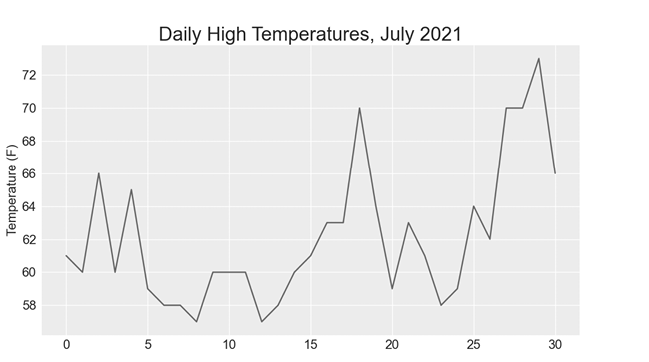
Figure 16-1: A line graph showing daily high temperatures for July 2021 in Sitka, Alaska
The datetime Module
Let’s add dates to our graph to make it more useful. The first date from the weather data file is in the second row of the file:
"USW00025333","SITKA AIRPORT, AK US","2021-07-01",,"61","53"The data will be read in as a string, so we need a way to convert the string "2021-07-01" to an object representing this date. We can construct an object representing July 1, 2021, using the strptime() method from the datetime module. Let’s see how strptime() works in a terminal session:
>>> from datetime import datetime
>>> first_date = datetime.strptime('2021-07-01', '%Y-%m-%d')
>>> print(first_date)
2021-07-01 00:00:00
We first import the datetime class from the datetime module. Then we call the method strptime() with the string containing the date we want to process as its first argument. The second argument tells Python how the date is formatted. In this example, '%Y-' tells Python to look for a four-digit year before the first dash; '%m-' indicates a two-digit month before the second dash; and '%d' means the last part of the string is the day of the month, from 1 to 31.
The strptime() method can take a variety of arguments to determine how to interpret the date. Table 16-1 shows some of these arguments.
Table 16-1: Date and Time Formatting Arguments from the datetime Module
| Argument | Meaning |
%A |
Weekday name, such as Monday |
%B |
Month name, such as January |
%m |
Month, as a number (01 to 12) |
%d |
Day of the month, as a number (01 to 31) |
%Y |
Four-digit year, such as 2019 |
%y |
Two-digit year, such as 19 |
%H |
Hour, in 24-hour format (00 to 23) |
%I |
Hour, in 12-hour format (01 to 12) |
%p |
AM or PM |
%M |
Minutes (00 to 59) |
%S |
Seconds (00 to 61) |
Plotting Dates
We can improve our plot by extracting dates for the daily high temperature readings, and using these dates on the x-axis:
sitka_highs.py
from pathlib import Path
import csv
from datetime import datetime

import matplotlib.pyplot as plt

path = Path('weather_data/sitka_weather_07-2021_simple.csv')
lines = path.read_text().splitlines()

reader = csv.reader(lines)
header_row = next(reader)

# Extract dates and high temperatures.
❶ dates, highs = [], []
for row in reader:
❷     current_date = datetime.strptime(row[2], '%Y-%m-%d')
    high = int(row[4])
    dates.append(current_date)
    highs.append(high)

# Plot the high temperatures.
plt.style.use('seaborn')
fig, ax = plt.subplots()
❸ ax.plot(dates, highs, color='red')

# Format plot.
ax.set_title("Daily High Temperatures, July 2021", fontsize=24)
ax.set_xlabel('', fontsize=16)
❹ fig.autofmt_xdate()
ax.set_ylabel("Temperature (F)", fontsize=16)
ax.tick_params(labelsize=16)

plt.show()
We create two empty lists to store the dates and high temperatures from the file ❶. We then convert the data containing the date information (row[2]) to a datetime object ❷ and append it to dates. We pass the dates and the high temperature values to plot() ❸. The call to fig.autofmt_xdate() ❹ draws the date labels diagonally to prevent them from overlapping. Figure 16-2 shows the improved graph.
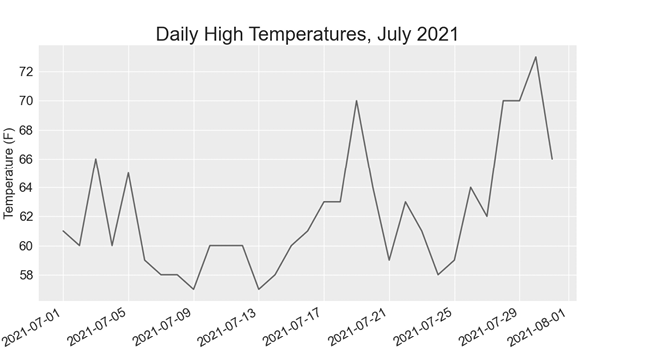
Figure 16-2: The graph is more meaningful, now that it has dates on the x-axis.
Plotting a Longer Timeframe
With our graph set up, let’s include additional data to get a more complete picture of the weather in Sitka. Copy the file sitka_weather_2021_simple.csv, which contains a full year’s worth of weather data for Sitka, to the folder where you’re storing the data for this chapter’s programs.
Now we can generate a graph for the entire year’s weather:
sitka_highs.py
--snip--
path = Path('weather_data/sitka_weather_2021_simple.csv')
lines = path.read_text().splitlines()
--snip--
# Format plot.
ax.set_title("Daily High Temperatures, 2021", fontsize=24)
ax.set_xlabel('', fontsize=16)
--snip--
We modify the filename to use the new data file sitka_weather_2021_simple.csv, and we update the title of our plot to reflect the change in its content. Figure 16-3 shows the resulting plot.
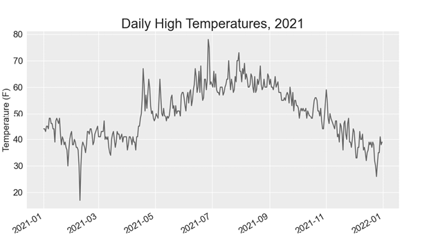
Figure 16-3: A year’s worth of data
Plotting a Second Data Series
We can make our graph even more useful by including the low temperatures. We need to extract the low temperatures from the data file and then add them to our graph, as shown here:
sitka_highs_lows.py
--snip--
reader = csv.reader(lines)
header_row = next(reader)

# Extract dates, and high and low temperatures.
❶ dates, highs, lows = [], [], []
for row in reader:
    current_date = datetime.strptime(row[2], '%Y-%m-%d')
    high = int(row[4])
❷     low = int(row[5])
    dates.append(current_date)
    highs.append(high)
    lows.append(low)

# Plot the high and low temperatures.
plt.style.use('seaborn')
fig, ax = plt.subplots()
ax.plot(dates, highs, color='red')
❸ ax.plot(dates, lows, color='blue')

# Format plot.
❹ ax.set_title("Daily High and Low Temperatures, 2021", fontsize=24)
--snip--
We add the empty list lows to hold low temperatures ❶, and then we extract and store the low temperature for each date from the sixth position in each row (row[5]) ❷. We add a call to plot() for the low temperatures and color these values blue ❸. Finally, we update the title ❹. Figure 16-4 shows the resulting chart.
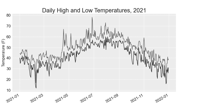
Figure 16-4: Two data series on the same plot
Shading an Area in the Chart
Having added two data series, we can now examine the range of temperatures for each day. Let’s add a finishing touch to the graph by using shading to show the range between each day’s high and low temperatures. To do so, we’ll use the fill_between() method, which takes a series of x-values and two series of y-values and fills the space between the two series of y-values:
sitka_highs_lows.py
--snip--
# Plot the high and low temperatures.
plt.style.use('seaborn')
fig, ax = plt.subplots()
❶ ax.plot(dates, highs, color='red', alpha=0.5)
ax.plot(dates, lows, color='blue', alpha=0.5)
❷ ax.fill_between(dates, highs, lows, facecolor='blue', alpha=0.1)
--snip--
The alpha argument controls a color’s transparency ❶. An alpha value of 0 is completely transparent, and a value of 1 (the default) is completely opaque. By setting alpha to 0.5, we make the red and blue plot lines appear lighter.
We pass fill_between() the list dates for the x-values and then the two y-value series highs and lows ❷. The facecolor argument determines the color of the shaded region; we give it a low alpha value of 0.1 so the filled region connects the two data series without distracting from the information they represent. Figure 16-5 shows the plot with the shaded region between the highs and lows.

Figure 16-5: The region between the two datasets is shaded.
The shading helps make the range between the two datasets immediately apparent.
Error Checking
We should be able to run the sitka_highs_lows.py code using data for any location. But some weather stations collect different data than others, and some occasionally malfunction and fail to collect some of the data they’re supposed to. Missing data can result in exceptions that crash our programs, unless we handle them properly.
For example, let’s see what happens when we attempt to generate a temperature plot for Death Valley, California. Copy the file death_valley_2021_simple.csv to the folder where you’re storing the data for this chapter’s programs.
First, let’s run the code to see the headers that are included in this data file:
death_valley_highs_lows.py
from pathlib import Path
import csv

path = Path('weather_data/death_valley_2021_simple.csv')
lines = path.read_text().splitlines()

reader = csv.reader(lines)
header_row = next(reader)

for index, column_header in enumerate(header_row):
    print(index, column_header)
Here’s the output:
0 STATION
1 NAME
2 DATE
3 TMAX
4 TMIN
5 TOBS
The date is in the same position, at index 2. But the high and low temperatures are at indexes 3 and 4, so we’ll need to change the indexes in our code to reflect these new positions. Instead of including an average temperature reading for the day, this station includes TOBS, a reading for a specific observation time.
Change sitka_highs_lows.py to generate a graph for Death Valley using the indexes we just noted, and see what happens:
death_valley_highs_lows.py
--snip--
path = Path('weather_data/death_valley_2021_simple.csv')
lines = path.read_text().splitlines()
    --snip--
# Extract dates, and high and low temperatures.
dates, highs, lows = [], [], []
for row in reader:
    current_date = datetime.strptime(row[2], '%Y-%m-%d')
    high = int(row[3])
    low = int(row[4])
    dates.append(current_date)
--snip--
We update the program to read from the Death Valley data file, and we change the indexes to correspond to this file’s TMAX and TMIN positions.
When we run the program, we get an error:
Traceback (most recent call last):
  File "death_valley_highs_lows.py", line 17, in <module>
    high = int(row[3])
❶ ValueError: invalid literal for int() with base 10: ''
The traceback tells us that Python can’t process the high temperature for one of the dates because it can’t turn an empty string ('') into an integer ❶. Rather than looking through the data to find out which reading is missing, we’ll just handle cases of missing data directly.
We’ll run error-checking code when the values are being read from the CSV file to handle exceptions that might arise. Here’s how to do this:
death_valley_highs_lows.py
--snip--
for row in reader:
    current_date = datetime.strptime(row[2], '%Y-%m-%d')
❶     try:
        high = int(row[3])
        low = int(row[4])
    except ValueError:
❷         print(f"Missing data for {current_date}")
❸     else:
        dates.append(current_date)
        highs.append(high)
        lows.append(low)

# Plot the high and low temperatures.
--snip--

# Format plot.
❹ title = "Daily High and Low Temperatures, 2021\nDeath Valley, CA"
ax.set_title(title, fontsize=20)
ax.set_xlabel('', fontsize=16)
--snip--
Each time we examine a row, we try to extract the date and the high and low temperature ❶. If any data is missing, Python will raise a ValueError and we handle it by printing an error message that includes the date of the missing data ❷. After printing the error, the loop will continue processing the next row. If all data for a date is retrieved without error, the else block will run and the data will be appended to the appropriate lists ❸. Because we’re plotting information for a new location, we update the title to include the location on the plot, and we use a smaller font size to accommodate the longer title ❹.
When you run death_valley_highs_lows.py now, you’ll see that only one date had missing data:
Missing data for 2021-05-04 00:00:00Because the error is handled appropriately, our code is able to generate a plot, which skips over the missing data. Figure 16-6 shows the resulting plot.
Comparing this graph to the Sitka graph, we can see that Death Valley is warmer overall than southeast Alaska, as we expect. Also, the range of temperatures each day is greater in the desert. The height of the shaded region makes this clear.
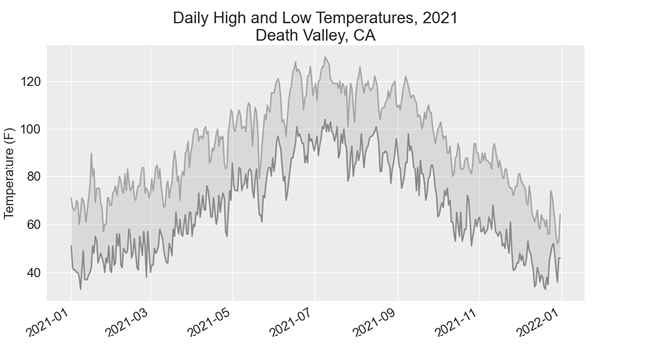
Figure 16-6: Daily high and low temperatures for Death Valley
Many datasets you work with will have missing, improperly formatted, or incorrect data. You can use the tools you learned in the first half of this book to handle these situations. Here we used a try-except-else block to handle missing data. Sometimes you’ll use continue to skip over some data, or use remove() or del to eliminate some data after it’s been extracted. Use any approach that works, as long as the result is a meaningful, accurate visualization.
Downloading Your Own Data
To download your own weather data, follow these steps:
- Visit the NOAA Climate Data Online site at https://www.ncdc.noaa.gov/cdo-web. In the Discover Data By section, click Search Tool. In the Select a Dataset box, choose Daily Summaries.
- Select a date range, and in the Search For section, choose ZIP Codes. Enter the ZIP code you’re interested in and click Search.
- On the next page, you’ll see a map and some information about the area you’re focusing on. Below the location name, click View Full Details, or click the map and then click Full Details.
- Scroll down and click Station List to see the weather stations that are available in this area. Click one of the station names and then click Add to Cart. This data is free, even though the site uses a shopping cart icon. In the upper-right corner, click the cart.
- In Select the Output Format, choose Custom GHCN-Daily CSV. Make sure the date range is correct and click Continue.
- On the next page, you can select the kinds of data you want. You can download one kind of data (for example, focusing on air temperature) or you can download all the data available from this station. Make your choices and then click Continue.
- On the last page, you’ll see a summary of your order. Enter your email address and click Submit Order. You’ll receive a confirmation that your order was received, and in a few minutes, you should receive another email with a link to download your data.
The data you download should be structured just like the data we worked with in this section. It might have different headers than those you saw in this section, but if you follow the same steps we used here, you should be able to generate visualizations of the data you’re interested in.
Mapping Global Datasets: GeoJSON Format
In this section, you’ll download a dataset representing all the earthquakes that have occurred in the world during the previous month. Then you’ll make a map showing the location of these earthquakes and how significant each one was. Because the data is stored in the GeoJSON format, we’ll work with it using the json module. Using Plotly’s scatter_geo() plot, you’ll create visualizations that clearly show the global distribution of earthquakes.
Downloading Earthquake Data
Make a folder called eq_data inside the folder where you’re saving this chapter’s programs. Copy the file eq_1_day_m1.geojson into this new folder. Earthquakes are categorized by their magnitude on the Richter scale. This file includes data for all earthquakes with a magnitude M1 or greater that took place in the last 24 hours (at the time of this writing). This data comes from one of the United States Geological Survey’s earthquake data feeds, at https://earthquake.usgs.gov/earthquakes/feed.
Examining GeoJSON Data
When you open eq_1_day_m1.geojson, you’ll see that it’s very dense and hard to read:
{"type":"FeatureCollection","metadata":{"generated":1649052296000,...
{"type":"Feature","properties":{"mag":1.6,"place":"63 km SE of Ped...
{"type":"Feature","properties":{"mag":2.2,"place":"27 km SSE of Ca...
{"type":"Feature","properties":{"mag":3.7,"place":"102 km SSE of S...
{"type":"Feature","properties":{"mag":2.92000008,"place":"49 km SE...
{"type":"Feature","properties":{"mag":1.4,"place":"44 km NE of Sus...
--snip--
This file is formatted more for machines than humans. But we can see that the file contains some dictionaries, as well as information that we’re interested in, such as earthquake magnitudes and locations.
The json module provides a variety of tools for exploring and working with JSON data. Some of these tools will help us reformat the file so we can look at the raw data more easily before we work with it programmatically.
Let’s start by loading the data and displaying it in a format that’s easier to read. This is a long data file, so instead of printing it, we’ll rewrite the data to a new file. Then we can open that file and scroll back and forth through the data more easily:
eq_explore_data.py
from pathlib import Path
import json

# Read data as a string and convert to a Python object.
path = Path('eq_data/eq_data_1_day_m1.geojson')
contents = path.read_text()
❶ all_eq_data = json.loads(contents)

# Create a more readable version of the data file.
❷ path = Path('eq_data/readable_eq_data.geojson')
❸ readable_contents = json.dumps(all_eq_data, indent=4)
path.write_text(readable_contents)
We read the data file as a string, and use json.loads() to convert the string representation of the file to a Python object ❶. This is the same approach we used in Chapter 10. In this case, the entire dataset is converted to a single dictionary, which we assign to all_eq_data. We then define a new path where we can write this same data in a more readable format ❷. The json.dumps() function that you saw in Chapter 10 can take an optional indent argument ❸, which tells it how much to indent nested elements in the data structure.
When you look in your eq_data directory and open the file readable_eq_data.json, here’s the first part of what you’ll see:
readable_eq_data.json
{
    "type": "FeatureCollection",
❶     "metadata": {
        "generated": 1649052296000,
        "url": "https://earthquake.usgs.gov/earthquakes/.../1.0_day.geojson",
        "title": "USGS Magnitude 1.0+ Earthquakes, Past Day",
        "status": 200,
        "api": "1.10.3",
        "count": 160
    },
❷     "features": [
    --snip--
The first part of the file includes a section with the key "metadata"❶. This tells us when the data file was generated and where we can find the data online. It also gives us a human-readable title and the number of earthquakes included in this file. In this 24-hour period, 160 earthquakes were recorded.
This GeoJSON file has a structure that’s helpful for location-based data. The information is stored in a list associated with the key "features" ❷. Because this file contains earthquake data, the data is in list form where every item in the list corresponds to a single earthquake. This structure might look confusing, but it’s quite powerful. It allows geologists to store as much information as they need to in a dictionary about each earthquake, and then stuff all those dictionaries into one big list.
Let’s look at a dictionary representing a single earthquake:
readable_eq_data.json
    --snip--
        {
            "type": "Feature",
❶             "properties": {
                "mag": 1.6,
                --snip--
❷                 "title": "M 1.6 - 27 km NNW of Susitna, Alaska"
            },
❸             "geometry": {
                "type": "Point",
                "coordinates": [
❹                     -150.7585,
❺                     61.7591,
                    56.3
                ]
            },
            "id": "ak0224bju1jx"
        },
The key "properties" contains a lot of information about each earthquake ❶. We’re mainly interested in the magnitude of each earthquake, associated with the key "mag". We’re also interested in the "title" of each event, which provides a nice summary of its magnitude and location ❷.
The key "geometry" helps us understand where the earthquake occurred ❸. We’ll need this information to map each event. We can find the longitude ❹ and the latitude ❺ for each earthquake in a list associated with the key "coordinates".
This file contains way more nesting than we’d use in the code we write, so if it looks confusing, don’t worry: Python will handle most of the complexity. We’ll only be working with one or two nesting levels at a time. We’ll start by pulling out a dictionary for each earthquake that was recorded in the 24-hour time period.
Making a List of All Earthquakes
First, we’ll make a list that contains all the information about every earthquake that occurred.
eq_explore_data.py
from pathlib import Path
import json

# Read data as a string and convert to a Python object.
path = Path('eq_data/eq_data_1_day_m1.geojson')
contents = path.read_text()
all_eq_data = json.loads(contents)

# Examine all earthquakes in the dataset.
all_eq_dicts = all_eq_data['features']
print(len(all_eq_dicts))
We take the data associated with the key 'features' in the all_eq_data dictionary, and assign it to all_eq_dicts. We know this file contains records of 160 earthquakes, and the output verifies that we’ve captured all the earthquakes in the file:
160Notice how short this code is. The neatly formatted file readable_eq_data.json has over 6,000 lines. But in just a few lines, we can read through all that data and store it in a Python list. Next, we’ll pull the magnitudes from each earthquake.
Extracting Magnitudes
We can loop through the list containing data about each earthquake, and extract any information we want. Let’s pull out the magnitude of each earthquake:
eq_explore_data.py
--snip--
all_eq_dicts = all_eq_data['features']

❶ mags = []
for eq_dict in all_eq_dicts:
❷     mag = eq_dict['properties']['mag']
    mags.append(mag)

print(mags[:10])
We make an empty list to store the magnitudes, and then loop through the list all_eq_dicts ❶. Inside this loop, each earthquake is represented by the dictionary eq_dict. Each earthquake’s magnitude is stored in the 'properties' section of this dictionary, under the key 'mag' ❷. We store each magnitude in the variable mag and then append it to the list mags.
We print the first 10 magnitudes, so we can see whether we’re getting the correct data:
[1.6, 1.6, 2.2, 3.7, 2.92000008, 1.4, 4.6, 4.5, 1.9, 1.8]Next, we’ll pull the location data for each earthquake, and then we can make a map of the earthquakes.
Extracting Location Data
The location data for each earthquake is stored under the key "geometry". Inside the geometry dictionary is a "coordinates" key, and the first two values in this list are the longitude and latitude. Here’s how we’ll pull this data:
eq_explore_data.py
--snip--
all_eq_dicts = all_eq_data['features']

mags, lons, lats = [], [], []
for eq_dict in all_eq_dicts:
    mag = eq_dict['properties']['mag']
❶     lon = eq_dict['geometry']['coordinates'][0]
    lat = eq_dict['geometry']['coordinates'][1]
    mags.append(mag)
    lons.append(lon)
    lats.append(lat)

print(mags[:10])
print(lons[:5])
print(lats[:5])
We make empty lists for the longitudes and latitudes. The code eq_dict['geometry'] accesses the dictionary representing the geometry element of the earthquake ❶. The second key, 'coordinates', pulls the list of values associated with 'coordinates'. Finally, the 0 index asks for the first value in the list of coordinates, which corresponds to an earthquake’s longitude.
When we print the first 5 longitudes and latitudes, the output shows that we’re pulling the correct data:
[1.6, 1.6, 2.2, 3.7, 2.92000008, 1.4, 4.6, 4.5, 1.9, 1.8]
[-150.7585, -153.4716, -148.7531, -159.6267, -155.248336791992]
[61.7591, 59.3152, 63.1633, 54.5612, 18.7551670074463]
With this data, we can move on to mapping each earthquake.
Building a World Map
Using the information we’ve pulled so far, we can build a simple world map. Although it won’t look presentable yet, we want to make sure the information is displayed correctly before focusing on style and presentation issues. Here’s the initial map:
eq_world_map.py
from pathlib import Path
import json

import plotly.express as px

--snip--
for eq_dict in all_eq_dicts:
    --snip--

title = 'Global Earthquakes'
❶ fig = px.scatter_geo(lat=lats, lon=lons, title=title)
fig.show()
We import plotly.express with the alias px, just as we did in Chapter 15. The scatter_geo() function ❶ allows you to overlay a scatterplot of geographic data on a map. In the simplest use of this chart type, you only need to provide a list of latitudes and a list of longitudes. We pass the list lats to the lat argument, and lons to the lon argument.
When you run this file, you should see a map that looks like the one in Figure 16-7. This again shows the power of the Plotly Express library; in just three lines of code, we have a map of global earthquake activity.
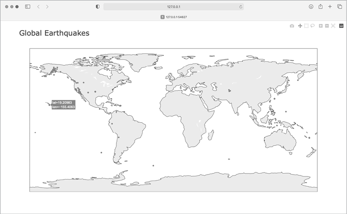
Figure 16-7: A simple map showing where all the earthquakes in the last 24 hours occurred
Now that we know the information in our dataset is being plotted correctly, we can make a few changes to make the map more meaningful and easier to read.
Representing Magnitudes
A map of earthquake activity should show the magnitude of each earthquake. We can also include more data, now that we know the data is being plotted correctly.
--snip--
# Read data as a string and convert to a Python object.
path = Path('eq_data/eq_data_30_day_m1.geojson')
contents = path.read_text()
--snip--

title = 'Global Earthquakes'
fig = px.scatter_geo(lat=lats, lon=lons, size=mags, title=title)
fig.show()
We load the file eq_data_30_day_m1.geojson, to include a full 30 days’ worth of earthquake activity. We also use the size argument in the px.scatter_geo() call, which specifies how the points on the map will be sized. We pass the list mags to size, so earthquakes with a higher magnitude will show up as larger points on the map.
The resulting map is shown in Figure 16-8. Earthquakes usually occur near tectonic plate boundaries, and the longer period of earthquake activity included in this map reveals the exact locations of these boundaries.
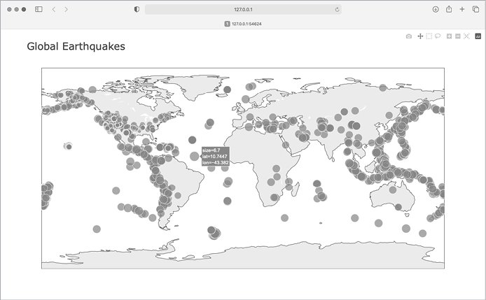
Figure 16-8: The map now shows the magnitude of all earthquakes in the last 30 days.
This map is better, but it’s still difficult to pick out which points represent the most significant earthquakes. We can improve this further by using color to represent magnitudes as well.
Customizing Marker Colors
We can use Plotly’s color scales to customize each marker’s color, according to the severity of the corresponding earthquake. We’ll also use a different projection for the base map.
eq_world_map.py
--snip--
fig = px.scatter_geo(lat=lats, lon=lons, size=mags, title=title,
❶         color=mags,
❷         color_continuous_scale='Viridis',
❸         labels={'color':'Magnitude'},
❹         projection='natural earth',
    )
fig.show()
All the significant changes here occur in the px.scatter_geo() function call. The color argument tells Plotly what values it should use to determine where each marker falls on the color scale ❶. We use the mags list to determine the color for each point, just as we did with the size argument.
The color_continuous_scale argument tells Plotly which color scale to use ❷. Viridis is a color scale that ranges from dark blue to bright yellow, and it works well for this dataset. By default, the color scale on the right of the map is labeled color; this is not representative of what the colors actually mean. The labels argument, shown in Chapter 15, takes a dictionary as a value ❸. We only need to set one custom label on this chart, making sure the color scale is labeled Magnitude instead of color.
We add one more argument, to modify the base map over which the earthquakes are plotted. The projection argument accepts a number of common map projections ❹. Here we use the 'natural earth' projection, which rounds the ends of the map. Also, note the trailing comma after this last argument. When a function call has a long list of arguments spanning multiple lines like this, it’s common practice to add a trailing comma so you’re always ready to add another argument on the next line.
When you run the program now, you’ll see a much nicer-looking map. In Figure 16-9, the color scale shows the severity of individual earthquakes; the most severe earthquakes stand out as light-yellow points, in contrast to many darker points. You can also tell which regions of the world have more significant earthquake activity.
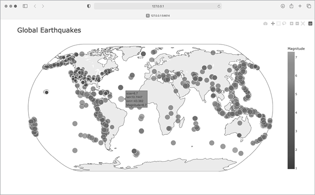
Figure 16-9: In 30 days’ worth of earthquakes, color and size are used to represent the magnitude of each earthquake.
Other Color Scales
You can choose from a number of other color scales. To see the available color scales, enter the following two lines in a Python terminal session:
>>> import plotly.express as px
>>> px.colors.named_colorscales()
['aggrnyl', 'agsunset', 'blackbody', ..., 'mygbm']
Feel free to try out these color scales in the earthquake map, or with any dataset where continuously varying colors can help show patterns in the data.
Adding Hover Text
To finish this map, we’ll add some informative text that appears when you hover over the marker representing an earthquake. In addition to showing the longitude and latitude, which appear by default, we’ll show the magnitude and provide a description of the approximate location as well.
To make this change, we need to pull a little more data from the file:
eq_world_map.py
--snip--
❶ mags, lons, lats, eq_titles = [], [], [], []
    mag = eq_dict['properties']['mag']
    lon = eq_dict['geometry']['coordinates'][0]
    lat = eq_dict['geometry']['coordinates'][1]
❷     eq_title = eq_dict['properties']['title']
    mags.append(mag)
    lons.append(lon)
    lats.append(lat)
    eq_titles.append(eq_title)

title = 'Global Earthquakes'
fig = px.scatter_geo(lat=lats, lon=lons, size=mags, title=title,
        --snip--
        projection='natural earth',
❸         hover_name=eq_titles,
    )
fig.show()
We first make a list called eq_titles to store the title of each earthquake ❶. The 'title' section of the data contains a descriptive name of the magnitude and location of each earthquake, in addition to its longitude and latitude. We pull this information and assign it to the variable eq_title ❷, and then append it to the list eq_titles.
In the px.scatter_geo() call, we pass eq_titles to the hover_name argument ❸. Plotly will now add the information from the title of each earthquake to the hover text on each point. When you run this program, you should be able to hover over any marker, see a description of where that earthquake took place, and read its exact magnitude. An example of this information is shown in Figure 16-10.
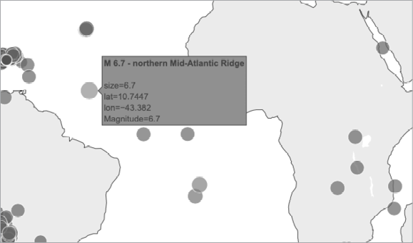
Figure 16-10: The hover text now includes a summary of each earthquake.
This is impressive! In less than 30 lines of code, we’ve created a visually appealing and meaningful map of global earthquake activity that also illustrates the geological structure of the planet. Plotly offers a wide range of ways you can customize the appearance and behavior of your visualizations. Using Plotly’s many options, you can make charts and maps that show exactly what you want them to.
Summary
In this chapter, you learned how to work with real-world datasets. You processed CSV and GeoJSON files, and extracted the data you want to focus on. Using historical weather data, you learned more about working with Matplotlib, including how to use the datetime module and how to plot multiple data series on one chart. You plotted geographical data on a world map in Plotly, and learned to customize the style of the map.
As you gain experience working with CSV and JSON files, you’ll be able to process almost any data you want to analyze. You can download most online datasets in either or both of these formats. By working with these formats, you’ll be able to learn how to work with other data formats more easily as well.
In the next chapter, you’ll write programs that automatically gather their own data from online sources, and then you’ll create visualizations of that data. These are fun skills to have if you want to program as a hobby and are critical skills if you’re interested in programming professionally.