15
Generating Data

Data visualization is the use of visual representations to explore and present patterns in datasets. It’s closely associated with data analysis, which uses code to explore the patterns and connections in a dataset. A dataset can be a small list of numbers that fits in a single line of code, or it can be terabytes of data that include many different kinds of information.
Creating effective data visualizations is about more than just making information look nice. When a representation of a dataset is simple and visually appealing, its meaning becomes clear to viewers. People will see patterns and significance in your datasets that they never knew existed.
Fortunately, you don’t need a supercomputer to visualize complex data. Python is so efficient that with just a laptop, you can quickly explore datasets containing millions of individual data points. These data points don’t have to be numbers; with the basics you learned in the first part of this book, you can analyze non-numerical data as well.
People use Python for data-intensive work in genetics, climate research, political and economic analysis, and much more. Data scientists have written an impressive array of visualization and analysis tools in Python, many of which are available to you as well. One of the most popular tools is Matplotlib, a mathematical plotting library. In this chapter, we’ll use Matplotlib to make simple plots, such as line graphs and scatter plots. Then we’ll create a more interesting dataset based on the concept of a random walk—a visualization generated from a series of random decisions.
We’ll also use a package called Plotly, which creates visualizations that work well on digital devices, to analyze the results of rolling dice. Plotly generates visualizations that automatically resize to fit a variety of display devices. These visualizations can also include a number of interactive features, such as emphasizing particular aspects of the dataset when users hover over different parts of the visualization. Learning to use Matplotlib and Plotly will help you get started visualizing the kinds of data you’re most interested in.
Installing Matplotlib
To use Matplotlib for your initial set of visualizations, you’ll need to install it using pip, just like we did with pytest in Chapter 11 (see “Installing pytest with pip” on page 210).
To install Matplotlib, enter the following command at a terminal prompt:
$ python -m pip install --user matplotlibIf you use a command other than python to run programs or start a terminal session, such as python3, your command will look like this:
$ python3 -m pip install --user matplotlibTo see the kinds of visualizations you can make with Matplotlib, visit the Matplotlib home page at https://matplotlib.org and click Plot types. When you click a visualization in the gallery, you’ll see the code used to generate the plot.
Plotting a Simple Line Graph
Let’s plot a simple line graph using Matplotlib and then customize it to create a more informative data visualization. We’ll use the square number sequence 1, 4, 9, 16, and 25 as the data for the graph.
To make a simple line graph, specify the numbers you want to work with and let Matplotlib do the rest:
mpl_squares.py
import matplotlib.pyplot as plt

squares = [1, 4, 9, 16, 25]

❶ fig, ax = plt.subplots()
ax.plot(squares)

plt.show()
We first import the pyplot module using the alias plt so we don’t have to type pyplot repeatedly. (You’ll see this convention often in online examples, so we’ll use it here.) The pyplot module contains a number of functions that help generate charts and plots.
We create a list called squares to hold the data that we’ll plot. Then we follow another common Matplotlib convention by calling the subplots() function ❶. This function can generate one or more plots in the same figure. The variable fig represents the entire figure, which is the collection of plots that are generated. The variable ax represents a single plot in the figure; this is the variable we’ll use most of the time when defining and customizing a single plot.
We then use the plot() method, which tries to plot the data it’s given in a meaningful way. The function plt.show() opens Matplotlib’s viewer and displays the plot, as shown in Figure 15-1. The viewer allows you to zoom and navigate the plot, and you can save any plot images you like by clicking the disk icon.
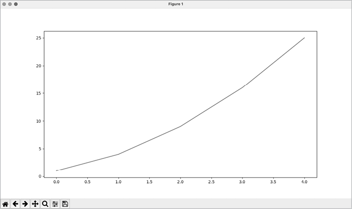
Figure 15-1: One of the simplest plots you can make in Matplotlib
Changing the Label Type and Line Thickness
Although the plot in Figure 15-1 shows that the numbers are increasing, the label type is too small and the line is a little thin to read easily. Fortunately, Matplotlib allows you to adjust every feature of a visualization.
We’ll use a few of the available customizations to improve this plot’s readability. Let’s start by adding a title and labeling the axes:
mpl_squares.py
import matplotlib.pyplot as plt

squares = [1, 4, 9, 16, 25]

fig, ax = plt.subplots()
❶ ax.plot(squares, linewidth=3)

# Set chart title and label axes.
❷ ax.set_title("Square Numbers", fontsize=24)
❸ ax.set_xlabel("Value", fontsize=14)
ax.set_ylabel("Square of Value", fontsize=14)

# Set size of tick labels.
❹ ax.tick_params(labelsize=14)

plt.show()
The linewidth parameter controls the thickness of the line that plot() generates ❶. Once a plot has been generated, there are many methods available to modify the plot before it’s presented. The set_title() method sets an overall title for the chart ❷. The fontsize parameters, which appear repeatedly throughout the code, control the size of the text in various elements on the chart.
The set_xlabel() and set_ylabel() methods allow you to set a title for each of the axes ❸, and the method tick_params() styles the tick marks ❹. Here tick_params() sets the font size of the tick mark labels to 14 on both axes.
As you can see in Figure 15-2, the resulting chart is much easier to read. The label type is bigger, and the line graph is thicker. It’s often worth experimenting with these values to see what works best in the resulting graph.
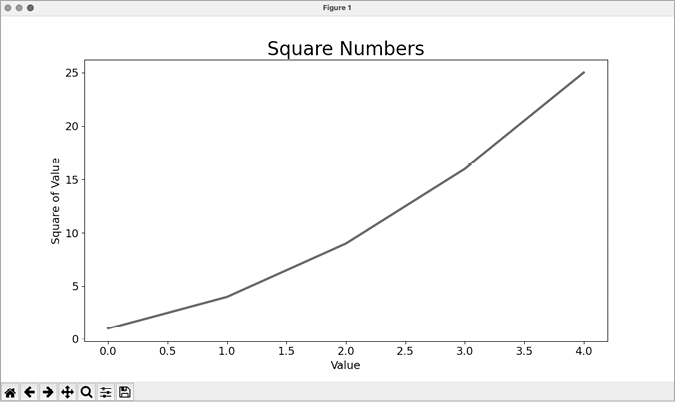
Figure 15-2: The chart is much easier to read now.
Correcting the Plot
Now that we can read the chart better, we can see that the data is not plotted correctly. Notice at the end of the graph that the square of 4.0 is shown as 25! Let’s fix that.
When you give plot() a single sequence of numbers, it assumes the first data point corresponds to an x-value of 0, but our first point corresponds to an x-value of 1. We can override the default behavior by giving plot() both the input and output values used to calculate the squares:
mpl_squares.py
import matplotlib.pyplot as plt

input_values = [1, 2, 3, 4, 5]
squares = [1, 4, 9, 16, 25]

fig, ax = plt.subplots()
ax.plot(input_values, squares, linewidth=3)

# Set chart title and label axes.
--snip--
Now plot() doesn’t have to make any assumptions about how the output numbers were generated. The resulting plot, shown in Figure 15-3, is correct.
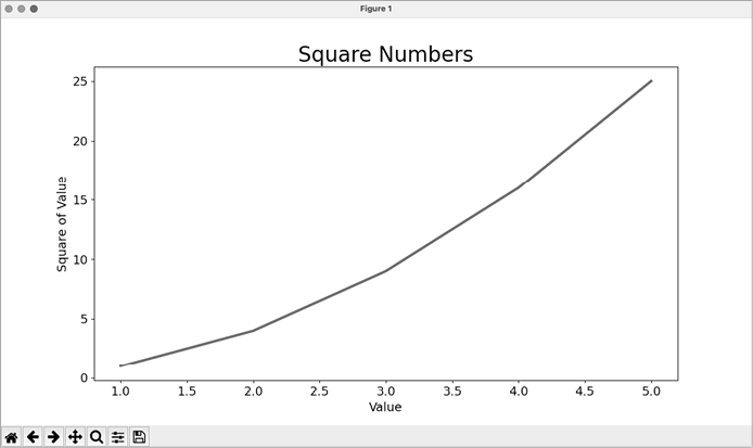
Figure 15-3: The data is now plotted correctly.
You can specify a number of arguments when calling plot() and use a number of methods to customize your plots after generating them. We’ll continue to explore these approaches to customization as we work with more interesting datasets throughout this chapter.
Using Built-in Styles
Matplotlib has a number of predefined styles available. These styles contain a variety of default settings for background colors, gridlines, line widths, fonts, font sizes, and more. They can make your visualizations appealing without requiring much customization. To see the full list of available styles, run the following lines in a terminal session:
>>> import matplotlib.pyplot as plt
>>> plt.style.available
['Solarize_Light2', '_classic_test_patch', '_mpl-gallery',
--snip--
To use any of these styles, add one line of code before calling subplots():
mpl_squares.py
import matplotlib.pyplot as plt

input_values = [1, 2, 3, 4, 5]
squares = [1, 4, 9, 16, 25]

plt.style.use('seaborn')
fig, ax = plt.subplots()
--snip--
This code generates the plot shown in Figure 15-4. A wide variety of styles is available; play around with these styles to find some that you like.
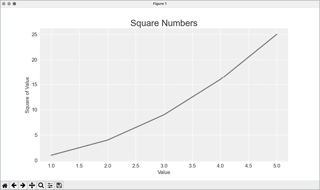
Figure 15-4: The built-in seaborn style
Plotting and Styling Individual Points with scatter()
Sometimes, it’s useful to plot and style individual points based on certain characteristics. For example, you might plot small values in one color and larger values in a different color. You could also plot a large dataset with one set of styling options and then emphasize individual points by replotting them with different options.
To plot a single point, pass the single x- and y-values of the point to scatter():
scatter_squares.py
import matplotlib.pyplot as plt

plt.style.use('seaborn')
fig, ax = plt.subplots()
ax.scatter(2, 4)

plt.show()
Let’s style the output to make it more interesting. We’ll add a title, label the axes, and make sure all the text is large enough to read:
import matplotlib.pyplot as plt

plt.style.use('seaborn')
fig, ax = plt.subplots()
❶ ax.scatter(2, 4, s=200)

# Set chart title and label axes.
ax.set_title("Square Numbers", fontsize=24)
ax.set_xlabel("Value", fontsize=14)
ax.set_ylabel("Square of Value", fontsize=14)

# Set size of tick labels.
ax.tick_params(labelsize=14)

plt.show()
We call scatter() and use the s argument to set the size of the dots used to draw the graph ❶. When you run scatter_squares.py now, you should see a single point in the middle of the chart, as shown in Figure 15-5.
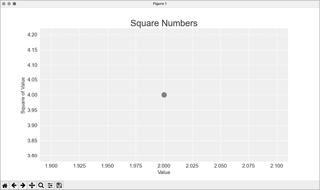
Figure 15-5: Plotting a single point
Plotting a Series of Points with scatter()
To plot a series of points, we can pass scatter() separate lists of x- and y-values, like this:
scatter_squares.py
import matplotlib.pyplot as plt

x_values = [1, 2, 3, 4, 5]
y_values = [1, 4, 9, 16, 25]

plt.style.use('seaborn')
fig, ax = plt.subplots()
ax.scatter(x_values, y_values, s=100)

# Set chart title and label axes.
--snip--
The x_values list contains the numbers to be squared, and y_values contains the square of each number. When these lists are passed to scatter(), Matplotlib reads one value from each list as it plots each point. The points to be plotted are (1, 1), (2, 4), (3, 9), (4, 16), and (5, 25); Figure 15-6 shows the result.
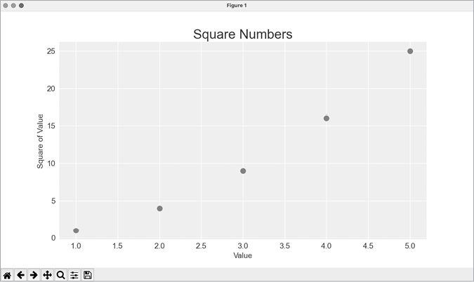
Figure 15-6: A scatter plot with multiple points
Calculating Data Automatically
Writing lists by hand can be inefficient, especially when we have many points. Rather than writing out each value, let’s use a loop to do the calculations for us.
Here’s how this would look with 1,000 points:
scatter_squares.py
import matplotlib.pyplot as plt

❶ x_values = range(1, 1001)
y_values = [x**2 for x in x_values]

plt.style.use('seaborn')
fig, ax = plt.subplots()
❷ ax.scatter(x_values, y_values, s=10)

# Set chart title and label axes.
--snip--

# Set the range for each axis.
❸ ax.axis([0, 1100, 0, 1_100_000])

plt.show()
We start with a range of x-values containing the numbers 1 through 1,000 ❶. Next, a list comprehension generates the y-values by looping through the x-values (for x in x_values), squaring each number (x**2), and assigning the results to y_values. We then pass the input and output lists to scatter() ❷. Because this is a large dataset, we use a smaller point size.
Before showing the plot, we use the axis() method to specify the range of each axis ❸. The axis() method requires four values: the minimum and maximum values for the x-axis and the y-axis. Here, we run the x-axis from 0 to 1,100 and the y-axis from 0 to 1,100,000. Figure 15-7 shows the result.
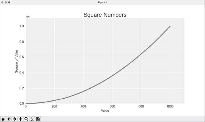
Figure 15-7: Python can plot 1,000 points as easily as it plots 5 points.
Customizing Tick Labels
When the numbers on an axis get large enough, Matplotlib defaults to scientific notation for tick labels. This is usually a good thing, because larger numbers in plain notation take up a lot of unnecessary space on a visualization.
Almost every element of a chart is customizable, so you can tell Matplotlib to keep using plain notation if you prefer:
--snip--
# Set the range for each axis.
ax.axis([0, 1100, 0, 1_100_000])
ax.ticklabel_format(style='plain')

plt.show()
The ticklabel_format() method allows you to override the default tick label style for any plot.
Defining Custom Colors
To change the color of the points, pass the argument color to scatter() with the name of a color to use in quotation marks, as shown here:
ax.scatter(x_values, y_values, color='red', s=10)You can also define custom colors using the RGB color model. To define a color, pass the color argument a tuple with three float values (one each for red, green, and blue, in that order), using values between 0 and 1. For example, the following line creates a plot with light-green dots:
ax.scatter(x_values, y_values, color=(0, 0.8, 0), s=10)Values closer to 0 produce darker colors, and values closer to 1 produce lighter colors.
Using a Colormap
A colormap is a sequence of colors in a gradient that moves from a starting to an ending color. In visualizations, colormaps are used to emphasize patterns in data. For example, you might make low values a light color and high values a darker color. Using a colormap ensures that all points in the visualization vary smoothly and accurately along a well-designed color scale.
The pyplot module includes a set of built-in colormaps. To use one of these colormaps, you need to specify how pyplot should assign a color to each point in the dataset. Here’s how to assign a color to each point, based on its y-value:
scatter_squares.py
--snip--
plt.style.use('seaborn')
fig, ax = plt.subplots()
ax.scatter(x_values, y_values, c=y_values, cmap=plt.cm.Blues, s=10)

# Set chart title and label axes.
--snip--
The c argument is similar to color, but it’s used to associate a sequence of values with a color mapping. We pass the list of y-values to c, and then tell pyplot which colormap to use with the cmap argument. This code colors the points with lower y-values light blue and the points with higher y-values dark blue. Figure 15-8 shows the resulting plot.
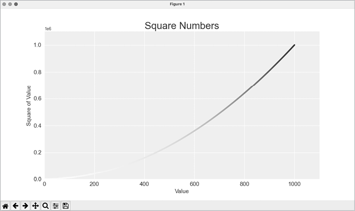
Figure 15-8: A plot using the Blues colormap
Saving Your Plots Automatically
If you want to save the plot to a file instead of showing it in the Matplotlib viewer, you can use plt.savefig() instead of plt.show():
plt.savefig('squares_plot.png', bbox_inches='tight')The first argument is a filename for the plot image, which will be saved in the same directory as scatter_squares.py. The second argument trims extra whitespace from the plot. If you want the extra whitespace around the plot, you can omit this argument. You can also call savefig() with a Path object, and write the output file anywhere you want on your system.
Random Walks
In this section, we’ll use Python to generate data for a random walk and then use Matplotlib to create a visually appealing representation of that data. A random walk is a path that’s determined by a series of simple decisions, each of which is left entirely to chance. You might imagine a random walk as the path a confused ant would take if it took every step in a random direction.
Random walks have practical applications in nature, physics, biology, chemistry, and economics. For example, a pollen grain floating on a drop of water moves across the surface of the water because it’s constantly pushed around by water molecules. Molecular motion in a water drop is random, so the path a pollen grain traces on the surface is a random walk. The code we’ll write next models many real-world situations.
Creating the RandomWalk Class
To create a random walk, we’ll create a RandomWalk class, which will make random decisions about which direction the walk should take. The class needs three attributes: one variable to track the number of points in the walk, and two lists to store the x- and y-coordinates of each point in the walk.
We’ll only need two methods for the RandomWalk class: the __init__() method and fill_walk(), which will calculate the points in the walk. Let’s start with the __init__() method:
random_walk.py
❶ from random import choice

class RandomWalk:
    """A class to generate random walks."""

❷     def __init__(self, num_points=5000):
        """Initialize attributes of a walk."""
        self.num_points = num_points

        # All walks start at (0, 0).
❸         self.x_values = [0]
        self.y_values = [0]
To make random decisions, we’ll store possible moves in a list and use the choice() function (from the random module) to decide which move to make each time a step is taken ❶. We set the default number of points in a walk to 5000, which is large enough to generate some interesting patterns but small enough to generate walks quickly ❷. Then we make two lists to hold the x- and y-values, and we start each walk at the point (0, 0) ❸.
Choosing Directions
We’ll use the fill_walk() method to determine the full sequence of points in the walk. Add this method to random_walk.py:
random_walk.py
    def fill_walk(self):
        """Calculate all the points in the walk."""

        # Keep taking steps until the walk reaches the desired length.
❶         while len(self.x_values) < self.num_points:

            # Decide which direction to go, and how far to go.
❷             x_direction = choice([1, -1])
            x_distance = choice([0, 1, 2, 3, 4])
❸             x_step = x_direction * x_distance

            y_direction = choice([1, -1])
            y_distance = choice([0, 1, 2, 3, 4])
❹             y_step = y_direction * y_distance

            # Reject moves that go nowhere.
❺             if x_step == 0 and y_step == 0:
                continue

            # Calculate the new position.
❻             x = self.x_values[-1] + x_step
            y = self.y_values[-1] + y_step

            self.x_values.append(x)
            self.y_values.append(y)
We first set up a loop that runs until the walk is filled with the correct number of points ❶. The main part of fill_walk() tells Python how to simulate four random decisions: Will the walk go right or left? How far will it go in that direction? Will it go up or down? How far will it go in that direction?
We use choice([1, -1]) to choose a value for x_direction, which returns either 1 for movement to the right or −1 for movement to the left ❷. Next, choice([0, 1, 2, 3, 4]) randomly selects a distance to move in that direction. We assign this value to x_distance. The inclusion of a 0 allows for the possibility of steps that have movement along only one axis.
We determine the length of each step in the x- and y-directions by multiplying the direction of movement by the distance chosen ❸ ❹. A positive result for x_step means move to the right, a negative result means move to the left, and 0 means move vertically. A positive result for y_step means move up, negative means move down, and 0 means move horizontally. If the values of both x_step and y_step are 0, the walk doesn’t go anywhere; when this happens, we continue the loop ❺.
To get the next x-value for the walk, we add the value in x_step to the last value stored in x_values ❻ and do the same for the y-values. When we have the new point’s coordinates, we append them to x_values and y_values.
Plotting the Random Walk
Here’s the code to plot all the points in the walk:
rw_visual.py
import matplotlib.pyplot as plt

from random_walk import RandomWalk

# Make a random walk.
❶ rw = RandomWalk()
rw.fill_walk()

# Plot the points in the walk.
plt.style.use('classic')
fig, ax = plt.subplots()
❷ ax.scatter(rw.x_values, rw.y_values, s=15)
❸ ax.set_aspect('equal')
plt.show()
We begin by importing pyplot and RandomWalk. We then create a random walk and assign it to rw ❶, making sure to call fill_walk(). To visualize the walk, we feed the walk’s x- and y-values to scatter() and choose an appropriate dot size ❷. By default, Matplotlib scales each axis independently. But that approach would stretch most walks out horizontally or vertically. Here we use the set_aspect() method to specify that both axes should have equal spacing between tick marks ❸.
Figure 15-9 shows the resulting plot with 5,000 points. The images in this section omit Matplotlib’s viewer, but you’ll continue to see it when you run rw_visual.py.
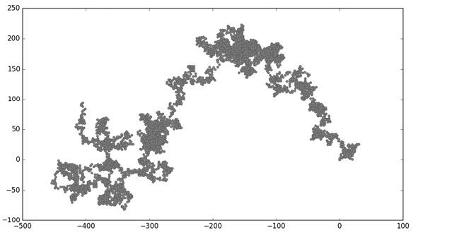
Figure 15-9: A random walk with 5,000 points
Generating Multiple Random Walks
Every random walk is different, and it’s fun to explore the various patterns that can be generated. One way to use the preceding code to make multiple walks without having to run the program several times is to wrap it in a while loop, like this:
rw_visual.py
import matplotlib.pyplot as plt

from random_walk import RandomWalk

# Keep making new walks, as long as the program is active.
while True:
    # Make a random walk.
    --snip--
    plt.show()

    keep_running = input("Make another walk? (y/n): ")
    if keep_running == 'n':
        break
This code generates a random walk, displays it in Matplotlib’s viewer, and pauses with the viewer open. When you close the viewer, you’ll be asked whether you want to generate another walk. If you generate a few walks, you should see some that stay near the starting point, some that wander off mostly in one direction, some that have thin sections connecting larger groups of points, and many other kinds of walks. When you want to end the program, press N.
Styling the Walk
In this section, we’ll customize our plots to emphasize the important characteristics of each walk and deemphasize distracting elements. To do so, we identify the characteristics we want to emphasize, such as where the walk began, where it ended, and the path taken. Next, we identify the characteristics to deemphasize, such as tick marks and labels. The result should be a simple visual representation that clearly communicates the path taken in each random walk.
Coloring the Points
We’ll use a colormap to show the order of the points in the walk, and remove the black outline from each dot so the color of the dots will be clearer. To color the points according to their position in the walk, we pass the c argument a list containing the position of each point. Because the points are plotted in order, this list just contains the numbers from 0 to 4,999:
rw_visual.py
--snip--
while True:
    # Make a random walk.
    rw = RandomWalk()
    rw.fill_walk()

    # Plot the points in the walk.
    plt.style.use('classic')
    fig, ax = plt.subplots()
❶     point_numbers = range(rw.num_points)
    ax.scatter(rw.x_values, rw.y_values, c=point_numbers, cmap=plt.cm.Blues,
        edgecolors='none', s=15)
    ax.set_aspect('equal')
    plt.show()
    --snip--
We use range() to generate a list of numbers equal to the number of points in the walk ❶. We assign this list to point_numbers, which we’ll use to set the color of each point in the walk. We pass point_numbers to the c argument, use the Blues colormap, and then pass edgecolors='none' to get rid of the black outline around each point. The result is a plot that varies from light to dark blue, showing exactly how the walk moves from its starting point to its ending point. This is shown in Figure 15-10.
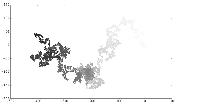
Figure 15-10: A random walk colored with the Blues colormap
Plotting the Starting and Ending Points
In addition to coloring points to show their position along the walk, it would be useful to see exactly where each walk begins and ends. To do so, we can plot the first and last points individually after the main series has been plotted. We’ll make the end points larger and color them differently to make them stand out:
rw_visual.py
--snip--
while True:
    --snip--
    ax.scatter(rw.x_values, rw.y_values, c=point_numbers, cmap=plt.cm.Blues,
        edgecolors='none', s=15)
    ax.set_aspect('equal')

    # Emphasize the first and last points.
    ax.scatter(0, 0, c='green', edgecolors='none', s=100)
    ax.scatter(rw.x_values[-1], rw.y_values[-1], c='red', edgecolors='none',
        s=100)

    plt.show()
    --snip--
To show the starting point, we plot the point (0, 0) in green and in a larger size (s=100) than the rest of the points. To mark the end point, we plot the last x- and y-values in red with a size of 100 as well. Make sure you insert this code just before the call to plt.show() so the starting and ending points are drawn on top of all the other points.
When you run this code, you should be able to spot exactly where each walk begins and ends. If these end points don’t stand out clearly enough, adjust their color and size until they do.
Cleaning Up the Axes
Let’s remove the axes in this plot so they don’t distract from the path of each walk. Here’s how to hide the axes:
rw_visual.py
--snip--
while True:
    --snip--
    ax.scatter(rw.x_values[-1], rw.y_values[-1], c='red', edgecolors='none',
        s=100)

    # Remove the axes.
    ax.get_xaxis().set_visible(False)
    ax.get_yaxis().set_visible(False)

    plt.show()
    --snip--
To modify the axes, we use the ax.get_xaxis() and ax.get_yaxis() methods to get each axis, and then chain the set_visible() method to make each axis invisible. As you continue to work with visualizations, you’ll frequently see this chaining of methods to customize different aspects of a visualization.
Run rw_visual.py now; you should see a series of plots with no axes.
Adding Plot Points
Let’s increase the number of points, to give us more data to work with. To do so, we increase the value of num_points when we make a RandomWalk instance and adjust the size of each dot when drawing the plot:
rw_visual.py
--snip--
while True:
    # Make a random walk.
    rw = RandomWalk(50_000)
    rw.fill_walk()

    # Plot the points in the walk.
    plt.style.use('classic')
    fig, ax = plt.subplots()
    point_numbers = range(rw.num_points)
    ax.scatter(rw.x_values, rw.y_values, c=point_numbers, cmap=plt.cm.Blues,
        edgecolors='none', s=1)
    --snip--
This example creates a random walk with 50,000 points and plots each point at size s=1. The resulting walk is wispy and cloudlike, as shown in Figure 15-11. We’ve created a piece of art from a simple scatter plot!
Experiment with this code to see how much you can increase the number of points in a walk before your system starts to slow down significantly or the plot loses its visual appeal.
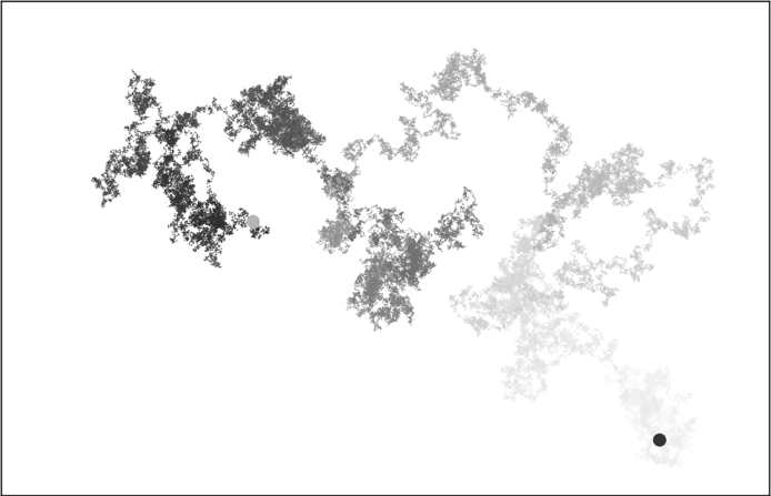
Figure 15-11: A walk with 50,000 points
Altering the Size to Fill the Screen
A visualization is much more effective at communicating patterns in data if it fits nicely on the screen. To make the plotting window better fit your screen, you can adjust the size of Matplotlib’s output. This is done in the subplots() call:
fig, ax = plt.subplots(figsize=(15, 9))When creating a plot, you can pass subplots() a figsize argument, which sets the size of the figure. The figsize parameter takes a tuple that tells Matplotlib the dimensions of the plotting window in inches.
Matplotlib assumes your screen resolution is 100 pixels per inch; if this code doesn’t give you an accurate plot size, adjust the numbers as necessary. Or, if you know your system’s resolution, you can pass subplots() the resolution using the dpi parameter:
fig, ax = plt.subplots(figsize=(10, 6), dpi=128)This should help make the most efficient use of the space available on your screen.
Rolling Dice with Plotly
In this section, we’ll use Plotly to produce interactive visualizations. Plotly is particularly useful when you’re creating visualizations that will be displayed in a browser, because the visualizations will scale automatically to fit the viewer’s screen. These visualizations are also interactive; when the user hovers over certain elements on the screen, information about those elements is highlighted. We’ll build our initial visualization in just a couple lines of code using Plotly Express, a subset of Plotly that focuses on generating plots with as little code as possible. Once we know our plot is correct, we’ll customize the output just as we did with Matplotlib.
In this project, we’ll analyze the results of rolling dice. When you roll one regular, six-sided die, you have an equal chance of rolling any of the numbers from 1 through 6. However, when you use two dice, you’re more likely to roll certain numbers than others. We’ll try to determine which numbers are most likely to occur by generating a dataset that represents rolling dice. Then we’ll plot the results of a large number of rolls to determine which results are more likely than others.
This work helps model games involving dice, but the core ideas also apply to games that involve chance of any kind, such as card games. It also relates to many real-world situations where randomness plays a significant factor.
Installing Plotly
Install Plotly using pip, just as you did for Matplotlib:
$ python -m pip install --user plotly
$ python -m pip install --user pandas
Plotly Express depends on pandas, which is a library for working efficiently with data, so we need to install that as well. If you used python3 or something else when installing Matplotlib, make sure you use the same command here.
To see what kind of visualizations are possible with Plotly, visit the gallery of chart types at https://plotly.com/python. Each example includes source code, so you can see how Plotly generates the visualizations.
Creating the Die Class
We’ll create the following Die class to simulate the roll of one die:
die.py
from random import randint

class Die:
    """A class representing a single die."""

❶     def __init__(self, num_sides=6):
        """Assume a six-sided die."""
        self.num_sides = num_sides

    def roll(self):
        """"Return a random value between 1 and number of sides."""
❷         return randint(1, self.num_sides)
The __init__() method takes one optional argument ❶. With the Die class, when an instance of our die is created, the number of sides will be six if no argument is included. If an argument is included, that value will set the number of sides on the die. (Dice are named for their number of sides: a six-sided die is a D6, an eight-sided die is a D8, and so on.)
The roll() method uses the randint() function to return a random number between 1 and the number of sides ❷. This function can return the starting value (1), the ending value (num_sides), or any integer between the two.
Rolling the Die
Before creating a visualization based on the Die class, let’s roll a D6, print the results, and check that the results look reasonable:
die_visual.py
from die import Die

# Create a D6.
❶ die = Die()

# Make some rolls, and store results in a list.
results = []
❷ for roll_num in range(100):
    result = die.roll()
    results.append(result)

print(results)
We create an instance of Die with the default six sides ❶. Then we roll the die 100 times ❷ and store the result of each roll in the list results. Here’s a sample set of results:
[4, 6, 5, 6, 1, 5, 6, 3, 5, 3, 5, 3, 2, 2, 1, 3, 1, 5, 3, 6, 3, 6, 5, 4, 1, 1, 4, 2, 3, 6, 4, 2, 6, 4, 1, 3, 2, 5, 6, 3, 6, 2, 1, 1, 3, 4, 1, 4, 3, 5, 1, 4, 5, 5, 2, 3, 3, 1, 2, 3, 5, 6, 2, 5, 6, 1, 3, 2, 1, 1, 1, 6, 5, 5, 2, 2, 6, 4, 1, 4, 5, 1, 1, 1, 4, 5, 3, 3, 1, 3, 5, 4, 5, 6, 5, 4, 1, 5, 1, 2]A quick scan of these results shows that the Die class seems to be working. We see the values 1 and 6, so we know the smallest and largest possible values are being returned, and because we don’t see 0 or 7, we know all the results are in the appropriate range. We also see each number from 1 through 6, which indicates that all possible outcomes are represented. Let’s determine exactly how many times each number appears.
Analyzing the Results
We’ll analyze the results of rolling one D6 by counting how many times we roll each number:
die_visual.py
--snip--
# Make some rolls, and store results in a list.
results = []
❶ for roll_num in range(1000):
    result = die.roll()
    results.append(result)

# Analyze the results.
frequencies = []
❷ poss_results = range(1, die.num_sides+1)
for value in poss_results:
❸     frequency = results.count(value)
❹     frequencies.append(frequency)

print(frequencies)
Because we’re no longer printing the results, we can increase the number of simulated rolls to 1000 ❶. To analyze the rolls, we create the empty list frequencies to store the number of times each value is rolled. We then generate all the possible results we could get; in this example, that’s all the numbers from 1 to however many sides die has ❷. We loop through the possible values, count how many times each number appears in results ❸, and then append this value to frequencies ❹. We print this list before making a visualization:
[155, 167, 168, 170, 159, 181]These results look reasonable: we see six frequencies, one for each possible number when you roll a D6. We also see that no frequency is significantly higher than any other. Now let’s visualize these results.
Making a Histogram
Now that we have the data we want, we can generate a visualization in just a couple lines of code using Plotly Express:
die_visual.py
import plotly.express as px

from die import Die
--snip--

for value in poss_results:
    frequency = results.count(value)
    frequencies.append(frequency)

# Visualize the results.
fig = px.bar(x=poss_results, y=frequencies)
fig.show()
We first import the plotly.express module, using the conventional alias px. We then use the px.bar() function to create a bar graph. In the simplest use of this function, we only need to pass a set of x-values and a set of y-values. Here the x-values are the possible results from rolling a single die, and the y-values are the frequencies for each possible result.
The final line calls fig.show(), which tells Plotly to render the resulting chart as an HTML file and open that file in a new browser tab. The result is shown in Figure 15-12.
This is a really simple chart, and it’s certainly not complete. But this is exactly how Plotly Express is meant to be used; you write a couple lines of code, look at the plot, and make sure it represents the data the way you want it to. If you like what you see, you can move on to customizing elements of the chart such as labels and styles. But if you want to explore other possible chart types, you can do so now, without having spent extra time on customization work. Feel free to try this now by changing px.bar() to something like px.scatter() or px.line(). You can find a full list of available chart types at https://plotly.com/python/plotly-express.
This chart is dynamic and interactive. If you change the size of your browser window, the chart will resize to match the available space. If you hover over any of the bars, you’ll see a pop-up highlighting the specific data related to that bar.
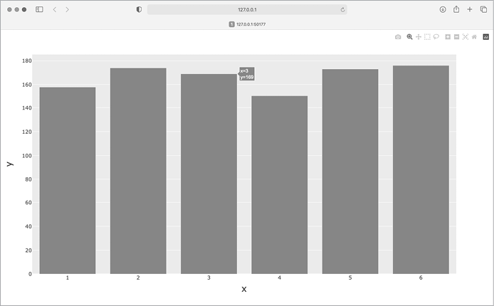
Figure 15-12: The initial plot produced by Plotly Express
Customizing the Plot
Now that we know we have the correct kind of plot and our data is being represented accurately, we can focus on adding the appropriate labels and styles for the chart.
The first way to customize a plot with Plotly is to use some optional parameters in the initial call that generates the plot, in this case, px.bar(). Here’s how to add an overall title and a label for each axis:
die_visual.py
--snip--
# Visualize the results.
❶ title = "Results of Rolling One D6 1,000 Times"
❷ labels = {'x': 'Result', 'y': 'Frequency of Result'}
fig = px.bar(x=poss_results, y=frequencies, title=title, labels=labels)
fig.show()
We first define the title that we want, here assigned to title ❶. To define axis labels, we write a dictionary ❷. The keys in the dictionary refer to the labels we want to customize, and the values are the custom labels we want to use. Here we give the x-axis the label Result and the y-axis the label Frequency of Result. The call to px.bar() now includes the optional arguments title and labels.
Now when the plot is generated it includes an appropriate title and a label for each axis, as shown in Figure 15-13.
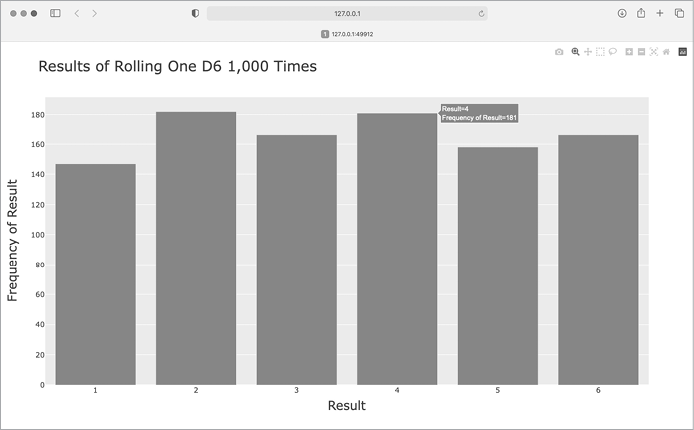
Figure 15-13: A simple bar chart created with Plotly
Rolling Two Dice
Rolling two dice results in larger numbers and a different distribution of results. Let’s modify our code to create two D6 dice to simulate the way we roll a pair of dice. Each time we roll the pair, we’ll add the two numbers (one from each die) and store the sum in results. Save a copy of die_visual.py as dice_visual.py and make the following changes:
dice_visual.py
import plotly.express as px

from die import Die

# Create two D6 dice.
die_1 = Die()
die_2 = Die()

# Make some rolls, and store results in a list.
results = []
for roll_num in range(1000):
❶     result = die_1.roll() + die_2.roll()
    results.append(result)

# Analyze the results.
frequencies = []
❷ max_result = die_1.num_sides + die_2.num_sides
❸ poss_results = range(2, max_result+1)
for value in poss_results:
    frequency = results.count(value)
    frequencies.append(frequency)

# Visualize the results.
title = "Results of Rolling Two D6 Dice 1,000 Times"
labels = {'x': 'Result', 'y': 'Frequency of Result'}
fig = px.bar(x=poss_results, y=frequencies, title=title, labels=labels)
fig.show()
After creating two instances of Die, we roll the dice and calculate the sum of the two dice for each roll ❶. The smallest possible result (2) is the sum of the smallest number on each die. The largest possible result (12) is the sum of the largest number on each die, which we assign to max_result ❷. The variable max_result makes the code for generating poss_results much easier to read ❸. We could have written range(2, 13), but this would work only for two D6 dice. When modeling real-world situations, it’s best to write code that can easily model a variety of situations. This code allows us to simulate rolling a pair of dice with any number of sides.
After running this code, you should see a chart that looks like Figure 15-14.
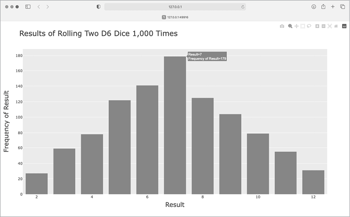
Figure 15-14: Simulated results of rolling two six-sided dice 1,000 times
This graph shows the approximate distribution of results you’re likely to get when you roll a pair of D6 dice. As you can see, you’re least likely to roll a 2 or a 12 and most likely to roll a 7. This happens because there are six ways to roll a 7: 1 and 6, 2 and 5, 3 and 4, 4 and 3, 5 and 2, and 6 and 1.
Further Customizations
There’s one issue that we should address with the plot we just generated. Now that there are 11 bars, the default layout settings for the x-axis leave some of the bars unlabeled. While the default settings work well for most visualizations, this chart would look better with all of the bars labeled.
Plotly has an update_layout() method that can be used to make a wide variety of updates to a figure after it’s been created. Here’s how to tell Plotly to give each bar its own label:
dice_visual.py
--snip--
fig = px.bar(x=poss_results, y=frequencies, title=title, labels=labels)

# Further customize chart.
fig.update_layout(xaxis_dtick=1)

fig.show()
The update_layout() method acts on the fig object, which represents the overall chart. Here we use the xaxis_dtick argument, which specifies the distance between tick marks on the x-axis. We set that spacing to 1, so that every bar is labeled. When you run dice_visual.py again, you should see a label on each bar.
Rolling Dice of Different Sizes
Let’s create a six-sided die and a ten-sided die, and see what happens when we roll them 50,000 times:
dice_visual_d6d10.py
import plotly.express as px

from die import Die

# Create a D6 and a D10.
die_1 = Die()
❶ die_2 = Die(10)

# Make some rolls, and store results in a list.
results = []
for roll_num in range(50_000):
    result = die_1.roll() + die_2.roll()
    results.append(result)

# Analyze the results.
--snip--

# Visualize the results.
❷ title = "Results of Rolling a D6 and a D10 50,000 Times"
labels = {'x': 'Result', 'y': 'Frequency of Result'}
--snip--
To make a D10, we pass the argument 10 when creating the second Die instance ❶ and change the first loop to simulate 50,000 rolls instead of 1,000. We change the title of the graph as well ❷.
Figure 15-15 shows the resulting chart. Instead of one most likely result, there are five such results. This happens because there’s still only one way to roll the smallest value (1 and 1) and the largest value (6 and 10), but the smaller die limits the number of ways you can generate the middle numbers. There are six ways to roll a 7, 8, 9, 10, or 11, these are the most common results, and you’re equally likely to roll any one of them.
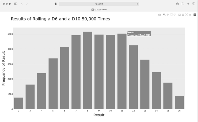
Figure 15-15: The results of rolling a six-sided die and a ten-sided die 50,000 times
Our ability to use Plotly to model the rolling of dice gives us considerable freedom in exploring this phenomenon. In just minutes, you can simulate a tremendous number of rolls using a large variety of dice.
Saving Figures
When you have a figure you like, you can always save the chart as an HTML file through your browser. But you can also do so programmatically. To save your chart as an HTML file, replace the call to fig.show() with a call to fig.write_html():
fig.write_html('dice_visual_d6d10.html')The write_html() method requires one argument: the name of the file to write to. If you only provide a filename, the file will be saved in the same directory as the .py file. You can also call write_html() with a Path object, and write the output file anywhere you want on your system.
Summary
In this chapter, you learned to generate datasets and create visualizations of that data. You created simple plots with Matplotlib and used a scatter plot to explore random walks. You also created a histogram with Plotly, and used it to explore the results of rolling dice of different sizes.
Generating your own datasets with code is an interesting and powerful way to model and explore a wide variety of real-world situations. As you continue to work through the data visualization projects that follow, keep an eye out for situations you might be able to model with code. Look at the visualizations you see in news media, and see if you can identify those that were generated using methods similar to the ones you’re learning in these projects.
In Chapter 16, you’ll download data from online sources and continue to use Matplotlib and Plotly to explore that data.